How important is library branding? And other marketing questions...

Ahead of Internet Librarian International, where I'm running a workshop next week, I had an interesting chat about marketing with Caroline Milner. The Q&A is reproduced below because I thought there were some good questions!

What are the biggest challenges libraries face when marketing their services?
There are so many! A big one is that we have so much to offer - we're complex organisations, but complex marketing messages rarely work. So how do you boil down what we do into messages people can easily understand, without dumbing down? And not just understand our messages, but see how we fit into their lives? Another problem is constantly battling against the wider narrative that libraries are irrelevant or dying. Library use is astronomically huge when you compare it to other cultural activities, but I bet 99% of the public wouldn't guess that.

And of course, a major disadvantage libraries face is that most of us have little or zero budget for marketing. Everything we cover in my workshop costs time, but almost none of it involves shelling out actual cash, because for most libraries it's just not an option readily available to them.

How important is library branding?
It depends how you interpret branding... I don't think branding as in visual identity as important as other people say it is.

It's not that it isn't good to have great branding, it's that there are so many other things we need to get right before the branding becomes key from the user's point of view. If your message is simple, clear, focuses on the benefits, and has a good call to action, but looks average, that will be 20x more effective than most library marketing even if the branding is perfect on all those other examples. It's the message, and its relevance, that matters to the users.

The library branding should reflect the library brand. It should communicate who you are. It should help users identify us and remember us. Beyond that, the exact logo or colour scheme is really not that big a deal. The people who say it is are often (not always, but often) the people who make money as branding consultants.

What about the interaction between marketing in the physical space, and marketing online?
Library marketing works best when the two go hand-in-hand. You want people to see the same key message more than once. The online marketing should hook them in, but the messages in the building should reinforce those messages and deliver on the promise. People need to be reminded of the same things in different contexts.

How much emphasis should library marketers place on social media?
Loads and loads. It's hard to talk in general terms - for example, social media for a Law Library that almost exclusively markets to the Law firm it is attached to is less vital than social media for a public library trying to reach thousands of people in a geographical area. But for most libraries, social media was the last great marketing silver bullet. It was the last big thing we could do that completely revolutionises and improves our communication with users. From now on it's really all about making several small changes to affect greater results.

Don't get me wrong, social media can't exist in isolation. It's not as simple as just being on all the latest platforms and posting about the library. But used strategically in conjunction with other channels, it can be hugely productive. It suits libraries really well.

What about involving stakeholders – getting their buy in, and their active support? 
We mustn't forget to market upwards - an absolutely key stakeholder for libraries is the person or group who holds the purse-strings, or who decides on the future of the institution. We need to talk their language, and communicate how what we're doing with the library aligns with their aims. 

More generally, the stakeholders are our key user groups, and those groups are everything. Not just in helping you spread the messages - word of mouth marketing is the most effective marketing of all - but also understanding what those messages should be in the first place. Understanding the different segments of your audience, and tailoring the communications to each group accordingly, is a huge part of what we cover in the workshop. A small amount of marketing segmentation goes a long way.

Library blankets for the win

Reblogged from Lib-Innovation

I've had a number of emails recently asking after our blankets in the library at the University of York, so I thought I'd blog about them.

Getting blankets for the library is probably one of the best things I've ever done in libraryland, honestly.  It took almost no effort and very little money. The students LOVE them. Everyone's a winner.

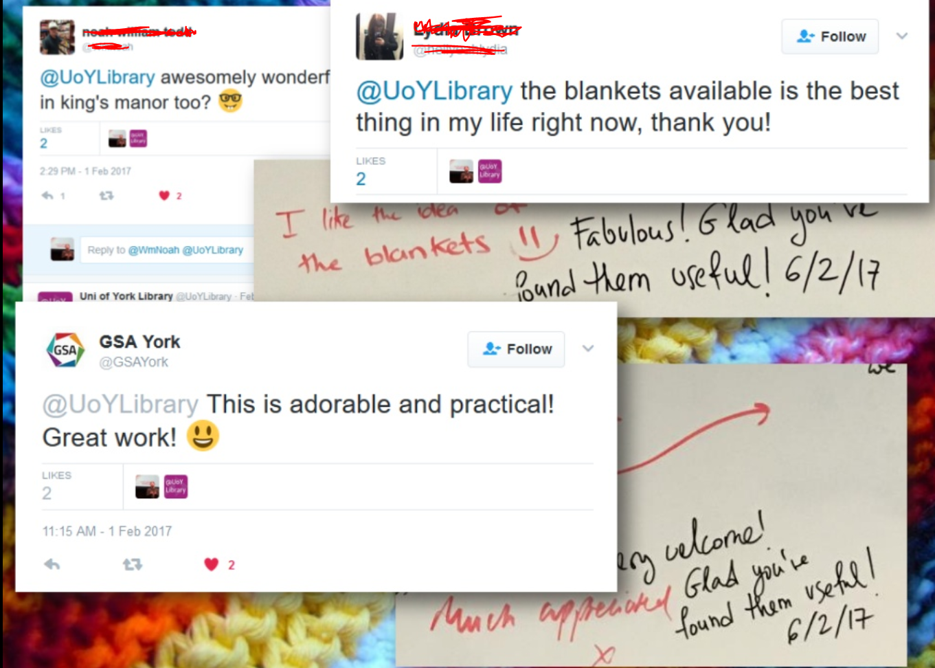
The quote in the title is from our feedback board where we asked students for tips for their peers. Here are some other quotes from the Graffiti Wall and from Twitter:

A plethora of positive feedback for the blankets

A plethora of positive feedback for the blankets

So the tl;dr of this post is, get blankets in your library! It's 100% worth doing.

Practicalities 

We bought 30 blankets for each of our sites. We get them from a local laundry who also launder them for us - but you can also buy perfectly serviceable and cheap examples from for example IKEA if you have your own laundry service to hand. They're laundered termly unless there's a reason to bring that schedule forward...

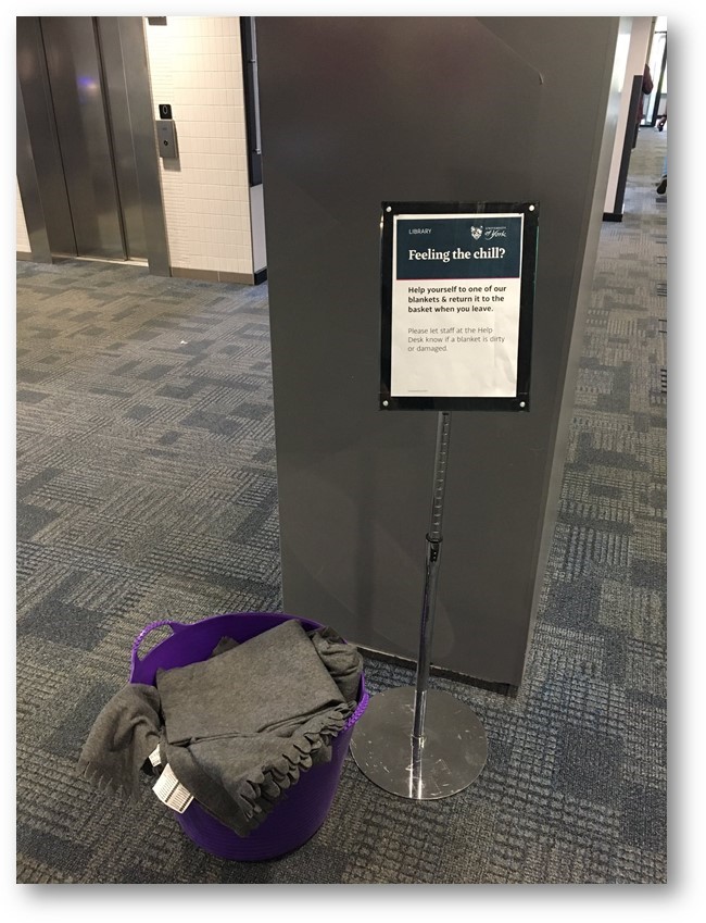
They sit in a bucket near the entrance of each library, and people can help themselves to them as they come and go. Here's a picture of the main campus library blankets: 

Library blanket bucket

You'll notice the blankets are a fairly drab grey - this is deliberate, to make them less tempting to abscond with...

Origins

Like all academic libraries, our number 1 complaint for users is about the temperature - and it's equally split between too hot and too cold most of the time. We don't actually control the temperature anyhow, so we adopted the UX mentality of 'if you can't fix the problem at least make the user experience better in any way you can' and tried to improve things in what small ways we could. 

We'd heard at UXLibs I that a college in Cambridge had given out blankets and that this had reduced their complaints about the cold. Some students of mine from the History of Art Department came to me as part of Library Committee and told me it was basically too cold to work in Kings Manor, our town centre site which is in a building several hundred years old, so I immediately thought back to what Cambridge had done and resolved to steal their idea... (Sonya Adams and Libby Tilley at Cambridge were both really helpful to me in advising on how to set this whole thing up.) 

The students involved were really pleased but the great thing is EVERYONE was really pleased. 

So as we head into the colder months, see if you can do this for your library. Or even better, get your students SLANKETS so their arms are still free for reading. :) 

A short post on preparing short presentations (for short time-slots)

This is a good question, something I've answered a lot in workshops but never blogged about. So here's what I think is really important about prepping short talks with PowerPoint presentations:

  1. Create the number of slides you think you need, then get rid of a couple! The time just rushes past in short presentations, so when it comes to your PPT (or whatever else you're using) you almost always need less than you think. Five slides for a 15 minute presentation may often be enough.
  2. Simplicity is never more important. Simple slides are better anwyay (image-rich, a little text as possible, no bullets) but are especially vital when you only have a very short window in which to convey your information. The messages need to stick, so make them easy to understand and support them with relevant images.
  3. Signpost to more detailed information. Have a blog-post already published which goes into more detail than your 15 minutes will allow, and use a customised bit.ly URL to share the post in an easy-to-remember link at the end of your talk.
  4. Structure is still important. Audiences find structured presentations easier to remember and understand, even for very short talks. So try to have a beginning, a middle, and an end clearly signalled (both in what you're saying and in your slides)
  5. Consider doing a 20:20. A 20:20 (also known as Pecha Kucha) technique involves having 20 slides, each of which automatically moves on after 20 seconds. These are acually really fun to do (the trick is to keep talking rather than stopping to wait for the slides to catch up) and force a real discipline in terms of the economy of your delivery. A 20:20 takes just under 7 minutes and it's amazing how much you can cover in that time if you practice. (I know point 5 directly contradicts point 1, but the approach is SO different with Pecha Kucha it's a whole different ball-game...) 

Sharing UX Findings: York's strategic approach

Reblogged from Lib-Innovation, updated with some new statistics and links.

For the 30th post on Lib-Innovation it seemed appropriate to celebrate the milestone by talking about dissemination of our UX work at York. Although the Lib-Innovation blog covers lots of other things too, the topic of UX was the main reason we created it in the first place.

We've tried to take a strategic approach to dissemination, proactively looking to share what we're doing with as many different types of audience as possible rather than just hoping it will happen. We're excited by what we're learning both from and about the ethnography, and the design, that we're undertaking, so we want people to know about it. In the ideal scenario, we'd spark ideas off that others take on and apply in their own contexts. And we want feedback and ideas to improve our own work. So we're telling people about the work across multiple platforms, and in this post we'll explore some of the ways we're doing it, and why.

Internal audiences

Our rule of thumb is that anyone who gives their time to take part in our ethnographic fieldwork should be the first to hear what we've done with the information. So for the last major UX project we did, the 100 or so participants go an interim report (along with library managers), and they will be the first to see the final report, before it is more widely circulated within the University.

The Library industry in general

The blog is open and anyone can read it, but it is aimed primarily at those in the library industry. (There's a separate blog which we aim at staff and students who use the library.) We hope to reach as many people as possible this way. Not everyone will end up caring too much about UX but hopefully for some it will stick. We put pretty much everything on here - the idea is you don't have to be at a certain event or to speak to any of us in person to learn everything there is to learn about what we're doing.

I tweet about it, we ask the people in the University's Central Marketing who deal with the library to tweet about it, and I sometimes reblog UX articles on my own website.

We've been pleasantly surprised by how much people have read the posts: the most popular article on this site (Vanya Gallimore's overview of our Understanding Academics UX project) has been viewed over 1800 times at the time of writing, which is more than the readership of the majority of subscription journals. What we've not had, however, is comments! I love blog comments. There was a period around 2011 or so when everyone left comments on each other's blogs, and as an author of a post it was so gratifying to be able to interact with people reading. That doesn't seem to happen any more (or maybe that's just our blog!), which is a shame.

We've also presented at a couple of non-UX related library events, for example at the Libraries, Archives and Museums Marketing Awards organised by the Welsh Government.

The Library UX community in particular

An obvious avenue for sharing our UX findings is conferences aimed wholly at libraries interested in UX. With that in mind I presented an overview of our UX activities so far at the Northern Collaboration Library UX event earlier in the year, and Vanya presented at UXLibs III, the biggest conference in this area, in June. You can see her slides here. My colleague Martin Philip also solicited feedback on our work so far during the UXLabs part of that conference, where delegates share work in progress.

UX Specialists from outside the world of libraries

We've only done one talk in this category so far but it's been incredibly beneficial. I presented to the Human Computer Interaction research cluster in York's Computer Science Department. There is a huge amount of knowledge and experience in the area of UX there, not just in terms of academic research but a lot the academics spend time in industry too.

They have a regular seminar series so we asked if we could take a slot in it. We approach this opportunity a bit like we'd approach a UX project: we didn't have a specific agenda or goal in mind but we were pretty sure we would learn something useful. My talk was very much 'here's what we've done, what would you advise we do next?' and it turns out they had a lot of extremely useful advice. I ended up writing pages of notes from the discussions that happened during the talk and afterwards.

A slide from the Computer Sciences presentation:

Among many positive outcomes, that particular day ended up shifting our future approach to UX to a less generative and more evaluative research process, to us changing the way we deal with customer profiles and personas entirely, to us putting together a bid (still in progress) for an intensive design workshop, and to the Department kindly offering to allows us use of their eye-tracking software for future projects. We hope to speak to more non-library audiences in the future. Talking of which...

Audiences outside HE and libraries entirely

I was invited by the Good Things Foundation, a charitable organisation who do a lot of work around digital inclusion and with public libraries, to talk to their staff at their Sheffield HQ. It was a great opportunity to exchange views and experiences with a completely different group of people, facing different challenges.

And finally: Slideshare 

I used to love Slideshare as a dissemination method. Recently however it's gone from being brilliantly useful to rather more hit and miss. It's always great for uploading your slides for others to find, and that can lead to all sorts of opportunities. But until recently Slideshare would 'feature' around 10 slidedecks each day on its homepage - if your slides got selected for this it would boost the views by 20,000 or so. Because of this it has a reach that we can't hope to match by any other channel. We have a lot of methods listed above which are about reaching quite specific audiences; Slideshare was our way just to reach far and wide and hope some relevant people were among the inflated audience.

In the last year or so Slideshare have stopped regularly updating their homepage, so the chance to get featured has reduced almost to zero. The overview of our UX activities so far hich I presented at Northern Collaboration has not been featured, but nevertheless 3,200 people have viewed it at the time of writing. My slides from the LAM Awards event mentioned above DID get featured however, and in fact as still there on the homepage of Slideshare, four months later. As such they've now been viewed just over 400,000 times, which is ridiculous. Clearly only a small fraction of those people are relevant to us at York.

However, 2,400 people have downloaded the slides, suggesting they want to study what we've done a little closer. And these slides led directly to the invitation from the Good Things Foundation, as well as a visit to York from librarians overseas to discuss our UX work - so although Slideshare's reach is unfocused, it's still been relevant and useful for us.

6 Alternatives to Bullet Points


First things first: bullet points are not inherently bad. They can be very useful in written documents. When used in presentations, however, they stop your presentation being as effective. (They often turn presentations into written documents) In fact, your audience engages less, remembers less, agrees less and likes you less when you use bullet points in your PowerPoint presentations. (International Journal of Business Communication, 2015)

So why take that risk?

Usually the answer to that question is one of: 1) It's what I've always done, 2) It's the easiest way thing to do, or 3) Because what else would I do?

For me, 'we've always done it this way' is not a reason to do something. 'This is the best way to do it' is a reason to do something, and sometimes that overlaps with that we've always done, but not always. 

Presentations are often huge opportunities. You have a room full of people giving you your attention (with potentially thousands more online afterwards) and you're there to talk to them about something significant. So although bullets may be easy, why not make the most of the opportunity? Why not do everything you can to not only get your message across but to get it to stick in people's minds? And finally, the 'what else is there?' issue - well, here are five alternatives to using bullets.

(Subscribers, there's LOTS of images in here, some of them stacked up as slides. It's probably going to be a lot easier to view this on the website itself rather than in an email / feedreader - here's the link.)

1) Just put fewer words on the slide

An example of using fewer words without reducing the impact

An example of using fewer words without reducing the impact

An obvious and straightforward place to start. Take away everything you don't need - if it's surplus to requirements, if you can remember to say it out-loud, or if it doesn't really matter whether you say it or not, just get rid of it!

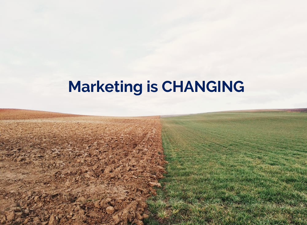
The example here is a slide I used in a recent workshop. I could of course have listed all the ways in which marketing is changing, using bullet points to separate them. But I felt the slide would have more impact with just a single sentence written on the screen, me listing examples out loud, and a visual metaphor as the background image.

2) Cascade the key messages across multiple slides

Rather than making four or five points on one slide (and risk your audience reading ahead and getting out of sync with you the presenter), make one point per slide over four or five slides. This gives each point room to breathe, and helps with signalling to ensure your audience understands and remembers you.

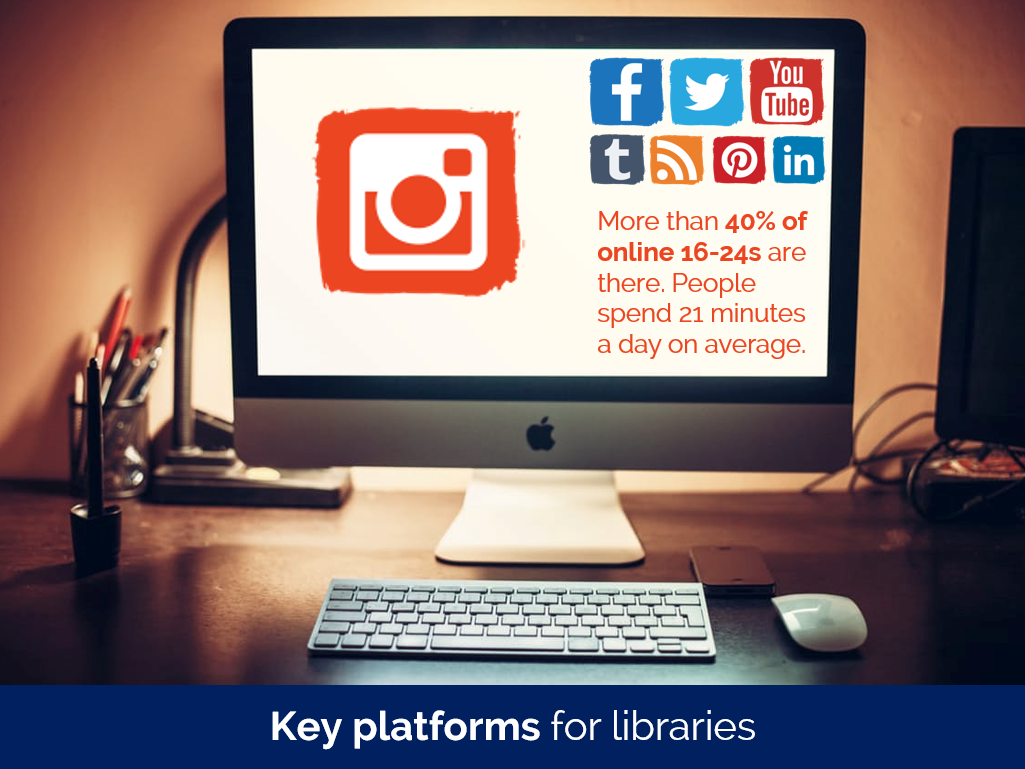
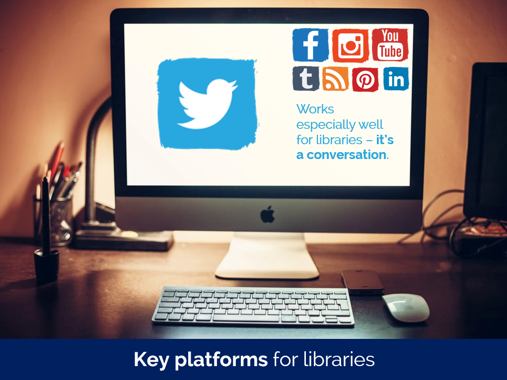
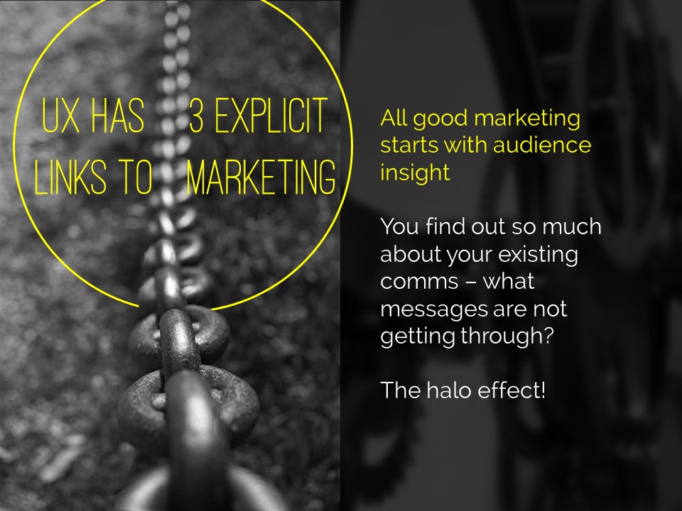
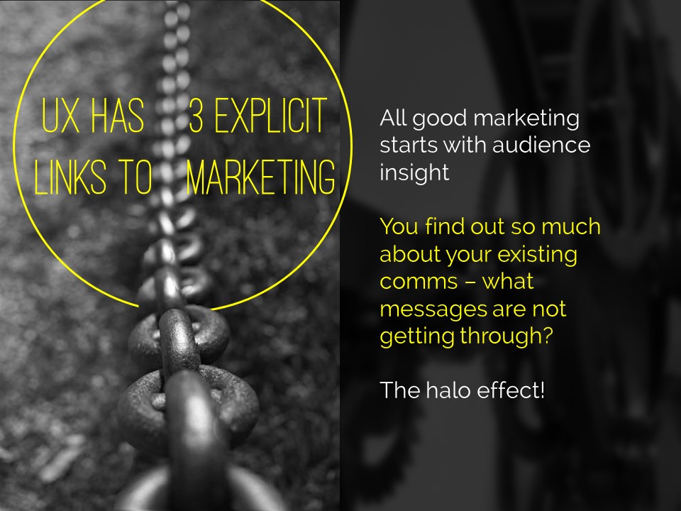
If you're making several points on a theme you don't have to make new slides from scratch for each one - just do the first slide, right-click and Duplicate it, then edit the text on the duplicated version. I've used this technique in the examples below (use the arrows to switch between slides):

If you've got the most recent PowerPoint you can use the Morph transition between the slides, which works really nicely.

People worry that this method will mean a longer presentation but this isn't the case - you take the same amount of time overall, but cycle more quickly through the slides.

3) Use colour to make lists readable, rather than use bullet points

An example of using colour to differentiate chunks of text

An example of using colour to differentiate chunks of text

There are times when you need several points on a slide - for example when you're showing an audience what you'll talk about, or are summarising something, or making comparisons. In these instances neither of the first two techniques are appropriate; you need all the text on one screen. So just write it out like you normally would, but get rid of the baggage and negative associations of bullet-points by not using them - and recreate the POINT of them (making text easier to read) by using alternating colours.

In the particular example shown here, I've actually built up to what you see over three slides. The first just says has the alternating colours text list much larger and in the centre of the screen, then the second is as you see above but with the Bodleian's reply hidden, and then lastly the slide you see here.

4) Highlight key sections of your slide, one by one

I do this a lot - sometimes by building the content of the slides one animation at a time, or by changing the colour to highlight each section, one at a time. Again it means you can have all the points on screen, but you're not using bullets and you're in sync with your audience.

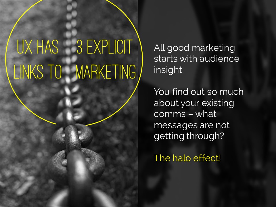
In the example below I've got all three points on screen but each one is highlighted yellow (picking out the yellow from elsewhere on the slide) while I talk about it - again use the arrows to move between them:

5) Turn your bullet points into something visual

An example of using icons instead of bullets

An example of using icons instead of bullets

A fifth option is to basically use bullets without people thinking 'Aargh, bullet points, death by PowerPoint here I come' etc. Use icons (for example from iconfinder.com) as bullet points - the images will help your audience learn. A basic example is shown here.

6) Combine several of the techniques above

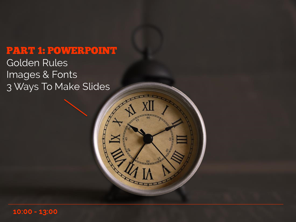
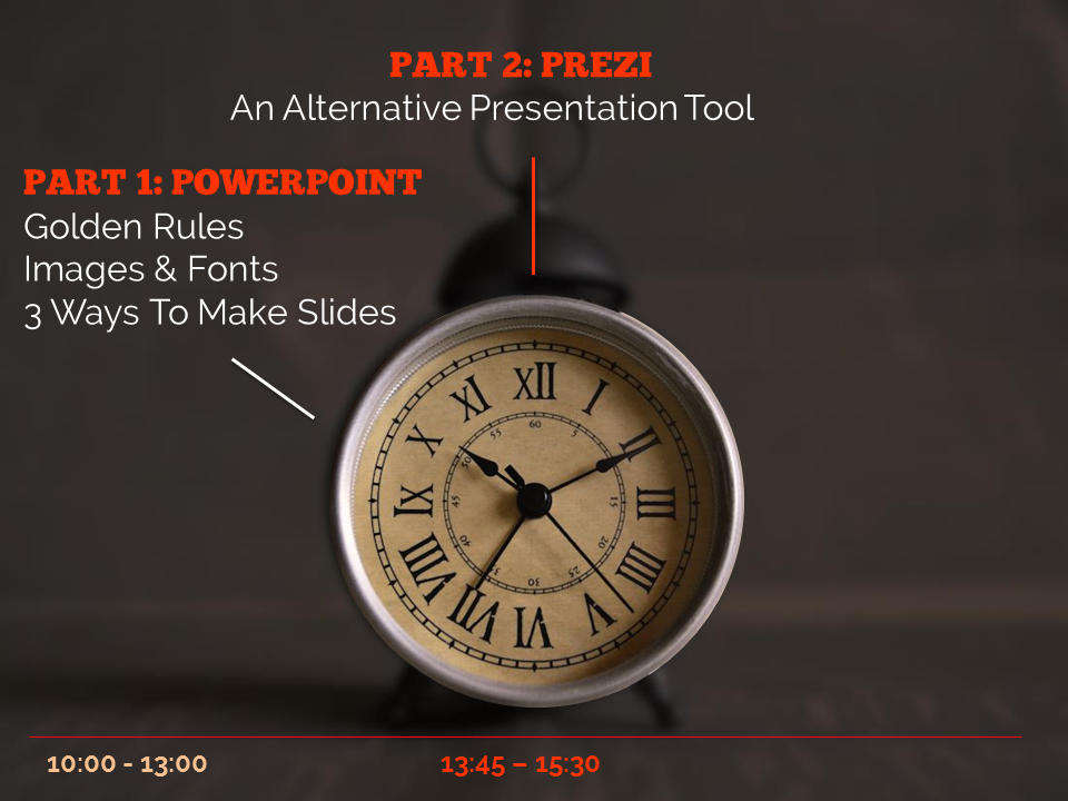
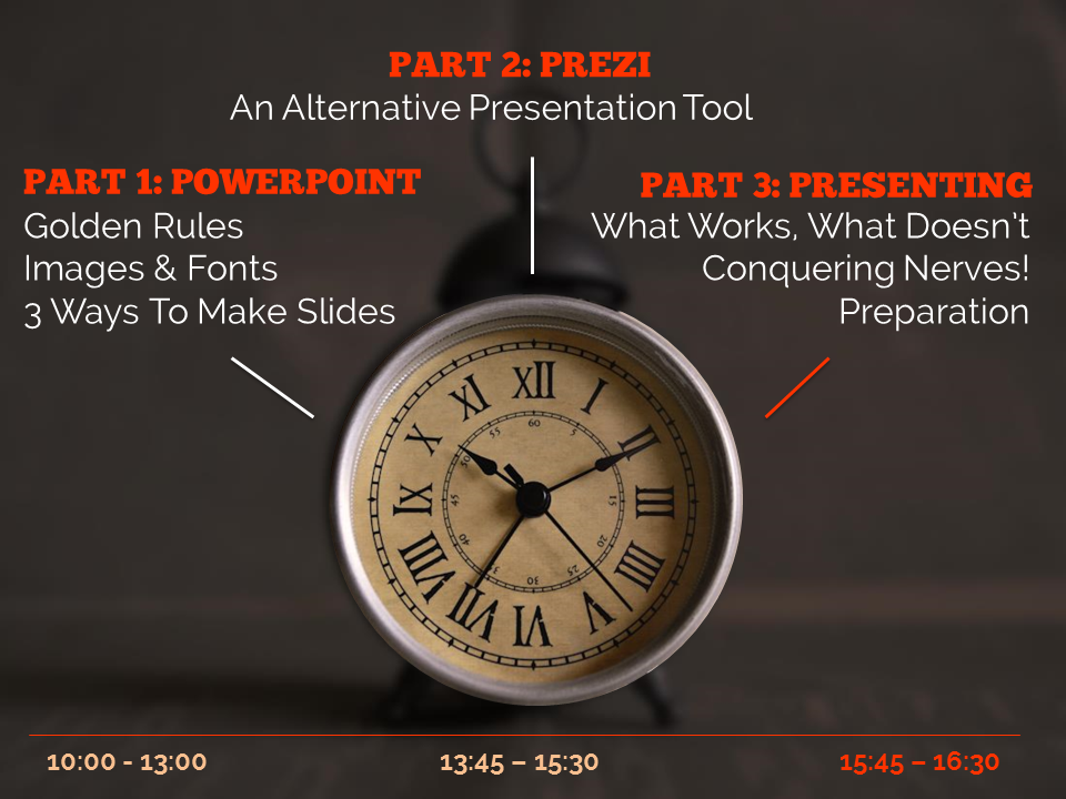
The final example below is how I introduce the timings for my Presentation Skills training days. It does what a single slide with bullet points would do, but uses colour and visual elements over three slides to introduce the information in a more engaging way. Part of the reason I bothered doing this is the slides allow me to talk about each part of the day in turn, whilst staying in sync with my audience, AND it allows the audience to see the full day's timings in one go on the final slide of the sequence.

So there you go! Several ways to avoid bullet points. It's really worth taking a small amount of time to rewrite presentations to avoid bullets: your audience will thank you for it...


You’ll find details of my Presentation Skills or PowerPoint workshops here: you can book an all-day or half-day session for your organisation, online or in person.