Marketing

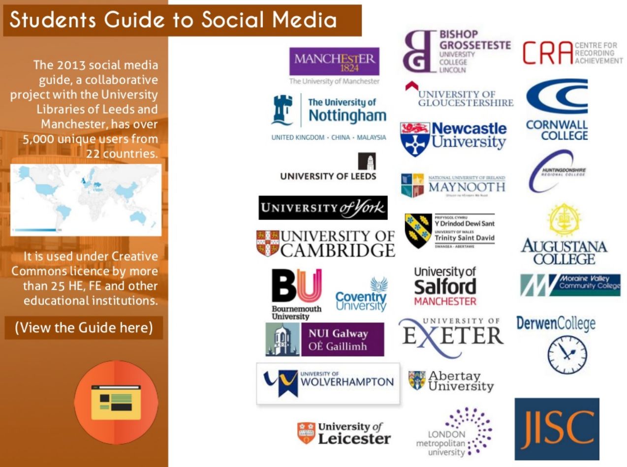
The Student Guide to Social Media is now fully reusable!


This actually happened at the end of last year but I didn't get around to blogging about it at the time. It's about the Student Guide to Social media - there's background info below and in a previous blogpost written when it first arrived.

Click this image to open the Student Guide to Social Media in a new window

Click this image to open the Student Guide to Social Media in a new window

It was always Creative Commons so anyone can use it, but now we've taken the ND (Non-Derivative) part off, so it's just CC-BY-NC. In other words you can take it and do whatever you want with it, including repurposing it, remixing it, taking only certain bits of it and not others, and generally reusing it in a flexible way.

It was made in Articulate, and the Articulate source file is available via JORUM. So if you want to use it to make something new, please go for it.

Whenever we talk about or use this in York the students are really responsive - it often gets rated as 'the most useful aspect' of infolit sessions. There's a growing awareness among undergraduates that social media can play a professional and academic role in their lives, but they often don't know where to start - so this overview is something they find helpful.

There's a bit more info about the Student Guide to Social Media on JISC's Digitial Student pages, too.

Twitter Video is here! And it's going to be great for libraries


NB If you're reading this and can't find Twitter video on the app, don't panic, it's being rolled out across all accounts but not everyone has it yet!

I resolutely refuse to include things in my training just because they're fashionable, and for that reason I still don't talk about Vine in any of the sessions I do. I think Vine can be great (some of the 'Vine-magic' stuff is awesome), but I'm yet to see an absolutely essential use for Libraries or in HE, so it gets left out. [Edit: I've finally seen a good example of a Library Vine account! Check out Newcastle Lib's here.]

Part of the problem is that 6 seconds is just too short for the kinds of ideas I have of how to use what you might call 'social video', as opposed to the more permanent videos you find on Vimeo and YouTube. I feel like I've been waiting for something like Vine, but less trendy...

Happily last week Twitter launched an alternative to Vine (which it also owns, by the way) which I do think we can get some proper use out of. You can now take 30 second videos and upload them to Twitter, where they'll play within the tweet without people needing to leave the site or the app. (At the moment you can't use video already on your camera roll.) The videos can be combinations of several shorter clips like Vine, but it won't automatically loop, and it won't play without someone hitting the 'play' button.

If Vine is the short-attention-span but bang on-trend toddler of internet video, Twitter video is its more considered older sibling. Less cool, but maybe with more meaningful things to say.

Here's how it works (email subscribers, click the title of this post to be taken to the web version if the pictures aren't appearing):

Image taken from Twitter's blog - click to be taken through to the relevant post

Image taken from Twitter's blog - click to be taken through to the relevant post

Like Vine it records as long as you hold the button, and you can quickly stitch together multiple clips - as many as you can fit into 30 seconds, in fact.

Note the third screen-shot there - you can delete, and drag to re-arrange the order. So it may be worth recording the most important parts (the start and end) first so you know how much time you have left for the rest, then re-arrange the order - rather than meticulously creating something with 20 clips, only to not have enough time for the ending and having to redo the whole thing.

So how can libraries use it? Before we get onto specific themes, the most essential thing is to think mobile. The whole point of this feature is people watch short videos, where they are, within the app. Twitter offered promoted videos to paying sponsors before this was rolled out to all of us, and apparently 90% of them were watched on mobile devices. So, hit the ground running (1 second intro, max!); shoot from the chest up if you've got people in there so they can clearly be seen on a small screen; if you're speaking make sure you're close to your phone so it's not too quiet; if you use words make the font LARGE; and if possible make the video in such a way as to not need sound to make sense.

I'd love some more ideas in the comments, but here's a few video ideas to start things off:

Customer Service: answering questions with video. If you use Twitter for customer service or a channel for enquiries, you'll know that often when one person answers a question it's worth ensuring everyone can see the answer (hence the twitter dot!) as many will find it useful. There could be even more impact to answering a question with video. So for example, a basic query like 'how do I locate a DVD' gets much more interesting if the answer is a video...

Transient videos. By which I mean, something where a video is appropriate or useful or funny or tapping into some sort of meme, but which you don't neccessarily want a 'permanent record' of on your YouTube channel. It's not that Twitter videos aren't permanent of course - they are - but just that your YouTube vids form a sort of canon which needs to be left alone, so the most important videos don't drown under lesser inconsequential ones. But Twitter video would be a way of getting something out there - news about an event, say - without that feeling of permanence.

If you do need to keep them though, you have the option to embed like I did above, meaning a Twitter video can be seen by and used by those not on Twitter, via the Library website, blog, or LibGuides.

Lightning Tours. Everyone loves a virtual tour! And you need a longer video to tour an entire library, but what about a new building, or new collection? 30 seconds should be doable.

Quick-fire 'Screen Capture'. Narrate a video which tells your users how to do something useful  and then tweet it as a twitter video. So that opens up instant guides to using equipment, finding stuff, getting the most out of databases etc. Here's an example of that, explaining how to make Billboards in Photofunia. (You could even have a #30SecondsOn... series.)

Ask A Librarian. For the brave and camera-confident, get a Twitter Q&A going, and answer the best questions with a to-camera answer from someone who knows what they're talking about.

Previews. Preview a larger video (a full virtual tour, say, or an infolit guide) with a movie-style trailer on Twitter video.

That's all I can think of for now but people are bound to come up with more creative ideas, and I'd love to hear them.

There's more on Twitter Video here. How are you going to use Twitter video in your library?

Social Media: The best times to post


I like an infographic that actually tells us something useful. So, following the 'social media image sizing' one from a few weeks back, here's a 'when to post' infographic from QuickSprout.

I didn't used to think social media timings were important, but increasingly I think it is worth trying to hit times of peak engagement IF you're tweeting or posting something important, particularly when using social media as an organisation rather than just for yourself. If you've put effort into creating useful content, you want as many people to see it as possible.

Image courtesy of QuickSprout - click on it to view it on their site

Image courtesy of QuickSprout - click on it to view it on their site

9 reasons to love the British Library's Mechanical Curator


At heart this is a post about discoverability, access, and bringing things to the surface that might otherwise not be seen. The Mechanical Curator of the title is one way of the ways the BL has done this with their digitised images, but only one of many - the point is we all have collections which WOULD engage people if they knew about it, so why not invest some time in getting the message out there in innovative ways?

I ran some workshops for the British Library at the end of last year, aimed at social media 'improvers' (people already using it as part of their professional role, who want to get more engagement and measure their impact etc), during which I talked about Tumblr. I showed various examples and confessed my favourite Tumblr of all was from the BL themselves, the Mechanical Curator.

The Mechanical Curator is Tumblr blog which regularly (and automatically) posts images from 1,000,000+ the BL have scanned from out-of-copyright books from previous centuries. It has been programmed with some Artificial Intelligence - or as far as I can see, more like Artificial Whimsy - and becomes taken with certain shapes, symmetries, and themes, and posts these more often and in clusters. After its set up and tweaking, there's no human intervention - it just gets on with it.

Click the pic to open The Mechanical Curator Tumblr in a new window. Go and explore it! I'll happily wait.

Click the pic to open The Mechanical Curator Tumblr in a new window. Go and explore it! I'll happily wait.

I loved the Mechanical Curator before, but I love it even more now, because I got (my childhood friend!) Ben O'Steen, who is Technical Lead at BL Labs, to come along and talk to the group about the project, as he designed the whole thing. And he gave such an interesting talk about it, and I learned so many new things, that I felt compelled to write this post about how great the whole thing is. Not just in itself, but in what it represents about the new ethos of library sharing, which could be the very thing which ensures our continued relevance.

So here we go, 9 reasons why I love the Mechanical Curator and the project around it:

  1. It's the perfect use for a Tumblr. It's not a regular blog which just used Tumblr because it's fashionable, it's a short, snappy alternative to the BL's more traditional blogging output (which happens via Typepad)
  2. It helps people engage with the BL even if they wouldn't usually. On a micro-level, people stumble across the weird little Tumblr and its weird little images, and then they can either leave it at that OR follow the links to the BL catalogue for each pic, and engage with the Library through other channels. That's what social media should do for us; exist on its on terms, and as a gateway to other library content. On a macro-level this whole project gets people interested in British Library materials - people who would never visit or even really know about the BL normally - and then allows them to learn more about the organisation if they wish to
  3. It takes something vast and makes it accessible one piece at a time. Tumblr is very visual and, like Pinterest, when it first came along I wondered what the point was when we already had Flickr. In this case, all the images the Mechanical Curator brings to the surfaces are on Flickr anyhow. But a digital repository or a Flickr account provide such a MASS of materials, it can be hard to find a way in and make sense of it all. The Tumblr takes one image at a time and gets it out another way, broken down into smaller chunks, which helps people find it, access it, and then explore further
  4. It's just the kind of thing you want your national library to be doing. They've taken 1 million images and said: here you go, you can do anything with them, whoever you are. That's fantastic. Not only that but they've done so in a properly interesting and accessible way, with an emphasis on actually REACHING people with the materials, not just making them available in a vacuum
  5. Forget librarians as gatekeepers... When I first entered librarianship I was very excited about the fact that while in the past librarians were gatekeepers of knowledge and information, now the gates were open and we were the sherpas who helped people find what they needed. This takes that anaology one step further and, in effect, brings all the content out from behind the gates and just puts it on the street, asking people to help themselves. I love that. We will get nowhere by trying to guard what we have, we need to give of ourselves as much as we can
  6. The BL is now immersed in pop-culture. My favourite Buzzfeed article of all time just happens to be this one: 44 Medieval Beasts That Cannot Even Handle It Right Now. All 44 are illustrated from the BL's images, put out by the Manuscripts Team
  7. The level of engagement is incredible. Sometimes you do all the right things to bring people in, but nobody comes. Not this time. Over the first 11 months, the images were viewed on Flickr 212 million times! I try not to put too much stock in views alone, but 20 million hits every month is hard to ignore. Not just that but every single one of the images have been viewed at least once, all but a handful 5 times or more. So despite the collosal scale and bredth of the collection, people are engaging with all of it
  8. People aren't just viewing the images, they're DOING things with the images. People are doing really creative things with the images: using them in art installations, free colouring-in books for children, as patterns on handbags... I love how this video from Joe Bell brings the images to life
  9. Including a huge movement to crowd-source some contextual information. Here's the wikipedia page (not set up by Ben or the BL) aimed at tagging all the maps found in the images with contextual and geographic information. As you can see, there are NONE left still to do: all 29,304 of the maps have been tagged.
 

It's not just maps - the community have tagged all sorts of things, providing the BL with groups and categories on its flickr page. Crowd-sourcing is great way of engaging a community and giving them ownership of something!

Finally, for some more context, here's one of Ben's presentations about the Mechanical Curator.

SO Can WE ALL do something like this?

As you can tell, I really think this project is ace. It's a template for what libraries can do with their collections - and although there's a tremendous amount of resource behind what the BL has done, we can all learn from it and apply some of their methodology.

Perhaps we can't all make a tumblr with Artificial intelligence, but we might know someone who can take Ben's code, freely available on Github, and apply it to another project. But to get distracted by the AI is to miss the point - the Mechanical Curator's greatest asset, for me, is taking something unmanagably vast and giving people another way to access it. So if your library has digitised materials which are out of copyright, don't just have them sat in a digital library! Get them out for people to happen across, via Tumblr, Pinterest or Instagram.

If you have collections which you own, or which are out of copyright, can you put them into the public domain and encourage people to take them and remix them?

Behind the Scenes at the Texas A&M University Libraries 'Happy' Video


Some of you may recall that before things got all serious with my post about my daughter, the previous article on this blog was a bit lighter and featured a great library tour video.

Texas A&M University Libraries pastiched Pharrel's Happy (one of the most watched pop videos in 2014) with one of their own. The original features loads of different people dancing to the song; Texas A&M featured loads of people dancing to the song AROUND the library, brilliantly, as way of providing orientation to new students.

This is an update on my previous post, as Texas A&M reached out and provided some great information about the aims behind the film - but first for those who haven't seen it, add to the 66,000+ views it has already had and take a look:

Stephanie Graves, Associate Professor and Cooridinator for Learning and Outreach, provided me with some details. First of all, here are the instructional outcomes they were aiming to achieve:

1)      We are a massive university and the size of the University Libraries can be intimidating.  We want their first introduction to the Libraries to be a positive, engaging experience that reduced library anxiety.  We intentionally choose the theme “Happy” to help accomplish this goal. 

2)      The students are inundated with information from various campus entities during orientation season.  We needed to do something that would be catchy, while relaying just enough information that was memorable.

3)      We have 6 buildings with numerous services.  This can be confusing.  It’s also impossible to give students a “tour” of the libraries on such a large campus.  We wanted the video to highlight our key services and communicate the variety of locations.

Overall, the video turned out to be very successful in reaching these. It's always hard to properly analyse success of this sort of thing, because the video went somewhat viral and that distorts all the statistics. We know it went down well in the library community but that's really on icing on the cake, and the cake is engagement from the library's actual users.

We had a record breaking attendance at our Library Open House (also Happy themed) with over 3,600 students in a 2 hour period. We ran out of Happy T-shirts (3,500) and had to order another batch (also gone). The library Happy shirt is now a “thing” on campus and you see them every day. Our desk staff get asked where folks can buy one on campus, which is a testament to the social phenomenon of our theme event.
— Stephanie Graves

This reinforces the belief that the details of these kinds of ventures, really perfecting a video and making sure it is aimed squarely at the target audience (and not librarians) really pays off. I'm so pleased this worked out so well for them. 

Finally, for those planning their own library video, you can see a Shooting Script from a video we made at York embedded in this blog post, and I'll leave the last word to Stephanie on their planning for their own film:

"We intentionally used student dance groups as our “actors” to help communicate that the libraries were student-centered spaces.  We used a student salsa group, our Aggie Wranglers, and a hip-hop group.  We were hopeful that the variety of dance would communicate the diversity of our campus and make all students feel welcome.  We carefully thought of all the locations and services that we wanted to highlight and in what sequential order to present them.  This pre-work was done  and then we met with the videographer to discuss our needs.   We had it planned out enough that the video only took a day and a half to shoot.    We benefited by having our very skilled student dance groups because we librarians had to do very little choreography.   We simply discussed how we wanted to highlight the space or services and the videographer had them dance as they normally would in the shoot. "