Marketing

Two great new sources of free-to-use stock photos


I got sent this guide to image sources, and it contained links to a couple of image sources I wasn't familiar with. They're both a little different to the sites I normally recommend, and I think they'll be very useful. I use stock images a lot, mostly in presentations but also in tweets, blogposts, other parts of this site, graphics and posters etc.

The downside with these particular sites, for me, is that it's hard to search them - they're both blogs rather than depository style sites like FreeImages.com. But actually this presents images, added on an on-going basis, in a new way (to me) which is potentially quite helpful.

The upsides are firstly you can do anything you like with them and you don't even have to attribute. The second updside is the standard of photography - and I've been looking for a free-to-use source vintage images for ages, and finally I've found one. Let's look at that one first.

New Old Stock

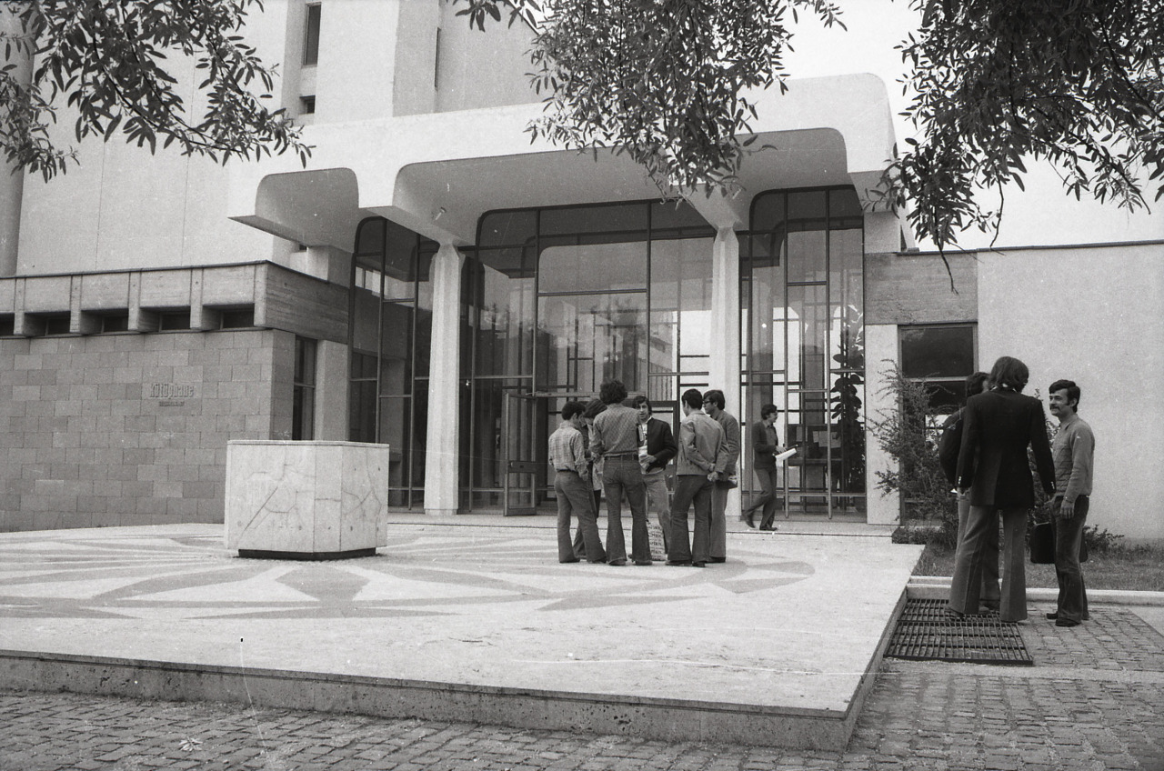
New Old Stock curates vintage photos 'free of known copyright restrictions' - this means you can use them for whatever purpose you like, however you want. Hey look, here's a library example!

METU Library, via New Old Stock

METU Library, via New Old Stock

Some of the pics go WAY back, like this Egyptian example:

There's a huge amount to explore on New Old Stock, mostly B&W or sepia but with some early colour too, and if you're on Tumblr you can subscribe to get notified whenever they post more.

Unsplash

Unsplash adds 10 new images a day (you can subscribe to keep updated) and again, it has a 'do anything' licence. Specifically the site says:

All photos published on Unsplash are licensed under Creative Commons Zero which means you can copy, modify, distribute and use the photos for free, including commercial purposes, without asking permission from or providing attribution to the photographer or Unsplash.
— unsplash.com/license

... which is good to know!

There are real advantages to not having to attribute. Although I'll always do so in a presentation, when you're tweeting in image or designing a poster or web materials, it's nice not to have to take up space with a URL and author name. It's also important to be able to modify the images in any way you please - on Flickr, for example, the majority of the Creative Commons images aren't set to allow this, meaning you can't use them in presentations or posters, or indeed do anything expect display them as they are.

The images on Unsplash are just a cut above most free image sites - for example I've used pictures of both coffee and bridges in presentations before, but never as nice as these examples...

The header image for this post is also from Unsplash.

So take a look and see if these images will be useful either for you or your library comms.

In Australian librarianship there's room to breathe


Last month I ran some library marketing workshops in Melbourne, Sydney and Brisbane. I was invited over to do this by PiCS, who were wonderful to work with and really looked after me. I don't normally write 'this is what I did' type blog posts, but working in Australia was one of the most amazing things I've ever done! So it seems silly not to write a little about it.

Australian librarians are ace. Engaged, reflective, getting things done. The marketing workshop relies on people being happy and able to discuss what they're doing and thrash out ideas in small groups, and every one of the delegates did this brilliantly.

I've now run a lot of workshops in my freelance career, so I hopefully have a good feel for the level at which to pitch them. What struck doing these was what a high level Australian info pros are working at. I had to adjust the tone of the training as I went along because everyone already doing a lot of things I was suggesting. To take one example - there's a section on marketing with video, and using nice animation tools to move away from tired talking-head or screen-capture videos. In every single workshop in Australia, participants were already using these tools at their own institutions. In the UK I'm used to maybe one or two institutions in a group of delegates who have used these tools already.

I don't mean this is a slight on UK librarians - I think what it comes down to is that there is room to breathe in the Australian library system. Although they are facing financial cuts there is nothing like the crisis facing libraries in the UK. They aren't being attacked by their own Government the whole time. And when you don't spend all your time fighting for survival, that frees you up to experiment, to prioritise, to innovate. It seems to really make a huge difference. (I also spoke to Australians who put their libraries being ahead of the curve down to the fact that they're an island who traditionally had to find answers by doing, rather than waiting to hear about the rest of the world was up to...)

The other main difference to my eyes - and I was only there for six days so I'm sure there are plenty of nuances I missed - is how integrated the libraries are with the rest of a city's public buildings. For example in Brisbane, a Library is part of the City Council regional business centre. And the the State Library of Queensland, also in Brisbane, sits right in the middle of the cultural quarter on the south bank of the river, within the Queensland Cultural Centre, in between the Museum and the Gallery of Modern Art. It's a destination - not just somewhere a council can save money by slashing services. Have a look at the first few seconds of this video to see its glorious location:

I'm not saying libraries in Australia have it easy. But - surprise suprise - when a library system isn't forced to spend 90% of its time defending its services, those services have more opportunity to develop and become more vital still to the community.

Incidentally, via Twitter I found a new photography app just before I left (thanks Amanda!), which is a neat hybrid between video and still image, allowing you to pan across a larger view. Here's where I had lunch in Brisbane, in a cafe that was part of the Gallery of Modern Art. The library is on the right as you pan across by clicking and holding the image and moving your mouse (or finger if you're on a tablet or phone).

I loved Australia. I've never been anywhere so many of the people were so genuinely nice. I felt completely at ease there. The way the trip worked is I arrived in Melbourne on a Saturday afternoon, had just over a day there to explore and recover from jet-lag, then did a 9 - 5pm workshop on the Monday. As soon as it finished I was off to the airport, and flew to Sydney that night. Then I had a day in Sydney, followed by a full-day workshop and flight to Brisbane. Then a day in Brisbane, a full-day workshop, and a 2:30am flight home via Singapore and Dubai. It was intense. It felt almost surrealy short. But I didn't want to spend any more time away from my family, particularly leaving my wife to cope with both the girls on her own!

So to all intents and purposes, I had a day to explore each of the three cities. Everyone told my Sydney was magnificent, and it was - although it had its worst storm in a decade when I was there, and I've never been so wet. I couldn't NOT go out in it as it was my only day there. But it was bad enough that people were being advised across the State to leave work early and get home to safety! But I really fell in love with Melbourne. What a great city!

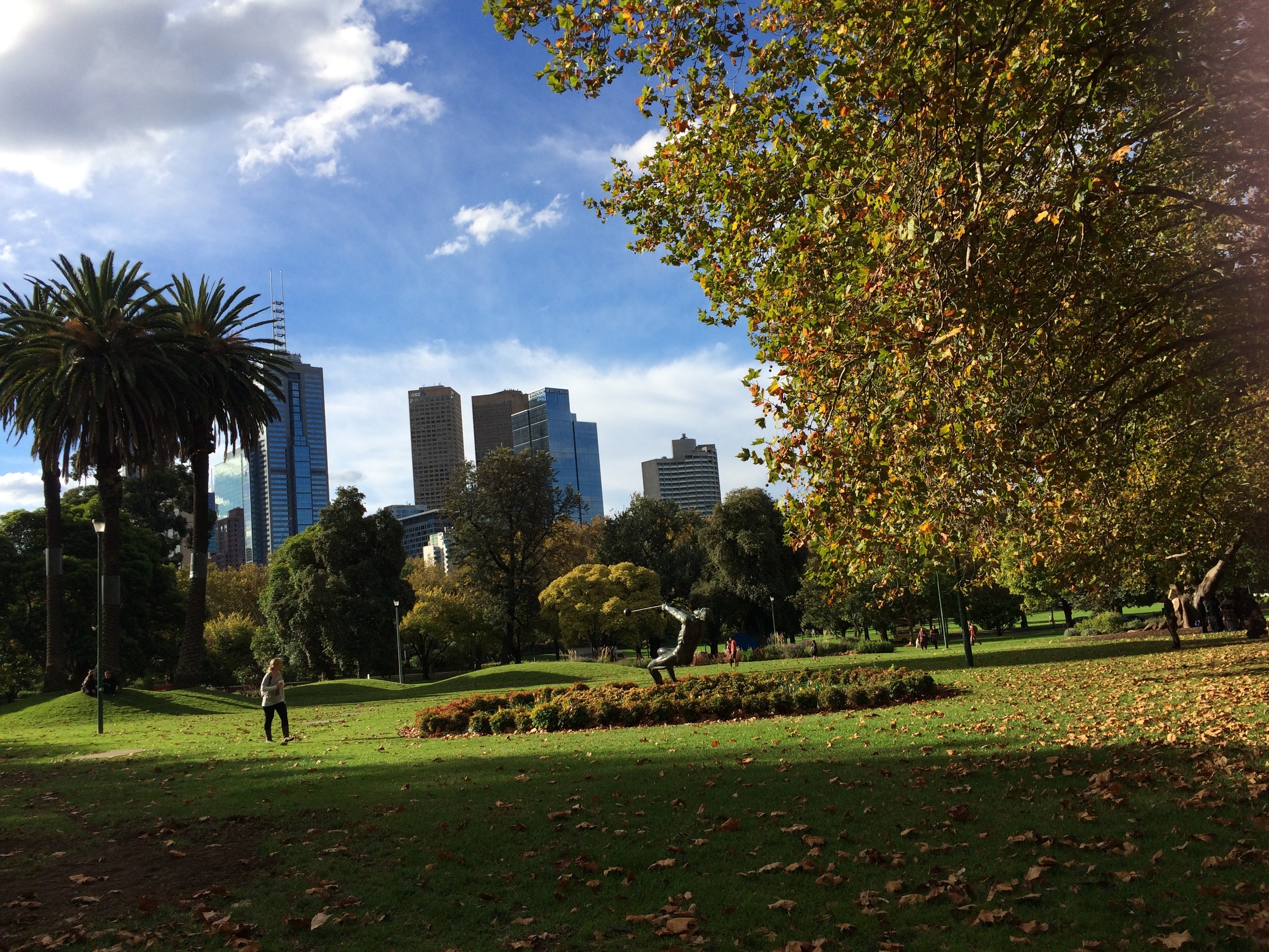
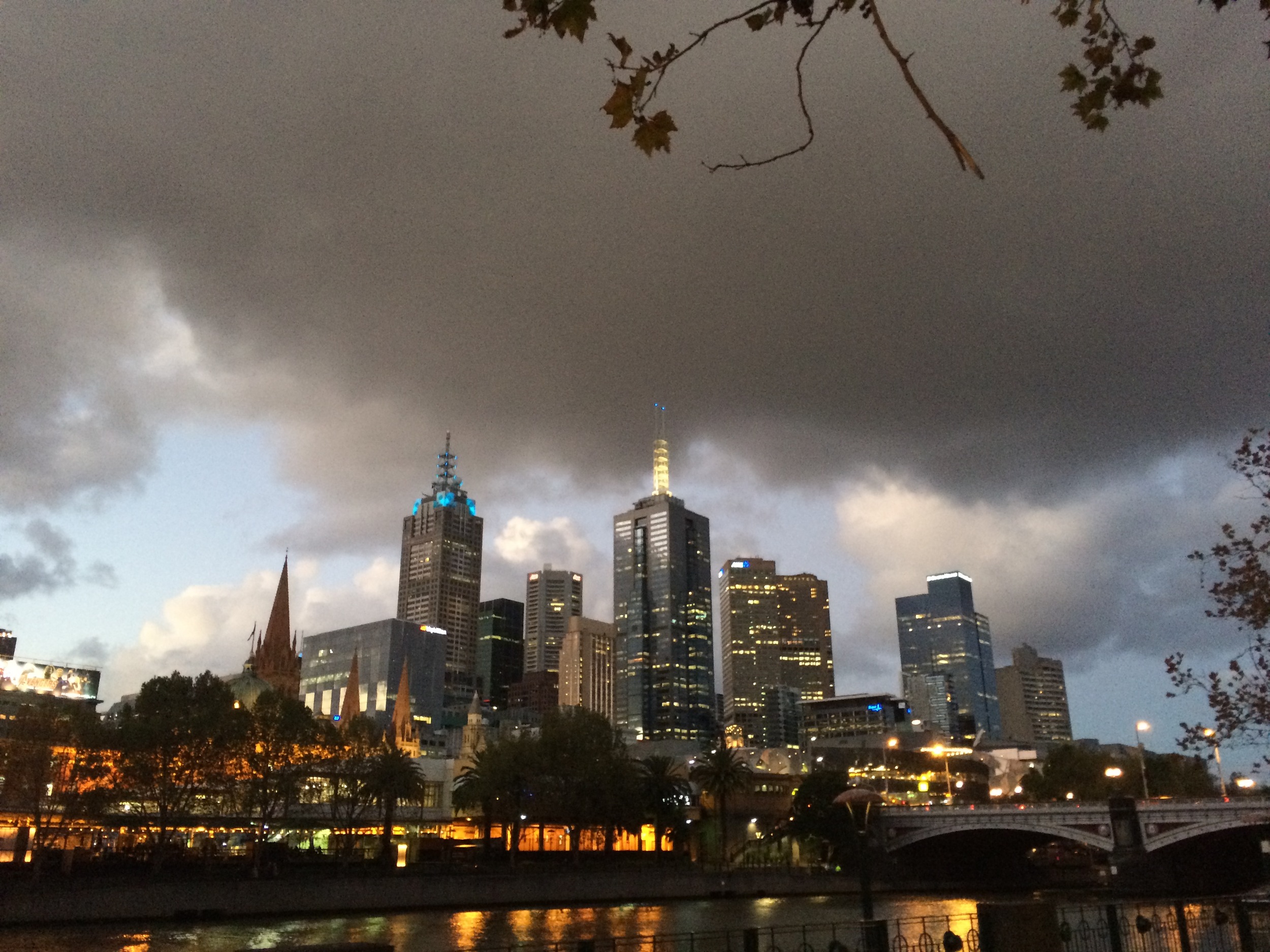
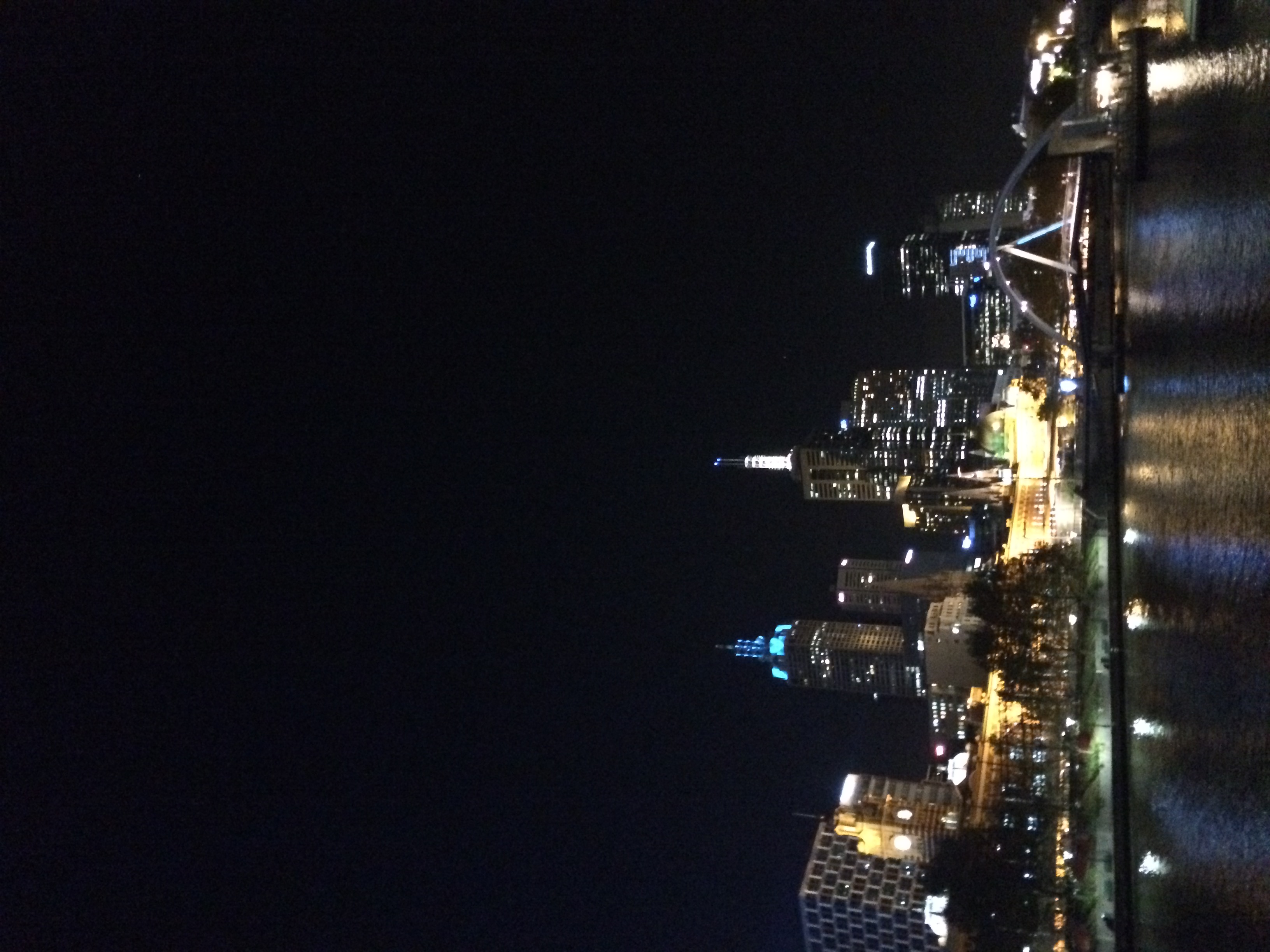
 Melbourne has a river running right through it, and when you're on the bank it feels like a great vantage point to be both IN the City and seeing the best of it at the same time.


Melbourne has a river running right through it, and when you're on the bank it feels like a great vantage point to be both IN the City and seeing the best of it at the same time.

Thanks to everyone who came to the workshops and participated so enthusiastically. You made me feel very welcome. I'll be back in a couple of years for another round.


Header pic is a Creative Commons image by Wotjeck Gurak.

Library comms are like tapas: lots of small elements make an effective whole


A tweet from Matt Imrie alerted me to this blogpost from Scott Pack. It's about book reviewing and whether or not blogs about books make any difference to the sales of books.

It really resonated with me, because his conclusions mirror my own about library communication:

...those sort of sales [from blog posts] combined WITH sales prompted by newspaper reviews AND other bloggers AND tweeters AND further word-of-mouth from people who subsequently read it COULD make a difference. Which is why we do need all sorts of book reviewing in all formats across all platforms.
— Me & My Big Mouth blog

This is the absolute nub. No single method of communication carries THAT much weight on its own anymore - we live in a fragmented world and we have to adapt to that. Even compared with two or three years ago, there's less of a chance to use one platform to reach all the people. And crucially, even if it you DO reach all the people, seeing a message once is for the most part not enough to get people to do anything different to what they were going to do anyway.

We need to be nudged a number of times before we act.

Sometimes a library will set up a blog, and try really hard with it, and after 6 months be really disappointed that they're only getting 100 views for each post. But the thing is, it's a few people seeing messages from the Library AND on Twitter AND on a digital screen in the building which tips people over into thinking or acting differently. Click the little stats icon on any one of your library's tweets and be stunned at just how few people actually saw it. But that's okay too, because all of your communications channels combine into a holistic presence. It's about building ambient awareness rather than trying to hit loads of people with a one-off message and expecting that to produce a significant result.

It feels like you're doing a lot of work for not that much reward across a series of channels, but actually the reward comes from how they work together rather than individually. Which is why having a strategic approach to coordinate your messages and to know what each platform is really for, is ultimately worth the time it takes to prepare...

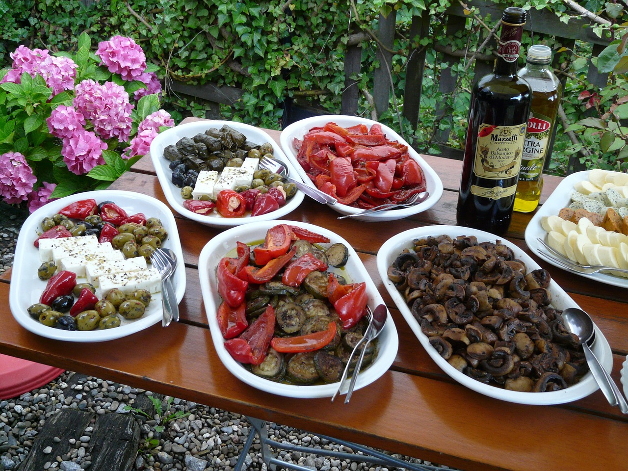
If you want an analogy, think of communication as being like tapas! No single dish is that significant on its own, but taken as a whole it's a really nice meal.

Marketing = this

Marketing = this

Australia! I am in you in April, running some marketing workshops...

Phil Bradley always said you could travel the world on a library degree, and that seems to be coming truer and truer. 

In April I'm running some workshops on marketing libraries, in Australia. If this is a side of the information profession you're interested in, I'd love to see you there! The dates and cities are:

  • April 20th: Melbourne
  • April 22nd: Sydney
  • April 24th: Brisbane

The training company who've asked me over to do these has put together a pretty comprehensive brochure detailing what we'll cover. You can see more info as well as booking details over on the PiCS site, and I've embedded the leaflet below.

A new and unlikely source of free stock photos!


There's a movie out called Unfinished Business. It stars Vince Vaughn. And as part of the publicity for it, the filmmakers have teamed up with Getty (who run iStock Photo) to make some stock photography freely available for editorial (i.e. non-commercial) use. This is a really nice idea!

It's a good bit of marketing (although as I say in my workshops, the vast majority of marketing doesn't work directly; I'm just as unlikely to go see the film as I was before...) and the photos themselves are great. I can imagine them being quite effective in information literacy sessions...

My favourite one is this:

If you want to get hold of these, you need to do so quickly - it's a limited time promotion. The first 4 pictures are available direct from Getty here; apparently the next 8 will be released in two weekly batches soon, via this page. Or you can look at all of them here on Adweek.

These are great because they capture the utter ludicrousness of most stock photography, and then amp it up further by having people look in the wrong direction. In the original of the one above (which was done in photoshop) the guy is looking at the camera - that at least makes a kind of sense - but in the Vaughn version he looks like he has no idea he's in a photoshoot.

Similarly in this one...

... the fact he's looking away just reminds you how barmy the whole conceit is, with the other actors looking at a (presumably blank) screen and grinning out how damn productive they all are, as the camera just happens upon this real-life office moment.

So can someone weave these into a library related presentation or teaching session? I'm going to try to for my Film & TV students, but I'd love to see examples from others too - leave me a link in a comment.