Tech Guide

Prezi Guide: The 5 Essentials To Stop Your Audience Feeling Sick


Prezi is nothing if not divisive. Some people love it, some people hate it - I'm in neither of those camps. I find it very useful in some situations, but still use good old fashioned PowerPoint Slides for more than half the presentations I give. Prezi should be used for a reason.

Prezi is relatively new (it's been around since 2009), it's getting more popular (there are around 40 million users now) and it's improving its interface all the time. Some people accuse it of being style over substance, but for certain ideas (interactive maps, for example) it provides substance that slides simply can't bring to the table. For me, Prezi can be fantastic as long as you adhere to one maxim above all: don't let the medium get in the way of the message. Any presentation materials should be there to support the presenter and work FOR the audience in adding to their experience. Do that, and Prezi can really raise the level of an audience's engagement.

Potentially, a great Prezi has the wow factor. So why would you want to completely undermine that by creating something which makes sections of your audience feel motion-sickness? It's up to you, the presenter, to minimize the possibility of this as far as humanly possible. Here's how. (For the short version, view the Prezi about it.)

1. Positioning

The single most important thing about creating a Prezi is the positioning of the objects on the canvas (and directly related to this, the order in which they're visited on the path). Position your materials sympathetically, people! By which I mean, rather than moving haphazardly around the canvas and disorientating the viewer, move from left to right, or from top to bottom - move in a way the human brain is used to.

2. Distancing

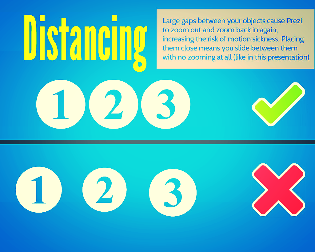
But positioning is about more than putting your objects in a coherent pattern - it's about having a uniform (and short) distance between them. The closer you place your objects together, the less zoom and swoop there is in your prezi. Place them right next to each other and it won't zoom out at all, it will just slide right over from one object to the next.

3. Sizing

As with distancing, uniformity is the key to sizing too. Put similarly sized objects together - ideally make them the exact same size. This means there's no need to zoom in or out. Contrast this to having a small object followed by a much larger object and then a small object again: the zoom is flying all over the place.

4. Rotation

99.9% of rotations and barrel-rolls in Prezis add absolutely zero value to the presentation.

I just made that stat up but I'm sure it's true. In fact most of the time rotating actively detracts from a Prezi. It is the Number One cause of queasyness in the viewer. It can be used with a good reason (a visual metaphor of some kind to better express your ideas) but otherwise, why would you? It just gets in the way of your message.

5. Pacing

The ability to zoom in and out is both Prezi's strength and its weakness. It's what allows you to show the relationship between objects on your presentation, it's what allows the element of surprise for the big reveal, it's what lets you put your own hierachy onto your information rather than having it dictated to you. But it's also at the heart of what can induce nausea in your audience.

So, pace your Prezi like you would regular slides. Don't move it on every few seconds - arrive at point on your path, talk about it for two minutes, or five minutes, or more, and then move on. This means there are fewer zooms per presentation, and less quickly following one-another. But you can still take advantage of the zoom's ability to enhance your presentation.


One last note on zooming

If you double-click the right arrow to move your presentation on (or left arrow to move it back) it zooms twice as fast. This can be effective in reducing the sea-sick effect - after all it's the transitions which cause the problems, so if you only transition for 50% of the time you did before, that helps. The only downside is it feels risky; if you triple click by mistake, you'll miss your path point entirely and have to go back...

Here's my Prezi on this whole topic - it explains what I've just said in a visually illustrative way (which is sort of the point of Prezi after all):


Finally

All that said, if members of your audience are particularly susceptible to motion-sickness, even doing ALL of the above may not be enough. So only use Prezi for a specific reason. Use it to do something PowerPoint can't, rather than as a direct replacement for the sake of it. Use it to cover several dispirate topics, or to make something interactive, or to visually explain relationships between ideas. But if you don't need to do any of those things, and it's a regular presentation, just use regular slides. Just be sure to use them well.

Which leads us to a bonus option:

(6. The nuclear option)

Prezi can be a very useful way to make a nice looking presentation: the fonts, icons, ease of importing images, and themes, make smart presentation materials without the need for a huge amount of effort or design knowledge. Once you get over the initial learning curve, it's quicker to make a nice Prezi than nice slides. So if you want to take advantage of all that, but want to 100% eliminate the possibility of motion-sickness, simply save your Prezi as a PDF, and use it as you would slides. Every path point on your Prezi is a full-page of the PDF so it ends up looking like a (nice) PowerPoint.

To save a Prezi as a PDF, click the share icon and choose the relevant option from there.

To save a Prezi as a PDF, click the share icon and choose the relevant option from there.


Disclaimer: Prezi will always make some people sick - they dislike Prezis intensely, and it's very important to them that they bring this up a lot. I offer no judgement here; I do the same with LinkedIn. But this guide is about stopping an audience feeling motion-sickness when watching a Prezi - if you aren't prepared to take steps to do this, you shouldn't be making Prezis!

7 Super Slide Styles to download, copy, and adapt


I love slides, as I've said before. One of the biggest problems people have when trying to make something effective and visually arresting is simply knowing where to start. Or having not much time at all, so they can get together the content but don't have chance to put it into a new style.

So with that in mind, I've created the presentation below. It features the same information presented seven different ways; if you like any or all of them, you can download the original PowerPoint from here, and do whatever you want with it. Delete the bits you don't want, modify and build on the styles you like.

I've not done this before, provided a sort of OER version of a presentation, so I'll be interested to see if people find it useful. I hope the templates can work in some situation or other for you, particularly if you're stuck for inspiration. It may be that you take a slide style and use it throughout a presentation, or it may be that you take one or two styles and just use them as a blueprint to give you a head-start, and then change them completely.  It's entirely up to you, you can do whatever you like with them - and although it would be great if you could credit me somewhere, don't worry if you can't fit it in. I'm not releasing them under a Creative Commons Attribution license, I'm just putting the whole thing into the public domain.

Something I need to make clear though (and thank you to Andrew Preater for flagging this up to me) is that the images are Creative Commons images (rather than public domain), and so if you want to use those images specifically you need to respect their original licenses! Each of them is linked to, both in the presentation itself and with its creator's name at the end of the presentation, so you can see the kind of Creative Commons licence they have. In all cases, they need at a minimum for the creator to be attributed. Obviously the images I've used here are just in there as examples, I'm expecting people to take the slide designs and redo them with their own content - but if you do decide to keep them, keep their Creative Commons status in mind...

For 6 of the styles I've included a little arrow in the breakdown section with a link to a full set of slides created somewhat in that style (most by me, a couple by other people) so you can see what an expanded version might look like.

To adapt and build on these styles if you like them, the right-click menu in PowerPoint is your friend. Firstly if you right-click on the little slide preview pane, you'll find the 'Duplicate' option. Duplicate the slide you like, then edit the contents. Right-clicking on the main slide edit view is vital here too: the menu it produces allows you to recolour text boxes or backgrounds, change the picture (but retaining size and positioning), copy elements you like and paste them elsewhere, blur or darken images so you can write directly onto them, etc etc. This allows you to take a single slide and build a presentation with a cohesive visual theme around it, rather than just having literally the same slide several times with different words on it.

Good luck making your slides, and let me know what you do with the templates! (You don't have to. I'm just curious to see whether people make things using these as a building block, and what they're like...)

Twitter Analytics is now free for all: so what can libraries get out of it?


Twitter stats packages are sort of fascinating but also not. I look at a fair few because I need to be able to talk about them in social media workshops: what tends to happen is I put my username in, go 'ooooh that's interesting!' a few times, but then never actually go back and check the analysis on a second occasion.

As individuals we don't really need Twitter stats apps (unless you take Twitter very seriously) but as organisations they can be genuinely useful. They can help us understand our network, show us what works (so we can build on it) and what doesn't (so we can phase it out).

For an analysis package to be useful to an organisation it really needs three qualities:

  1. It must give you information you can ACT on. There are a million stats apps out there, but if they don't tell you anything which you can use to inform better practice for your twitter account, then they don't really have any value.
  2. It must NOT tweet things about that information on your behalf. Some apps tell you useful things - but they tell the rest of the world those useful things too. I'm dubious about this at the best of times (for me an auto-tweet saying "This week on Twitter: X follows / unfollows, Y ReTweets and Z total reach!" either looks a bit awkward if X, Y and Z are small numbers, and a bit show-boaty if they're large) but I really don't think organisational accounts should have anything tweeted on their behalf.
  3. It ideally needs to be free. Some things are worth paying for but realistically it's hard to get the people who control the purse-strings in libraries to shell-out for a Twitter stats annual subscription...

Thankfully the official Twitter Analytics, newly available for all, meets all three of those criteria. If you just tweet as yourself, sign in to analytics.twitter.com and have a look a round at the things worth noting; it's interesting to see how few of your followers actually see your tweets, for example.

If you tweet as an organisation or group, Analytics is definitely worth your time. But it's quite overwhelming at first as there's a LOT of information there - so here's a guide to what to look out for.

Twitter Analytics: What You Can Learn, and What You Might Do

We'll look at the two main tabs in turn.

The Tweets Tab is potentially the most useful thing the tool offers, because it deals with follower engagement, which is the most important metric (much more so than number of followers). It shows you how many people see your tweets - not that many; only just over 10% of my followers see each of mine, on average - and how much engagement you're getting over time in terms of people replying, RT'ing, and so on.

So, dissecting the screen (I'm using my own account as an example as I don't run my Library's account anymore, but as I say the notes and advice are aimed at organisations using Twitter) one area at a time:

Tweet Impressions

'Impressions' basically means views. So in other words, the figures aren't the total number of people who've seen your tweets, they're the total number of times the tweets have been seen.

Things to note here are the spike on August 14th, and the big drops at weekends.

Things to note here are the spike on August 14th, and the big drops at weekends.

What can you learn? Most days your tweets will have a similar number of impressions – some days that’ll be much higher. Why was it higher that day? Was it simply that someone with a huge amount of followers RT’d you? Or was it that you posted a particular type of content which struck a chord with people?

Clearly there are far fewer impressions at the weekend – is it worth scheduling some tweets to maintain a more consistent level of service?

The overall number of impressions is only really meaningful if you know how many times you tweeted - if you tweet 15% more and get 15% more impressions, then clearly you're maintaining the status quo rather than having a particularly successful month. Twitter Analytics doesn't (currently) give you your tweets totals, so use an app like SumAll to find that out, and cross-reference the two.

What might you do? Go back and look at your tweets from your most successful day, find out what you did differently, and aim to repeat and build on it. Also if the overall impressions for the month are up significantly on the month before, identify why and try and do more of the same. If you feel it's worth scheduling tweets to cover the weekend, a social media dashboard like Hootsuite can do this for you.


Engagements

This shows you the main actions people have taken based on your tweets over the last month, and compares it with the previous month.

This is useful for measuring campaigns

This is useful for measuring campaigns

Ultimately if you're using social media for communication and marketing, you want people to take actions, it's vital.

1000 Facebook friends who act and feel the same regarding the Library as they did before they joined your Facebook network, are of far less value than just 50 Facebook friends who actually modify their behaviour as a result of becoming part of your network. They might use the Library more, for example, or tell their friends about how great it is, because they're connected with you on social media. So, this part of the screen is really worth your attention.

What you can learn: Although looking at these graphs and seeing if you're doing better or worse than the month before is interesting in itself, I think the real value of this metric is to measure a campaign. It can tell you whether your specific audience responds well, or indifferently, to certain types of content and output.

For example, if you're spending a month promoting a new electronic resource at a business library, or inducting freshers at an academic library, or crowd-sourcing tips and advice at a public library, you can see how much engagement this results in compared with your normal patterns of tweeting.

What you might do: If the campaign is successful, run similar things again. Over time you should build up a picture of what your network likes and what it doesn't, which you can use as a platform to develop a more engaging social media presence. If I was an organisation I'd look at the graph on the left and think, okay, replies and favourites were up significantly, which is good, but RTs and link-clicks more than doubled - so what did I do to cause that? Whatever it was it's worth trying to repeat in future - if people are clicking links, preferably through to other content of yours such as your Library website, then social media is doing its job fantastically well for your organsiation.

The other thing this section, and indeed the Followers graph described below and the whole analytics package generally, is *reporting*. It's so great to be able to have figures to hand when reporting on your library's social media programmes, or justifying putting time into it, or looking to expand. Instead of telling your boss 'We've got some great engagement, people really seem to like our twitter account' you're able to say things like 'In the last 6 months our network has grown by 40%, and on average we get over 1,000 interactions on the platform per month - equivalent to a fairly busy Enquiries Desk in the physical Library'. Or whatever you want to say.

You can use the statistics to tell meaningful stories.


Tweet by Tweet impressions and engagements

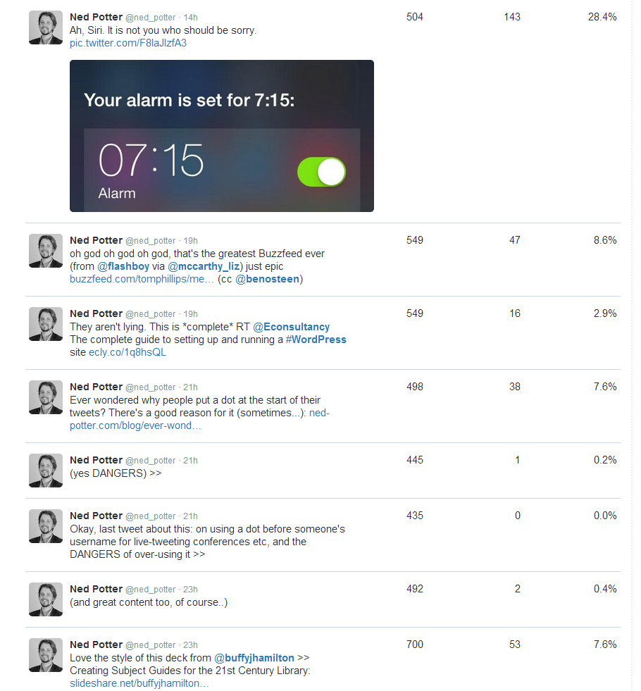
I wish the columns of this one were sortable, because then you'd be able to instantly identify specific tweets which resulted in the most actions being taken. As it is you can glance down the list and see your most recent tweets and how they've been received - Impressions is how many people saw the tweet, Engagements is how many people interacted with it (not just RTs, replies and favourites, but clicking on hashtags, images, your username etc), and the Engagement Rate is the latter divided by the former.

The first number is Impressions, the second is Engagements, the third is Engagement Rate

The first number is Impressions, the second is Engagements, the third is Engagement Rate

What you can learn: Well the screengrab above appears to show that my network is a lot more interested in clicking on a link to Buzzfeed list of 'Medieval Beasts That Cannot Even Handle It Right Now' then they are in clicking on a link to a Wordpress guide! Which is entirely fair enough. Essentially this metric gives you an insight into what people react to. The engament rate is absolutely key to understanding what your network values - it could be that a tweet has 50,000 impressions if it gets ReTweeted by Stephen Fry, for example, which would distort the number of engagements to a massive figure. But it's the engagement divided by the impressions that gives you a true picture of what people care about, rather than just how many people happened to see it. Does that make sense?

What you might do: It's the same as above - identify what your audience responds to and do it more, basically. It works the other way too - it's not in the screenshot above but a little further down in my stats I saw a tweet that only got 93 impressions. This is because I tweeted at 5:10pm, and the largest percentage of my followers are from the UK, and everyone is either winding down or on the way home by then. So don't tweet anything important during commuting time. But you knew all that already.


Individual Tweet Analysis

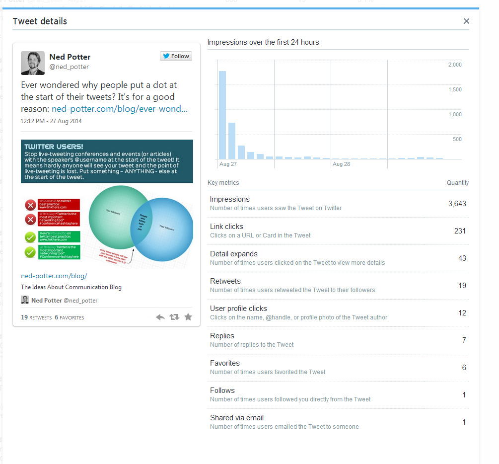
An extension of the tweet-by-tweet covered above, this allows you to really drill down and see EXACTLY how people responded to each tweet.

People would have needed to click 'Detail expands' to see the picture properly.

People would have needed to click 'Detail expands' to see the picture properly.

What you can learn: This shows you exactly what people DO when your tweet appears in their timeline, either because they follow you or because they follow someone who ReTweeted you. The 'Follows' stat is interesting - it's not been possible before to see so explicitly when a specific tweet causes someone to take the plunge and hit the follow button, nor how many people are emailing your tweets to non-twitter users.

What you might do: Honestly I think you'd need to be in a full-time Comms role to get any real use out of this level of detail - there's simply too many tweets to spend time analysing each one. One thing I do find interesting is the number of people clicking links, even in quite popular tweets that get a lot of RTs - it's relatively low as a percentage.

Something I've been trying to do since restarting this blog after a hiatus for much of 2014 is to include an image in the tweet linking to my post, which tells as much of the story of that post as possible. This means people don't HAVE to click the link to get the (hopefully!) useful piece of information. So my tweet about the BuzzFeed Libraries had the actual BuzzFeed mock-up added as an image to the tweet (not a good example of useful information, admittedly!), and my tweet about revoking access to twitter apps you don't need had the little poster that I'd made used in the same way. (I also then put these in the blogposts themselves, as not everyone finds my blog via Twitter.)

If you use Twitter Cards (more on this another time) they seem to automatically take the image from the blogpost and use it in the tweet, which I've only discovered recently - so in the example above, I've just added a link to my post in the tweet, and the Twitter Card has put in the main image from the post - again, meaning people can get the info there and then without having to leave Twitter and read it on here.


The Followers Tab

This is slightly less important but still useful. It shows you how your followership changes over time, and gives you a bit of info about demographics. Everything on this tab can fit into one screenshot:

I can highly recommend NOT using Internet Explorer to view this page, as it bafflingly uses as sort of 'Ancient Manuscript' font which makes the figures completely unreadable...

I can highly recommend NOT using Internet Explorer to view this page, as it bafflingly uses as sort of 'Ancient Manuscript' font which makes the figures completely unreadable...

What you can you learn: Perhaps the most useful aspect of this would be to see weeks or months where your number of followers changes dramatically. I can't stress enough how I don't think number of followers is a metric you should worry too much about (level of engagement is worth so much more) - but generally when I've run campaigns on our Library Twitter account, concerted efforts to engage the network, word has spread and the number of followers has gone up more than it would normally, and that is a good thing. (My own graph above is pretty regular so doesn't really tell you anything, except I obviously annoyed some people in July 2013 because it went down!) So if there's a drop, a leveling out, or a spike, you can look back at your tweets from the period and try and identity the cause.

If anyone can think of a use for the Interests part of the screen then please let me know in the comments - I'm stuck for how we could meaningfully use this. Gender is potentially interesting - if your Library is attracting an unusually large amount of one gender versus another, you could seek to address that. Your followers also follow is interesting in passing - keep in mind that a larger proportion of your network will view conversations between you and the people who feature highly in this list, for reasons discussed in last week's post. See also the UPDATE section at the bottom of the post for a great idea (from Imperial) on how to use this section.

Location is definitely worth noting, for reasons of time-zone. I have around 1500 followers from North America, so realistically anything I tweet before lunchtime is not going to reach them.

What you might do: The most obvious thing is to identify what went right (or wrong) when your number of followers changed dramatically, and either seek to emulate it or stop doing it accordingly. The other thing you can do is adapt when you tweet to suit a global audience - either by saving key information until, for example, 3pm UK time if you're a UK tweeter, so you get the most audience for it (Tweriod can help with this, it tells you when your followers are online), or by scheduling tweets for late night if that suits your overseas followers.


The Twitter Cards Tab I'm struggling to make much sense of at first glance. I do use Twitter Cards and I'm going to write a post about them at some point, so will revisit it then.

One final piece of advice - most of the info in Analytics is displayed on a month by month basis - so take print screens! To build up a picture over time you need to be able to compare the data. So put a reminder in your calendar for the first of each month: Screengrab My Twitter Stats.

That's a lot of information, has anyone made it to the end..? If so what do you think, is (are) Twitter Analytics potentially useful to you?


UPDATE FOR ACADEMIC LIBRARIES: I really like this idea from Imperial Library:

So basically by looking at how many of your followers ALSO follow your Student's Union, or your overall University's Twitter account, you can see approximately how much of your network is actually your target audience. Of course there's lots of good reasons for including, for example, other libraries and librarians as part of your target audience - but your PRIMARY group are people who use your Library, and that will not be everyone who follows you on Twitter. A proviso is that there will of course be students and staff who follow you and not the overall University account, but still it's a useful exercise.

Ever wondered why people put a dot at the start of their tweets?


It's for a good reason.

The most common Twitter mistake...

The most common Twitter mistake...

Years ago I wrote a thing on TinyWrite (which sadly doesn't exist anymore) about using a character at the start of a tweet to ensure everyone sees it - when that's appropriate. Later I saw the slide-deck below, on the same subject.

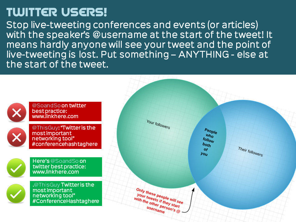
I saw those slides again today, and I feel the same way about the presentation now as I did when it first came out - it is very good (and very popular), but it is also a 44-slide way of making what is quite a simple point! So I made the image above, because it occurred to me that a Venn Diagram could explain it fairly succinctly... I LOVE Venn Diagrams. Any excuse to use one. (Here's my favourite one ever.)

Anyhow here's the deck for a fuller explanation:

You see this problem on Twitter all the time, still. Even experienced Twitter users fluent in everything else on the platform make the error. The reason this matters is that sometimes you want all of your followers to see a tweet with, as I say, sharing content and live-tweeting events being the two main examples. Fairly often people will tweet a link to one of my blog posts with @ned_potter at the start of the tweet - so basically only people following both the tweeter and me will see that tweet, and my followers may already have seen it when I tweeted it anyway...

So it is a basic part of the way Twitter works - Twitter filters conversations so you only see those between people you follow, otherwise it would be completely unusable and overwhelming. (Incidentally, one of the side effects of this system is sometimes you can be tweeting as an organisation, and having a dispute with a user, and it feels like the whole world can see your conversation, which is embarrassing. In actual fact, only people who follow both you and the user will see it, so it's not nearly as problematic as it feels at the time...)

So if you want all your followers to see a tweet, make sure there's a character of some kind before an @username. It's not the end of the world if people get this wrong - but you may as well get it right!


Edit: A brief follow up on over-sharing via the dot

As part of the conversation that followed me tweeting about this post earlier, Matt Shaw pointed this out:

If you click on the date in that tweet you'll see all the tweets which followed in reply - but essentially it comes down to some people overusing the dot to ensure everyone sees their tweets. There are three main reasons people use the dot apart from the live-tweeting and post-sharing described above.

  1. Because someone asks a question to which the answer has value to everyone (this is, in my view, completely acceptable - as long as you're a good judge of what constitutes value to everyone, and I'm not always confident I am a good judge of that...)
  2. Because your tweet is so hilarious / insightful / clever that everyone simply must see it (this is sometimes okay, I am guilty of doing it on occasion, but when people do it all the time it makes me wince)
  3. Because they want everyone to see the praise they're responding to (this one I have the most problem with - you see people responding to thanks for their talk, as in this example from Chuck G in an article raging against the dot. You also see people saying thank you for people nominating them for a #FollowFriday in this fashion. Why do people do this? Or worse still, ReTweet their FollowFriday nominations?! Everyone who sees the tweet already follows them! Desist!)

So, use the dot with caution! Use it to share blog posts and presentations from other Twitter users - or better still, put a word in there to make it a proper sentence. And as Chuck says, if you're tweeting a conference lead with the hashtag (that's a far better solution than my example in the image at the top of this post). But otherwise, think carefully.

ALL THAT SAID, as I've mentioned before, my number 1 piece of advice to tweeters is to ignore advice to tweeters - unless you're tweeting as an organisation, just do it how you want to...


Creating quick and easy videos with Adobe Voice


I saw this tweet earlier in the week, and had a look at the list. It's a good list, and the thing which really caught my eye was Adobe Voice. It allows you to create an animated video which sits somewhere between a normal video or screen-capture, and a slidedeck on autoplay. I decided to sign up and have a go, and it took only about half an hour to create this video with it.

It's a very new product, coming out in May of this year. Hopefully the video above shows you how it works and what it can do - the reason I feel like it could be so useful for libraries is that it allows you to explain fairly dry and complex information in a visual and engaging way. Some types of video, particularly stuff about databases and online things, really don't lend themselves to the 'person talking either to or off camera' school of video-creation - and screen capture can sometimes be a little dull too. I feel like this is a nice hybrid - the 'animation' element keeps things moving, and you can use screengrabs if you like too. You need neither a micrphone nor a video camera to create an effective video. You don't have to master complicated software (and even Camtasia, which I think is ace and very easy to use, feels complex compared to Voice).

Like a lot of new tools coming out these days, it makes things look very smart without the user having to know about anything except providing useful content. There are lots of different templates - here's the same video as above, using a different theme. Notice how it recolours the icons to fit the new theme.

You can also choose different layouts - I chose a side-by-side theme but there are four other options.

So have a look and see if it could be useful to your library. In summary:

(The Cons list looks really big when they're side-by-side but that's only because the cons take more explanation!)

Pros

  1. Solves an existing problem! I love tools which do this
  2. Free
  3. It's an all-in-one solution. When I create slides I have to go to iconfinder for icons, flickr for images and PPT to actually make it - Voice does all these things from one place
  4. Looks great
  5. Extremely quick to create something useful
  6. Conveys information well - it's not just pretty, it's effective in what we need it for

Cons

  1. iOS only
  2. You can't, at the time of writing, have more than one layout (or theme) per video, which would be nice
  3. In fact there's very little flexibility in how you layout each slide, once your theme and layout are selected - but this is also its strength. It's idiot proof. You'd have to go out of your way to make something bad with this tool
  4. At the moment there's no option to upload to YouTube - they have to be hosted on Adobe's own site and embedded elsewhere. That's fine, but having a video which isn't on YouTube always seems like a massive waste of an opportunity...