Academic Libraries

How to explain academic publishing to a five year old

Last week I tweeted a cow-based academic publishing analogy in response to the prompt in the title, and the replies and quote-tweets extended the metaphor so gloriously, so creatively, so bleakly and hilariously at the same time, that I’ve pulled my favourites together below.

Here’s the original tweet:

Before we get into the epic farm based explainer, take a look at this excellent, cake-based alternative:

(It’s worth clicking on @DevilleSy’s original tweet to read the other replies to it, which are excellent.)

So, to the farm.

Someone asked me to explain who is who in the metaphor, so briefly: the cows are the researchers, creating academic outputs, peer-reviewing them for free, and the farmer is the publisher. He’s not even milking the cows, they are self-milking. The weakest part of the analogy is ‘the cows paying the farmer to take away the milk’, which lots of people have picked me up on - I know it doesn’t happen a lot of the time, but there are often costs associated with publishing an article. You might need permissions to use an image (author pays), colour printing costs (rare now, but author pays) there are predatory pay-to-publish journals (author pays) or legit-but-still-charging-you-some-money journals with submission or membership fees (author pays) - and there are Article Processing Charges (author or their grant / institution pays, an average of over 1,400 Euros a time according to this 2018 article).

I am, of course, hugely in favour of Open Access. The cow is paying the farmer but at least the farmer isn’t then charging the cows a second time, and all cows (and even animals who don’t live on a farm at all) can get to the milk whenever they need it. But speaking as an academic librarian, I know that libraries are paying just as much or more for journal and database subscriptions as we ever were, AND Universities and authors are paying APCs as well. So we’re getting there - but the farmers sure are making a lot of cash in the meantime…

Talking of OA, let’s get back to some choice Dairy metaphor continuations with one of my absolute favourites:

Some people picked up on the role the cows themselves play as peer-reviewers - if indeed the milk even gets that far:

That last one! Amazing. Not to mention the fact that the peer-review process often leads to milk being poured away entirely, or kept for so long before being available that it goes off:

Then we get to the fact that despite the best efforts of peer-review, academic publishing is a market, and quality is by no means the sole (or main) driver or which milk gets consumed.

Not all milk is treated equally.

Is there a vet in the house? Because some elitist cows just got burned.

What about that whole murkly business of recycling the milk into ‘new’ milk?

Fair warning, it gets especially bleak now… We turn to the subject of the cow who can’t produce enough high quality milk.

Ooof. On a happier note, one of my favourite tweets is this one from my colleague Anthony. I can’t believe how many Likes this got because it relies on a detailed understanding of obscure and rarely used subscription models based on the number of students on modules…

There was a reminder to sign up for ALCS royalties (if you’re in the UK); I did this with my own book and would highly recommend it.

And there are loads more great replies and quote-tweets but quite honestly I’ve lost control of my Mentions for now! Some people University presses took offence at my tweet and I apologise to them; it’s a glib tweet designed for a five year old so it didn’t go into much nuance… Lots of publishers do great work. They’re not all like the ones we’re looking at through this ultra-cynical lens.

One tweeter suggested my analogy was a ‘wonderful pastiche’ of ‘every dumb hot take on publishing’. That tweet was from… a publisher.

Anyway, thanks to everyone who chipped in - there’s a certain gallows humour approach to dissecting this whole system, which we’re all complicit in, and I really enjoyed just how far the cows-and-farmer take on things could go.


The cow pic in the Header is a CC0 image from Pexels.

Embedding ethnography Part 1: long term UX in the Library

The User Experience in Libraries Conference is looming next week, and I've got a series of UX related posts (not all by me!) lined up for this blog. (Read post 2, A UX Intern writes... here.) Apart from writing about last year's conference, and creating the UX Resource List for anyone interested in an introduction to the area, I've not really talked much about ethnography on here, but I've been doing a lot.

Apparently someone recently asked Andy Priestner (UXLibs Chair) what 'the next fad in libraries will be after UX'! To me this totally miscasts what User Experience in libraries is all about. Purely and simply, UX is an umbrella term for a suite of methods to help us understand our uses better, and design changes to that service so it works more successfully for those users. That is not a new or faddish need. It isn't going to go away. The methods may be new to libraries (in the UK at least; they're more established in the US and Scandanavia particularly) but there is a growing community of libraries and librarians getting amazing understanding and insight with them, so we'll continue to use them. More and more info pro jobs are starting to get elements of UX in the job description. This stuff is here to stay not because it is fashionable, but because it works.

The posts over the next two or three weeks will cover three projects undertaken at the University of York, including guest posts from UX Interns we had for two of them. The first covered Postgraduate students, the second covered specifically just Postgraduate Researchers, and the third, still ongoing at the time of writing, focused on academics. All of them have been fascinating and rewarding, but by no means plain sailing...

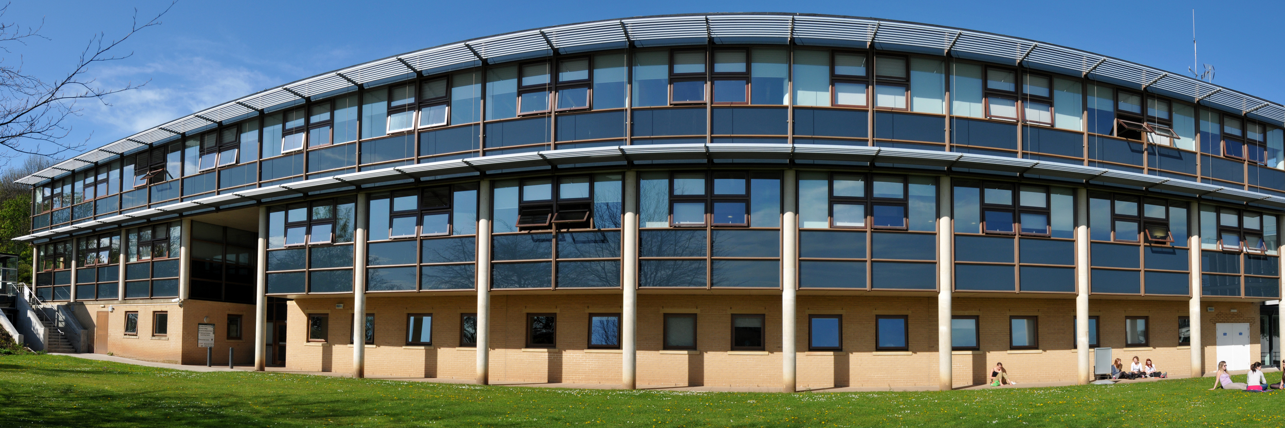
The Fairhurst Building at the University of York, the HQ for all our UX projects. Photo used by permission, copyright of Paul Shields.

The Fairhurst Building at the University of York, the HQ for all our UX projects. Photo used by permission, copyright of Paul Shields.

UX at York: project overviews

I'll go into more detail in subsequent posts but here's an introduction to each project.

  • Project 1: Summer UX. This was a 2 month project with the aim of building a UX Toolkit - essentially understanding the UX techniques and methodologies in a York context, see how they worked, what we could learn etc. We had an intern working part-time during the 2 months, and we used 5 ethnographic techniques across a total of 25 participants. These were all Postgraduates, both PGRs and PGTs, from a mix of disciplines.
  • Project 2: PGR-UX. The second project also featured an intern, and was more focused - we spoke to fewer people, and the participants were all Research PGs. We targeted people from specific departments, and really only used three of the ethnographic techniques.
  • Project 3: Understanding Academics. This project is absolutely huge and still on-going. It involves everyone in Academic Liaison, will last several months, and involves academics from every single Department at York. We have spoken to around 100 people in total for this, and used two ethnographic techniques. The analysis has just started.

Embedding ethnography

The key to our approach at York has been to try and integrate ethnography into our regular routine right from the start, rather than having a little UX silo where UX projects happen in isolation. We now try and utilise UX wherever appropriate in the Library, although quite honestly we've been better at embedding the ethnography than we have at the design-thinking / human-centred design aspect that completes (or continues) the UX-cycle, but that side of things is coming. We aim to consistently supplement our existing data collection methods with a nuanced UX approach, and because of the amount of work involved in ethnography and the sheer amount of time it takes, we target specific groups and areas we want to know more about and use ethnographic techniques with them. Each time we do, we learn more about that group of users then we've ever known about a group of users before. It's fantastic.

The five of us who attended UXLibs set ourselves up as available to be brought in on any wider projects happening in the library, to provide advice and guidance of if, where and how ethnography might be useful. So although the first project listed above, Summer UX, was primarily a way to try out UX in a York context, the subsequent two have been existing projects which have been deemed suitable for ethnographic input, and we've been brought in to advise on how best to go about it.

Next time will be the first guest post in a very long while on this blog - our first ever UX Intern, Emma Grey, has written about her experiences working with us when completely new to both libraries and User Experience, and the five ethnographic techniques she employed, including how she refined them as she went along. 


Header pic by the Library Photographer at the University of York, Paul Shields. Used with permission.


10 Tiny Tips for Trainers & Teachers


I do a whole load of training these days, both as part of my day-job and my freelance work, so have picked up a few small tricks along the way. There's nothing earth-shattering here - but if you run training or teach infolit classes, you may find some of these useful.  

Here's the short, visual version - then I go into each one in a bit more detail below.

Session structure

1. Start with something practical. Sometimes there is, unavoidably, a bunch of theory or conceptual stuff you have to get through. But if that's the case, if at all possible make this second on your itinerary for the day / hour - and start off with something practical. Diving in with something for people to DO wakes everyone up, and grounds the whole workshop in something tangible rather than abstract. It also makes everyone into active participants early on.

2. Allow time to recharge. A full-day workshop should have coffee-breaks etc built-in, but even a 1hr workshop can be quite overwhelming. Just building in a 3 minute gap for participants to switch-off, chat to each other, relax, will help them focus for the second half of the session and raise the energy level all round. A break 10 minutes in to a 1hr session works brilliantly - surprisingly better then, than half-way through the session or later.

3. Sum up via a Random Slide Challenge (also known as Battle Decks). I love a random slide challenge. Here's how it works:

  1. You create a short simple slide-deck which summarises the session you've just run (I normally create two decks of 5 slides each)
  2. You get participants to deliver the presentation (so in my case, two volunteers)
  3. The volunteers have never seen the slides before, which is part of the fun - so they see each slide for the first time at the same moment the audience does, and have to improvise their presentation based on that
  4. You move the slides along after 15 seconds per slide, so the whole thing takes only just over a minute per presentation

You have to give them the best possible chance of knowing which part of the session each slide is getting at! If you look at slide 41 onwards of the deck embedded here, you'll see an example of a random-slide challenge set of slides.

This works well for two reasons - firstly it is often hilarious. People in the audience shout-out if they pick up on what the slide is about before the presenters, and basically it leaves everyone on a high at the end of the session. Feedback forms at both the British Library, where I've done this on training courses, and for my infolit classes at York, often point towards this as being one of the delegates' favourite parts. The other reason it works is it's often a surpisingly great summary of the session. People say the exact kinds of things I would have said if I was summarising myself, but it has more impact because it's another voice (and, with students, it's one of their peers). Try it! The only thing is, you need a plan B for if you get no volunteers, which once happened to me. Prizes help ensure this doesn't happen...

4. Close after the questions. It's good to end any training or teaching session with a call to action - a clear message as to where participants can go from here. This can be somewhat muddied by a Q&A session (which can of course throw up anything), so build in time for questions just before the end, and leave yourself the last 5 minutes to close the session with something direct and meaningful.


Tablet as teaching assistant

5. Use Padlet on your tablet to remember who's who. Padlet is a great tool that can be used in all sorts of ways. You create an online wall, onto which you and anyone else who has the URL can post notes. Anyone can double-click anywhere to add a sort of virtual post-it. Then they can put in their name as the title, and a note, or a URL - links to pics or videos become embedded objects on the wall. I use it to crowd-source people's ideas in training sessions - like you'd use a flipchart, except everyone can go back and look at the URL after the session, and it becomes a sort of archive for everyone to learn from oneanother.

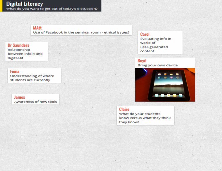
Anyway, depending on the session I'll go round at the start and ask people to introduce themselves, and say what they want to get out of the day / hour. This is very useful in and of itself, as you can tailor things accordingly. I'll type it into Padlet on the big presenting screen as I go, so we can all refer back to it later in the day and see if we did what we said we'd do! But the really useful thing is, you can choose exactly where your notes go on the screen - so I put the notes in a way which corresponds to the physical layout in the room and where people are sitting, like in the example below. Then when I take it off the big-screen to put my slides up, I put the Padlet wall on my ipad screen - this means I've got everyone's names in the right place for easy reference so I can remember who's who!

(I feel like I didn't explain that very well. Does that make sense? The example below should clear it up.)

A Padlet wall example

A Padlet wall example


6. Skip ahead in the presentation, on your tablet. I like to have my slides or prezi open on my ipad so I can see what's coming. This is particularly handy if you're joint-teaching with somone - while they're speaking, you can recap what you're supposed to be saying next. A massive part of successful teaching and presenting, for me, is feeling in control - and this helps.


Handouts

7. Hand out the handouts. It's tempting to feel more organised by distributing the handouts, if you use them, before people arrive. Placing one by each PC or on every table. But if the group is of 20 or less, hand them round yourself; it's a great opportunity to meet each person individually and make eye-contact which, however brief, makes the communication easier and fuller for the session proper.

8. Use screengrabs to make exercises easy to find. It's amazing how often people lose their place in a handout. When you get to an excercise in the handout, put a screengrab of the slide that's on the big-screen at the time you're introducing the excercise - it makes it quick and easy for people to know exactly where they should be.


Materials

9. Use a free PBworks wiki to store materials for delegates. For all sorts of reasons, it's good to have materials online. Particularly if your session is link-heavy, store a digital copy of the hand-out on a free wiki (PBworks for example) so delegates can access them that way and just click on URLs rather than typing them in. Put the PowerPoint on there too - this means you’ll have a copy of your presentation and hand-outs even if your USB stick falls out of your pocket and your printer breaks…

10. Send the presentation round afterwards with an email. A follow-up email is useful for reinforcing key messages, and making sure people have access to the presentation materials. Don’t rely on people (students especially) tracking it down for themselves; follow up directly, ensuring they have a copy of the presentation AND your contact details. If there are issues around attachment filesizes, upload your slides to Slideshare and your hand-out to Scribd, and include links instead.


As always, I'd welcome comments - add your own tips below and help make this post more useful!

#BLAle14 Tuning out the white noise in library communication

A lot of the communication between Libraries and academic departments is just white noise, unless we tailor and personalise it. This takes a large amount of time, but the returns you get are absolutely huge - and this is the basis of my #BLAle14 keynote, a version of which is here:.

Tuning out the white noise: marketing your library services from Ned Potter

For context, here's the Twitter back-channel during the presentation - divided into sections so you can read along with the slides if you're especially keen. There's more on the conference itself below the Storify.

=======

The BLA

I became a Business Librarian this year, when I took over looking after the York Management School alongside my other departments in January. I also took over our membership of the Business Librarians Association and have been looking forward to the BLA Annual Conference, which everyone told me was excellent. And it was! I had a great time, it was great to catch up with old friends and make new ones, and I very much appreciate Nathan and the organisers inviting me to speak. As I said in my talk, I've found the BLA to be an extremely useful and helpful organisation to be a part of, so if anyone reading this looks after a Business School but isn't a member, I'd recommend signing up.

I was only able to attend two days of the conference but for me the highlights included:

  • The National Space Centre where we were lucky enough to experience a Key Stage 2 film all about The Stars and that in the Planet-arium
  • Very nice accomodation as part of the conference venue which made everything extremely easy - it's much more relaxing never having to worry about travelling from a hotel etc, so other conference organisers take note
  • A very interesting presentation about The Hive in Worcester - the UK's first joint public and academic library, from Stephanie Allen. I have to admit it never even occured to me that a public-academic library was possible, but although it sounds complicated Stephanie made a pretty convicing case for it being a great idea. It sounds like a great place - generally I have no interest in Libraries as places but I'd quite like to visit The Hive...
  • Joanne Farmer showing us Northampton's very nicely done video on employability (which she scripted)
  • Andy Priestner's very engaging talk about how UX in Libraries is very much a thing now - here's Andy's presentation on Slideshare, take a look .

I was sad to miss Aidan Smith's presentation on Occupye, used at Birbeck to show where there is seating free in the Library - this won the best short paper prize.

I thought the organisers did a great job, and it was the first conference I'd been to since LIASA so it felt great to be at that kind of event again. Thanks for having me!

Twitter tips for improvers

Here's a new set of slides I've just uploaded to my Library's slideshare account:

Tips for Twitter IMPROVERS

from

University of York Library

I think the key to good feedback in a workshop is probably 10% about the content, 10% about the delivery, and 80% about whether it is pitched at the level the participants expect and require. That's probably an exaggeration but you get my point. I've blogged on here before about how I run sessions around Web 2.0 and academia for the Researcher Development Team at York, and in the last couple I've really felt for a small number of participants who were at a stage beyond the level I was pitching at. The workshops are introductions so participants literally set up, for example, a Twitter account from scratch - so anyone who is already past that point but wants to know about content and tone, is doing far too much thumb-twiddling for my liking, until later in the session.

With all that in mind, as of next academic year we're reworking the workshops, and in each case I'll run one 'A beginner's guide to' type session and one 'Improvers' type session, so people can get exactly what they need out of the workshops. We didn't have time to arrange that for this terms' workshops, so I produced the slides above to send on to participants of my introductory workshop, for those who wanted to go further. In January when the next set of workshops run (I don't do any in the Autumn term, because AUTUMN TERM), I'll flesh this out into a proper interactive 1.5 hour session.

Have I left anything important out? One of the things I love about Slideshare is that you can update and reupload slides over the same URL, so you don't lose that continuity (and your statistics). So if there's anything you'd add to this, let me know in a comment, and I can eventually make a new and improved version to put online in place of this one.

My advice to Tweeters: ignore advice to Tweeters...

I think guides for tweeting well are most important for organisations - it's key that companies, businesses and public bodies get this stuff right, and they often don't. For individuals though, I'm increasingly of the mind that unless you specifically want Twitter to DO something for you which it currently isn't doing (and the slides above are aimed at researchers who specifically want to grow their network in order to find more value in it), it's not worth reading 'how to tweet' guides (of the kind I used to write myself) and trying to change how you approach it. There's plenty of good advice to be had in these, but it's not necessary to follow any of it - apart from not being unpleasant or otherwise making people bad about themselves. If you want to tweet about your lunch every day, why should you stop doing that just to retain followers? I think it's better to be yourself and have a group of followers who are prepared to put with that, for better or for worse...

Number of followers isn't an end in itself. A smaller group of engaged followers who want to interact with YOU is far better than a huge group for whom you have to put on any kind of show. So while when writing in print it's important to adopt a style appropriate for the medium, I consider Twitter to be much closer to spoken communication. As long as you're prepared to deal with the consequences, why not just be yourself?