presentation tools

The Snipping Tool is on your PC, waiting to make life a tiny bit better

If you already use the Snipping Tool, you know it's changed your life in a tiny way. You remember the days before you found it as extraordinarily wasteful. You shudder a little bit.

If you've NOT found the Snipping Tool before now: welcome. Everything up to now has been pre-Snipping Tool. You will remember this day.

The Snipping Tool allows you to draw a box around any section of your PC screen (or all of it) and then instantly saves whatever is in the box as an image. You can copy and paste that image into slides, posters, twitter, etc etc - or save it as JPG if you wish.

I know it doesn't sound like a big deal but trust me, when you prepare a lot of slides it saves AN AGE compared to taking the full print-screen then cropping. It's easier to set the margins just right than with cropping, too. So for screen-grabs in presentations, it makes things so much easier.

Here's a gif (I've never made a gif before) of the Snipping Tool doing its thing:

Look how quick it is to take the screengrab and then make it the background of the slide! Then just insert a text box, or an arrow, or a circle, and highlight the key things. Use it get images of logos, websites, databases, stills from youtube, stills from your own videos to act as thumbnails and to use in social media. It's useful in so many ways and the few seconds it saves you each time really do add up. Pin it to your taskbar forthwith.

The Snipping Tool is on all PCs already, you don't have to install it. Go to the Start Menu, type 'Snip' and there it is. It's been there all along!

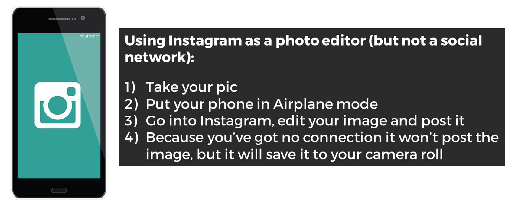
How to use Instagram as an easy photo editor but NOT necessarily a social network!


As well as being a massively popular social network, Instagram is a brilliant photo editing tool - it's quick, intuitive and easy to transform images. But you can't save the photos to your phone unless you post them online, and sometimes you might want to edit a photo and not share it with the world on social media.

So how do you do this? The tl;dr version of this post:

How to use Instagram as a photo editor

This is great for family stuff (and professional stuff, more on which below). I've become a little obsessed with manipulating photos so that the most important part of the image is clearly highlighted in some way. For example this weekend I took a picture of my daughter and wanted to use the filters Instagram provides and also the tilt-shift function. I love tilt-shift - it makes part of your image slightly out of focus, drawing the eye to the in-focus part you define. But I didn't want to post a picture of my kids on Instagram because I use that purely for drumming related shenanigans - so I took the picture and went into Instagram, edited it, and posted in Airplane Mode so it didn't actually get as far as the internet, but DID save to my camera roll. I really like the way the bits in the picture frame are in focus, but the resit isn't.

The original picture

The original picture

The tilt-shifted, Instagram filtered one

The tilt-shifted, Instagram filtered one

5 steps to use Instagram professionally for photo editing

For professional projects this is potentially very useful, especially if you can't find a free stock image that suits your requirements. Let's say you're making a slide for a presentation and you need to talk about Google. You don't want to pay for a photo, and you can't find a suitable Google-related pic which has space to write on, without having to pay.

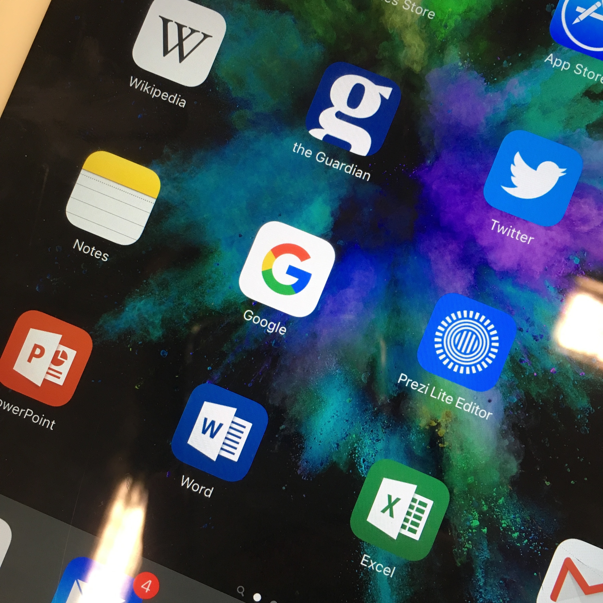
STEP 1: Use your phone to take a picture of the Google app icon on a tablet. (Keep in mind you don't have to take a photo - you could screengrab your phone or tablet if you want to get an image of an app or website. I've gone with a photo in this example to get the angle.)

STEP 1: Use your phone to take a picture of the Google app icon on a tablet

STEP 2: Apply a filter. (I ended up choosing X-PRO II)

STEP 3: Use the Radial Tilt-Shift to effectively blur everything except the Google icon

STEP 4: If you don't post it to Instagram it won't save to your Camara Roll. So go into Airplane Mode then post it - you'll see the 'Failed' message and you can press the X to dismiss it. Instagram will now forget all about the image and not attempt to repost it when you have connectivity - but you'll still have the edited pic saved to your phone.

STEP 4: If you don't post it to Instagram it won't save to your Camara Roll. So go into Airplane Mode then post it - you'll see the 'Failed' message and you can press the X to dismiss it. Instagram will now forget all about the image and not attempt…

STEP 5: Your finished photo! The eye is drawn to the Google icon, and the photo is darkened and blurred so you can potentially add easily readable white text to your image as part of a slide. Email it to yourself and it's ready to use in your slide.

STEP 5: Your finished photo! The eye is drawn to the Google icon, and the photo is darkened and blurred so you can potentially add easily readable white text to your image as part of a slide.

Finally here are the two photos side by side so you can see the difference.

Original photo

Original photo

Edited version

Edited version

You can sign up to Instagram and never publically post a picture if you don't want to! If you make creative use of this technique let me know in a comment.

Using Prezi in the Academic Library


The zooming presentation tool Prezi is a very divisive alternative to PowerPoint. Prezi's 40 million users have created MANY bad presentations since it launched in 2009, and for that reason it has a bad rep in some circles - poorly made Prezis make the audience feel motion-sick, and even really well made Prezis are sometimes more about the tool and the presenter than they are about the content and the audience. Conversely some people LOVE it: "I just use Prezi for everything" is a phrase you hear sometimes, which personally I view as a mistake.

My own feelings on Prezi are somewhere in the middle - I don't use it for about 75% of the presentations I create, but I don't hate it either. It can be a really effective tool in the academic environment, and at my institution we've had students and staff love what we've done with it. The key is, use Prezi with a good reason. Otherwise, don't.

So here are some good uses for Prezi in the academic library:

1. Interactive Maps of the Library

My favourite use for Prezi is take something static, and make it dynamic. You can stretch any image as large as you want (as long as it's not a low-res image) and make it the background to your entire presentation, then add points of interaction with that image.

This is the main example from York - our interactive map of the library:

This serves two purposes. Firstly it sits online (and embedded in various places on our website and Libguides) for the students to interact with in their own time. The students appreciate this because the information about the library, of which there is a LOT, is arranged geographically. This level of context makes it easier to get to grips with. The non-linear qualities of Prezi mean that if, for example, the student wants to know what's on the second floor of the Fairhurst building, they just click on the second floor of the Fairhurst building. (Try it in the map above!) It goes straight there - rather than having to skip a bunch of slides or scroll through a bunch of text or sit through a video. Talking of video, I've embedded about 10 videos in this Prezi at appropriate points - anyone who's ever tried to embed videos in PowerPoint know what a thankless task that is... In Prezi you just copy and paste in the YouTube URL and it does the rest.

The second purpose is to use it in Induction talks. We create department-specific versions of it - these tend to be far less detailed than the full version above, covering less ground, but adding in more subject detail: the specific whereabouts of a department's books and journals, for example, or details of the Special Collections we have which are most relevant to them. Here's a History of Art example that I used this year with my Postgraduates.

As Prezi users will know, the order in which your presentation visits the various elements on the canvas is known as the 'Path'. It's easy to take things out of your path WITHOUT taking them out of your presentation - meaning you can deliver a talk for whatever time-slot you have, but when you give people the link the presentation afterwards they can see the full version with much more detail left in.

So for me, the ability to take a floor-plan PDF and make it interactive, the ability to contextualise our YouTube videos, and the ability to make copies of the map which we customise for each department and presentation length, are all good reasons to justify using Prezi.

If you want to take your own floor-plans and turn them into interactive maps, it's really not that complicated - I've written a guide to that here. Student feedback is great so it's worth doing - also, we often get academics giving us very good feedback and starting conversations about it, so it's a chance to boost our credibility in departments more generally.

2. Presentations with a focus on visual content

Another History of Art example here - the presentation I use for a session on Finding Images with my HoA 1st years. Because it's all about imagery, a very visual presentation makes sense. It also helps to make some of the tedious step-by-step instructions I have to cover slightly more engaging. I don't know why but I quite like the 70s wallpaper aesthetic of this Prezi template, too.

3. Presentations on several disparate subjects

The final reason I use Prezi is when covering lots of different topics or tools under one umbrella. When doing a presentation or teaching session on one topic or idea, the linear nature of PowerPoint suits this well. But when covering lots of things, it can be helpful to show the audience all of them at first, then visit each of them one by one. For a session for academics on online tools and technologies, there's not much linking the content except everything is online - for that the Prezi helps make sense of the broader context.

For most teaching and most presentations I find PowerPoint is fine - it's also much maligned of course, but when used well it can be very effective. For me it's never a case of tossing a coin as to which one to choose - unless there's a compelling reason to use Prezi, why risk the audience feeling sea-sick?

That said, when there IS a compelling reason to choose it, it make a huge difference to the level of engagement. People literally sit up in their seats and take notice. And if you always keep the audience in mind, and use Prezi to deliver your message effectively rather than show off, it will work.

In terms of accessibility, Prezi does provide a transcript of each presentation but I'm not sure that would be much of a recreation of actually watching the presentation, so we don't provide any information only in Prezi. In the Finding Images presentation above, for example, there's nothing in it which isn't also in the hand-out I give the students.

Here's a specific post on how NOT to make your audience feel sick, if you want more detail on that. If you've had successes or failures in using Prezi in academic libraries that you'd be willing to share, leave me a comment below.

(updated) Training up North! Presentation Skills workshop coming up

UPDATED 1st OCTOBER:

I now have confirmation of the location and details on the October 16th workshop. I've deleted all the stuff about the York workshops in the post below, as those dates are now past.


Oct 16: Presentation skills workshop, Liverpool

This is the full-day Making Your Message Stick workshop, which I've just revamped, for CILIPNW. It'll take place at the Library at the University of Liverpool. All the details, including how to book, are on the CILIP website - in essence we'll be covering how to make a very effective presentation indeed (which, as it happens, will also look really nice!).

There are also two free student places available, with a deadline of October 5th for application - if you're currently enrolled on a LIS course, click here to see how to apply.

Some feedback from the two most recent Presentation Skills workshops I've run, for CILIP NE and the Bodleian:

“Tips and tricks about perfect presentations - it was fantastic! Very informative, very attractive content of the course. I’d recommend it to anyone.”

”The trainer’s knowledge and approach to the presentation were outstanding. We received numerous references for further learning and finding resources, which is greatly appreciated.”

”It was excellent. It is a particularly difficult topic to present on, as the audience is looking to see excellent presentation skills in action. The trainer succeeded in demonstrating presentation skills as well as talking about them.”

”It was just perfect.”

”Ned is very engaging and was able to get across his enthusiasm and expereince of presenting at a high standard.”

”The trainer gave lots of useful tips and could draw on own experience in libraries to illustrate points; there as a good balence between written and spoken input and time to practice new ideas.”

”The course was really fantastic, I came away with lots of practical ideas and feeling enthusiastic about sharing them with my team.”

”The best training I have ever been on.”

“I found the day very useful - a very practical session with time for hands-on practice and a lot of good advice given. I have heard a lot of about Ned’s presentation expertise. He was great!”

”Really useful and informative. Good to have practical sessions as well as demos.”

”Ned was fantastic, and there was a great balance of practical exercises, and presentation of examples and tips.”
— Bodleian Libraries 2015, and CILIP NE 2015

You can see all of the upcoming workshops on my Upcoming Events page. Hope to see you at one of them!


The 4 Most Important PowerPoint Rules for Successful Presentations


I have been working on these slides, 10 minutes at time here, 15 minutes there, for MONTHS! I finally uploaded them to Slideshare this morning.

There are a few reasons for making these. First of all it's separating out what is essential in slide design, to what is merely desirable. There's a million and one guides to creating nice PowerPoint slides and a lot of them focus on what is desirable, but that can often be too much information if you want to improve your presentation materials but you're not sure where to start. The presentation below focuses on the four rules which REALLY matter (backed up by actual research) - and as it says in the slides, an attractive presentation is actually just a byproduct of an effective presentation. Follow the four rules below and you will be making effective PowerPoint slides which communicate effectively and make your message stick.

Another reason to make these is my understanding of what matters with slide design is evolving over time, so this reframes some of the things I've highlighted in previous presentations. It covers some of what we talk about in my Presentation Skills Training; I realise not everyone who wants to attend these can get to them, so wanted to disseminate some of the guidance they contain more widely. (If you're already booked onto a workshop don't worry though - the information above is a small part of the full content of the day!) 

I hope people find these useful. In my experience the easiest way to make a big difference to how effective your presentations are is to start with the materials (for teaching as well as conference presentations) - a great set of slides makes the audience sit up and take notice, which in turn gives you the confidence to deliver a better presentation.

If you'd rather use a design tool to help craft your slides for you, check out Canva and Haiku Deck from Presentation Tools Week.