Marketing

Ask yourselves, libraries: are surveys a bit bobbins?

We all agree we need data on the needs and wants of our users.

We all agree that asking our users what they want and need has traditionally been a good way of finding that out.

But do we all agree surveys really work? Are they really getting the job done - providing us with the info we need to make changes to our services?

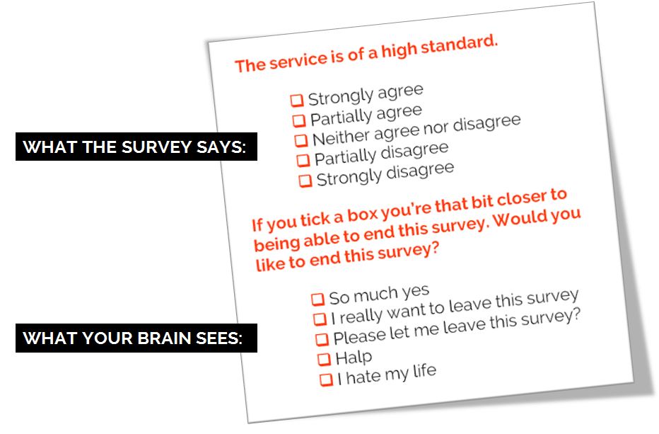
Personally I wouldn't do away with surveys entirely, but I would like to see their level of importance downgraded and the way they're often administered changed. Because I know what it's like to fill in a survey, especially the larger ones. Sometimes you just tick boxes without really thinking too much about it. Sometimes you tell people what they want to hear.  Sometimes you can't get all the way through it. Sometimes by the end you're just clicking answers so you can leave the survey.

I made this. CC-BY.

I made this. CC-BY.

How can we de-bobbins* our surveys? Let me know below. Here are some ideas for starters:

  1. Have a very clear goal of what the survey is helping to achieve before it is launched. What's the objective here? ('It's the time of year we do the survey' does not count as an objective)
     
  2. Spend as much time interpretting and analysing and ACTING ON the results as we do formatting, preparing and promoting the survey (ideally, more time)
     
  3. Acknowledge that surveys don't tell the whole story, and then do something about it. Use surveys for the big picture, and use UX techniques to zoom in on the details. It doesn't have to be pointless data. We can collect meaningful, insightful data.
     
  4. Run them less frequently. LibQual every 2 years max, anyone?
     
  5. Only ever ask questions that give answers you can act on
     
  6. Run smaller surveys more frequently rather than large surveys annually: 3 questions a month, with FOCUS on one theme per month, that allows you to tweak the user experience based on what you learn
     
  7. Speak the language of the user. Avoid confusion by referring to our stuff in the terms our users refer to our stuff
     
  8. [**MANAGEMENT-SPEAK KLAXON**] Complete the feedback loop. When you make changes based on what you learn, tell people you've done it. People need to know their investment of time in the survey is worth it.

Any more?


*International readers! Bobbins is a UK term for 'not very good'.

Upcoming presentation skills workshops and library marketing training

Just a quick post to say here's the current list of open workshops I'm doing this year - if you want to see if I'm doing something at your organisation specifically then the full listing is on the Upcoming Events page, but below are the non-in-house events currently in the diary. Hope to see you at one of them!

You can see a whole load of feedback from previous workshops via the Training page.

An Alternative to Seth Godin's 5 Rules to create amazing PowerPoint Presentations


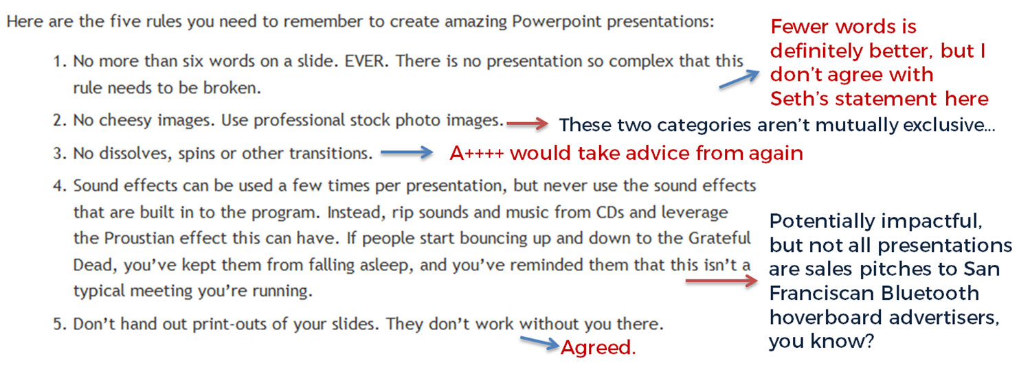
Seth Godin is a very influential man, and his views on PowerPoint carry a lot of weight. He wrote a famous post a while back (1.5k Facebook shares, a gazillion tweets about it etc) on creating amazing presentations - you can read it here. I agree with lots of it completely, but I'm not totally on board with the five rules at the end.

My take on Seth's rules

My take on Seth's rules

No more than six words on a slide. EVER. There is no presentation so complex that this rule needs to be broken. To me this seems too arbitrary. Fewer words is without doubt better than more words when it comes to slides - they're presentation tools not written documents. But six? As the maximum ever? Unless that's based on research that shows seven or more words reduces the effectiveness of your PowerPoint, why limit yourself in such an extreme way? I'd say one or two sentences to ensure brevity but allow yourself a little flexibility in conveying meaning and nuance.

No cheesy images. Use professional stock photo images. First of all there are plenty of cheesy professional stock photos! Authenticity is key. The trick is to find images which look like the camera has happened upon a real scene - lots of pro stock images show impossibly perfect people laughing flirtatiously over a blank iPad, I mean come on. I find Pixabay and Unsplash have enough for most presentations I make, plus someone introduced me to Pexels the other day which looks good, and they're all free - both of copyright and financial cost. The professional stock photo sites cost a fortune to use - why use them when so many great (legal) images can be found for free?

No dissolves, spins or other transitions. Yup. No argument here. If it's extraneous to your story, all you're doing is reducing the impact of your message.

Sound effects can be used a few times per presentation, but never use the sound effects that are built in to the program. Instead, rip sounds and music from CDs and leverage the Proustian effect this can have. If people start bouncing up and down to the Grateful Dead, you’ve kept them from falling asleep, and you’ve reminded them that this isn’t a typical meeting you’re running. I like the idea about using music etc but it really needs a certain type of high energy presentation performance to pull this off. It's not for everybody (I couldn't do it). It's hard to think of a rule around sound that is absolute; it all depends on your audience, and some of them way think the use of music is a little distracting, whatever your music taste... From what I understand about the Proustian effect it's a very personal thing; I'm not sure a presenter could expect to cause or induce it for a room full of people. 

Don’t hand out print-outs of your slides. They don’t work without you there. I agree with this. But I wouldn't put it in my top 5...

Header pic is a CC-BY image by Betsyweber - clcik to view original on Flickr.

Header pic is a CC-BY image by Betsyweber - clcik to view original on Flickr.


My own top 5 rules for creating effective PowerPoint slides

So what would I put in my top 5 rules for creating amazing PowerPoint presentations? I can answer that question because the intro to my full-day Presentation Skills training is built around five golden rules, based on existing research into what makes for an effective presentations - and that's the aim here, to build something which works. 'Amazing' is no good on its own; you need people to remember your key messages, not just how great a presenter you were.

Here we go:

  1. Keep it simple. Slides don't need to be flash - get rid of anything that doesn't tell your specific story, and leave behind something which supports and reinforces what you're saying out loud, and prompts you as to what to say next.
  2. No more bullets. Bullet points ruin slides. They're fine for documents, but you're not making a document in PowerPoint. As well as being symptomatic of a general Death By PowerPoint malaise, they make people less likely to agree with, understand and remember your presentation. Oh and they like you less when you use them. That's enough of a reason to never use them, surely?
  3. Make one point per slide. Make your point, allow your audience to digest it, then move on together in sync with them. Several points on a slide inevitably result in your audience moving at a different pace to you, because they can only listen and read for a few short seconds. Why be in conflict with your presentation materials when you don't have to? Give each key message room to breathe.
  4. Big fresh fonts. Font size 24 is the absolute minimum you should ever use in slides. If you need more you're trying to fit too much on one slide. Either ditch some text or cascade it across two slides. Non-standard fonts (which is to say, fonts which don't appear in the Office Suite) can, if chosen carefully, increase the impact of your presentation. Typography is underrated.
  5. More images, less text. Too much text stops slides working. Relevant images help people learn. Make the most of your opportunity with each new PowerPoint you make!

A library marketing manifesto


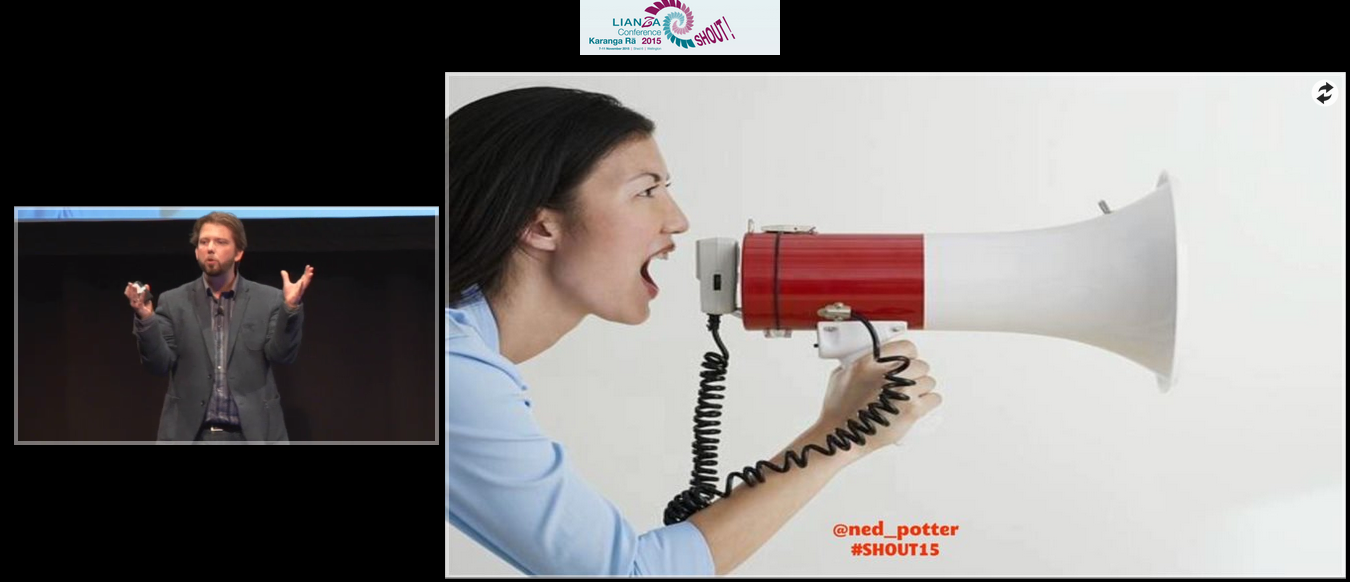
I just delivered a keynote at the LIANZA Conference, #SHOUT15, in New Zealand. It outlines a Library Marketing Manifesto - an attempt to boil everything down into five things we must do to be heard and listened to above the clamour of modern life. I know some people are uncomfortable with the word marketing, but essentially this is all about communication between us and our communities.

Specifically:

1. We will be community orientated
2. We will do what people need, but market what they want
3. We will cater for library novices and for library experts
4. We will keep things simple
5. We will coordinate our marketing into campaigns

Here are the slides:

The talk was recorded. Although the video inevitably mortifies me a bit, I'm delighted to have a record of the whole thing because I was so excited to be there, and the audience were so fantastically receptive.

Watch the talk here.

And finally, here are some excellent tweets which help explain the slides a little more. (I'll write about the experience of actually being in New Zealand and the rest of the conference later on.) The embedded version doesn't cover the full thing - you can view that online here if you wish.

How the terrible fonts on my website led me to New Zealand...

Every so often I will search twitter for the URL of this website. I recommend doing this - you can see what people are saying when they link to your site, what people respond most to, sometimes what they don't like. Occasionally I'll reply with more information if appropriate.

Maybe twice a year I'll run a similar search for www.librarymarketingtoolkit.com, and it was doing this that led me to discover the following tweet:

LIANZA is the Association for Library and Information Professionals in New Zealand. I replied to say 'you don't like the font..?' and someone else joined to say how much they ALSO didn't like the font! I got some useful feedback on the font you're looking at now on this site, too - so thanks to Seonaid, they've since been tweaked! And the Toolkit website was completely overhauled in terms of visual style, as a result of that chat.

Anyhow, Ines on the LIANZA account and I got talking, which resulted in this:

(I've mentioned before that although I work part time and make part of my living through workshops, I don't ask money for conference talks apart from expenses.) This led to an email exchange and to cut a long story short (is that the most misused phrase ever? I've basically let the long story run its course here, apologies...) I'm delivering a keynote at the annual LIANZA conference in November. I'm more excited about it than possibly anything I've ever done professionally! I will be setting out a library communication manifesto in my talk.

The other keynotes include Justin Hoenke, who I can't wait to meet in person after we worked together on Buy India a Library. I also can't wait to hear Kim Tairi speak. The whole programme looks ace. I also get to be a 'human book' which I've not done before...

For anyone interested I gush a bit more about NZ in an interview for LIANZA's Library Life magazine (PDF).

Digital Marketing Workshop, Wellington, November 12th

While I'm out there I'm also running a workshop for PiCS, for whom I also run workshops in Australia every two years. If you're interested there's more info including booking here.

It's a really fun course - we dip into absolutely loads of tools which help libraries (and library services) communicate. Every single thing we cover is useful - they solve existing problems - relatively straightforward to use, free, and immediately available. This is not about the future of libraries or tech just on the horizon. It's about things you can do the minute you get back to your desk.

We'll cover online publishing (including Prezi and Sway), Geolocation and Augmented Reality, Marketing with Video, Measuring Impact on Social Media, and various other smaller topics.

Some feedback from recent UK versions of this course:

“Very up to date - thanks - very useful, practical and relevant course - I’m brimming with ideas”

”So much of it was useful... really easy tools to use and could results in some quick wins for us. Tips on blogging were useful too and hopefully will inspire us to actually start one. Augmented reality bit was fascinating - lots of potential there”

”I thought this course was excellent, one of the best courses I have attended at the BL... ALL the content was useful - Ned was excellent in really understanding the BL collections and needs and shaping the course appropriately. I have already recommended this course to colleagues!”

“This has been a fantastic course - I have learnt so much and gained more confidence around a number of digital marketing tools and how to use them effectively. Ned’s knowledge and brilliant presentation style is great and kept me hooked for the whole day. Everything has been amazing”
— UKeIG, NHS, British Library

So if you're in New Zealand it would be great to see you there! LIANZA attendees get a reduced rate, too...