Marketing

4 questions to ask to help you simplify your comms

Simplification is often useful to raise engagement with an audience. Not always, but often.

It's not about dumbing down, or making things superficial, or losing the nuance. The aim is simply to take away anything that isn't essential for the message. Get rid of the extraneous. Be brutal. It's like tuning out the white noise so you're left with a perfect signal; there's less to distract your audience, and a greater chance they'll understand the message and respond do it. Everyone is overwhelmed with information so anything to cut through that and make it easier for your audience is worth doing.

There is a check list of four questions you can ask yourself (in descending order or severity!) which can help to simplify your comms and your key marketing messages. I do this all the time in my day-job and I absolutely guarentee it makes a difference in the level of engagement I get from my audience.

1) Do we need to send this at all?

If we over-saturate our audience then our communications begin to loose value over time. So we have to be careful to only communicate when we have enough of important to that particular audience. The first way to simplify, then, is the most extreme: do I really need to send this? Most of the time the answer is yes, but occasionally opportunities to hold back arise, and those opportunities need to be taken.

Think of it from your audience's point of view. Would you want this if you were them?

2) Can we get rid of anything extraneous?

Again, it's not about making it TOO short. It's not about superficiality. It's about making it as short as possible whilst maintaining the meaning and the nuance of the message. Every sentance or element should be scrutinised - if it doesn't NEED to be there, get rid of it.

Some elements of your message can be present for the user at the next stage, rather than this initial contact - so for example, if the comms is to ask users to go to a website, some of the key information can be on the website without needing to also be included in the comms themselves.

For the user, a long message is a) more likely to make them not even read / watch at all, b) more likely to make them stop reading / watching before the end and c) make them less likely to retain the key information in their head afterwards.

3) Can we cascade this over more than one message?

Sometimes once you've got rid of what's extraneous you're still left with a LOT. To cut it further would be to leave out essential information. From a marketing point of view, it can be worth marketing one big thing at a time rather than trying to market everything at once - allowing your audience a chance to lock in on one key theme at a time, reducing the risk of getting lost in the detail. This is risky, because it can lead to over-communication (which goes against the first principle above) so you have to make a judgement call. But with something like academic induction, for example, telling everyone everything simply doesn't work. We KNOW people can't remember all that. So in that scenario it can be worth trying to cascasde one large message into two or three smaller ones.

4) Can the language be made clearer?

So you've done 1 - 3: yes it's essential and needs to go out; it's as short as it can be without losing nuance; it needs to be just one message. So can anything be done with the language and tone to make it clear and simple to follow? Can it be less formal without losing credibility? Is there any obscure terminology that your users won't all be familiar with? Are there acronyms that need replacing or explaining?

You can't always simplify comms, and it's not always desirable to do so. But if you ask yourself these four questions before disseminating key messages, the chances are you'll get a higher level of engagement from your audience.


BONUS QUESTION: Can we segment our audience?

Segmentation is too complex to get into detail here, but the basic principle is to divide your audience up into smaller groups and tailor the communication to each one. This often presents opportunities for simplification, because you're not having to include all of the information all of the time - you can pick and choose the parts that matter most to each segment.

Ask yourselves, libraries: are surveys a bit bobbins?

We all agree we need data on the needs and wants of our users.

We all agree that asking our users what they want and need has traditionally been a good way of finding that out.

But do we all agree surveys really work? Are they really getting the job done - providing us with the info we need to make changes to our services?

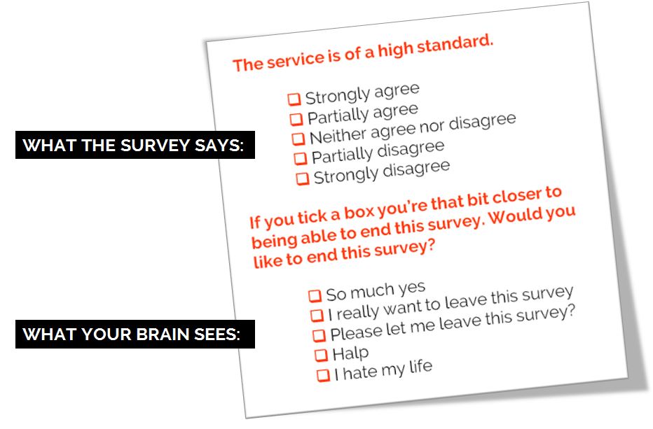
Personally I wouldn't do away with surveys entirely, but I would like to see their level of importance downgraded and the way they're often administered changed. Because I know what it's like to fill in a survey, especially the larger ones. Sometimes you just tick boxes without really thinking too much about it. Sometimes you tell people what they want to hear.  Sometimes you can't get all the way through it. Sometimes by the end you're just clicking answers so you can leave the survey.

I made this. CC-BY.

I made this. CC-BY.

How can we de-bobbins* our surveys? Let me know below. Here are some ideas for starters:

  1. Have a very clear goal of what the survey is helping to achieve before it is launched. What's the objective here? ('It's the time of year we do the survey' does not count as an objective)
     
  2. Spend as much time interpretting and analysing and ACTING ON the results as we do formatting, preparing and promoting the survey (ideally, more time)
     
  3. Acknowledge that surveys don't tell the whole story, and then do something about it. Use surveys for the big picture, and use UX techniques to zoom in on the details. It doesn't have to be pointless data. We can collect meaningful, insightful data.
     
  4. Run them less frequently. LibQual every 2 years max, anyone?
     
  5. Only ever ask questions that give answers you can act on
     
  6. Run smaller surveys more frequently rather than large surveys annually: 3 questions a month, with FOCUS on one theme per month, that allows you to tweak the user experience based on what you learn
     
  7. Speak the language of the user. Avoid confusion by referring to our stuff in the terms our users refer to our stuff
     
  8. [**MANAGEMENT-SPEAK KLAXON**] Complete the feedback loop. When you make changes based on what you learn, tell people you've done it. People need to know their investment of time in the survey is worth it.

Any more?


*International readers! Bobbins is a UK term for 'not very good'.

Upcoming presentation skills workshops and library marketing training

Just a quick post to say here's the current list of open workshops I'm doing this year - if you want to see if I'm doing something at your organisation specifically then the full listing is on the Upcoming Events page, but below are the non-in-house events currently in the diary. Hope to see you at one of them!

You can see a whole load of feedback from previous workshops via the Training page.

An Alternative to Seth Godin's 5 Rules to create amazing PowerPoint Presentations


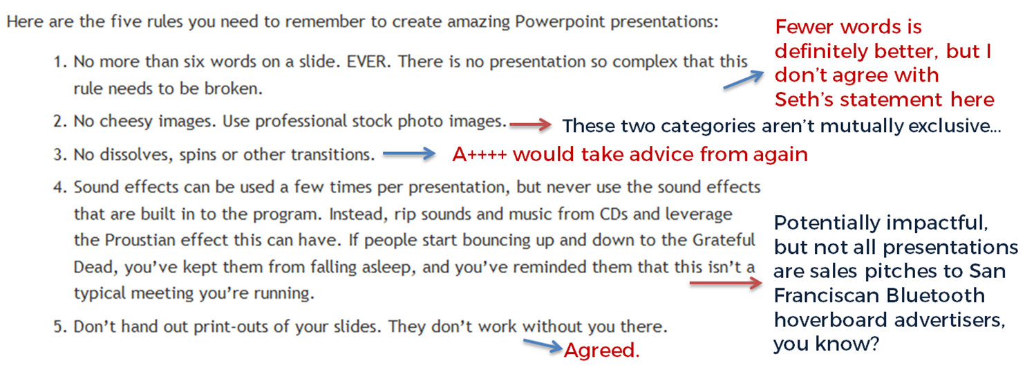
Seth Godin is a very influential man, and his views on PowerPoint carry a lot of weight. He wrote a famous post a while back (1.5k Facebook shares, a gazillion tweets about it etc) on creating amazing presentations - you can read it here. I agree with lots of it completely, but I'm not totally on board with the five rules at the end.

My take on Seth's rules

My take on Seth's rules

No more than six words on a slide. EVER. There is no presentation so complex that this rule needs to be broken. To me this seems too arbitrary. Fewer words is without doubt better than more words when it comes to slides - they're presentation tools not written documents. But six? As the maximum ever? Unless that's based on research that shows seven or more words reduces the effectiveness of your PowerPoint, why limit yourself in such an extreme way? I'd say one or two sentences to ensure brevity but allow yourself a little flexibility in conveying meaning and nuance.

No cheesy images. Use professional stock photo images. First of all there are plenty of cheesy professional stock photos! Authenticity is key. The trick is to find images which look like the camera has happened upon a real scene - lots of pro stock images show impossibly perfect people laughing flirtatiously over a blank iPad, I mean come on. I find Pixabay and Unsplash have enough for most presentations I make, plus someone introduced me to Pexels the other day which looks good, and they're all free - both of copyright and financial cost. The professional stock photo sites cost a fortune to use - why use them when so many great (legal) images can be found for free?

No dissolves, spins or other transitions. Yup. No argument here. If it's extraneous to your story, all you're doing is reducing the impact of your message.

Sound effects can be used a few times per presentation, but never use the sound effects that are built in to the program. Instead, rip sounds and music from CDs and leverage the Proustian effect this can have. If people start bouncing up and down to the Grateful Dead, you’ve kept them from falling asleep, and you’ve reminded them that this isn’t a typical meeting you’re running. I like the idea about using music etc but it really needs a certain type of high energy presentation performance to pull this off. It's not for everybody (I couldn't do it). It's hard to think of a rule around sound that is absolute; it all depends on your audience, and some of them way think the use of music is a little distracting, whatever your music taste... From what I understand about the Proustian effect it's a very personal thing; I'm not sure a presenter could expect to cause or induce it for a room full of people. 

Don’t hand out print-outs of your slides. They don’t work without you there. I agree with this. But I wouldn't put it in my top 5...

Header pic is a CC-BY image by Betsyweber - clcik to view original on Flickr.

Header pic is a CC-BY image by Betsyweber - clcik to view original on Flickr.


My own top 5 rules for creating effective PowerPoint slides

So what would I put in my top 5 rules for creating amazing PowerPoint presentations? I can answer that question because the intro to my full-day Presentation Skills training is built around five golden rules, based on existing research into what makes for an effective presentations - and that's the aim here, to build something which works. 'Amazing' is no good on its own; you need people to remember your key messages, not just how great a presenter you were.

Here we go:

  1. Keep it simple. Slides don't need to be flash - get rid of anything that doesn't tell your specific story, and leave behind something which supports and reinforces what you're saying out loud, and prompts you as to what to say next.
  2. No more bullets. Bullet points ruin slides. They're fine for documents, but you're not making a document in PowerPoint. As well as being symptomatic of a general Death By PowerPoint malaise, they make people less likely to agree with, understand and remember your presentation. Oh and they like you less when you use them. That's enough of a reason to never use them, surely?
  3. Make one point per slide. Make your point, allow your audience to digest it, then move on together in sync with them. Several points on a slide inevitably result in your audience moving at a different pace to you, because they can only listen and read for a few short seconds. Why be in conflict with your presentation materials when you don't have to? Give each key message room to breathe.
  4. Big fresh fonts. Font size 24 is the absolute minimum you should ever use in slides. If you need more you're trying to fit too much on one slide. Either ditch some text or cascade it across two slides. Non-standard fonts (which is to say, fonts which don't appear in the Office Suite) can, if chosen carefully, increase the impact of your presentation. Typography is underrated.
  5. More images, less text. Too much text stops slides working. Relevant images help people learn. Make the most of your opportunity with each new PowerPoint you make!

A library marketing manifesto


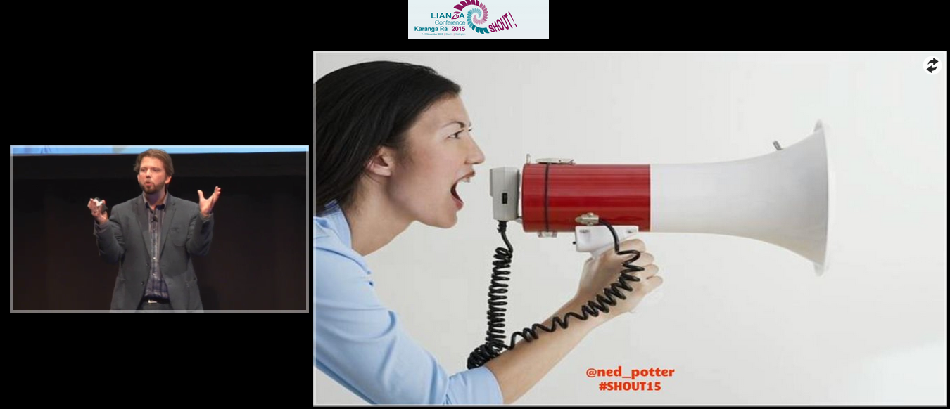
I just delivered a keynote at the LIANZA Conference, #SHOUT15, in New Zealand. It outlines a Library Marketing Manifesto - an attempt to boil everything down into five things we must do to be heard and listened to above the clamour of modern life. I know some people are uncomfortable with the word marketing, but essentially this is all about communication between us and our communities.

Specifically:

1. We will be community orientated
2. We will do what people need, but market what they want
3. We will cater for library novices and for library experts
4. We will keep things simple
5. We will coordinate our marketing into campaigns

Here are the slides:

The talk was recorded. Although the video inevitably mortifies me a bit, I'm delighted to have a record of the whole thing because I was so excited to be there, and the audience were so fantastically receptive.

Watch the talk here.

And finally, here are some excellent tweets which help explain the slides a little more. (I'll write about the experience of actually being in New Zealand and the rest of the conference later on.) The embedded version doesn't cover the full thing - you can view that online here if you wish.