Presentations

An Alternative to Seth Godin's 5 Rules to create amazing PowerPoint Presentations


Seth Godin is a very influential man, and his views on PowerPoint carry a lot of weight. He wrote a famous post a while back (1.5k Facebook shares, a gazillion tweets about it etc) on creating amazing presentations - you can read it here. I agree with lots of it completely, but I'm not totally on board with the five rules at the end.

My take on Seth's rules

My take on Seth's rules

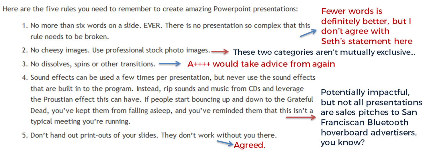
No more than six words on a slide. EVER. There is no presentation so complex that this rule needs to be broken. To me this seems too arbitrary. Fewer words is without doubt better than more words when it comes to slides - they're presentation tools not written documents. But six? As the maximum ever? Unless that's based on research that shows seven or more words reduces the effectiveness of your PowerPoint, why limit yourself in such an extreme way? I'd say one or two sentences to ensure brevity but allow yourself a little flexibility in conveying meaning and nuance.

No cheesy images. Use professional stock photo images. First of all there are plenty of cheesy professional stock photos! Authenticity is key. The trick is to find images which look like the camera has happened upon a real scene - lots of pro stock images show impossibly perfect people laughing flirtatiously over a blank iPad, I mean come on. I find Pixabay and Unsplash have enough for most presentations I make, plus someone introduced me to Pexels the other day which looks good, and they're all free - both of copyright and financial cost. The professional stock photo sites cost a fortune to use - why use them when so many great (legal) images can be found for free?

No dissolves, spins or other transitions. Yup. No argument here. If it's extraneous to your story, all you're doing is reducing the impact of your message.

Sound effects can be used a few times per presentation, but never use the sound effects that are built in to the program. Instead, rip sounds and music from CDs and leverage the Proustian effect this can have. If people start bouncing up and down to the Grateful Dead, you’ve kept them from falling asleep, and you’ve reminded them that this isn’t a typical meeting you’re running. I like the idea about using music etc but it really needs a certain type of high energy presentation performance to pull this off. It's not for everybody (I couldn't do it). It's hard to think of a rule around sound that is absolute; it all depends on your audience, and some of them way think the use of music is a little distracting, whatever your music taste... From what I understand about the Proustian effect it's a very personal thing; I'm not sure a presenter could expect to cause or induce it for a room full of people. 

Don’t hand out print-outs of your slides. They don’t work without you there. I agree with this. But I wouldn't put it in my top 5...

Header pic is a CC-BY image by Betsyweber - clcik to view original on Flickr.

Header pic is a CC-BY image by Betsyweber - clcik to view original on Flickr.


My own top 5 rules for creating effective PowerPoint slides

So what would I put in my top 5 rules for creating amazing PowerPoint presentations? I can answer that question because the intro to my full-day Presentation Skills training is built around five golden rules, based on existing research into what makes for an effective presentations - and that's the aim here, to build something which works. 'Amazing' is no good on its own; you need people to remember your key messages, not just how great a presenter you were.

Here we go:

  1. Keep it simple. Slides don't need to be flash - get rid of anything that doesn't tell your specific story, and leave behind something which supports and reinforces what you're saying out loud, and prompts you as to what to say next.
  2. No more bullets. Bullet points ruin slides. They're fine for documents, but you're not making a document in PowerPoint. As well as being symptomatic of a general Death By PowerPoint malaise, they make people less likely to agree with, understand and remember your presentation. Oh and they like you less when you use them. That's enough of a reason to never use them, surely?
  3. Make one point per slide. Make your point, allow your audience to digest it, then move on together in sync with them. Several points on a slide inevitably result in your audience moving at a different pace to you, because they can only listen and read for a few short seconds. Why be in conflict with your presentation materials when you don't have to? Give each key message room to breathe.
  4. Big fresh fonts. Font size 24 is the absolute minimum you should ever use in slides. If you need more you're trying to fit too much on one slide. Either ditch some text or cascade it across two slides. Non-standard fonts (which is to say, fonts which don't appear in the Office Suite) can, if chosen carefully, increase the impact of your presentation. Typography is underrated.
  5. More images, less text. Too much text stops slides working. Relevant images help people learn. Make the most of your opportunity with each new PowerPoint you make!

Where to start when planning talk or teaching session

This seems obvious, right? And yet so often it doesn't happen.

Venn diagram showing 'what you know' in one circle and 'what matters to your audience' in the other. Where they overlap is where your talk should be.

Venn diagram showing 'what you know' in one circle and 'what matters to your audience' in the other. Where they overlap is where your talk should be.

There are two main ways in which, when we give talks or run teaching sessions and workshops, we don't adhere to this principle. Clearly no one ever strays entirely into the blue circle (giving a talk about a subject which matters to your audience, but which you no absolutely nothing about, is pretty much impossible) but we can easily spend too much time in the orange circle where it doesn't overlap, or just not make the most of the overlapping section of the diagram.

NB: I very deliberately use the phrase 'what matters to your audience' above - rather than 'what interests them', because I'm not advocating taking a superficial approach and only telling your community about cool stuff they already care about. We can tell them things they don't know they need to know! Sometimes they wouldn't choose to hear it in advance, but they thank us afterwards. So it's very much what matters to them, whether they realise it before the session or not.

There's no excuse for telling an audience things which don't matter at all - unless it's a small part of your presentation, to serve a particular purpose.

Telling people everything we know

I don't wish to generalise but a lot of times Librarians give out too much information, particularly early on in a relationship between the institution and the user. Induction or Welcome talks often contain vast swathes of detail, or a talk at a conference will include ALL the info about a particular project - and often this can actually get in the way of the message. After a while the audience gets overwhelmed and starts to filter, or just switch off. We can only retain so much new information at one time.

So when crafting a talk or presentation, the starting point should not be 'What do I know about this subject?' but specifically what do the audience want to know about this subject, that I can tell them?

Missing out on the over-lap

There's a second, more subtle, factor here. The over-lap of what matters to your audience and what you know about can also include things which aren't part of your core message. In other words, you can establish your credibility with your audience by telling them things which matter to them, and THEN telling about the library's relevance to them - they're more inclined to take you seriously if you aren't just advocating for your own service or value. I use this a lot in infolit teaching - I'll tell the students about internet privacy, different search engines, how to use social media in an academic context etc, as well as telling them about what the library does and how to use databases effectively. Because it's in the overlap of the diagram above - I know about this stuff, and it matters to my audience. What's really interesting is when I started doing this *rather than just talking about the library) the feedback, both the scores and the qualitative feedback, went up hugely; they really liked the sessions. But when they're asked to rate the most useful part of the session, the vast majority mention the bits about the library!

As long as it doesn't conflict with our ethics and values, libraries can provide both services and expertise based on what our users need - it doesn't have to be a 'library' function in the traditional sense.

So: create presentations and teaching from the audience's point of view first, working back to what you know about what matters to them, rather than the other way around. It's only a small shift but it makes a huge difference.

A library marketing manifesto


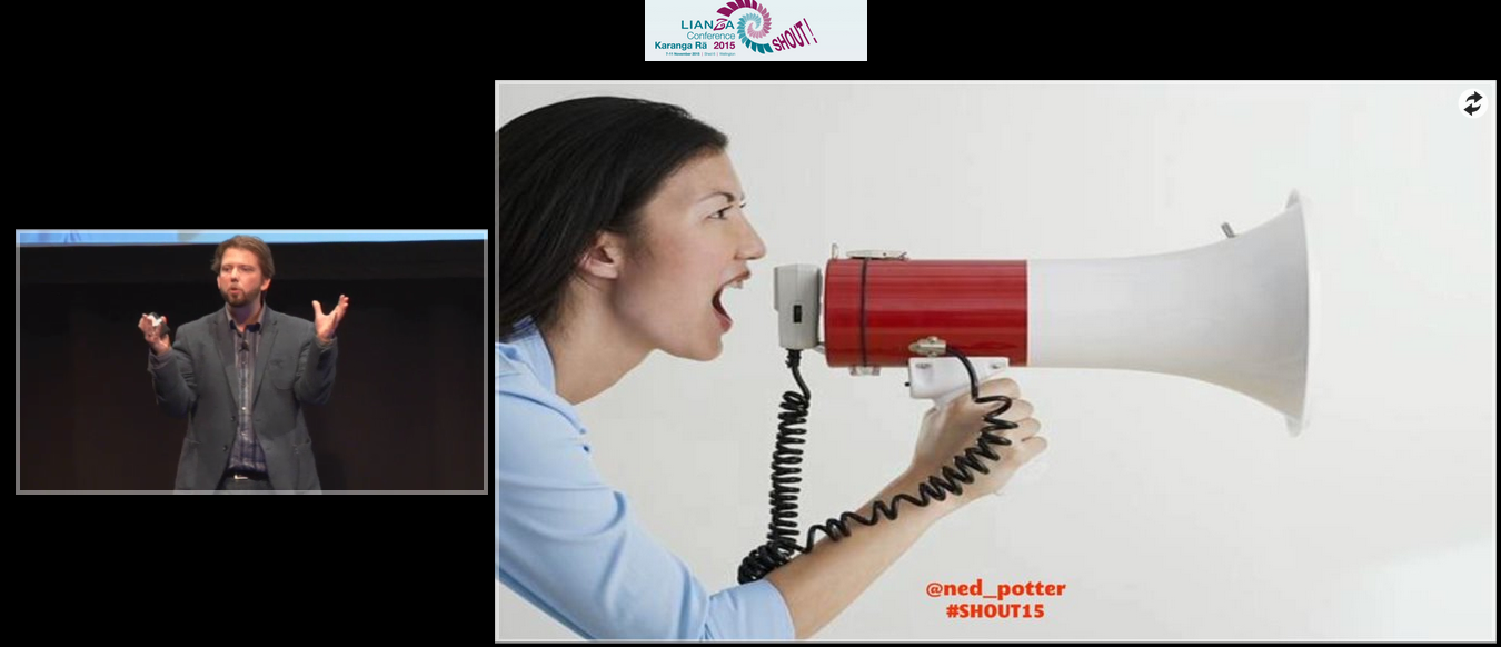
I just delivered a keynote at the LIANZA Conference, #SHOUT15, in New Zealand. It outlines a Library Marketing Manifesto - an attempt to boil everything down into five things we must do to be heard and listened to above the clamour of modern life. I know some people are uncomfortable with the word marketing, but essentially this is all about communication between us and our communities.

Specifically:

1. We will be community orientated
2. We will do what people need, but market what they want
3. We will cater for library novices and for library experts
4. We will keep things simple
5. We will coordinate our marketing into campaigns

Here are the slides:

The talk was recorded. Although the video inevitably mortifies me a bit, I'm delighted to have a record of the whole thing because I was so excited to be there, and the audience were so fantastically receptive.

Watch the talk here.

And finally, here are some excellent tweets which help explain the slides a little more. (I'll write about the experience of actually being in New Zealand and the rest of the conference later on.) The embedded version doesn't cover the full thing - you can view that online here if you wish.

Using Prezi in the Academic Library


The zooming presentation tool Prezi is a very divisive alternative to PowerPoint. Prezi's 40 million users have created MANY bad presentations since it launched in 2009, and for that reason it has a bad rep in some circles - poorly made Prezis make the audience feel motion-sick, and even really well made Prezis are sometimes more about the tool and the presenter than they are about the content and the audience. Conversely some people LOVE it: "I just use Prezi for everything" is a phrase you hear sometimes, which personally I view as a mistake.

My own feelings on Prezi are somewhere in the middle - I don't use it for about 75% of the presentations I create, but I don't hate it either. It can be a really effective tool in the academic environment, and at my institution we've had students and staff love what we've done with it. The key is, use Prezi with a good reason. Otherwise, don't.

So here are some good uses for Prezi in the academic library:

1. Interactive Maps of the Library

My favourite use for Prezi is take something static, and make it dynamic. You can stretch any image as large as you want (as long as it's not a low-res image) and make it the background to your entire presentation, then add points of interaction with that image.

This is the main example from York - our interactive map of the library:

This serves two purposes. Firstly it sits online (and embedded in various places on our website and Libguides) for the students to interact with in their own time. The students appreciate this because the information about the library, of which there is a LOT, is arranged geographically. This level of context makes it easier to get to grips with. The non-linear qualities of Prezi mean that if, for example, the student wants to know what's on the second floor of the Fairhurst building, they just click on the second floor of the Fairhurst building. (Try it in the map above!) It goes straight there - rather than having to skip a bunch of slides or scroll through a bunch of text or sit through a video. Talking of video, I've embedded about 10 videos in this Prezi at appropriate points - anyone who's ever tried to embed videos in PowerPoint know what a thankless task that is... In Prezi you just copy and paste in the YouTube URL and it does the rest.

The second purpose is to use it in Induction talks. We create department-specific versions of it - these tend to be far less detailed than the full version above, covering less ground, but adding in more subject detail: the specific whereabouts of a department's books and journals, for example, or details of the Special Collections we have which are most relevant to them. Here's a History of Art example that I used this year with my Postgraduates.

As Prezi users will know, the order in which your presentation visits the various elements on the canvas is known as the 'Path'. It's easy to take things out of your path WITHOUT taking them out of your presentation - meaning you can deliver a talk for whatever time-slot you have, but when you give people the link the presentation afterwards they can see the full version with much more detail left in.

So for me, the ability to take a floor-plan PDF and make it interactive, the ability to contextualise our YouTube videos, and the ability to make copies of the map which we customise for each department and presentation length, are all good reasons to justify using Prezi.

If you want to take your own floor-plans and turn them into interactive maps, it's really not that complicated - I've written a guide to that here. Student feedback is great so it's worth doing - also, we often get academics giving us very good feedback and starting conversations about it, so it's a chance to boost our credibility in departments more generally.

2. Presentations with a focus on visual content

Another History of Art example here - the presentation I use for a session on Finding Images with my HoA 1st years. Because it's all about imagery, a very visual presentation makes sense. It also helps to make some of the tedious step-by-step instructions I have to cover slightly more engaging. I don't know why but I quite like the 70s wallpaper aesthetic of this Prezi template, too.

3. Presentations on several disparate subjects

The final reason I use Prezi is when covering lots of different topics or tools under one umbrella. When doing a presentation or teaching session on one topic or idea, the linear nature of PowerPoint suits this well. But when covering lots of things, it can be helpful to show the audience all of them at first, then visit each of them one by one. For a session for academics on online tools and technologies, there's not much linking the content except everything is online - for that the Prezi helps make sense of the broader context.

For most teaching and most presentations I find PowerPoint is fine - it's also much maligned of course, but when used well it can be very effective. For me it's never a case of tossing a coin as to which one to choose - unless there's a compelling reason to use Prezi, why risk the audience feeling sea-sick?

That said, when there IS a compelling reason to choose it, it make a huge difference to the level of engagement. People literally sit up in their seats and take notice. And if you always keep the audience in mind, and use Prezi to deliver your message effectively rather than show off, it will work.

In terms of accessibility, Prezi does provide a transcript of each presentation but I'm not sure that would be much of a recreation of actually watching the presentation, so we don't provide any information only in Prezi. In the Finding Images presentation above, for example, there's nothing in it which isn't also in the hand-out I give the students.

Here's a specific post on how NOT to make your audience feel sick, if you want more detail on that. If you've had successes or failures in using Prezi in academic libraries that you'd be willing to share, leave me a comment below.

How the terrible fonts on my website led me to New Zealand...

Every so often I will search twitter for the URL of this website. I recommend doing this - you can see what people are saying when they link to your site, what people respond most to, sometimes what they don't like. Occasionally I'll reply with more information if appropriate.

Maybe twice a year I'll run a similar search for www.librarymarketingtoolkit.com, and it was doing this that led me to discover the following tweet:

LIANZA is the Association for Library and Information Professionals in New Zealand. I replied to say 'you don't like the font..?' and someone else joined to say how much they ALSO didn't like the font! I got some useful feedback on the font you're looking at now on this site, too - so thanks to Seonaid, they've since been tweaked! And the Toolkit website was completely overhauled in terms of visual style, as a result of that chat.

Anyhow, Ines on the LIANZA account and I got talking, which resulted in this:

(I've mentioned before that although I work part time and make part of my living through workshops, I don't ask money for conference talks apart from expenses.) This led to an email exchange and to cut a long story short (is that the most misused phrase ever? I've basically let the long story run its course here, apologies...) I'm delivering a keynote at the annual LIANZA conference in November. I'm more excited about it than possibly anything I've ever done professionally! I will be setting out a library communication manifesto in my talk.

The other keynotes include Justin Hoenke, who I can't wait to meet in person after we worked together on Buy India a Library. I also can't wait to hear Kim Tairi speak. The whole programme looks ace. I also get to be a 'human book' which I've not done before...

For anyone interested I gush a bit more about NZ in an interview for LIANZA's Library Life magazine (PDF).

Digital Marketing Workshop, Wellington, November 12th

While I'm out there I'm also running a workshop for PiCS, for whom I also run workshops in Australia every two years. If you're interested there's more info including booking here.

It's a really fun course - we dip into absolutely loads of tools which help libraries (and library services) communicate. Every single thing we cover is useful - they solve existing problems - relatively straightforward to use, free, and immediately available. This is not about the future of libraries or tech just on the horizon. It's about things you can do the minute you get back to your desk.

We'll cover online publishing (including Prezi and Sway), Geolocation and Augmented Reality, Marketing with Video, Measuring Impact on Social Media, and various other smaller topics.

Some feedback from recent UK versions of this course:

“Very up to date - thanks - very useful, practical and relevant course - I’m brimming with ideas”

”So much of it was useful... really easy tools to use and could results in some quick wins for us. Tips on blogging were useful too and hopefully will inspire us to actually start one. Augmented reality bit was fascinating - lots of potential there”

”I thought this course was excellent, one of the best courses I have attended at the BL... ALL the content was useful - Ned was excellent in really understanding the BL collections and needs and shaping the course appropriately. I have already recommended this course to colleagues!”

“This has been a fantastic course - I have learnt so much and gained more confidence around a number of digital marketing tools and how to use them effectively. Ned’s knowledge and brilliant presentation style is great and kept me hooked for the whole day. Everything has been amazing”
— UKeIG, NHS, British Library

So if you're in New Zealand it would be great to see you there! LIANZA attendees get a reduced rate, too...