Upcoming presentation skills workshops and library marketing training

Just a quick post to say here's the current list of open workshops I'm doing this year - if you want to see if I'm doing something at your organisation specifically then the full listing is on the Upcoming Events page, but below are the non-in-house events currently in the diary. Hope to see you at one of them!

You can see a whole load of feedback from previous workshops via the Training page.

How to use Instagram as an easy photo editor but NOT necessarily a social network!


As well as being a massively popular social network, Instagram is a brilliant photo editing tool - it's quick, intuitive and easy to transform images. But you can't save the photos to your phone unless you post them online, and sometimes you might want to edit a photo and not share it with the world on social media.

So how do you do this? The tl;dr version of this post:

How to use Instagram as a photo editor

This is great for family stuff (and professional stuff, more on which below). I've become a little obsessed with manipulating photos so that the most important part of the image is clearly highlighted in some way. For example this weekend I took a picture of my daughter and wanted to use the filters Instagram provides and also the tilt-shift function. I love tilt-shift - it makes part of your image slightly out of focus, drawing the eye to the in-focus part you define. But I didn't want to post a picture of my kids on Instagram because I use that purely for drumming related shenanigans - so I took the picture and went into Instagram, edited it, and posted in Airplane Mode so it didn't actually get as far as the internet, but DID save to my camera roll. I really like the way the bits in the picture frame are in focus, but the resit isn't.

The original picture

The original picture

The tilt-shifted, Instagram filtered one

The tilt-shifted, Instagram filtered one

5 steps to use Instagram professionally for photo editing

For professional projects this is potentially very useful, especially if you can't find a free stock image that suits your requirements. Let's say you're making a slide for a presentation and you need to talk about Google. You don't want to pay for a photo, and you can't find a suitable Google-related pic which has space to write on, without having to pay.

STEP 1: Use your phone to take a picture of the Google app icon on a tablet. (Keep in mind you don't have to take a photo - you could screengrab your phone or tablet if you want to get an image of an app or website. I've gone with a photo in this example to get the angle.)

STEP 1: Use your phone to take a picture of the Google app icon on a tablet

STEP 2: Apply a filter. (I ended up choosing X-PRO II)

STEP 3: Use the Radial Tilt-Shift to effectively blur everything except the Google icon

STEP 4: If you don't post it to Instagram it won't save to your Camara Roll. So go into Airplane Mode then post it - you'll see the 'Failed' message and you can press the X to dismiss it. Instagram will now forget all about the image and not attempt to repost it when you have connectivity - but you'll still have the edited pic saved to your phone.

STEP 4: If you don't post it to Instagram it won't save to your Camara Roll. So go into Airplane Mode then post it - you'll see the 'Failed' message and you can press the X to dismiss it. Instagram will now forget all about the image and not attempt…

STEP 5: Your finished photo! The eye is drawn to the Google icon, and the photo is darkened and blurred so you can potentially add easily readable white text to your image as part of a slide. Email it to yourself and it's ready to use in your slide.

STEP 5: Your finished photo! The eye is drawn to the Google icon, and the photo is darkened and blurred so you can potentially add easily readable white text to your image as part of a slide.

Finally here are the two photos side by side so you can see the difference.

Original photo

Original photo

Edited version

Edited version

You can sign up to Instagram and never publically post a picture if you don't want to! If you make creative use of this technique let me know in a comment.

An Alternative to Seth Godin's 5 Rules to create amazing PowerPoint Presentations


Seth Godin is a very influential man, and his views on PowerPoint carry a lot of weight. He wrote a famous post a while back (1.5k Facebook shares, a gazillion tweets about it etc) on creating amazing presentations - you can read it here. I agree with lots of it completely, but I'm not totally on board with the five rules at the end.

My take on Seth's rules

My take on Seth's rules

No more than six words on a slide. EVER. There is no presentation so complex that this rule needs to be broken. To me this seems too arbitrary. Fewer words is without doubt better than more words when it comes to slides - they're presentation tools not written documents. But six? As the maximum ever? Unless that's based on research that shows seven or more words reduces the effectiveness of your PowerPoint, why limit yourself in such an extreme way? I'd say one or two sentences to ensure brevity but allow yourself a little flexibility in conveying meaning and nuance.

No cheesy images. Use professional stock photo images. First of all there are plenty of cheesy professional stock photos! Authenticity is key. The trick is to find images which look like the camera has happened upon a real scene - lots of pro stock images show impossibly perfect people laughing flirtatiously over a blank iPad, I mean come on. I find Pixabay and Unsplash have enough for most presentations I make, plus someone introduced me to Pexels the other day which looks good, and they're all free - both of copyright and financial cost. The professional stock photo sites cost a fortune to use - why use them when so many great (legal) images can be found for free?

No dissolves, spins or other transitions. Yup. No argument here. If it's extraneous to your story, all you're doing is reducing the impact of your message.

Sound effects can be used a few times per presentation, but never use the sound effects that are built in to the program. Instead, rip sounds and music from CDs and leverage the Proustian effect this can have. If people start bouncing up and down to the Grateful Dead, you’ve kept them from falling asleep, and you’ve reminded them that this isn’t a typical meeting you’re running. I like the idea about using music etc but it really needs a certain type of high energy presentation performance to pull this off. It's not for everybody (I couldn't do it). It's hard to think of a rule around sound that is absolute; it all depends on your audience, and some of them way think the use of music is a little distracting, whatever your music taste... From what I understand about the Proustian effect it's a very personal thing; I'm not sure a presenter could expect to cause or induce it for a room full of people. 

Don’t hand out print-outs of your slides. They don’t work without you there. I agree with this. But I wouldn't put it in my top 5...

Header pic is a CC-BY image by Betsyweber - clcik to view original on Flickr.

Header pic is a CC-BY image by Betsyweber - clcik to view original on Flickr.


My own top 5 rules for creating effective PowerPoint slides

So what would I put in my top 5 rules for creating amazing PowerPoint presentations? I can answer that question because the intro to my full-day Presentation Skills training is built around five golden rules, based on existing research into what makes for an effective presentations - and that's the aim here, to build something which works. 'Amazing' is no good on its own; you need people to remember your key messages, not just how great a presenter you were.

Here we go:

  1. Keep it simple. Slides don't need to be flash - get rid of anything that doesn't tell your specific story, and leave behind something which supports and reinforces what you're saying out loud, and prompts you as to what to say next.
  2. No more bullets. Bullet points ruin slides. They're fine for documents, but you're not making a document in PowerPoint. As well as being symptomatic of a general Death By PowerPoint malaise, they make people less likely to agree with, understand and remember your presentation. Oh and they like you less when you use them. That's enough of a reason to never use them, surely?
  3. Make one point per slide. Make your point, allow your audience to digest it, then move on together in sync with them. Several points on a slide inevitably result in your audience moving at a different pace to you, because they can only listen and read for a few short seconds. Why be in conflict with your presentation materials when you don't have to? Give each key message room to breathe.
  4. Big fresh fonts. Font size 24 is the absolute minimum you should ever use in slides. If you need more you're trying to fit too much on one slide. Either ditch some text or cascade it across two slides. Non-standard fonts (which is to say, fonts which don't appear in the Office Suite) can, if chosen carefully, increase the impact of your presentation. Typography is underrated.
  5. More images, less text. Too much text stops slides working. Relevant images help people learn. Make the most of your opportunity with each new PowerPoint you make!

A decade in Libraries: it's more fragmented now, but that's okay


10 years ago last month, I started my first job in the Information profession.

This is the New Horizons space probe, which launched in the same month as my own journey through librarianship (**HONKINGLY TRITE JOURNEY METAPHOR KLAXON**) trying to get to Pluto. It got there last year - my daughter was 2 that day and I deeply reg…

This is the New Horizons space probe, which launched in the same month as my own journey through librarianship (**HONKINGLY TRITE JOURNEY METAPHOR KLAXON**) trying to get to Pluto. It got there last year - my daughter was 2 that day and I deeply regretted not taking annual leave for her birthday. Other things that happened in my first month in this profession included Charlie Kennedy resigning from the Lib Dems and a whale swimming in the Thames. #AbsoluteScenes

It was a Customer Services role at the University of Leeds: back then I was fine with the term 'customer' in a library context, actively pleased about it in fact, and right away my Dad began the process of helping me understand how wrong I was... I had no intention to stay in library work - it was a temporary measure, and I wasn't even first choice for the job: I'd been interviewed months earlier and was first reserve for if anything came up! But it turned out to be about a million times more interesting than I expected, so I stuck around. (There's more on my library roots here. Remember the Library Routes Project? That was great. The wiki has gone but you can still find people's blog posts about how they got into this profession.)

A lot has happened to the industry and the profession in the last 10 years (there are many fewer libraries open, for a start), and there are people who'd be much better at documenting it than me. One thing I think we can all agree on is that the profession has become much more fragmented. There are many groups and sub-groups and splinter groups, and we don't speak with one voice very often. This is undoubtedly sad, but it's also completely inevitable.

People tend to regress towards the mean, by which I mean most of us see what's normal and that at least influences our thinking. The great thing about social media and the connected world is that there are so MANY means, so many normals - everyone can find their tribe. (This, of course, has its downsides in the wider context - idiots and hateful people can find other idiots to legitimise their hate. But that's not what this post is about.) So if you have a set of views, and you find others who share them, then you can DEVELOP those views rather have your rough edges smoothed off and your rebellion derailed... So I don't think we can really bemoan our fragmented profession - in a way it should always have been like this, but people couldn't find each other so easily before. Views and voices were more homogenised than they are now. It's true it would be easier to get things done if we all felt the same and agreed on everything - but given that isn't going to happen, we can all make progress on a local level, making our services the best they can be, and contributing to our communities in meaningful ways.

Over the last 10 years I've fallen in and out of love with various library organisations, I've said and done some things I'm proud of and some I cringe when I remember, and I've had amazing experiences I could never have predicted. The constant through all this has been the people - librarians are, for the most part, a magnificent community to be a part of. We are supportive. We share things. We talk openly about failures so others can learn from them, and we don't closely guard our successes so others can benefit from them too. We build meaningful networks online and in person and help each other get things done.

Of course there are exceptions to this happy picture, but that's the case in any large group of people. The trick is to work out who needs to blend into the background noise, and who might be on to something useful that can change the way you think...

If you read this blog, or are / have been part of my Twitter network, or if I've chatted to you at conferences or via email, thank you for helping shape my views and experiences over the last 10 years.


Image by National Aeronautics and Space Administration (NASA), Applied Physics Laboratory - "PEPSSI Instrument Tastes Pluto's Atmosphere" from the Applied Physics Laboratory New Horizons website., Public Domain, commons.wikimedia.org/w/index.php?curid=41340864


Where to start when planning talk or teaching session

This seems obvious, right? And yet so often it doesn't happen.

Venn diagram showing 'what you know' in one circle and 'what matters to your audience' in the other. Where they overlap is where your talk should be.

Venn diagram showing 'what you know' in one circle and 'what matters to your audience' in the other. Where they overlap is where your talk should be.

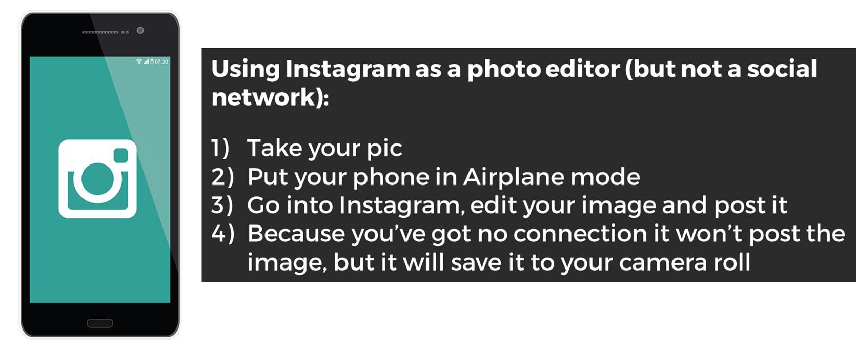
There are two main ways in which, when we give talks or run teaching sessions and workshops, we don't adhere to this principle. Clearly no one ever strays entirely into the blue circle (giving a talk about a subject which matters to your audience, but which you no absolutely nothing about, is pretty much impossible) but we can easily spend too much time in the orange circle where it doesn't overlap, or just not make the most of the overlapping section of the diagram.

NB: I very deliberately use the phrase 'what matters to your audience' above - rather than 'what interests them', because I'm not advocating taking a superficial approach and only telling your community about cool stuff they already care about. We can tell them things they don't know they need to know! Sometimes they wouldn't choose to hear it in advance, but they thank us afterwards. So it's very much what matters to them, whether they realise it before the session or not.

There's no excuse for telling an audience things which don't matter at all - unless it's a small part of your presentation, to serve a particular purpose.

Telling people everything we know

I don't wish to generalise but a lot of times Librarians give out too much information, particularly early on in a relationship between the institution and the user. Induction or Welcome talks often contain vast swathes of detail, or a talk at a conference will include ALL the info about a particular project - and often this can actually get in the way of the message. After a while the audience gets overwhelmed and starts to filter, or just switch off. We can only retain so much new information at one time.

So when crafting a talk or presentation, the starting point should not be 'What do I know about this subject?' but specifically what do the audience want to know about this subject, that I can tell them?

Missing out on the over-lap

There's a second, more subtle, factor here. The over-lap of what matters to your audience and what you know about can also include things which aren't part of your core message. In other words, you can establish your credibility with your audience by telling them things which matter to them, and THEN telling about the library's relevance to them - they're more inclined to take you seriously if you aren't just advocating for your own service or value. I use this a lot in infolit teaching - I'll tell the students about internet privacy, different search engines, how to use social media in an academic context etc, as well as telling them about what the library does and how to use databases effectively. Because it's in the overlap of the diagram above - I know about this stuff, and it matters to my audience. What's really interesting is when I started doing this *rather than just talking about the library) the feedback, both the scores and the qualitative feedback, went up hugely; they really liked the sessions. But when they're asked to rate the most useful part of the session, the vast majority mention the bits about the library!

As long as it doesn't conflict with our ethics and values, libraries can provide both services and expertise based on what our users need - it doesn't have to be a 'library' function in the traditional sense.

So: create presentations and teaching from the audience's point of view first, working back to what you know about what matters to them, rather than the other way around. It's only a small shift but it makes a huge difference.