Creating images with copy-space for text

This post originally appeared on the Lib-Innovation blog.

As always things have changed in my library over the summer, and we needed some new images to reflect our reconfigured rooms, new signage and new services. We're very fortunate to have easy access to the University photographer Paul Sheilds, who is based in our Morrell Library building, so we booked a morning with him.

We had very specific needs in mind, based on a list we'd drawn up to suit what I wanted for our Induction Project, what my Academic Liaison colleague David Brown wanted for the new LibGuides and what the Comms Team needed. In particular I was really keen to get photos with copy-space.

Copy-space literally means a space to write 'copy' in the newspaper meaning of the word - in other words an area of the image which is less busy and which could be written upon without obscuring a key part of the picture.

In essence I wanted to be able to write directly onto the images (for use in slides, posters, digital screens and social media) without having either a separate area for text, or a back-filled text box - because I think it looks smarter that way and because it allows the images to be full screen at all times. It's a lot easier to do this when the images are captured with that in mind from the outset.

Here are some examples - these are works-in-progress that I'm playing around with for the forthcoming #UoYTips Induction campaign for 2016/17 at my institution. They won't look exactly like this in the final versions but the copy-text principle will remain.

We have borrowable laptops which I wanted to showcase. I've added a piece of text to the copy-space:

Here's an example of an image of the same lockers which is a great pic but which doesn't have copy-space built in (making it a little less flexible to work with in marketing):

It would be possible to write on this of course, but you'd need to manipulate the image to ensure the text was legible, or used a back-filled text box.

Next up is a picture of the copy-print-scan machines - the copy-space in this case being the underside of the lid. I did experiment with having the text at an angle to match it but it looked a little clunky so I went with good old fashioned horizontal text for this one...

Here's a picture of a student - by not putting her centre of the frame (and by conforming to the rule of thirds) we've made space for the text.

Finally here's an example where despite leaving copy-space the background is too busy to write directly onto - the text wouldn't be clear enough. There's a neat divide where the wall ends, so I've inserted a shape over everything to the left of the wall, to make the copy-space more clearly defined. I did this in PowerPoint - inserting the rectangle, filling it black, then making the fill 19% transparent. The white text is clearly visible against it, and the focus of the image (the walls you can write on) is still clear and uncluttered.

Type Genius: the joys of font-pairing

I'm a little bit obsessed with nice fonts - I love how they can impact on design and help tell your story. An aspect of design which is often undervalued is the combinations of fonts: pairing up fonts (or sometimes mixing groups of three fonts, ideally not more than three in one design) for posters, or social media campaigns, or PowerPoint presentations.

I've just found a great site called Type Genius that helps out with choosing fonts, more on which below.

Here are four font combinations I like, three of which I've used, and all the fonts for which can be downloaded individually from Fontsquirrel:

BEBAS NUEUE AND MONTSERRAT

The first combination is what is used for the blog and much of the rest of site. The blog title is Bebas Nueue and the body text is Monstserrat. (Whenever I use Heading 2 in the formatting that's also Montserrat, but in all-caps - the Heading 3 used in this post os back to Bebas Nueue again). I chose them mainly because when I rejigged the design of the site recently I wanted a thicker body text font, so chose Montserrat which I've been using since I saw Matthew Reidsma use it for his UXLibs I keynote. Bebas compliments it for titles because it a tall and narrow font in contrast with Montserrat being thick and more rounded.

LATO AND ROBOTO SLAB

The second combination I've not used at the time of writing, but got from Type Genius - which you can find at typegenius.com. You tell it what font you want to use, and it gives you a number of potential companions to pair with it (as it happens when you put in Montserrat it suggests Bebas Nueue, as used on this site).

In the case of Lato and Roboto Slab, I've actually not used the Regular Lato in the example above at all - I used Lato Thin for the first part and Lato Heavy for 'titles'. I do like the contrast of light and heavy.

RALEWAY AND... RALEWAY

Which brings us to the third combination, which isn't technically a pair as it's just Raleway used in three different ways. I love Raleway beyond all other fonts. As long as you have both Raleway Regular and Raleway Bold installed (although PowerPoint will try and Bold non-standard fonts when you highlight them and click the Bold button, it's not the same as actually installing the Bold version that the typographers intended) they work so beautifully together, especially in all caps. The intro to UX presentation I blogged about recently used Raleway in all possible combinations (Regular and Bold in both lower and upper case) with no other fonts involved:

The other joy of Raleway is it renders perfectly on Slideshare. Some other fonts, even when you save and upload your presentations as a PDF, go a bit blocky on Slideshare, for example my LIANZA Marketing Manifesto slides, which use Raleway along with ChunkFive Roman - the latter looked great at the conference but not so good on Slideshare, but Raleway was perfect in both situations.

MATHLETE BULKY AND CAVIAR DREAMS

I used this combination for my Tuning Out The White Noise presentation which became the most popular thing I've ever put on Slideshare (despite Mathlete Bulky not rendering properely on the site) and I use it in some of my training materials, so I've become slightly bored with it due to over-exposure! I also over-used Mathlete and have since changed it round so it gets much less use in my slides, because it's a little too quirky for any kind of long-term reading. I like the way it looks but usability has to come first.

Further reading

For more info and guidance on font-pairing, check out this article from CreativeBloq, and Canva's Ultimate Guide to font-pairing.

If you have a particular pairing you'd recommend I'd love to hear it in a comment below.

4 questions to ask to help you simplify your comms

Simplification is often useful to raise engagement with an audience. Not always, but often.

It's not about dumbing down, or making things superficial, or losing the nuance. The aim is simply to take away anything that isn't essential for the message. Get rid of the extraneous. Be brutal. It's like tuning out the white noise so you're left with a perfect signal; there's less to distract your audience, and a greater chance they'll understand the message and respond do it. Everyone is overwhelmed with information so anything to cut through that and make it easier for your audience is worth doing.

There is a check list of four questions you can ask yourself (in descending order or severity!) which can help to simplify your comms and your key marketing messages. I do this all the time in my day-job and I absolutely guarentee it makes a difference in the level of engagement I get from my audience.

1) Do we need to send this at all?

If we over-saturate our audience then our communications begin to loose value over time. So we have to be careful to only communicate when we have enough of important to that particular audience. The first way to simplify, then, is the most extreme: do I really need to send this? Most of the time the answer is yes, but occasionally opportunities to hold back arise, and those opportunities need to be taken.

Think of it from your audience's point of view. Would you want this if you were them?

2) Can we get rid of anything extraneous?

Again, it's not about making it TOO short. It's not about superficiality. It's about making it as short as possible whilst maintaining the meaning and the nuance of the message. Every sentance or element should be scrutinised - if it doesn't NEED to be there, get rid of it.

Some elements of your message can be present for the user at the next stage, rather than this initial contact - so for example, if the comms is to ask users to go to a website, some of the key information can be on the website without needing to also be included in the comms themselves.

For the user, a long message is a) more likely to make them not even read / watch at all, b) more likely to make them stop reading / watching before the end and c) make them less likely to retain the key information in their head afterwards.

3) Can we cascade this over more than one message?

Sometimes once you've got rid of what's extraneous you're still left with a LOT. To cut it further would be to leave out essential information. From a marketing point of view, it can be worth marketing one big thing at a time rather than trying to market everything at once - allowing your audience a chance to lock in on one key theme at a time, reducing the risk of getting lost in the detail. This is risky, because it can lead to over-communication (which goes against the first principle above) so you have to make a judgement call. But with something like academic induction, for example, telling everyone everything simply doesn't work. We KNOW people can't remember all that. So in that scenario it can be worth trying to cascasde one large message into two or three smaller ones.

4) Can the language be made clearer?

So you've done 1 - 3: yes it's essential and needs to go out; it's as short as it can be without losing nuance; it needs to be just one message. So can anything be done with the language and tone to make it clear and simple to follow? Can it be less formal without losing credibility? Is there any obscure terminology that your users won't all be familiar with? Are there acronyms that need replacing or explaining?

You can't always simplify comms, and it's not always desirable to do so. But if you ask yourself these four questions before disseminating key messages, the chances are you'll get a higher level of engagement from your audience.


BONUS QUESTION: Can we segment our audience?

Segmentation is too complex to get into detail here, but the basic principle is to divide your audience up into smaller groups and tailor the communication to each one. This often presents opportunities for simplification, because you're not having to include all of the information all of the time - you can pick and choose the parts that matter most to each segment.

What is UX and how can it help your organisation?

User Experience - UX - is still relatively new to libraries. I've been writing about it a lot on here of late: there's now been 4 posts in the Embedding Ethnography series about what we're doing at York.

I thought it would be useful take a step back and create a slide-deck to introduce UX - ethngraphy and design - in this context. Here it is:

One of the most popular pages on this site is the Structured Introduction to UX and Ethnography and I wanted something to go on there, and also for a new blog from the University of York.

Introducing Lib-Innovation

The Lib-Innovation blog is an attempt to capture some of the more creative stuff we do at York, and especially as a channel to disseminate ideas and results around our UX activities.  I'm reposting my own articles from Lib-Innovation on here, but not those written by my colleagues: if you're interested in the results of the UX studies I've written about on here so far, the Head of Relationship Management at York, Michelle Blake, has written about the projects on Lib-Innovation. What we learned what absolutely fascinating and we've already started to make the changes to help both students and staff.

More on UX

Here is a (continually updated) list of the latest posts on this blog that feature User Experience in some way.

A second UX Intern writes... Oliver Ramirez on User Experience

This post originally appeared on the Lib-Innovation blog.

This is another guest post in the Embedding Ethnography series - click to see all four so far - this time written by Oliver Ramirez. He completed some hugely detailed work for us at the start of 2016, and these are his reflections on the whole process.

Oliver is now based in London and enjoyed UX work so much he wants to pursue it further, perhaps with another internship - if you're reading this and you are potentially interested in having him come and work with you, send me an email and I'll put you in touch!


My UX research internship: More than ticking boxes

I was interested in seeing how my user experience knowledge from my Computer Science degree could apply to physical services. So, when I was offered the chance to conduct a UX research project for the library team at the University of York, I took my chance to see how library UX works.

The motivations behind the project were straightforward; among postgraduate research students (PGRs), there was a large disparity in satisfaction scores when it came to certain areas of research life. In conducting the project, I was to identify the reasons for this.

For this, the UX research approach made sense. I was to report on how PGRs conducted research, in particular their habits and reasons behind study space choices and resource choices, their interactions with others during research, and their use of study services. Through this, I would identify the pain points for less happy demographics, try to understand what worked for happier demographics, and suggest ways to try and bridge the gaps between those experiences.

As part of this research, I ran 1 on 1 sessions with PGRs across different departments. The team also gave me a couple of UX techniques to test out, so as well as a “non-directed interview”, I ran Cognitive Mapping and Love & Break Up Letter exercises with each participant.

Cognitive Mapping

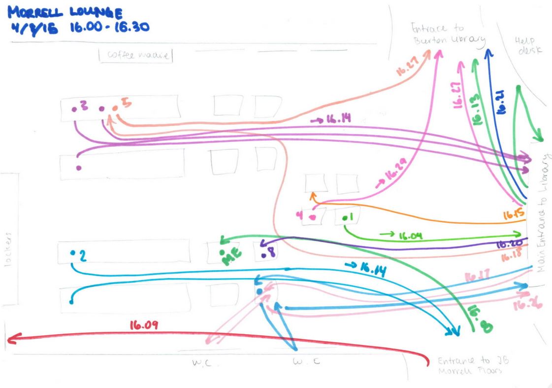
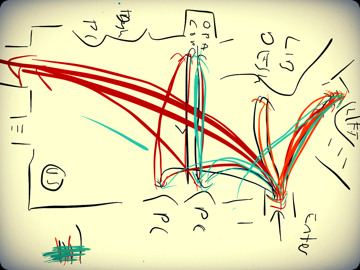
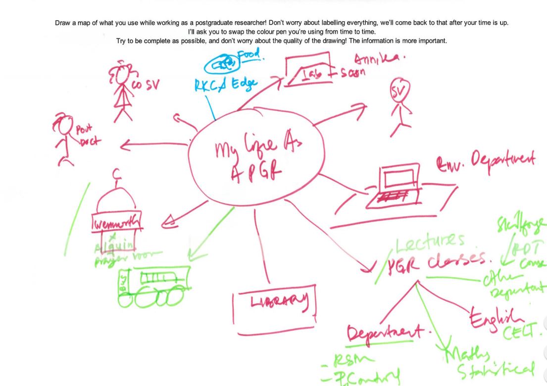
The first exercise that I ran with participants was cognitive mapping. Participants were asked to draw a “map” of the things that they interacted with while conducting research (limited to the areas I outlined earlier), mostly adopting the methodology outlined by Donna Lanclos. I say “map” because, in reality, few participants drew anything resembling a conventional map – participants mostly favoured writing down concepts (for example, ‘their office’) and linking those to other related concepts (‘their office’ may be near their ‘supervisor’).

A Cognitive Map from the PGRUX Project

A Cognitive Map from the PGRUX Project

It was a great way of getting the participants to think about the areas I would end up interviewing them on, and the temporal and relational information captured in the map made it easier to pick up on each participant’s thoughts. One good example of this is how a participant placed importance on their desk: they drew it as their map’s central element early on, and branched everything off of that central element. This was reflected in their interview, where they emphasised the importance of that desk to them.

“Non-directed interviews”

Using the participant’s cognitive map as a ‘guide’, I would then conduct a non-directed interview. This involved taking an almost passive, neutral stance in everything I asked about, primarily allowing the concepts brought up on the participant’s map to direct the conversation – then, after those points had been exhausted, I would consult my own discussion guide to cover the rest of the areas of interest.

Conducting the interview in this way was initially difficult for me – it was sometimes hard to probe without being ‘aggressive’ (asking weighted questions or changing the topic), and I sometimes struggled to facilitate the conversation without suggesting topics to talk about.

There was immense value from conducting the session in this way, however. By focusing the interview on the topics participants brought up, gathered information more closely reflected the participant’s “perspective” – their habits, their opinions and their choices, mostly on what they were aware of in the discussed areas. Gathering the information in this way allowed for me to more effectively deliver insight on issues of awareness.

Love/Break Up Letters

Finally, participants were asked to write a ‘love’ or ‘break up’ letter. By asking participants to address this letter to a personified IT or library service, we hoped to draw out the emotions of participants towards those services, and easily establish positive/pain points.

My participants seemed to be very polarised by the exercise; people either really got into it, or they really didn’t. Upon reflection, the abstract nature of the exercise may have made some participants uncomfortable, especially knowing that their letters would be scrutinised. However, while I feel that while this technique didn’t work in a 1 on 1 session, there is merit to trying it out in a pop-up-desk context, or a ‘prize raffle’ format – this would allow for many responses, and for the easy identification of pain points across services.

All in all, I felt that the techniques allowed me to attain some real insight into PGRs, and despite the initial nerves, I really enjoyed conducting these sessions with participants. But while I’m singing the praises of these techniques now, back before I started my internship, my mentality for designing around users (or stakeholders in general) was one of appeasement – design a website that does what stakeholders need it to do, and fix any issues preventing its smooth use. A real ‘checklist’ oriented approach. Historically, I had followed this approach in my degree through a type of observation called ‘usability testing’, where I noted any issues users had when doing tasks that I had set.

So, heading into this internship, I had expected to do just that: more observation, make a list of issues to fix, and suggest some solutions - tick those boxes off, one by one, on the way to a “good UX”. But, throughout my internship, I realised this approach just yields a ‘passable’ user experience – you end up with something that works, but not necessarily something that’s good.

Example of Findings: Lonely Researchers

For example, one of my participants told me something that really struck me: they said that when they were based at a general desk, that they felt disconnected from their department. It was always possible to contact or visit their supervisors, or use the department testing rooms, or go out of their way to interact with their peers, but not being based alongside all of that meant that they felt ‘distant’ with their department. This changed when they were offered a desk inside their department. Besides improvements on all of those fronts, they reported feeling ‘valued’ as a member of the university because of it.

The importance of ‘department community’ - being alongside your researcher peers and supervisor so that interaction is readily possible – was prominent in my discussion with some participants. During my research, I found that while non-department PGR study spaces covered various noise levels (something participants valued), those spaces did not facilitate this kind of ‘natural interaction’ that only happens when PGRs and supervisors are all based together – and so PGRs based outside their department missed out on this.

My approach of “observation to find issues, fix issues” would not have yielded this type of insight – I would have thought along the lines of “they don’t really like the silence in this building”, suggested to change the noise level policy and called it a day. It wouldn’t have made much headway in creating a better UX for the people based outside their departments.

But, it finally dawned on me during my time with the library team at York: good UX necessitates understanding what your user values, what is important to them, and actively working with that in mind. Which worked out for me, in the end: UX is a more satisfying when it isn’t just making something that works and ticking boxes.


Header pic of the University by Paul Shields, used by permission.