A Beginner's Guide to Instagram Reels, Stories, & the Grid: what to post where

Instagram is a fun place to market a cultural org, but it’s also a complicated space in which to work. It has so many layers and ways to post, and to a certain extent they all work together - which just makes it even more confusing to people trying to get the most out of the platform! It all makes Twitter seem very straightforward by comparison.

It is worth trying to do Instagram well, however. It’s worth taking the time to familiarise yourself with what each facet of it does, and then craft content for your audiences.

Before we go into the details, let’s look at how an Instagram account is displayed to its audience.

Screenshot @NYPL on Instagram, overlayed with contextual info. PROFILE PIC. It’s worth keeping this consistent. People tap it to view your Stories. THE GRID. The photos and videos people see when they view your profile.

(Click the pic to open a larger version in a new window)

So, what do you post, and where should it go? At the time of writing, there are four ways to post Instagram content.

The Grid

The Grid is the bread-and-butter, the ‘main’ posts you put on your Instagram account. It can be photos or videos. It’s what people see when they click on your profile. You might post a few times a week to the Grid, even if you post more often to Stories.

In the library world, it’s photos of interesting things that do well here, rather than incredible photography per se. A perfect shot of a book, taken on an expensive camera, will reach fewer people than a nice picture of your library’s interior taken on your phone.

Remember: pictures of Words do not work! Shots of library interiors seem to do really well, as to shots of library exteriorsArchive photography is always popular. It’s worth noting that not all your posts have to be about your library: images of the geographic location you’re in are often popular, as in this Liverpool Uni Library example.

Shots of objects from Special Collections often get engagement, like this one from the BL.

Stories

Stories are 15 second videos (or a longer video broken into 15s chunks) or a 7 second-long still. They’re orientated as portrait rather than landscape or square. because they’re only really intended to be viewed on phones. They can have music and gifs and animations and - crucially - links, added to them, natively in Instagram. They do NOT appear on your grid; they’re found when people click your profile pic. They disappear after 24 hours - but they can be pinned in themes to be found later by the more curious among your followers. And the more you use them well, the more your account will grow and the greater your engagement will be with your audience… Got all that? Just in case anyone is still scratching their head, the next post in the Instagram Mini Series will be All About Stories in more detail.

Reels

Reels are a brilliant opportunity for all of us. There’s a whole post on Reels coming up, but in essence they are portrait videos, maximum 90 seconds long, and massively favoured by the algorithm. They’re shared waaaay more widely than any other type of Instagram post - the reach will be several times that of a regular video or image. (Confusingly, Reels also appear on your Grid unless you disable this, but let’s not dwell on that now!)

Here’s the kind of content that seems to suit Reels well - firstly the Book Sorter POV video which I made by literally blutacking a GoPro to a book! It’s not serious, it’s a bit silly, but it’s also introducing people to the Book Return machine by stealth…

Music is important in Reels, so the second video with shots of the library cut to fit with the music behind it, is a type that can work well.

Instagram TV

Instagram TV is almost not worth worrying about at all. It use to be IGTV and was the home of any videos longer than 1 minute. It didn’t really work, no one watched it, so they rebranded it to Instagram TV at the end of 2021 and now all your videos go there, regardless of length - except Reels. It’s really little more than filter now - people can click on the relevant tab on your profile and see all your videos (except your Reels!) in one place - but they can find them all on your Grid anyway. The thing about regular videos - rather than Reels - is that they simply do not get seen. Instagram doesn’t share them. So even brilliant videos won’t find an audience.

The tl;dr is, focus your energies on the Grid, Reels, and Stories.


This is Part 6 in the Instagram Series. Read Parts 1 - 5 if you’re interested.

Everyone is posting pictures of words to Instagram... and nobody should

Part 5 in the Instagram Series. Read Parts 1 - 4 are here. If you want. No pressure.

If there’s one social media rule that is universal across platforms, industries and sectors, it’s this:

Learn what your audience likes, and do more of it.

The other side of this coin is, of course, to do less of what your audience doesn’t engage with. It’s incredibly easy to follow these maxims; you don’t need pay for any tools or be an analytics guru. Just click on your posts and compare their views / reach / impressions and you’ll quickly learn what works for your community, and what doesn’t.

With that in mind, cultural orgs please, please, please:

Stop posting pictures of words to instagram

I see it happening all the time and it never gets engagement - which means, essentially, almost no one sees the message. You know the sort of thing - photos of book covers, or motivational quotes, or graphics, or photos of signs, or ‘resource of the week’ posters. And in every single case, there’s a massive drop in Likes compared to when they post ‘captured’ images (rather than created ones) of buildings, or spaces, or interesting objects.

If you visit any Instagram profile on a PC (rather than on your phone) you can hover over a post to see how many Likes it has so you can see for yourselves. Go to literally any library, HE or museum Insta account and do some hovering. A new account still finding its feet might get 20 Likes for a picture of a building, but only 4 Likes for a Picture of Words. A really, really successful account with a big following might get 200 Likes for a Picture of Words! But hover over the captured picture of the interior of their building next to it, and you’ll see that has 780 Likes. It’s the same everywhere.

Why does it matter?

In short: if you want a message seen, it needs engagement from your followers because Likes equal Reach.

Instagram is not as straightforward as Twitter. If you follow me on Twitter and I post at 1pm and you’re online at 1pm, you’ll see my post. Instagram is a lot fuzzier, and will not just show your posts to your followers in a simple way - the more people engage initially, the more of your followers will see it.

Likes, Comments and Shares are vital as the more you get, the more people Instagram’s algorithm will show your post to. A really important message about the library closing early simply won’t reach anyone if it’s just a screenshot of the words ‘the library is closing early today’ because no one will hit Like. So no one knows you’re closed early!

Have a look at this comparison from my library’s Insta account. This isn’t quite a full ‘pictures of words’ because we don’t post any, but it’s an example of an unsuitable picture for Instagram and shows you the impact engagement has on reach. For various reasons that I won’t bore you with now, I posted a picture of a case that I absolutely knew wouldn’t get much engagement. It’s a great photo but it’s not OF the kinds of things our audience respond best to, so as a result it got a very low number of Likes. Next to it is a more regular post, of our buildings looking dramatic at night, which got many more Likes.

A briefcase pic with 15 Likes and reaching 392 accounts. A building pic with 95 Likes, reaching 834 accounts.

The heart symbol represents Likes, the Quote symbol is Comments, the Arrow symbol represents people Forwarding the post, and the Bookmark symbol is people saving the post to their Favourites.

The key thing to look at is of course Accounts reached: 392 for the case, and 834 - over twice as many - for the building. So it’s not just a bit of a shame we didn’t get more Likes for the briefcase post; it’s ineffective communication that is only getting to a fraction of the target audience.

We all have key messages. We all have things which we need our audiences to hear. Not all of them have suitable visual metaphors. So how do you get those messages out?

Use Stories Instead

Option 1 is to take the words and put then into a Story.

Words work fine in Stories, people expect them. Especially anything time-sensitive, pertaining to events that day - just use a Story to spread the news.

The more you use Stories (for the kinds of things you might use a tweet for) the more your audience comes to expect you to use them and looks out for them.

When we ask our students how they get updates from the Library, every single undergraduate - every one - says Instagram Stories.

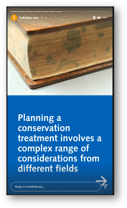
Screenshot: planning a conservation treatment involves a complex range of considerations

Here the BL are using several Stories in a row for a larger narrative - most users are happy to tap through a few Stories in a row if your message is too long to fit in one screen

Remember Stories can have URLs in, unlike Grid posts - so you can post a few words and a link to more information

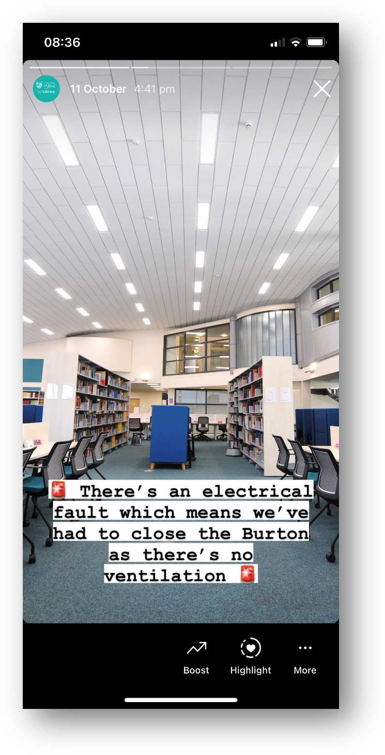
Screenshot of a Story - picture of a library interior, with 'there's an electrical fault so we've had to close the library' written across it

A classic Not That Interesting But Still Important post, which wouldn’t work on the Grid but is perfect for Stories

Use the caption

Option 2 is simply to pair the message with a good picture and more people will see it. Obivously Instagram is a visual medium but you can use the caption for detailed info if the situation warrants it - just phrase it in an engaging way!

Does the picture have to match the news in the caption? No it doesn’t. It’s better if it does, but it’s not essential - what’s essential is choosing a pic people will Like, so more people get the news you need them to hear.

Here’s an example from my library of using a pic for reach, but the caption to deliver important messaging. I was so pleased with this picture when I took it - the colours were just good that day with the bright sun and blue skies and green grass - that I didn’t post it right away, I saved it for exactly this kind of situation where we needed Reach.

Post multiple images, and keep the words of the ‘front cover’…

Option 3 is to get creative by smuggling Pictures Of Words in as part of a post with multiple images. Here’s an example of this - I took a nice picture of the library in the sun, and then used multiple further pictures with words on, and the caption, to tell the audience the info I needed them to know. It got lots of Likes and so lots of people saw it - which absolutely would not have been the case if I’d just posted the Zones-related graphics.

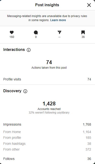
Here are the Insights for that picture. As you can see the accounts reached figure is higher than the previous examples - 1,428 - because of the higher levels of engagement. It’s not just the 160 Likes, it’s the fact that 36 people Bookmarked it, 74 people visited our profile after viewing the picture.

You can also see that 32% of the views were from people who weren’t following us, and that 36 people followed us directly as a result of seeing this post - so Reach helps you find users who didn’t yet know you were on Instagram, as well as ensuring as many existing followers see key messages as possible…

Insights, showing 1,428 accounts reached, 160 Likes, 36 Saves, 36 new follows

I really hope I’ve convinced you not to post ‘created’ images or pictures of words from now on! If you’ve been doing so up till now don’t feel bad, because EVERYONE does it. But do yourself a favour, reach more people, and do more of what your audience likes.


I’ve run a lot of in-house workshops for various cultural organisations, in which I audit their social media and come up with recommendations, working with staff on what they feel comfortable implementing. If you’d like to discuss social media training, get in touch!

Social Media Manifesto video

Following on from my talk at #VALA2022 in Melbourne, the organisers have kindly made the video available. Apart from the fact that the kitchen / slides synergy is even more pronounced than I’d feared it was, I’m happy that I don’t seem too asleep for the hour (12:15am, UK time…)!

My hope with this talk was that it would be cross-platform (the ideas in the manifesto will hopefully apply whether you’re a Twitter user, Instagram user, Facebook user etc) and also cross-sector, for public, academic, health, business, special and school libraries all being able to potentially apply these principles.

Thanks for watching!

It's 10 years since The Library Marketing Toolkit was published!

It’s a summer of Tin anniversaries for me - first 10 years of freelancing, and now 10 years since my book, The Library Marketing Toolkit, was launched into the world on this very day in 2012.

Facet Publishing approached me in late 2010 about writing a book on marketing libraries. They were actively seeking to bring more ‘new professionals’ into their author-pool at the time, and I think I was a major beneficiary of that - I wasn’t nearly as qualified to write a book on this subject back then than I am now! Bethan Ruddock also wrote The New Professionals Toolkit over the same sort of time-period, and it was an exciting era for sure.

The timing was actually pretty tricky for me, because another thing that happened in 2010 was my daughter being born. When I was asked about writing the book I initially said ‘I would love to do this but I can’t do it this year’ and whilst Facet were very understanding, they did say that the book would be written by SOMEONE this year and they’d like it be me, but if it would happen without me if I couldn’t do it. So my wife and I talked about it and decided that for the doors it would open, writing a book would be a worthwhile short-term crisis to have… It was, just about, but I wouldn’t recommend having a new baby and a book to write to anyone, because if you’ve got a full-time job as I did then you’re writing at weekends and in the evenings, whilst trying to parent, and that is pretty brutal. Thank you so much to Alice for putting up with all the accommodations necessary to get the book done.

The sales figures

Books about libraries are niche. There are a handful of publishers, most selling books at VERY high prices in order to meet their costs, selling mainly to libraries and sometimes to librarians. The books don’t sell in large numbers; I was told that 300 would be a decent number to sell.

Mine turned out to be one of Facet’s best ever sellers, and the total sales figures after a decade are these: 2118 books sold, of which 1916 are paperbacks and 202 are ebooks. It continues to sell a handful of copies each year.

I took this screenshot when it reached number 1 in the Amazon.co.uk chart (and by chart I mean the super-specialist chart library-related books go into…); I had a similar one when it did the same thing in the US Amazon chart but I can’t find it now. I don’t mind telling you I was unashamedly thrilled about this!

Screenshot the Amazon library management chart, showing The Library Marketing Toolkit at number 1

Is this Windows XP? Either way it’s time-capsule of a screen-shot…

I didn’t keep a regular track on its chart position, but in 2013 it did briefly rise to number 17 in the overall (not just library-related, but all industries) chart for Public Relations, which was exciting…

The Open Access debate: does it harm sales? (Spoiler alert: no.)

One particular detail I find interesting, is what happened when I made chapters available Open Access. When I wrote the book in 2010/11, OA was not something I was aware of at all. Then as I was educated about it by my network on Twitter, I started to pester Facet about letting me make some or all of the Toolkit available Open Access. They were kind enough to let me make four chapters available OA: I know this isn’t the ideal scenario of the whole book but this was a new area to them with their policy still under development, and I really appreciated them being more flexible than saying either ‘no’ or ‘one chapter only’.

Anyway, up until 2015, the Toolkit sales had basically halved each year. It happened like clockwork - around 1,000 sales in the first year, around 500 in the second, around 250 in the third and so on. However, the year after I made the OA chapters available, sales didn’t halve, for the first time ever; in fact they stayed the same as the previous year.

Now, there is definitely correlation there - can we claim causation? Of course we can’t be completely sure - who knows what other factors were at play in book sales over the 12 months - but I see it as fairly compelling evidence that apart from being A Good Thing generally, OA can also lead to more book sales than would have been the case without it.

In addition to this of course, lots more people have read the OA chapters so more people see the work. At the time of writing, the most popular OA chapter from the Toolkit is the Strategic Marketing chapter, which has been downloaded 2,042 times, which is very close to the 2,118 book sales; between them the OA chapters have been downloaded over 4,000 times.

The writing process

Some stuff came very easily as I was writing - all the social media things for example - and other things required a lot more chipping away at to work properly. I showed the chapter on strategy to my friend Andy Priestner because I was really struggling with it. He gave me SUCH useful feedback, especially about the level of ambition the chapter was showing: essentially his point was (and my memory is genuinely abject so sorry if I’m misquoting you here Andy): if you’re going to get people to do strategic marketing, they need to aim higher than you’re suggesting in your chapter: they need to change user behaviour and that’s no small thing. This advice was so important, no just to the book but to my overall approach to marketing, and I still talk about ambition in marketing in the workshops I run today, 11 years later.

I have learned things about the way my brain works over time: one is that I have to get SOMETHING down and then make it good later, rather than trying to write well straight away. Whether it’s a presentation, an article, or even a whole book: some sort of draft - honestly, it can be any old nonsense - is needed before I can make sense of ideas and organise them. I then rewrite the rubbish draft, and then refine, refine, refine. So in I finished a draft and sent it off to Facet in December 2011, not in the hope that they’d like it but in order to have finished part 1 of the process - writing something down - so I could get on with part 2, writing something good.

At this point I started making major revisions, literally ditching entire chapters and restructuring whole sections of the book, and in the meantime Facet sent the 1st draft to Antony Brewerton, I think at my suggestion because I really admired his thoughts on libraries. He came back with a review of it, and quite honestly it was BRUTAL. There was nothing unkind about it and he was very encouraging, but he pointed some flaws I was all too aware of and it was savage to read it.

I just found it and reread it, 10 and a half years later, and it was still painful: my skin went hot and I think I probably went red, sat here at my PC in 2022 - it was so spot on as to the problems with the book. As well as pointing out stuff I already knew was a problem, he also had a huge number of constructive suggestions and drew attention to lots of things I didn’t know were problematic until he pointed them out.

In short, it was exactly what I needed. Some things I couldn’t change (Antony wanted to see more evidence of marketing campaigns I’d run, but at that stage I simply hadn’t led any!) but all the things I could change I did. In early 2012 between January 25 and February 20 I rewrote the book into the version that exists today.

If by any chance you’ve read the book and found it useful, thank Andy and Antony if you see them!

The publishing process

The publishing process itself was surprisingly painless. An early conversation with the publisher was about writing style - could I write in my own voice? The answer came back yes, very much so. I think this the only way I could have got through it, because I dislike academic writing intensely. The amount of great ideas that haven’t had the traction they should have in librarianship, because their authors have used the construct of academic writing to communicate, drives me mad.

Facet worked with me on the process of working out exactly what the book should be and the kinds of chapters it should contain. They were happy for me to either write it all or edit a volume of contributed chapters; I wanted a halfway house with case studies, which they were fine with. We agreed the deadline and wordcount, they supplied me with a style guide, and then largely left me to get on with it, rather than constantly checking on progress, which I hugely appreciated. They were really supportive when I needed support (especially Sarah Busby, the commissioning editor at the time), but didn’t micromanage anything.

I opted to pay for an indexer rather than to do the indexing myself - a decision I would highly recommend! They’re really good at it and by that stage of the process you are completely sick of your own work… It’s worth noting that while a publisher will do some marketing of your book, it’s really on you. If you want to sell copies, you need to put the work in to market it. So I set up a website for mine, I made a Slideshare presentation about it, it had its own twitter account. I really went for it, and that’s what you have to do to raise awareness and shift copies.

There were some great reviews, and the ones I loved were the ones which really got where I was coming from - not just telling people how to market their library, but trying to reassure them that they could. One review in the Australian Library Journal ended like this and really made my week:

“The whole book has a reassuring and inspiring tone: ideas and approaches outlined in the book appear absolutely achievable and commonsensical. I suggest that you buy, borrow or beg a copy today.”

The case studies

To be absolutely frank, there’s not a lot of my own writing in the book which I fully stand by now. It’s not that I disagree with past me, it’s that I’ve learned so much since that’s superseded what I wrote.

However what really holds up a decade later is the case studies. I could not believe the people who said yes to writing for my book! I am still honoured they did, and they wrote REALLY great stuff. Thank you so much to everyone who contributed to this! They all did so for free (I actually negotiated my own royalties down in order to get them each a free copy of the book as payment) and I’m hugely grateful.

The follow-up…

I’ve been asked more than once to write a sequel to the book, and I have not done so. This is mainly because it was a huge amount of work, a sort of once-in-a-lifetime level of commitment.

I haven’t ruled out self-publishing a book though: the attraction would be I could sell it waaay cheaper, I could publish it on the timeline of my choosing, and make it the length I wanted rather than needing to achieve any sort of target. So if I ever write a follow-up, I’ll let you know.

If you’ve bought the Toolkit for yourself or your library, or read any of the OA chapters, then thank you! I hope it was useful.

A library social media manifesto

Last night at quarter-past-midnight, I sat in my kitchen and was live-streamed into a #VALA2022 conference room in Melbourne. The hybrid thing worked really well, more on which below, but first things first, here are my slides.

The presentation

A library social media manifesto

When I was invited to present on the topic of social media I wasn’t initially sure how to frame it. I talk about social media in workshops all the time but that’s a different thing, really - 3 hours instead of 30 minutes, hands-on rather than a talk, and normally quite focused so for example just covering one tool or approach. In the end I submitted an abstract I was not quite happy with, and then about a month later was struck by the ‘manifesto’ framing for the info and asked the organisers if I could change my plans! They kindly said yes, updated the website etc, and so the slides above are the product of all that.

I’ve tried to create something universal, so whether you work in public, academic, health, school, law or business libraries this should apply equally. I’ve also tried to create something that will help libraries feel refreshed and re-energised - some people I’ve spoken to have talked about a bit of a lull in their social media progress, after making some real progress a year or so into the pandemic… Anyway, check out the slides and see if the ideas help you. The video of the talk will be available in due course.

I absolutely love, love, love this sketch-note of my talk from Kim Williams. It captures all the key points and works as a companion piece to the slides above. Thank you Kim!

The hybrid experience

I realised on the afternoon of the presentation that my slide theme of slate grey and yellow matched my kitchen… What hadn’t twigged at that point was that I’d be presenting in that same kitchen! (The main ‘home office’ space is in our bedroom, in which my wife was asleep due to it being 12:15am, so the kitchen was really the only opion for this.) The people of #VALA2022 must think I’m REALLY serious about slide design and always match it to the room…

A slate grey and yellow kitchen

He’s not wrong…

ANYWAY the hybrid experience worked really well for me, and gave me hope for the future of conferences. I just attended UXLibs in person and, of all the conferences I’ve ever attended, I think that is the least doable online - we absolutely HAVE to be in the space together to make it work. So it’s a stark choice of, either have it in person or don’t have it at all. But for most conferences, hybrid can work well and VALA2022 is a great example of that.

I was on Zoom, and both my webcam and my slides appeared on the big screen in the room in Melbourne. I could also see and hear the room audience through Zoom, which makes a huge difference to how connected I felt - when I said I was drinking gin while presenting for the first time, and heard people laugh, I settled in right away.

The other key thing to all this was the conference app. People could ask questions the whole time on the app, whether they were watching online or in the room. I had these up on my second screen and responded to them in real time, which I really enjoy. Interactivity all the way through is always my preference over ‘questions at the end’.

Anyway, I had a great time, people said nice things on twitter so I’m assuming it worked well from their end too (much as I would have LOVED to be there - libraries of Australia, please invite me back over to your wonderful country! Running marketing workshops a few years back in Sydney, Brisbane and Melbourne was on of the best things I’ve ever done professionally). If you’re thinking of running a hybrid conference, talk to the VALA2022 people, they know what they’re doing!

(And if you’re wondering why hybrid is necessary, read Fobazi Ettarh’s post on the subject, and have a look at the Twitter conversation it sparked.)

Thanks to VALA for inviting me, thanks especially to Sam Gibbard, thanks to the organisers for letting me change my talk details and also for recording the session, and thanks SO much to the audience who came along - making your way early to the earliest session of Day 3 no less, and knowing it was a streamed presentation: I appreciate you!