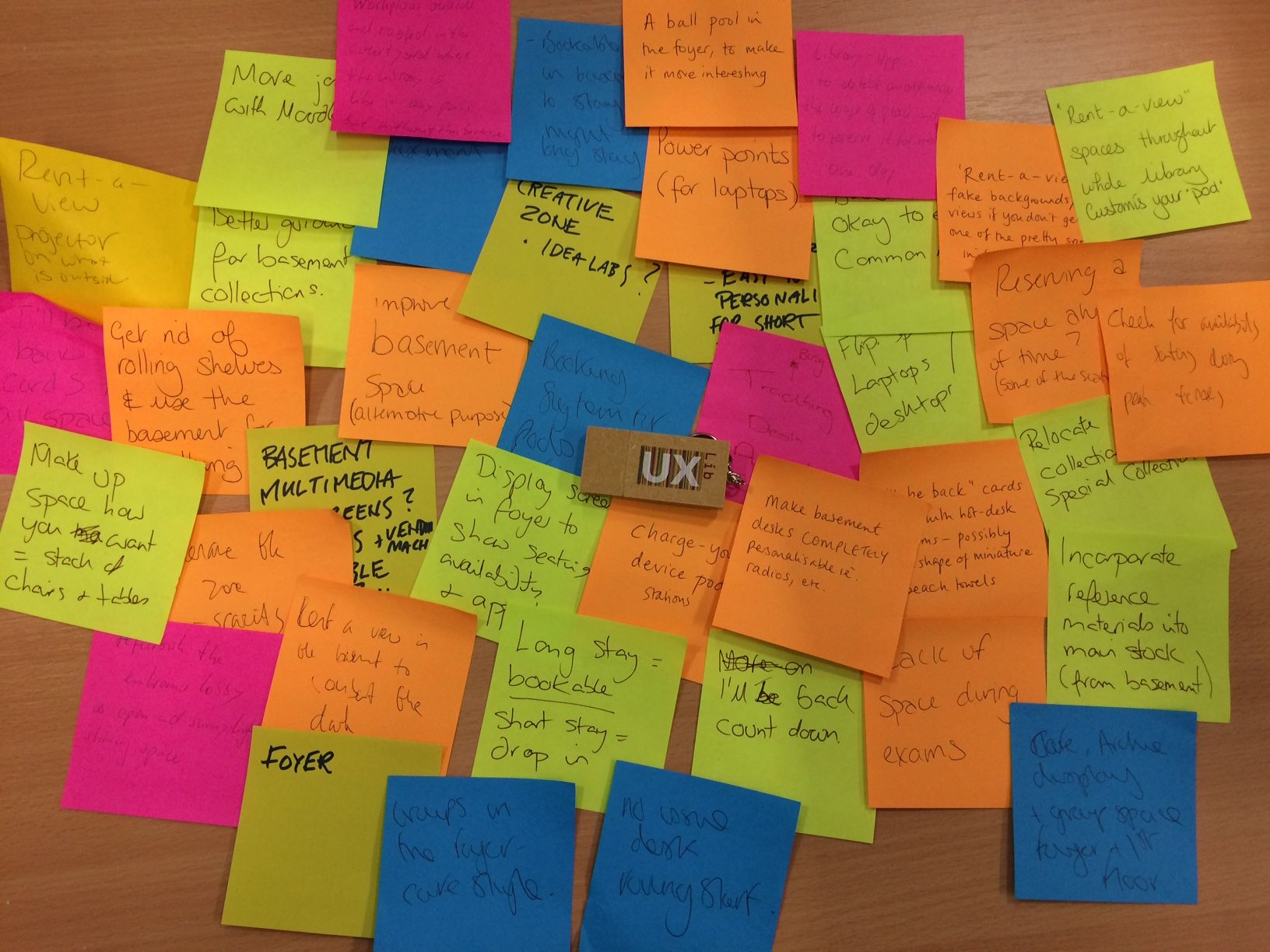
It looks nice, I think. It's certainly good as a video. But there was a fundamental problem with what we were then doing for the pitch at the conference.
After our pitch in the heats, on the way back to the main hall for the pitch Final, lots of people said nice things. Some people said we'd've got there vote, if they'd've had one. All of them asked about the tool, and how we made the presentation. It was generally agreed that VideoScribe was pretty brilliant.
Not one of them mentioned our concept.
(Ugh, I thought the above was important enough to need its own line. But I can't write single sentence paragraphs without feeling like Dan Brown. Still. At least I'm not writing whole sections in italics.)
I had committed an absolue cardinal sin of presenting: I'd let the tool become the content! I'd let the medium obscure - well, if not obscure the message exactly, certainly not allowed the message the room it needed to breathe. This became brutally clear to me when I watched the 3 finalists doing their pitches. Our pitch had drama and a twist, and a really engaging piece of software at its heart. But their pitches, all presented with nice slides, were all about the concepts and they had the time to explore them properly. I really wanted our presentation to stand-out, and it did, but not for the reasons which really counted in the context of the conference pitching competition...
So, apologies, Space Grey teammates. I'm convinced we could have done a lot more justice to our pretty brilliant concept if we'd just gone with a good old fashioned PowerPoint presentation. It was a good learning experience for me. Although, I have to say, when they announced Blue Steel as the winners of the heat, LeMurph and I did breath a sigh of relief that, after the most exhausting of conferences, we could finally stop, and just sit there and relax for the remainder of our time. But in future I'll be more careful to heed my own advice.
The winning pitch, from Purple Haze, was brilliant. It was great to hear David Jenkins speak - I'd heard he was fantastic at it, and he was. (As was Angus.) David's a natural - his enthusiasm and dynamicism energised me even though I was completely knackered! I'm very glad they won.
If you've watched the video above, I'd be interested to hear what you think of the Responsive Study Space idea. I reckon the basic principles - use ethnographic techniques to identify the dead space in your library, then convert that space into a study area which changes its nature according to where abouts you are in the academic year, based on student need - are pretty sound. The idea is that just as a Responsive Design website takes all the same elements and re-arranges them to be the best fit for the size of screen, Responsive Study Space takes the same elements of the room but maximises number of study spaces at Exam time, collaborative study spaces in term time, provides induction information in October and November, and so on depending on what your ethnography reveals. I really do think it's a good idea!


