user experience

Getting UX Done

It’s here! bit.ly/GettingUXDone.

I’m currently at UXLibs 7, so this is good timing. My colleague Paul Harding and I presented at the last User Experience in Libraries conference, in 2022, and then wrote the paper up as a chapter in the 2023 UXLibs Yearbook, which I’d highly recommend you buy for your library… The link at the top of the page is to an Open Access copy of our chapter in the White Rose repository, and you can see lots of other OA stuff (including previous UXLibs year book pieces) on my Publications page.

Ask not what your organisation can do for UX; ask what UX can do for your organisation.

The title of the chapter refers to our central thesis, that we need to spend less time talking about the concept of UX in our organisations, and more time focusing on the results. Sell by doing. Save the library money and give UX the credit afterwards…

We have lots of tips in there about how to truly embed UX, and a case study about the YorSearch Improvement Project, a UX-led piece of work to usher in the new UI for our catalogue. That particular piece of work had a fairly profound ongoing effect on the way we approach User Experience at York, and the ‘three rounds of five’ approach to the fieldwork (detailed in the article) is one we use all the time, including in the recent Website Improvement Project.

Anyway, have a read of the article and let me know if you have questions or would like to discuss any of it in more detail.


A structured introduction to UX in libraries is a whole page of this website, recently revamped, and it displays posts about UX work we’ve done at York. It also features a new quote from Andy Priestner (UXLibs founder and chair) about what UX really is:

At their core, UX methods are all about making sure that the user is at the centre of what you do. They are about accepting that library services should not be built around staff agendas, convenience, assumptions or gut feelings, but instead around what your users really need and really do. This naturally requires that you regularly connect with, empathise with, involve, and understand your users.

A myriad of UX research techniques are available to explore user activities and needs: attitudinal techniques such as semi-structured interviews, cognitive mapping and photo studies; and behavioural techniques such as observation, behavioural mapping and usability testing. These approaches should always be conducted in balance so you are researching both what people say they do and think they need (attitudinal), and what they actually do and really need (behavioural).

The UX Process begins with user research, continues with data analysis and concludes with the ideation and testing of prototypes. The end result should be investment in more valuable and relevant user-centred services and initiatives, which have been generated from, and tested with, your users.
— Andy Priestner, May 2023

5 more UX insights for library website content

This is the second post of three covering the process of completely rewriting my library’s website from scratch. Here’s part one: 5 UX insights, and here is the new site itself: york.ac.uk/library.

Don’t try and sell the library.

In the prototype version of the site the homepage started with a section called ‘Plan your visit’, with opening times and other details. One student told us ‘It feels like I’m a visitor not a member, or like an Open Day rather than something for current researchers and students. You’re selling the library, rather than making it usable [for the people already here].’ I loved this. Because I was finding the line between ‘information dump’ and ‘promoting the library’ a really hard one to judge, and she told me where I wasn’t getting it right.

In the University context specifically, a lot of the website is external facing rather than inward facing. It’s aimed at potential users rather than existing ones. This means that the way the website is set up and designed to be used, and the language we’re encouraged to employ, is often better suited to external comms too - and we have to be aware of this and resist it, to ensure we’re speaking to OUR audience as they wish to be spoken to. Of course, the audience I’m aiming this website at is external too - but it is primarily internal. So: no more ‘plan your visit’ (but the opening times are still really easy to find!).

anticipate needs, and make it clear you’ve done so.

On the subject of opening times, the banner at the time we did the UX work said ‘the library is open 8am to midnight’. A problem with the previous site is it mentioned opening hours on multiple occasions all over the place, and rarely would we get them all up to date at once when the times changed. In the new version, there’s one banner and it’s mirrored onto the Visit & Study page - so we only edit in one place for the whole site. Much better.

The UX took place just before Easter, and I was planning to change the banner during Easter itself to say ‘the library is open as usual over Easter’ but students wanted this info to be present already. They said we can see the opening times now but what about the bank holiday? So now, our opening times banner tries to anticipate and answer follow-up questions - so for example right now it says ‘The Library is currently open 24/7 until midnight 3 June.’

No one knows what ‘Collections’ means.

We have changed our Collections pages to Featured Collections pages because people didn’t know the difference between the significant books or groups of books that we wanted to make a song and dance about, and just All Our Stuff. We used the word ‘collections’ to mean quite a few different but closely related things, and it confused everyone. So now we’ve tried to remedy this and use the word with intention, or not at all.

Students want bridges.

A perennial problem for all library marketing is we’re too close to what we’re promoting, so we assume other people get why it’s important. We list features not benefits. Our student intern who worked with us on this project said they wanted bridges so that our resources were more explicitly connected with their academic work. “For example the large collection of exam papers - it would be a big help to students if there were some guides on how to make the most of these, how to use and learn from them. Don’t assume that that departments are providing this information or help.” So now we’ve got guidance on how to use exam papers, rather than just a list of them - and we’re trying to incorporate more bridges going forward, so our site is not just ‘here’s what we have’ but ‘here’s what we have and how you can use it’.

Don’t link to the catalogue, embed it.

A simple one, this. We had a mixture of links to the catalogue and embedded search boxes. The students assumed there must be a good reason for this, and that one method would offer one function while the other method would offer something else - so we asked them which we should keep to make things simple, and the embed was the preferred option (see the Where to start in the library’ section of this page for an example).

Part 3 will be about the way we organised the project. As always, any comments and questions are welcome below!

Starting small and scaling up, and what have we learned about Design? UX at York

In March I presented at the excellent Northern Collaboration event on UX, held in Huddersfield. Here are the slides from my talk, which was basically a timeline of our ethnographic and design adventures at York since we went to the first UXLibs conference in 2015:

I've blogged about the event and the other talks over on Lib-Innovation.

This week, as part of our approach to disseminating our UX work and talking (and listening) to as many different types of audience as possible, I presented to the Good Things Foundation in Sheffield. Good Things is a charity working around social inclusion and digital divide, and it was really interesting to hear about what they did, especially their work with public libraries. 

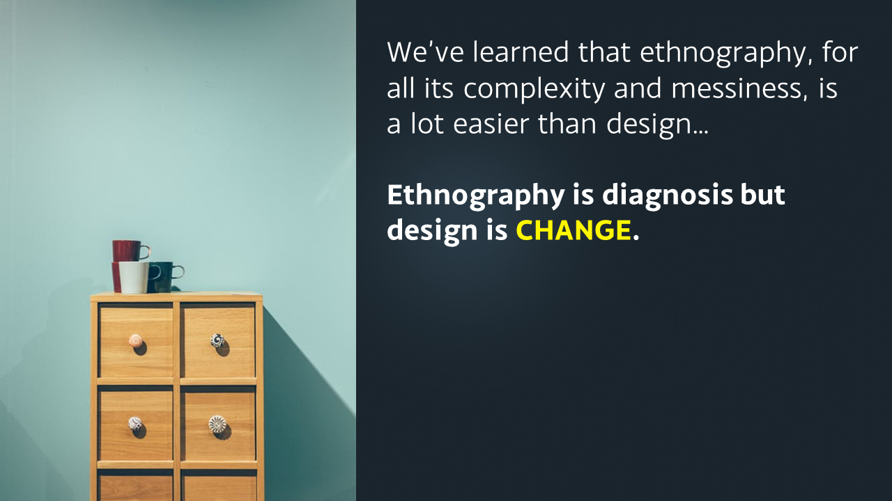
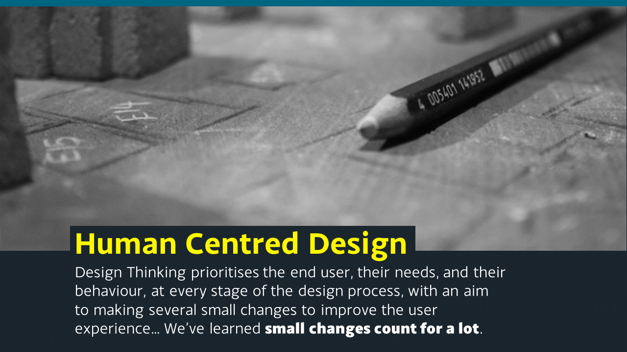
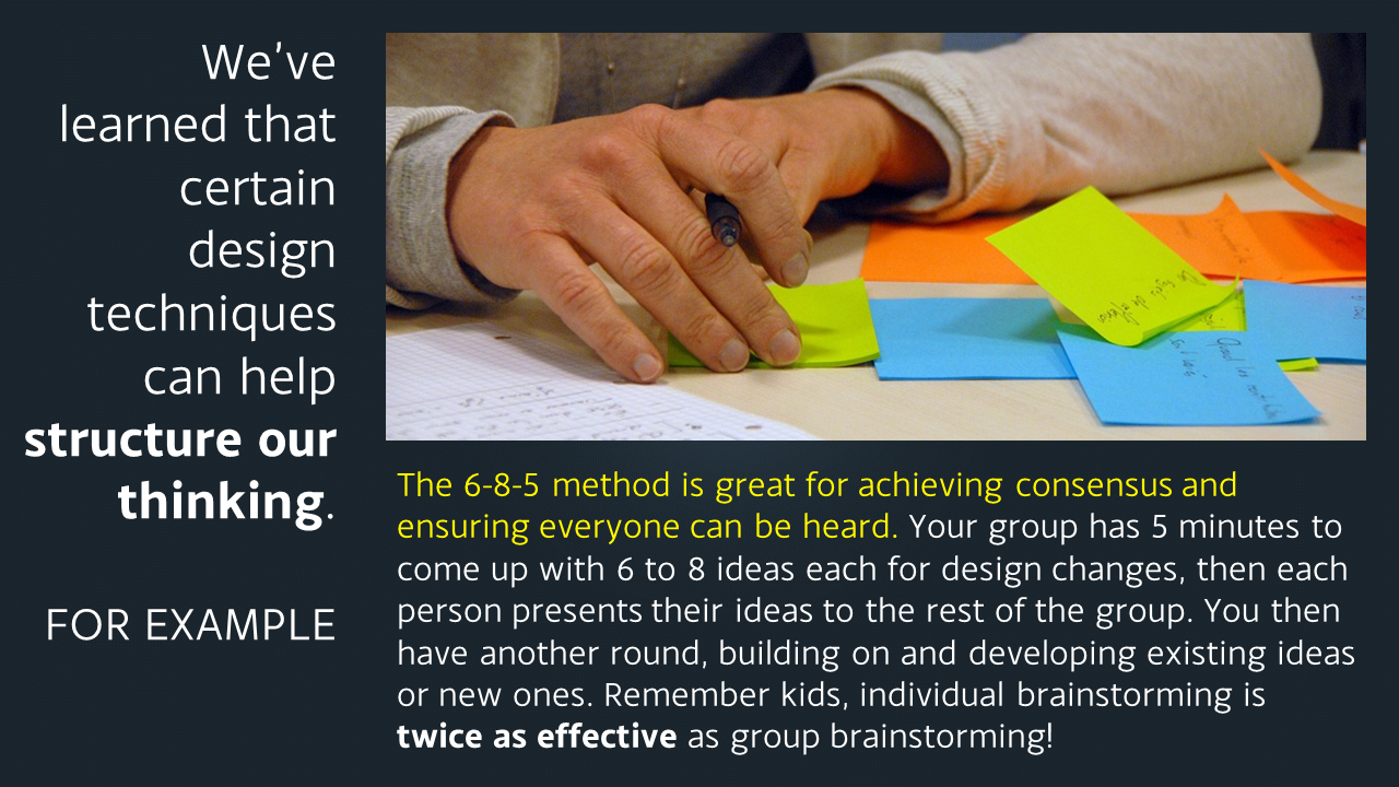
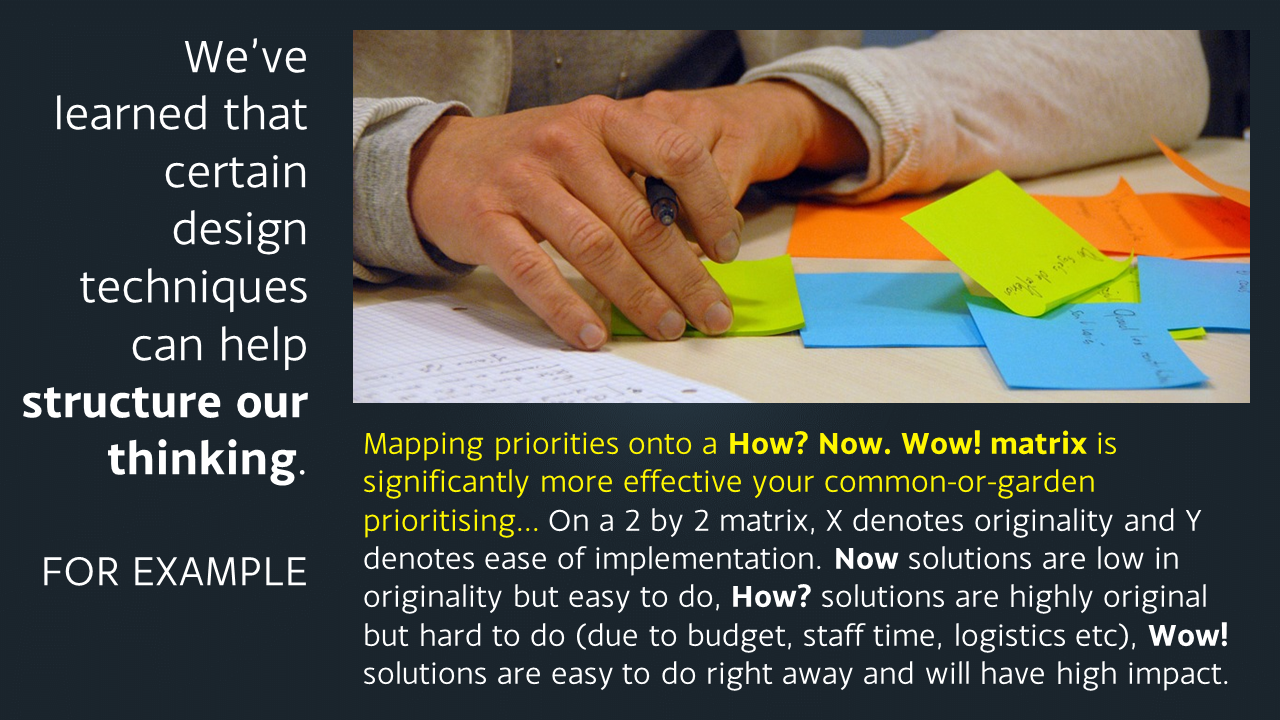
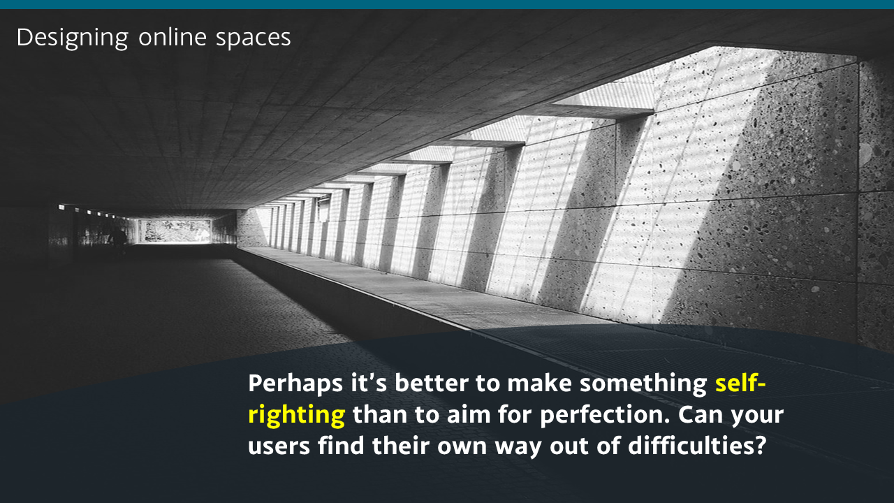
They were particularly interested in design, so the presentation consisted of an extended and adapted version of the one embedded above, with a more specific section on design added in. At the moment Slideshare is not playing ball so I thought I'd upload the design related slides as images here in the meantime, because I do think the design aspect of UX is the part we libraries struggle with most, and it's good to share what we've learned.

Just click the arrows on the image below to cycle through the slides (email subscribers, this'll work better live on the site - click here to view this post on ned-potter.com)

If you have any more tips on getting human centred design embedded as part of the organisational culture in libraries, do let me hear them!