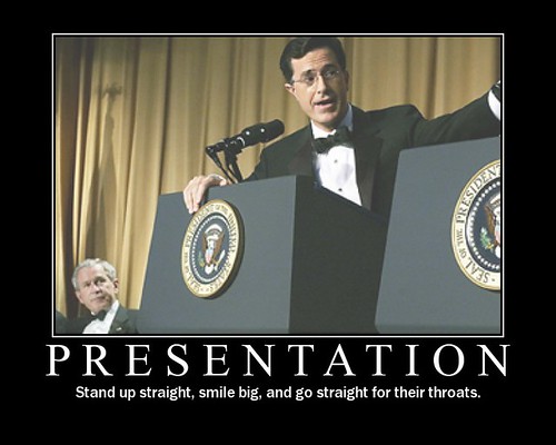
Presentations

The ridiculous reach of Slideshare

I'm always banging on about Slideshare.net to anyone who'll listen - I think it's the great underrated social network, the secret weapon of communication. And people do listen - whether it's librarians on presentation skills or social media courses, or academics on web 2.0 / edtech courses, people are amazed at the reach Slideshare can provide. An example I like to give is of a presentation I created a couple of years back called The Time For Libraries Is Now - it's essentially pro-library propaganda packaged up in such a way that non-librarians will hopefully look at it. I've only given that presentation once to a room full of people, but it's been viewed around 70,000 times online - that's the equivalent of my having presented at Wembley Stadium! It's more or less the same amount of effort, for hundreds of times the audience and reach, and that makes Slideshare invaluable. People LOVE to share presentations, they tweet links to them, they talk about them on Facebook, they embed them on their own blogs and sites - and they view them a lot more readily than they'll read an article or a blogpost. It's all about packaging up a message for maximum impact; I've said before on this blog, that if I have something really important to say, I'll say it with slides.  Here's my Slideshare profile. Anyhow, Slideshare have just started emailing users with updates on how their decks are doing. This week I got this:

Slideshare stats showing 397k total views and 2k views for this week

What struck me (apart from the fact that the Tweets / FB stats are wrong for some reason) is the sheer number of views per week - for things I've already done, and don't update or even regularly add to. Around 2 thousand views a week! This blog gets around 2,500 views a week (unless I actually write a blog post in a given week, in which case hopefully it goes up a bit...) and that's with an archive of 100s of posts for Google to find - Slideshare only has about 25 of my presentations on and yet that many people are receiving the messages I've put out there. (Plus, only four of my blogposts have had over 10,000 views, let alone 50 or 70,000.)

So, information professionals with something to say - make a nice slidedeck and get it on Slideshare. Libraries with key messages for users and potential users - by all means use all the usual channels, but use Slideshare as well! Got some new facilities? Make a slide deck about it, full of nice pictures of those facilities, and embed it on your library homepage. Got some new courses coming up? Create a PowerPoint with what the courses are, why they'll benefit the users, and some quotes from previously satisfied customers - stick it on Slideshare and embed it on your bookings page. Teaching information skills? Put the PowerPoint on Slideshare afterwards so your students can refer back to it.

In terms of getting your message to stick, and generally making slide decks which are nice enough to get shared a lot on Slideshare (and perhaps picked up and featured on their homepage, which guarentees a huge amount of exposure), here's some tips I've previously posted on here - on a slidedeck of course!


And if you're interested and haven't seen it, here's the Time For Libraries Is Now deck I mentioned at the top of the piece.

Digital Marketing Toolkit workshop, 21st May, Edinburgh

A title screen for the course presentation

Next month I'm running a workshop on marketing information services using new technologies. It's a course I really enjoy teaching - during the full-day we discuss marketing with video, mobile, online publishing, geolocation (Foursquare), actual real-life useful things to do with QR Codes, social media... The emphasis as always is on talking not just about why they're relevant, but what actual next-steps you might take towards using them.

The course is being put on by UKeIG - full details can be found on their website.

Here's some pariticpant feedback from last time we ran it:

  • Really useful, great delivery. Thanks!
  • Brilliant workshop, well done!
  • Perfect; taught me more about things I was using and also some new
  • Excellent day
  • Very informative, paced well
  • Hugely useful
  • Thought it was a great overview, got a lot from it .

So, I hope to you see some of you there!

People don't need to know about all the services we provide - they just have to know what's relevant to them

Reblogged from the Library Marketing Toolkit Pew Internet have just released their 10 key findings from their Library research:

The slide I'm particularly interested in is number 11, which tells us that:

  • 22% say they know all or most of the services their libraries offer
  • 46% know some of what their libraries offer
  • 31% know not much or nothing at all of what their libraries offer . .

Initially this makes somewhat depressing reading, statistical proof of what we've all known for a long time: the public don't understand what modern libraries actually DO. The library brand is so synonymous with 'book' that there's little room for the many and varied services we offer, and it really is the services we must emphasize in our marketing, now the content we provide is often readily available by other means. Ambiguity or confusion is the enemy of great marketing - simple messages stick so much better. But inevitably, as we change to accommodate the new needs of our users, and add more and more aspects to the offer we make, it becomes harder to summarize the modern library and easily communicate how we can help people in their lives.

Actually though, the figures aren't that bad. 22% is a surprisingly high number to know most or all of the services their library offers - I'm not sure I know all the services my library offers and I work there! With an offering as diverse as ours no one needs ALL that we offer, so what matters is not everyone knowing everything, but each group knowing what is relevant for them. Perhaps it's time to stop worrying about whether people 'understand' modern libraries in general, and move on to simply ensuring that the parents know what services we offer for children, the people on the wrong side of the digital divide know we can help them get online and use new technology , the people who hold the purse strings know how important we are to the local community, and so on.

This process is formally referred to as 'segmentation' or 'segmenting the market' - dividing your users up into groups, basically, and tailoring the message to suit each one. It's something library marketing types go on about a lot, and perhaps fills non-marketing types with dread... But it doesn't have to be intimidating. At its simplest level, you’re targeting each group with a slightly different aspect of the same message, making sure they know about one key service relevant to them, and then letting them discover the rest once they’re in through the door.

Going back to Pew’s findings. the 31% who know nothing of the library is much more worrying. But again, the approach needn't be 'how do we tell all 31% everything we do in the Library!' - it can be about dividing that 31% up into existing segments, and targeting them with relevant services. The average person in the street doesn't need to think 'I know all about the Library'; they just need to think 'I want to start looking into the genealogy of my family tree, and I know the Library can help me', or whatever their need might be.  Segmenting the market is hard to do, but it's proper marketing - the results can be hugely beneficial.

10 non-standard tips for public speaking!

Old-school presentation image  

I teach a full-day Presentation Skills course for the British Library, among others, and I recently sought feedback on it from someone I trust. The thing he wanted more on - and it was one of those 'it's obvious now they say it' moments - was presenting itself, the process of it, rather than just preparing the materials. There was indeed a section on this in the training but it wasn't very long, so in order to improve the course I've read up on it a bit more; I learned a lot of useful things (and had others I already knew better articulated to me) so I thought I'd share some of them here.

Preparation

1. It's better to know the subject than the presentation. Learning anything from memory is really hard. But so is looking at notes, or reading presentations out from a script. If I try and learn a presentation I get worried - I'm aiming for something so specific, there's a feeling of pressure around getting it right, and a feeling that if I forget something the whole house of cards will fall apart. I prefer to only speak about stuff I know a bit about, and just use the slides to reinforce key points and basically prompt me to talk about certain aspects of a topic, as appropriate to that particular audience. This is much more relaxing than worrying about remembering particular phrases etc. It also means you're more flexible - things can even be tackled in a different order based on what the audience wants, for example.

In short, you can't be derailed because you're not on rails. That's a very reassuring feeling.

2. Imagine your audience leaving the room (after your talk!). It's often very hard to know where to start when creating a presentation - the default position is 'what do I know about this subject?' but actually that's the wrong way around most of the time. The more pertinent question is 'What do the audience want from this subject?' - if you imagine your audience leaving the room after you've spoken, what have they learned, what do they know now, what did they get out of it? Think about what is important to them in that moment, and build the presentation from there - if necessary going and doing more research beforehand, so you can talk more authoritatively about what matters to them.

3. The rule of three - there might be something in it... I've heard many times now that we remember things most easily in groups of three. There's a lot of it about - 3 act plays, stories with a beginning, a middle and an end etc. Presentations-wise, it's relevant because the audience will likely only remember 3 things from your presentation, so you need to make sure these are the most important three! If you're completely stuck for a structure, try the 3:3:3 method - three main parts of your presentation, each divided into three sub-sections, and if necessary each of those subsections divided into three as well.

4. Store your presentation in the cloud. Of course every presenter takes their presentation along on a USB stick but USB sticks do break sometimes, and they're small and easily lost. So a sensible back-up plan is to store your presentation in the Cloud, and of course the easiest way to store your presentation in the cloud is to email it to yourself. (Then it's backed up twice! Once in your inbox, once in your sent box. :) )

5. Have a one-page cheat sheet. Part of presenting well is being relaxed, and a lot of being relaxed (for me, certainly) is knowing exactly what your doing with the logistics of the day. So make a one page document with EVERYTHING you need to know in it: presentation start time, room number, directions to the venue, contact name and details, train self-ticket machine reference number, etc - print it out and carry it with you, and email it to yourself so you can check it on your phone. You're much more likely to arrive relaxed, on time, and focused.

Delivery

6. Look everyone in the eye, then pick your favourites to come back to... This is particularly useful for nervous speakers. Public speaking is about communication, and communication is better with eye contact. So I will try to literally look every member of the audience in the eye at least once, at least as far as I reasonably can. (After 5 rows or so, it's hard to be specific.) During this time, I'll notice a few people who are particularly receptive - they're nodding emphatically, or smiling at what I'm saying - and I'll come back to them throughout the talk, as a form of encouragement... I don't get nervous anymore, but even as a non-nervous person I like to see people on my side. (The flip-side of this idea is to work on the more indifferent members of the audience - or even hostile, but that doesn't come up too often in our industry, thankfully - by focusing more explicitly on them.)

7. Remember if people are looking down at a screen and typing, it's a compliment. I can imagine that it can be disconcerting if you're not a Twitter user, and you see people looking down at their phones rather than up at you. It must feel like kids ignorning what you're saying and texting their friends. But it's a good thing! They're sufficiently invested in what you're saying that they want to broadcast it to their network on Twitter - it's also a way for them to make notes at the same time. And of course, that means your words are reaching a bigger audience, which is excellent.

8. Have a Plan B for your intro and your outro. It sounds obvious but knowing what your opening line is going to be is quite important. Sometimes people decide to with something like 'Hello everyone, my name is Ned, I'm from York' but then the person introducing them says 'This is Ned, he's from York' so you really can't use that one... So know what you'll say if your planned opener is ruled out for whatever reason. The same goes with the closer - if it's covered in the questions for example, or if you finish surprisingly early and need some more material to call upon, have a relevant topic in mind in advance.

9. Listen very carefully, an introvert will say this only once... Lots of people reading this will be introverts; I'm one, certainly. A characteristic we share is only saying stuff once - if it's said, it's done with, we don't want to say it again. I feel embarrassed telling a story to someone if I know I've told it to someone else, even if the two people are completely unconnected! But in presentations we have to fight that instinct, and make sure we say the really important stuff (main arguments, big statements, statistics, quotes) at least twice; perhaps in different ways but at least twice nevertheless.

10. Think in tweetbites. You thought it was enough to think in memorable soundbites! Not anymore. For the maximum impact, your most important statements needs to be tweetable so that your presentation is amplified beyond the walls of the room you're in. You've put hours of work into it, so why not double, triple or otherwise exponentially increase the audience for your key messages? Think in quotable, tweetable chunks (as long as that's not actually to the detriment of your presentation, of course...).

---

Is there anything else you'd add? I've love to hear from you in the comments so this post becomes more useful over time.

More tips

You can find all sorts of presentation tips online - the following three articles were particularly useful in assembling the list above: 30 quick tips for speakers; Compulsive obsessive details will save your neck; and the Introverts Guide to presenting.

As the title suggests, these are non-standard tips for public speaking - which is to say, beyond the obvious ones everyone knows such as not facing away from the audience etc: for more 'nuts-and-bolts of presenting' advice, and more on creating materials, check out these previous posts:

Plus there's also this early blog post on: tips for first time speakers.

Good luck!

Twitter for Researchers guide

At my institution we're really stepping up our support for researchers, and I've been doing a lot of stuff around the Web 2.0 end of the spectrum. I'm running a suit of workshops called Becoming a Networked Researcher, and I've been into departments to give taster presentations like this one:

We've also finally completed a guide to using Twitter for Researchers. It's more a Twitter for Researchers actually, rather than the process of academic research itself (although that is possible). I've hosted it on Scribd in order to embed it on our web pages, and it got picked up and featured on Scribd's homepage so that helped boost the number of views it has had, which is huge, relatively speaking - around three-and-a-half-thousand. Plenty of those have been from York researchers, which is great - they've given us a lot of positive feedback and ReTweets.

The guide took a surprisingly long time to do - the difference between knowing stuff and actually writing an ideal version of it down in a document never ceases to disappoint me... Adding examples took a while too. I couldn't decide between very brief of very comprehensive - in the end I decided somewhere between the two, keeping it as short as possible but including a LOT of information. The idea is, if they want more, they can come to the Twitter workshop as part of the Becoming a Networked Researcher suite.

Anyhow, here it is - feel free to use stuff from it, with attribution:

Twitter for research by University of York Information

There'll be some more University of York Library stuff on the blog shortly, around Digital Literacy, videos etc!

- thewikiman