3 simple ways to use images more effectively in PowerPoint


Poor old PowerPoint, much maligned despite actually being pretty decent. Admittedly what PowerPoint WANTS you to do is a bad presentation, but if you ignore its promptings it can be a great communicatory tool.

Here are three techniques I use with images to help me make better slides.

Darkening Images

I use this technique a lot in my own slides, and indeed apply to making graphics, posters, thumbnails, and videos too. You take your desired picture (using pictures is good, relevant images help people learn) and then you reduce the brightness in PowerPoint in order to be able to write a relevant sentence or two on top. You retain the value of the picture, your words are clearly legible, and your slide looks extra stylish because it contains no filled (or semi-transparent) text boxes.

So here's a nice image, but it's too busy for text to be easily readable:

Here's the same thing darkened. To do this, right-click on the image and choose Format Picture, then find the Brightness and Contrast menu: this is in different places depending on which version of PowerPoint you're on. Then slide the Brightness slider to the left until you get a happy compromise between the picture being dark enough to write on in white, and light enough to still be easy to see and to work as a supporting image.

Like this:

I use this technique all the time in presentations and training materials, much of the time first showing the image in its orignal state then on the next slide the darkened version. Often I also use the Blur effect on the image to make the text even clearer against the background.

The Rule of Thirds

The Rule of Thirds is not something I'm very good at explaining, but it is something I find very interesting... It's around what makes an image particularly interesting or arresting, and I'll point you towards Ruth Jenkins' excellent blog post about it for a proper explanation.

A really short version is: images are most pleasing when the subjects are arranged on the (invisible) lines of division if you were to divide the space into thirds vertically and physically.

From a purely practical point of view, it relates to slides in that images which conform to the rule of thirds don't have anything in their dead centre. This is great for slides because it leaves a nice 'copy-space' for us to write in - whereas images where the subject is bang in the middle are really hard to use in presentations because there's nowhere convenient for the text to go.

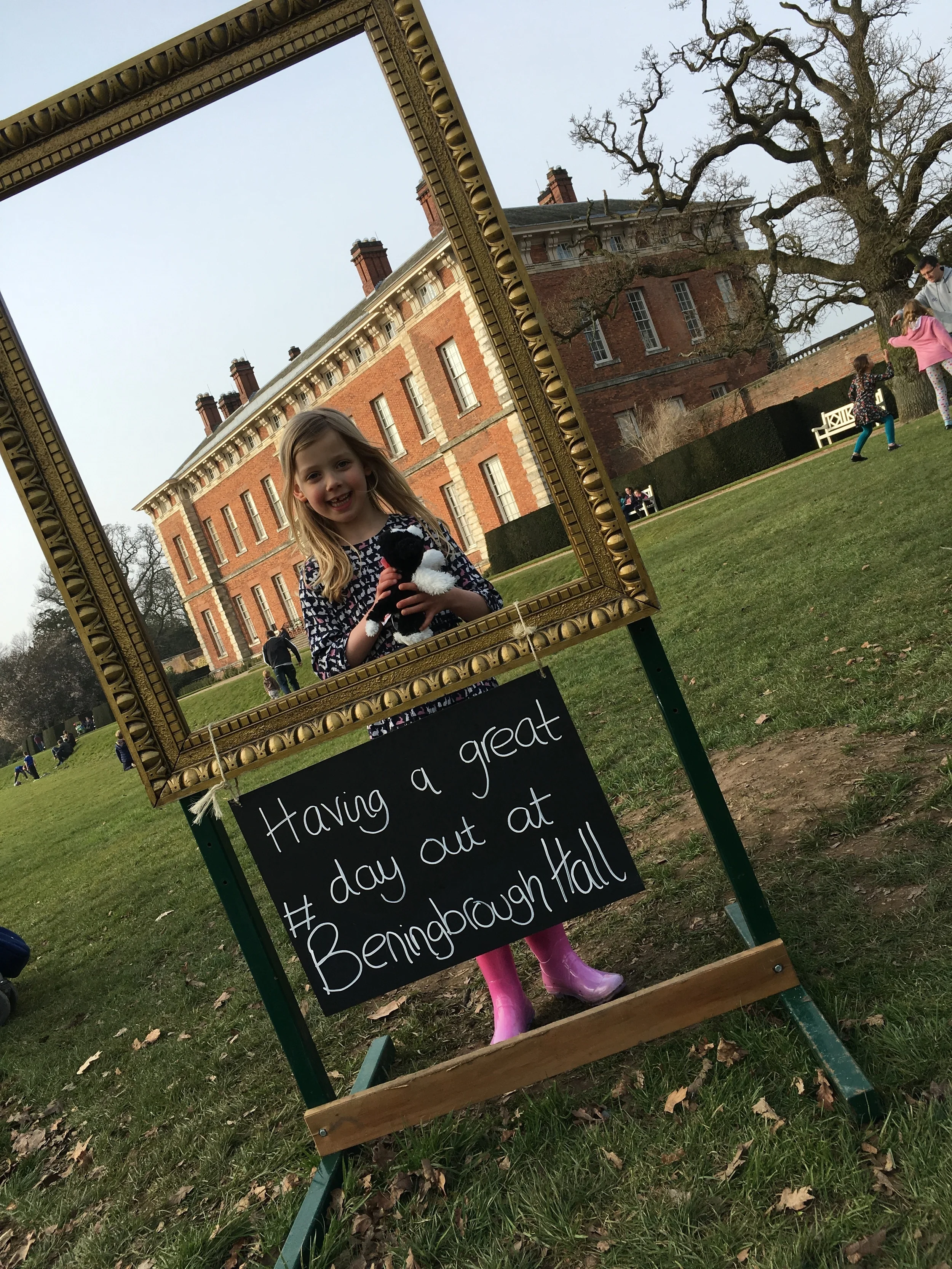
So let's say you're talking about mobile phone use. The image in the darkening example above is a perfectly nice picture of a phone - but the focus of the image, the phone itself, is right in the middle of the frame. So our caption, though nicely readable against the darkened background, obscures the phone somewhat.

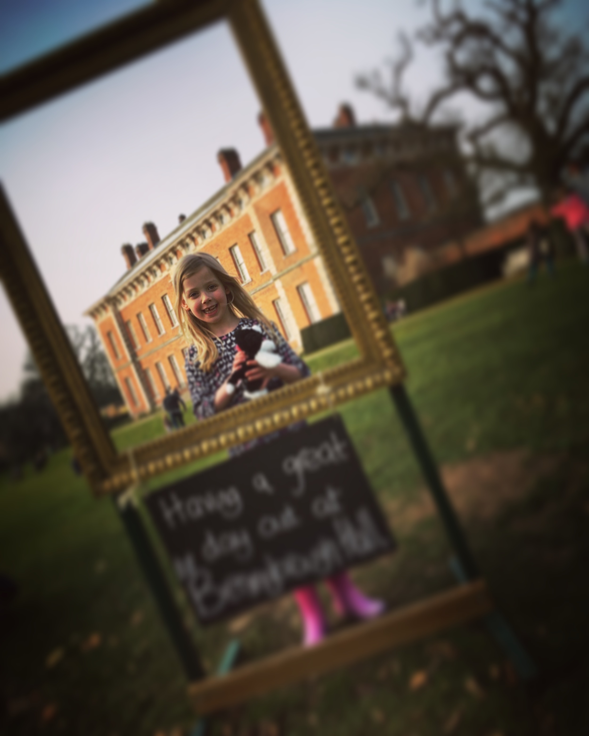
Here's another shot of the same person holding the same phone - this time the rule of thirds is applied. I've put in the division lines to make it clearer.

So the subjects are on the division lines - in this case, the lady holding the phone and the phone itself. Our slide is about mobile phone use so the photographer has done some of the work for us by putting the phone in focus and everything else not.

When we add our caption there's a natural space (again, on a vertical division line) to put the text.

So when picking out images for use in slides, you don't HAVE to think about the Rule of Thirds - but it certainly makes life easier if the subject isn't dead-centre in the picture.

Extending Images

Finally there's a technique which is a little bit more complicated but which allows you to manipulate images which you want to use but which aren't quite the right proportions for your slides.

Let's say you have a portrait image to fit into your landscape slide. You don't want to stretch the image because that will ruin it. If it's a busy image with a lot going on then it's best just to back-fill the rest of the slide with a block colour like black, white or grey, and write on that. But if the edge of your image is very simple - a picture of the sky for example - you can paste a second copy of your picture onto your slide, then use the crop tool to crop the second version to a tiny sliver of sky. Then you line up the sliver with the rest of your portrait-aligned picture, and stretch it to fill the slide completely. Your portrait image is now landscape.

In the example below I've used this technique to apply the Rule of Thirds to an image with a centred subject. Here's the original picture:

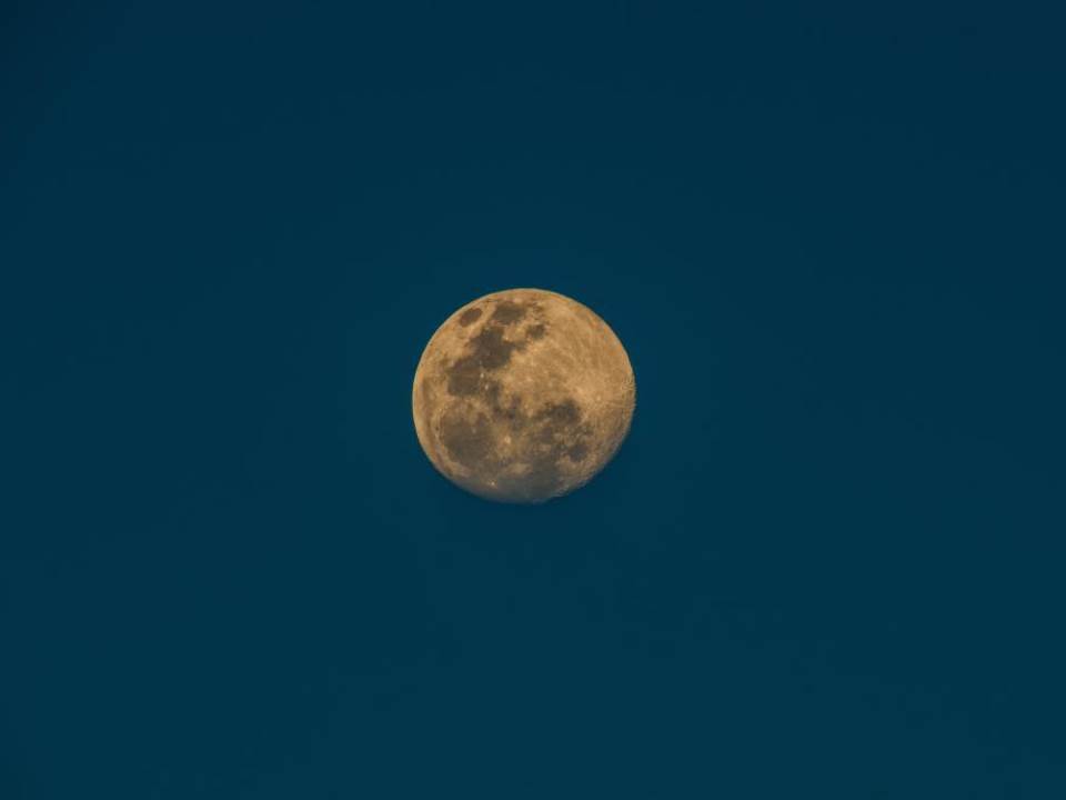
As you can see, the moon is bang in the middle, making it trickier to write anything big enough for people at the back of a lecture hall to read and still keep the slide looking coherent.

So we paste in the second version, crop, and stretch to extend:

Hopefully you'll agree this is literally seamless - you can't see the point at which the old image ends and the extended, cropped version begins.

I hope you can use one or more of the techniques above in your slides, and good luck!


All of the images used in these examples are Creative Commons Zero - they can be used, remixed, modified and so on without attribution. I sourced them via finda.photo.

So you want to make in infographic? 4 useful options


We're putting together a guide to various infographic software for our students, so I've had cause to play around with a few. I find a lot of tools recomended on the web just don't quite work for educational stuff (or, indeed, library stuff); they're just too much style and not enough substance.

Also, all the articles about infographic tools are entitled things like '61 GREAT INFOGRAPHIC PACKAGES!' which always baffles me somewhat. Maybe it's the information professional in me, but I think if you're going to write something recommending a set of tools, you should at least narrow the number down to a recommended few...

So what are the most effective tools for creating meaningful infographics?

1) Great for stats and figures: Piktochart

I really like Piktochart. It's the tool we use most often at work. My colleagues have used the templates to create infographics, for example this one has been used to explain library processes to users in a way that is engaging and easy to understand:

An example of a Piktochart template

An example of a Piktochart template

It's simple to take something like the template above and change the images (there's a huge built in library of icons, or you can use your own) and the colours etc to suit whatever you wish to express. Piktochart also has seperate templates for Reports, which are nice.

For me, though, the way it integrates very easily with your own data from Excel or Google Sheets, which you can import from a .CSV file, is the best thing about this tool. So it takes what you already have and makes it visually appealing, which helps prevent the all-style-no-substance issue that afflicts a lot of infographics.

You can import your own data

You can import your own data

Although Piktochart does infographics, reports, and some really nice data visualisation with maps, I've mostly used it to create individual charts which I've then exported for use in other things, like Action Plan documents, or presentations. In the example below, all the graphs etc and visualisations are from Piktochart, and I'm by no means an expert user so this is just scratching the surface of what it can do.

Piktochart is free, but also has reasonably priced educational packages, one of which we have at York, that allow you a few more options and some more features. 

2) Good for flexibility: Canva

Canva does a lot more besides infographics. It's really good for creating images perfectly sized for social media, and they put genuinely useful tips on their design school blog.

At York we've used Canva for creating one page guides to things like Google Scholar, or JSTOR, in order to embed them in the VLE, blogs, etc. Canva is simple to use and there are a lot of nice built in fonts and images which can make otherwise not-overly-exciting subjects a bit more engaging for users.

You can use Canva for free, which is what we do. It tries to tempt you in with paid for images and templates, but you can also import your own images so there's no requirement to pay for theirs if you don't want to.

Here's the interface and an example of a free to use template you can build on:

The Canva interface

The Canva interface

I'd recommend playing around with Canva if you've not used it, because it has so many potential applications. The trick, really, is being able to sort through the paid stuff to find the free stuff, and being able to sort through the superficial 'this is probably great if you're the web designer for an artisan baker in Portland' templates to find the 'I can actually see this working in my world' examples...

3) Good for interactivity: Infogram

Infogram is particularly good for creating graphics you want to embed online, because they can be responsive and interactive depending on what you do with them. It's basically about hovering over different bits of the graphics, but it does allow you to focus on certain parts of the data more easily than a static chart allows. See the example below:

Other pluses with Infogram include its ability to import data from a really impressive variety of sources. Downsides include the free version being fairly stripped back of features, and even the cheaper paid for version being out of financial reach for most non-profits.

4) Good for surprising you with its potential for making infographics: PowerPoint!

The much maligned PowerPoint is actually a very good tool which is often deployed spectacularly badly by its users. It's more flexible people than people realise (especially the two most recent iterations, 2013 + 2016), and that makes it surprisingly good for infographics. The main reason it's good is because you can take something - a chart or graph from excel, words written in interesting fonts, icons, images - and put it on a slide, and it just stays where you put it. Then you can layer more and more stuff on, and easily move it around - unlike Word which is a nightmare for that sort of thing, and a bit like Photoshop, but without the need for a 2 year learning curve...

The keys to making an infographic are firstly to edit your slide to the right dimensions: go into the Design tab, choose Page setup and then choose, for example, A3, Portrait. Your single slide is your infographic. Secondly, use images from somewhere like freeimages.com, or icons from iconfinder.com, to make your content interesting (along side graphs and charts you can copy and paste in from Excel). Thirdly, use a non-standard font - download one from fontsquirrel.com - as typography makes a huge difference.

Bonus option: Visual.ly for Google Analytics Infographics

If you have a website which uses Google Analytics to track statistics, but don't want to be logging in to check your stats all the time, visual.ly provide a useful free service. You log in with your Google ID, give them your analytics code, and they send you a weekly infographic which tells you how you've done in all the key areas. When you have a good week it's a nice friendly blue, if you have a not-so-good week it's red for danger...

Sign up for yours at visual.ly, here. Everything else visual.ly does is a paid for service, but the Analytics infographics are free.


Do you have any recommendations I should add to this list? Leave me a comment below.


Upcoming presentation skills workshops and library marketing training

Just a quick post to say here's the current list of open workshops I'm doing this year - if you want to see if I'm doing something at your organisation specifically then the full listing is on the Upcoming Events page, but below are the non-in-house events currently in the diary. Hope to see you at one of them!

You can see a whole load of feedback from previous workshops via the Training page.

How to use Instagram as an easy photo editor but NOT necessarily a social network!


As well as being a massively popular social network, Instagram is a brilliant photo editing tool - it's quick, intuitive and easy to transform images. But you can't save the photos to your phone unless you post them online, and sometimes you might want to edit a photo and not share it with the world on social media.

So how do you do this? The tl;dr version of this post:

How to use Instagram as a photo editor

This is great for family stuff (and professional stuff, more on which below). I've become a little obsessed with manipulating photos so that the most important part of the image is clearly highlighted in some way. For example this weekend I took a picture of my daughter and wanted to use the filters Instagram provides and also the tilt-shift function. I love tilt-shift - it makes part of your image slightly out of focus, drawing the eye to the in-focus part you define. But I didn't want to post a picture of my kids on Instagram because I use that purely for drumming related shenanigans - so I took the picture and went into Instagram, edited it, and posted in Airplane Mode so it didn't actually get as far as the internet, but DID save to my camera roll. I really like the way the bits in the picture frame are in focus, but the resit isn't.

The original picture

The original picture

The tilt-shifted, Instagram filtered one

The tilt-shifted, Instagram filtered one

5 steps to use Instagram professionally for photo editing

For professional projects this is potentially very useful, especially if you can't find a free stock image that suits your requirements. Let's say you're making a slide for a presentation and you need to talk about Google. You don't want to pay for a photo, and you can't find a suitable Google-related pic which has space to write on, without having to pay.

STEP 1: Use your phone to take a picture of the Google app icon on a tablet. (Keep in mind you don't have to take a photo - you could screengrab your phone or tablet if you want to get an image of an app or website. I've gone with a photo in this example to get the angle.)

STEP 1: Use your phone to take a picture of the Google app icon on a tablet

STEP 2: Apply a filter. (I ended up choosing X-PRO II)

STEP 3: Use the Radial Tilt-Shift to effectively blur everything except the Google icon

STEP 4: If you don't post it to Instagram it won't save to your Camara Roll. So go into Airplane Mode then post it - you'll see the 'Failed' message and you can press the X to dismiss it. Instagram will now forget all about the image and not attempt to repost it when you have connectivity - but you'll still have the edited pic saved to your phone.

STEP 4: If you don't post it to Instagram it won't save to your Camara Roll. So go into Airplane Mode then post it - you'll see the 'Failed' message and you can press the X to dismiss it. Instagram will now forget all about the image and not attempt…

STEP 5: Your finished photo! The eye is drawn to the Google icon, and the photo is darkened and blurred so you can potentially add easily readable white text to your image as part of a slide. Email it to yourself and it's ready to use in your slide.

STEP 5: Your finished photo! The eye is drawn to the Google icon, and the photo is darkened and blurred so you can potentially add easily readable white text to your image as part of a slide.

Finally here are the two photos side by side so you can see the difference.

Original photo

Original photo

Edited version

Edited version

You can sign up to Instagram and never publically post a picture if you don't want to! If you make creative use of this technique let me know in a comment.

An Alternative to Seth Godin's 5 Rules to create amazing PowerPoint Presentations


Seth Godin is a very influential man, and his views on PowerPoint carry a lot of weight. He wrote a famous post a while back (1.5k Facebook shares, a gazillion tweets about it etc) on creating amazing presentations - you can read it here. I agree with lots of it completely, but I'm not totally on board with the five rules at the end.

My take on Seth's rules

My take on Seth's rules

No more than six words on a slide. EVER. There is no presentation so complex that this rule needs to be broken. To me this seems too arbitrary. Fewer words is without doubt better than more words when it comes to slides - they're presentation tools not written documents. But six? As the maximum ever? Unless that's based on research that shows seven or more words reduces the effectiveness of your PowerPoint, why limit yourself in such an extreme way? I'd say one or two sentences to ensure brevity but allow yourself a little flexibility in conveying meaning and nuance.

No cheesy images. Use professional stock photo images. First of all there are plenty of cheesy professional stock photos! Authenticity is key. The trick is to find images which look like the camera has happened upon a real scene - lots of pro stock images show impossibly perfect people laughing flirtatiously over a blank iPad, I mean come on. I find Pixabay and Unsplash have enough for most presentations I make, plus someone introduced me to Pexels the other day which looks good, and they're all free - both of copyright and financial cost. The professional stock photo sites cost a fortune to use - why use them when so many great (legal) images can be found for free?

No dissolves, spins or other transitions. Yup. No argument here. If it's extraneous to your story, all you're doing is reducing the impact of your message.

Sound effects can be used a few times per presentation, but never use the sound effects that are built in to the program. Instead, rip sounds and music from CDs and leverage the Proustian effect this can have. If people start bouncing up and down to the Grateful Dead, you’ve kept them from falling asleep, and you’ve reminded them that this isn’t a typical meeting you’re running. I like the idea about using music etc but it really needs a certain type of high energy presentation performance to pull this off. It's not for everybody (I couldn't do it). It's hard to think of a rule around sound that is absolute; it all depends on your audience, and some of them way think the use of music is a little distracting, whatever your music taste... From what I understand about the Proustian effect it's a very personal thing; I'm not sure a presenter could expect to cause or induce it for a room full of people. 

Don’t hand out print-outs of your slides. They don’t work without you there. I agree with this. But I wouldn't put it in my top 5...

Header pic is a CC-BY image by Betsyweber - clcik to view original on Flickr.

Header pic is a CC-BY image by Betsyweber - clcik to view original on Flickr.


My own top 5 rules for creating effective PowerPoint slides

So what would I put in my top 5 rules for creating amazing PowerPoint presentations? I can answer that question because the intro to my full-day Presentation Skills training is built around five golden rules, based on existing research into what makes for an effective presentations - and that's the aim here, to build something which works. 'Amazing' is no good on its own; you need people to remember your key messages, not just how great a presenter you were.

Here we go:

  1. Keep it simple. Slides don't need to be flash - get rid of anything that doesn't tell your specific story, and leave behind something which supports and reinforces what you're saying out loud, and prompts you as to what to say next.
  2. No more bullets. Bullet points ruin slides. They're fine for documents, but you're not making a document in PowerPoint. As well as being symptomatic of a general Death By PowerPoint malaise, they make people less likely to agree with, understand and remember your presentation. Oh and they like you less when you use them. That's enough of a reason to never use them, surely?
  3. Make one point per slide. Make your point, allow your audience to digest it, then move on together in sync with them. Several points on a slide inevitably result in your audience moving at a different pace to you, because they can only listen and read for a few short seconds. Why be in conflict with your presentation materials when you don't have to? Give each key message room to breathe.
  4. Big fresh fonts. Font size 24 is the absolute minimum you should ever use in slides. If you need more you're trying to fit too much on one slide. Either ditch some text or cascade it across two slides. Non-standard fonts (which is to say, fonts which don't appear in the Office Suite) can, if chosen carefully, increase the impact of your presentation. Typography is underrated.
  5. More images, less text. Too much text stops slides working. Relevant images help people learn. Make the most of your opportunity with each new PowerPoint you make!