Prezi FTW

The ultimate guide to Prezi, updated and refreshed!

A lot has happened since I wrote this post, complete with a Prezi guide created in Prezi itself, in July 2011. I've been the Technical Reviewer for a successful book on Prezi, I've been twice approached by publishers to write books about Prezi (including the 2nd edition of the one I was reviewer for!), I've used it for loads more training and presentations, and the Prezi guides I've written across various formats have been viewed almost a quarter of a million times. (Clearly I'm wasting my time with all this library stuff. :) ) There's also a deluge of comments on the Prezi, many asking when I'm going to update it - because the other thing that has changed, quite substantially, is Prezi itself. The whole interface has changed completely. So here is the ultimate guide to Prezi, updated and refreshed for 2013, with new screenshots, new instructions, additional examples, and an edited FAQ. I hope it's still useful!

The other change that's happened in this time is that Prezi has gone from a little niche presentation tool to something you see a LOT. And many people really don't like it - admittedly some of this comes from people being too cool to get on board with popular trends, but much of it comes from the majority of Prezis being fairly awful... They are made entirely with the presenter in mind (look what I can do!) and not with the audience in mind - and EVERY presentation should be made with the audience in mind. Bad Prezis get in the way of the messages you're trying to get across, rather than support them - and worse still, can leave the audience feeling motion-sickness. It's up to you as the Prezi creator to ensure this doesn't happen! As you can imagine, the guide above contains tips for doing so.

A lot of people expect me to be this mad Prezi fan-boy because I've written these guides, and I've actually had delegates at conferences express disappointment when I've turned up with slides! But I don't use Prezi all the time by any means - it has its strengths and its limitations, and isn't appropriate for every scenario. These days, I use PowerPoint if I want to talk about one idea - something with a linear thread - and Prezi if I've got lots of disparate ideas or themes within the same presentation. That's why I use it for my full-day training workshops (that and the fact that it's a lot easier to make a nice Prezi than a nice PowerPoint - the thought of making 7 hours worth of slides that aren't terrible fills me with dread...). The important thing is you decide whether or not you can get Prezi to work for you, and if so, when. It can be a fantastic way to get ideas across to an audience.

Also, in case you've not seen it, here's 6 useful things which even experienced Prezi users miss, and if you're interested my Prezi profile is here.

Happy presenting!


6 useful things Prezi can do (which even experienced users miss)

I keep discovering new things about the presentation software Prezi. Asking around, it seems lots of other users didn't know about some or all of these either, so with that in mind I thought I'd draw your attention to 6 useful things. Got any more? Leave them in a comment...

1. Upgrade to the educational licence for free if you are a student or work for a University

All you need to do is go to Upgrade on the Prezi site, and stick in your university email address (.edu or .ac.uk etc). As a result of the upgrade you get more storage space (quite useful), the ability to substitute the Prezi logo for one of your own (could be useful for institutional branding of Prezis) and the ability to keep Prezis private (very useful, particularly from a teaching point of view - you don't want students to see the presentation until it's ready!). Well worth doing, I think.

The upgrade box is at the bottom of the screen

2. Hold down shift when drawing frames and hidden frames to maintain a perfect 4:3 aspect ratio (trust me, this one is REALLY useful!)

This is completely brilliant. I use LOADS of hidden frames in my Prezis, to ensure the viewer is shown exactly what I want them to see in the order I want them to see it. However, when you draw a frame or hidden frame which isn't the (usually 4:3) aspect ratio you're using to present - in other words, when the frame isn't the same shape & proportions as a monitor or projector screen - then other stuff can creep into the frame and slightly ruin all the careful planning.

By pressing shift before drawing a frame, it keeps a perfect 4:3 aspect ratio as you draw it - moving the mouse simply increases or decreases the size, but the shape stays the same. You can in effect create several screens, and populate the screens with content knowing that everything will fit perfectly when you're presenting or when people are viewing the presentation online. I used this technique loads in the new technologies Prezi and the branding Prezi I recently created. The result is: better looking, more cohesive prezis.

An example of hidden frames using 4:3 aspect ratio

3. Save your Prezi to a USB stick

I realise most of you will know this one, but I wrongly assumed it was an 'upgraded licence only' option for ages, so thought I'd flag it up here. It's very much worth doing because a: you aren't relying on an internet connection, b: if you've got embedded YouTube videos (and there is an internet connection) they'll still play and c: it enables you to use a clicker to move the presentation along without having to stand by the PC and use a mouse or the keyboard - you can't use a clicker with a web-based Prezi, for some reason.

When you click 'download' you get a ZIP file - you can extract the ZIP to a USB stick but make sure you take all the files and folders with you, as you need all of them to play the Prezi back. You can't edit it on the stick, so make sure it's your final version before you download it.

Screengrab showing the download button

4. Print your Prezi in an actually quite useful way

Pressing 'print' in edit mode saves the Prezi to a PDF - each page of the PDF is a 'screen' on Prezi (i.e each number on your path becomes a printed screenshot). Again, I'd not previously realised this worked so neatly. It means that, for example, for teaching, you could set a simplified path on your presentation, press print to produce a handout of a reasonable length, then put the path back to the full route again. Also, it's the ultimate back-up - if you can't present your Prezi for some disastrous reason, you can present with the PDF instead.

Screengrab showing the print-preview

5. Import a PowerPoint presentation directly into Prezi

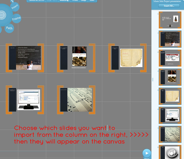
The easiest way to get started with Prezi is probably to import a PPT and mess around with that. If you have slides you wish to convert, just click Insert > PowerPoint and import them onto the canvas - you can choose all or some of the slides, and have Prezi automatically add a path between them if you like. You can edit the text within Prezi - it's not like importing a PDF where you're stuck with what you have.

I'm not sure there's much point in just pulling in some slides and leaving it at that, but it's a nice jumping-off point to creating something more interesting - and it's a lot quicker than typing all the info from your slides in by hand. Quick tip: the more straightforward the slide, the better this works - it struggles with more complicated stuff.

Screengrab showing import slides

6. Choose from more than just 3 colours for your fonts

It used to be the case that you chose your theme, then stuck with the three colours you were given. Now you can change any passage of text to one of a huge number of colour choices - type it first, then the options appear above it on the right.

Picture showing colour highlighting

I hope some or all of these are useful.

A newly updated Ultimate Prezi Guide is here (refreshed in May 2013), and all sorts of related materials are available here.

- thewikiman