I keep discovering new things about the presentation software Prezi. Asking around, it seems lots of other users didn't know about some or all of these either, so with that in mind I thought I'd draw your attention to 6 useful things. Got any more? Leave them in a comment...
1. Upgrade to the educational licence for free if you are a student or work for a University
All you need to do is go to Upgrade on the Prezi site, and stick in your university email address (.edu or .ac.uk etc). As a result of the upgrade you get more storage space (quite useful), the ability to substitute the Prezi logo for one of your own (could be useful for institutional branding of Prezis) and the ability to keep Prezis private (very useful, particularly from a teaching point of view - you don't want students to see the presentation until it's ready!). Well worth doing, I think.
2. Hold down shift when drawing frames and hidden frames to maintain a perfect 4:3 aspect ratio (trust me, this one is REALLY useful!)
This is completely brilliant. I use LOADS of hidden frames in my Prezis, to ensure the viewer is shown exactly what I want them to see in the order I want them to see it. However, when you draw a frame or hidden frame which isn't the (usually 4:3) aspect ratio you're using to present - in other words, when the frame isn't the same shape & proportions as a monitor or projector screen - then other stuff can creep into the frame and slightly ruin all the careful planning.
By pressing shift before drawing a frame, it keeps a perfect 4:3 aspect ratio as you draw it - moving the mouse simply increases or decreases the size, but the shape stays the same. You can in effect create several screens, and populate the screens with content knowing that everything will fit perfectly when you're presenting or when people are viewing the presentation online. I used this technique loads in the new technologies Prezi and the branding Prezi I recently created. The result is: better looking, more cohesive prezis.
3. Save your Prezi to a USB stick
I realise most of you will know this one, but I wrongly assumed it was an 'upgraded licence only' option for ages, so thought I'd flag it up here. It's very much worth doing because a: you aren't relying on an internet connection, b: if you've got embedded YouTube videos (and there is an internet connection) they'll still play and c: it enables you to use a clicker to move the presentation along without having to stand by the PC and use a mouse or the keyboard - you can't use a clicker with a web-based Prezi, for some reason.
When you click 'download' you get a ZIP file - you can extract the ZIP to a USB stick but make sure you take all the files and folders with you, as you need all of them to play the Prezi back. You can't edit it on the stick, so make sure it's your final version before you download it.
4. Print your Prezi in an actually quite useful way
Pressing 'print' in edit mode saves the Prezi to a PDF - each page of the PDF is a 'screen' on Prezi (i.e each number on your path becomes a printed screenshot). Again, I'd not previously realised this worked so neatly. It means that, for example, for teaching, you could set a simplified path on your presentation, press print to produce a handout of a reasonable length, then put the path back to the full route again. Also, it's the ultimate back-up - if you can't present your Prezi for some disastrous reason, you can present with the PDF instead.
5. Import a PowerPoint presentation directly into Prezi
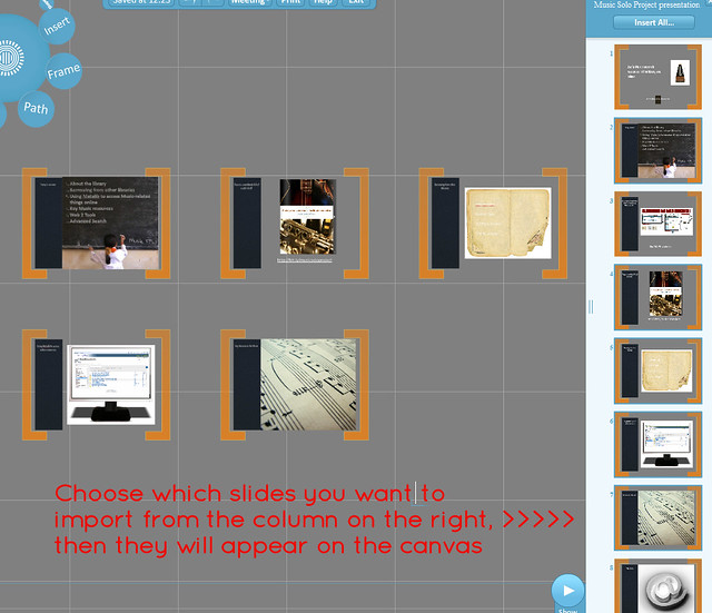
The easiest way to get started with Prezi is probably to import a PPT and mess around with that. If you have slides you wish to convert, just click Insert > PowerPoint and import them onto the canvas - you can choose all or some of the slides, and have Prezi automatically add a path between them if you like. You can edit the text within Prezi - it's not like importing a PDF where you're stuck with what you have.
I'm not sure there's much point in just pulling in some slides and leaving it at that, but it's a nice jumping-off point to creating something more interesting - and it's a lot quicker than typing all the info from your slides in by hand. Quick tip: the more straightforward the slide, the better this works - it struggles with more complicated stuff.

6. Choose from more than just 3 colours for your fonts
It used to be the case that you chose your theme, then stuck with the three colours you were given. Now you can change any passage of text to one of a huge number of colour choices - type it first, then the options appear above it on the right.
I hope some or all of these are useful.
A newly updated Ultimate Prezi Guide is here (refreshed in May 2013), and all sorts of related materials are available here.
- thewikiman


