presentation software

A book about Prezi

  the cover of the book

Mastering Prezi for Business Presentations, by Russell Anderson-Williams, has just been released by Packt Publishing.

I have an interest in this, because I served as one of the two Technical Reviewers for the book. Check it out, I even get a little bio in there!

A bio, of me


About the book

As the name suggests the book is aimed at people giving business presentations - but basically all of it is applicable to anyone wishing to progress their Prezi skills to the next level. What I really like about it is it's written by someone from a proper design background, so there's a lot of technical stuff which is really handy if, like me, you quite like designing multimedia things but have no real idea what you're doing. The sections on using audio and video are really good, and Russell certainly knows a lot of tips and tricks which were new to me. He really gets to grips with the potential of the software, and it's very engagingly written.

About being a technical reviewer

The way the process works with this particular publisher, is that they send you each chapter basically as soon as it has been written. You're encouraged to use the comments facility of Word to go into as much detail as you can, suggesting changes and improvements or highlighting the bits you think work really well. There's also a questionnaire for each chapter, which includes questions like 'what do you think the next chapter should be' and so on. You send back the chapter and the questionnaire, they pass it on to the author along with the other reviewer's comments, and then you get sent the next one or two chapters once they're done.

It's an odd process because you want to be doing a good job as a reviewer and actually making constructive suggestions, so you want to add as many comments as possible - but at the same time you don't want to be finding fault where there is none, and the fewer comments you make the more complete the chapter is already, which is a good thing. So the balance is a hard one to find.

I was doing this around the same time I was finishing off my own book, and I have to say I would have found it very difficult to work like this - showing people what I'd done as I went along. I'm the kind of person who likes to have anything creative more or less complete before showing anyone - and that includes having all the chapters drafted, for context! Facet asked for one chapter early on in the writing process (to check I could actually write) but then let me get on with it thereafter till it was a completed draft. At this point they said they could send it off for proofing, indexing etc - or they could get it reviewed. I asked for it to be reviewed, and specifically asked if Antony Brewerton could review it; I'm really glad I did as the extremely helpful comments he came back with led me to actually restructure the book quite significantly, moving content around and adding some stuff in.

All in all reviewing this Prezi book was enjoyable. Sometimes I found it hard to turn around the work in the time the publisher wanted, and I never really had a sense if what I was doing was actually useful - I asked for feedback but I was told they'd be in touch if there were any problems, so hopefully that means there weren't any. The best part of it was definitely getting to read a great book! There are loads of really useful tips I've adopted, and my recent Prezis are much better than my earlier ones because of it.

One thing is certain - I much prefer this kind of reviewing than critical reviewing for publication, and when I get asked to do that I always suggest someone else to take it on. Knowing what goes into writing a book means I could never really criticise anyone else's knowing they might read that criticism, so a review from me is of no use to anyone...


6 useful things Prezi can do (which even experienced users miss)

I keep discovering new things about the presentation software Prezi. Asking around, it seems lots of other users didn't know about some or all of these either, so with that in mind I thought I'd draw your attention to 6 useful things. Got any more? Leave them in a comment...

1. Upgrade to the educational licence for free if you are a student or work for a University

All you need to do is go to Upgrade on the Prezi site, and stick in your university email address (.edu or .ac.uk etc). As a result of the upgrade you get more storage space (quite useful), the ability to substitute the Prezi logo for one of your own (could be useful for institutional branding of Prezis) and the ability to keep Prezis private (very useful, particularly from a teaching point of view - you don't want students to see the presentation until it's ready!). Well worth doing, I think.

The upgrade box is at the bottom of the screen

2. Hold down shift when drawing frames and hidden frames to maintain a perfect 4:3 aspect ratio (trust me, this one is REALLY useful!)

This is completely brilliant. I use LOADS of hidden frames in my Prezis, to ensure the viewer is shown exactly what I want them to see in the order I want them to see it. However, when you draw a frame or hidden frame which isn't the (usually 4:3) aspect ratio you're using to present - in other words, when the frame isn't the same shape & proportions as a monitor or projector screen - then other stuff can creep into the frame and slightly ruin all the careful planning.

By pressing shift before drawing a frame, it keeps a perfect 4:3 aspect ratio as you draw it - moving the mouse simply increases or decreases the size, but the shape stays the same. You can in effect create several screens, and populate the screens with content knowing that everything will fit perfectly when you're presenting or when people are viewing the presentation online. I used this technique loads in the new technologies Prezi and the branding Prezi I recently created. The result is: better looking, more cohesive prezis.

An example of hidden frames using 4:3 aspect ratio

3. Save your Prezi to a USB stick

I realise most of you will know this one, but I wrongly assumed it was an 'upgraded licence only' option for ages, so thought I'd flag it up here. It's very much worth doing because a: you aren't relying on an internet connection, b: if you've got embedded YouTube videos (and there is an internet connection) they'll still play and c: it enables you to use a clicker to move the presentation along without having to stand by the PC and use a mouse or the keyboard - you can't use a clicker with a web-based Prezi, for some reason.

When you click 'download' you get a ZIP file - you can extract the ZIP to a USB stick but make sure you take all the files and folders with you, as you need all of them to play the Prezi back. You can't edit it on the stick, so make sure it's your final version before you download it.

Screengrab showing the download button

4. Print your Prezi in an actually quite useful way

Pressing 'print' in edit mode saves the Prezi to a PDF - each page of the PDF is a 'screen' on Prezi (i.e each number on your path becomes a printed screenshot). Again, I'd not previously realised this worked so neatly. It means that, for example, for teaching, you could set a simplified path on your presentation, press print to produce a handout of a reasonable length, then put the path back to the full route again. Also, it's the ultimate back-up - if you can't present your Prezi for some disastrous reason, you can present with the PDF instead.

Screengrab showing the print-preview

5. Import a PowerPoint presentation directly into Prezi

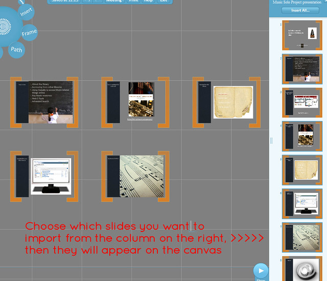
The easiest way to get started with Prezi is probably to import a PPT and mess around with that. If you have slides you wish to convert, just click Insert > PowerPoint and import them onto the canvas - you can choose all or some of the slides, and have Prezi automatically add a path between them if you like. You can edit the text within Prezi - it's not like importing a PDF where you're stuck with what you have.

I'm not sure there's much point in just pulling in some slides and leaving it at that, but it's a nice jumping-off point to creating something more interesting - and it's a lot quicker than typing all the info from your slides in by hand. Quick tip: the more straightforward the slide, the better this works - it struggles with more complicated stuff.

Screengrab showing import slides

6. Choose from more than just 3 colours for your fonts

It used to be the case that you chose your theme, then stuck with the three colours you were given. Now you can change any passage of text to one of a huge number of colour choices - type it first, then the options appear above it on the right.

Picture showing colour highlighting

I hope some or all of these are useful.

A newly updated Ultimate Prezi Guide is here (refreshed in May 2013), and all sorts of related materials are available here.

- thewikiman

How to use Prezi really well

I'm loving using slides to disseminate stuff at the moment, so I've re-written and updated my Prezi FTW post and produced a new top ten tips on creating a great presentation with the online zooming software. Also, I used it as an opportunity to really really hard with the slide-deck and experiment with a slightly different style.   (And put in a little bit of library pride on the final couple of slides.) :)

edit: since these slides were created, Prezi has improved some features and made some changes - including a Theme Editor. This means point 2, about choosing your colour scheme early and the fonts / colours not being mix-and-matchable, is no longer quite as true...

How to use prezi and WIN - feel free to share / use this.

View more presentations from Ned Potter.
For more in-depth information, including a Prezi guide in Prezi itself, see my ultimate guide to Prezi.

Prezi as grand canvas

Since the original Prezi FTW guide I've used Prezi in a new way. Rather than just creating a presentation on a blank background, I've started trying to use an image as the canvas, and superimposing all my text, graphics etc onto that image.

Here is the interactive library map I created for the New Professionals Information Days:

Everything you need to know about technology and working in libraries on Prezi

As you can see it's designed to be used interactively by the viewer, rather than navigated through in linear fashion - everything highlightable is clickable. I think this makes more of the unique properties of Prezi versus PowerPoint - increasingly, I don't think it's worth using Prezi over really nice slides unless you exploit some of these types of capabilities.

In Edit view the Prezi looks  like this:

My Prezi as seen in edit view

All those blue boxes are Hidden Frames, and hidden frames are what makes each bit highlightable (and clickable on). It's really easy to do.

I think this has loads of potential. You could do maps, plans, desks anything with a top down view really. Because Prezi writes directly and transparently on to whatever the surface of the canvas is (as opposed to having to create a text-box with a white or coloured background, for example) you can add text to anything which doesn't already have text on it. So for example you could take the full size version of this picture (from www.sxc.hu):

Some notes arranged on a desk

...and write text of varying sizes on all the little bits of note-paper, making full use of all the different angles, etc etc. You get a nice cohesive top-down view, and then you get to zoom in and read all the intriguing pieces of text individually. Or you could use an old fashioned painting as your canvas (imagine a 19th century oil-painting of a lake) and then zoom in with extreme close-up of some modern water-skiers on there, for some Banksy style anarchy (but subtler)!

So I'd encourage anyone to experiment with the Prezi as Grand Canvas idea. Good luck!

- thewikiman

Fail or Prevail: Top Tips For First Time Speakers


Fail or Prevail Poster on the tube

In the run-up to the New Professionals Conference next month, a few people have asked about sources of advice about presenting. I don’t claim to be an expert in this by any means  -  I’ve only presented at a handful of events and there’s loads I need to work on. (Not least of which is the fact that my voice doesn’t project too well, so I almost never get to present in anything like my natural way of speaking because I’M TOO BUSY TRYING TO MAKE SURE PEOPLE CAN HEAR ME. Happy days.) But I do go to a lot of events and see a lot of presentations, and anyone who does this pretty quickly gets to know what works and what doesn’t.

I should say, before I go any further, that this is just my opinion. This isn’t me with my “Ned Potter, New Professionals Conference Organising Committee” hat on; this stuff applies to all presentations, generally. It’s me with my usual “thewikiman spouting off about stuff” hat on – you certainly don’t have to do any of the stuff I’m about to say, if you’re presenting at NPC2010.

For me this whole thing divides into two key areas, plus general stuff.

Presentation Style

  • Reading it out = fail. If you’re going to read your presentation out, you need to be really good at reading stuff out. 9 times out of 10, unless you’re delivering a paper at an academic conference or something very precise of that nature, presentations with notes sound better than presentations read in full from prose. Stuff you write and stuff you say out loud requires different words, different phrases, and a different style. I originally intended to read my paper out last year, then I tried it a week or so beforehand. I panicked – I just could not make it sound interesting, or dynamic, or natural. It took a while to put it into note form – so if you do plan to do this then start the process early…
  • Saying out loud the exact same stuff that’s on the slide = fail. Admittedly there are times when this can be useful – statistics, and quotations, are times when I like to reinforce what I’m saying verbatim with words on the screen. Otherwise, your voice and your visual materials should compliment rather than duplicate each other. People will read your slide in their heads quicker than you can read it out loud anyway. Also, don’t turn your head and read the slides off the screen – you won’t believe how much this affects whether or not people can hear you. You have the laptop or whatever you’re using for the slides in front of you, so glance down at that if you do need to read stuff such as a quote or statistic.
  • Matching style to context = prevail. Things that work well in a seminar situation don’t always work in a big hall full of people, and vice versa. After New Professionals last year, I was feeling pretty confident going into the CILIP Graduate Day – I was delivering an improved version of the paper that won me a prize. But although the content was improved, the style wasn’t quite right and I don’t feel I did a very good job – my presentation was well suited to being delivered to 100 people in a big room, and less well suited to being delivered to 30 people in a smaller, more informal setting. I can’t even really put my finger on what was wrong with it, but I do know that if I had my time again I’d rewrite it for a more intimate audience.
  • Practicing in a meaningful way = prevail. There’s no point in practicing your presentation in your head. You need to say it out loud, in a voice that will carry. This changes some phraseology, how long it takes to perform etc. Leave gaps for taking sips of water, for pauses to collect yourself, and for the inevitable moment when you can’t pick up a page of notes on the first three tries, or pick up two pages at once by mistake. You really, really, have to practice it exactly as you will do it on the day, except not in front of a hundred people. Even if you feel silly. It’s worth it, honestly. If your spouse / partner / house-mate is going to laugh at you practicing at full volume, do it when they’re out (or leave them).
  • Timing your presentation to be exactly right, then reducing it by 10% anyway = prevail. There is some ancient Law of Presentations that says it’ll take longer on the day than it did when you rehearsed it. I practiced my presentation for NPC2009 and got it down to the exact 20 minute slot I had to fill, it was spot on. I spoke really slowly and left plenty of time for pauses as noted above. And still, at the conference itself, I ended up skipping a slide entirely (and I only had about 9) because I was running short of time. Get it so it takes exactly as long as it should do, then go through and ruthlessly cut out 10% of filler. It’s better to be under than over, and the chances are you’ll end up with a more focused and better presentation anyway

Presentation Materials

  • A gazillion slides = fail. Generally speaking, fewer slides is better.
  • More than a small handful of bullet points per slide, plus having any unnecessary animations = fail. You really don’t want more than five bullet points on a slide, it gets too cluttered, small, and hard to read. Just spread stuff across two slides if necessary - or even better, just write less stuff.  Similarly with animations – unless particular animations serves a purpose, don’t use them. Having your bullet points bounce in from the right of the screen, or unfurl like a blind, is old. Also, studies have shown that Power Point animations that feed in the bullet points one-by-one actually lull the brain into a non-receptive state, as it expects to be spoon-fed thereafter, meaning people remember less of your presentation. I was told that on a PowerPoint course*, so that makes it FACT. *(Yes, I went on a PowerPoint course. I was young, and had work-budget left to spend on self-development.)
  • Making an effort with PowerPoint = prevail. PowerPoint is so easy to use, many people don’t look beyond its basic templates. But they’re pretty ugly. I was talking to Buffy Hamilton about this and we agreed there’s really no excuse, anymore, for not making an effort – it takes a couple of minutes longer to prepare a much, much nicer ‘zen’ style presentation. Have a look at one of Buffy’s examples, or Bobbi Newman’s, or Helene Blowers'. The essential principle is, you have a CC image (there are literally millions on flickr, of course) which serves as the background for your slide, then you create some kind of text box and put the key point in it (or just type straight onto the pic). No fussy slides, no bullet points, no naff-looking templates – just the key message, and a picture which tells the story. It’s really easy to do.
  • Exploring alternatives to PowerPoint = prevail. Of course, you don’t have to use PowerPoint at all. There are plenty of alternatives now which look fabulous but are very easy to use – have a look at Prezi (which I’ll be using for own presentation this year - very much a work in progress at the moment -  along with some zen slides too), or Ahead, or Slide.com. They make you look awesomely professional with very little effort, and we can all enjoy that!

And in general…

There is a whole lot of common sense stuff which everyone says, everyone knows, and still people quite often forget to do.

  • Get familiar with the facilities available to you = prevail. Email the organisers and ask what there is. Of course there’ll be some kind of PC with PowerPoint and a projector, but will there be internet access on that PC for you to log in to your online presentation software? Does it have Office 2007 or will you have to make sure to save your slides as .ppt rather than .pptx? And talking of PowerPoint – if you use this, don’t save your file as ‘Conference Presentation’ or the name of the event. Everyone does that. When you arrive, you’ll probably transfer your presentation from your USB stick onto the PC everyone will use to present on – in the heat of the moment of change-over, from the previous presentation to yours, you’ll find yourself staring at 8 icons on the desktop all called the same thing and probably have a stroke from all the panic. Save your presentation as your name, even though that’ll seem silly at the time when you’re on your own in your room…
  • Get familiar with the people you’ll be working alongside = prevail. If there’s a meet-up / tweet-up the night before, get involved. If the event on the day starts at 10am, get there at 9:15 and set up your stuff, then go and speak to the other people who are there early. Chances are they’ll be either running the event or they’ll be fellow presenters – it’s great to get to know these people beforehand, as it’ll help you feel more comfortable later on the stage. Also, say hello to the person doing the sound if you’re mic’d up – they can make or break your presentation, so go and say hi even if they’ve got scary beards, like wizards, and look like they hate you.
  • Negating the impact of your words by saying ‘um’, ‘like’ and ‘sort of’ a lot = fail. Unlike in TV dialogue or books, people in real life say ‘um’ a LOT. In fact, perfectly normal people say ‘er’ as much as ‘the film comedy nervous person who says er a lot’ says er, if you listen. That’s fine, we all do it. But when you’re presenting, you need to have absolute conviction in what you’re saying, be confident that it doesn’t need to be qualified or mitigated by any indecision, and OWN it so much you don’t ever have to fall back on saying ‘sort of’ to buy yourself some time to remember what you’re saying.
  • Starting big! = prevail. So many good books or films have complicated back stories to tell, yet they still manage to start with a bang. It’s the old, ooh look someone’s being garrotted before the opening credits, and then after that it says ‘five years earlier’, trick. If you have to do a lot of setting up to make your point, open with a bold statement first, then go back to the beginning and do the back-story. So let’s say you’re talking about The Librarian of the Future. You could say, “libraries are changing, this is why it’s important, here are some trends, we need to adapt” blah blah. OR, you could say “The librarian of the future will work in the cloud. He or she will not be employed to work in a building, but rather will work collaboratively with colleagues from around the world to provide 24hr rolling information services to online subscribers” or whatever – THEN go back to the start and give them all the context.
  • Not following your own advice = fail. I’ve just read all that back and quite a lot of it I didn’t do last time I presented. Sigh.

So there you go. For tips on speaking generally, I thought this article was really good – The Introvert’s Guide to Speaking.

Good luck!

-          thewikiman

p.s since writing this, I’ve read 30 quick tips for speakers, which includes this one which I think is a great point, and that I hadn’t thought of: don’t apologise for stuff the audience won’t know is wrong. If you come to a slide and something mysterious has happened – ie a graphic has disappeared, or whatever – they’ll only know it’s a problem if you make it a problem. Just recompose yourself and move on without it. This is another piece of advice I’ve failed to follow in the past! I say stuff like, “ooh, that’s weird, erm.. not sure what’s happened there! Heh-heh! Seems to have been some kind of problem, the video I’d embedded has gone! I wonder what’s happened there..” SHUT UP THE WIKIMAN! You buffoon! Generally speaking, even if you do clearly have to apologise for some kind of disaster, doing so once is preferable to doing so multiple times.

p.p.s Plus that same article also has ‘always repeat the question back to the audience so they can hear it’ which I should have put in, too.

p.p.s See all the guides to everything that I've ever written, in one continually updated place, here.