Information Professional

The 4 Most Important PowerPoint Rules for Successful Presentations


I have been working on these slides, 10 minutes at time here, 15 minutes there, for MONTHS! I finally uploaded them to Slideshare this morning.

There are a few reasons for making these. First of all it's separating out what is essential in slide design, to what is merely desirable. There's a million and one guides to creating nice PowerPoint slides and a lot of them focus on what is desirable, but that can often be too much information if you want to improve your presentation materials but you're not sure where to start. The presentation below focuses on the four rules which REALLY matter (backed up by actual research) - and as it says in the slides, an attractive presentation is actually just a byproduct of an effective presentation. Follow the four rules below and you will be making effective PowerPoint slides which communicate effectively and make your message stick.

Another reason to make these is my understanding of what matters with slide design is evolving over time, so this reframes some of the things I've highlighted in previous presentations. It covers some of what we talk about in my Presentation Skills Training; I realise not everyone who wants to attend these can get to them, so wanted to disseminate some of the guidance they contain more widely. (If you're already booked onto a workshop don't worry though - the information above is a small part of the full content of the day!) 

I hope people find these useful. In my experience the easiest way to make a big difference to how effective your presentations are is to start with the materials (for teaching as well as conference presentations) - a great set of slides makes the audience sit up and take notice, which in turn gives you the confidence to deliver a better presentation.

If you'd rather use a design tool to help craft your slides for you, check out Canva and Haiku Deck from Presentation Tools Week.

Aim your professional development output at '1 Year Ago You'


What do you know now, that is useful and pertinent to your professional life (or even your personal life) that you didn't know 1 year ago?

Whatever it is, the chances are there are plenty of people still at the '1 Year Ago You' stage who could do with hearing about it. So why not blog about it, write an article about it, or submit a proposal to speak about it at a conference or event?

I know lots of people who don't do any of those things because they consider that they simply don't have anything to say. It's easy to fall into the trap of thinking you have nothing to contribute - there's so much dialogue already, after all. And Imposter Syndrome runs through our profession like a vein. 

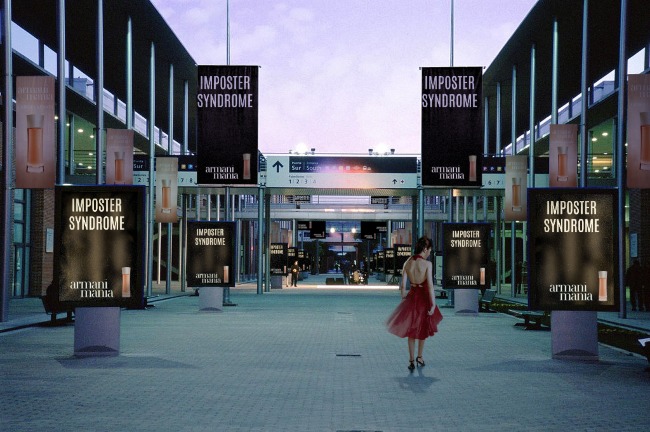
Imposter Syndrome: For a Man, or a Woman

Imposter Syndrome: For a Man, or a Woman

But we want new perspectives. We love to hear others' experiences. We need to know what has worked and what hasn't in professional situations other than our own. In short, we do want to hear from you, and we'd welcome your professional development output. (That's the rather awkward phrase I've come up with to describe the kinds of things we do as part of our online presence, or at professional events.)

Framing what you might choose to say as 'advice for 1 Year Ago You' is often enough to make people realise, actually, yes, they could present a paper or write a blog. The blog you are reading now is almost entirely aimed at Past Me - we're all learning useful stuff all the time and where appropriate I try and repackage that into something others might find useful. Most of the posts on here are about things I wished I'd discovered sooner.

Of course, it doesn't have to be '1 Year Ago You' specifically. It could be '6 Months Ago You'. Or '1 Day Ago You'. But someone, somewhere, will be at the exact stage you were before you learned about that useful tool / technique / concept / article / platform / literature or whatever it might be, that made it all click for you. So 'cascade the knowledge', as they say - you DO have something to say, and there will be an audience for it.

7 Super Slide Styles to download, copy, and adapt


I love slides, as I've said before. One of the biggest problems people have when trying to make something effective and visually arresting is simply knowing where to start. Or having not much time at all, so they can get together the content but don't have chance to put it into a new style.

So with that in mind, I've created the presentation below. It features the same information presented seven different ways; if you like any or all of them, you can download the original PowerPoint from here, and do whatever you want with it. Delete the bits you don't want, modify and build on the styles you like.

I've not done this before, provided a sort of OER version of a presentation, so I'll be interested to see if people find it useful. I hope the templates can work in some situation or other for you, particularly if you're stuck for inspiration. It may be that you take a slide style and use it throughout a presentation, or it may be that you take one or two styles and just use them as a blueprint to give you a head-start, and then change them completely.  It's entirely up to you, you can do whatever you like with them - and although it would be great if you could credit me somewhere, don't worry if you can't fit it in. I'm not releasing them under a Creative Commons Attribution license, I'm just putting the whole thing into the public domain.

Something I need to make clear though (and thank you to Andrew Preater for flagging this up to me) is that the images are Creative Commons images (rather than public domain), and so if you want to use those images specifically you need to respect their original licenses! Each of them is linked to, both in the presentation itself and with its creator's name at the end of the presentation, so you can see the kind of Creative Commons licence they have. In all cases, they need at a minimum for the creator to be attributed. Obviously the images I've used here are just in there as examples, I'm expecting people to take the slide designs and redo them with their own content - but if you do decide to keep them, keep their Creative Commons status in mind...

For 6 of the styles I've included a little arrow in the breakdown section with a link to a full set of slides created somewhat in that style (most by me, a couple by other people) so you can see what an expanded version might look like.

To adapt and build on these styles if you like them, the right-click menu in PowerPoint is your friend. Firstly if you right-click on the little slide preview pane, you'll find the 'Duplicate' option. Duplicate the slide you like, then edit the contents. Right-clicking on the main slide edit view is vital here too: the menu it produces allows you to recolour text boxes or backgrounds, change the picture (but retaining size and positioning), copy elements you like and paste them elsewhere, blur or darken images so you can write directly onto them, etc etc. This allows you to take a single slide and build a presentation with a cohesive visual theme around it, rather than just having literally the same slide several times with different words on it.

Good luck making your slides, and let me know what you do with the templates! (You don't have to. I'm just curious to see whether people make things using these as a building block, and what they're like...)

Email Communication Part 2: Measuring Impact, Subject Line Length, Email Frequency & More


Earlier in the week I wrote about the basics of good email communication, the three Ts. In this follow-up I want to cover a few more complex things which didn't fit in the previous post, particularly around the theme of an email newsletter.


Why do people unsubscribe from mailing lists and newsletters?

Reasons people no longer want to receive a regular email from an organisation include, in ascending order of importance according to Litmus: Found an alternative way to get the same info, Preferred to seek out info on their own, Found the content irrelevant, Received too many emails generally, Found the content to be repetitive or boring over time.

And in First Place? 54% of people said the reason they unsubscribed was this: Emails came too frequently. Don't over-saturate your audience - pick your moments, based on THEIR needs, the lifecycle of their work, and on how much vital information you have to impart. Which leads us to...

So how frequently should I email?

In Part 1 of this post I talked about the importance of being Timely - emailing at the right time of the day so that your email is received both at a time when people actually read emails and when yours isn't buried under a pile of other emails coming in at the same time. 3pm appears to be the sweet spot.

There's another aspect to being timely though. Firstly, Monday appears to be the best day on which to send an email newsletter - for all the reasons you'd imagine (people are still full of vim and vigour early on in the week, and not yet weighed down by all the things they wished they'd got done but ran out of time to do).

Secondly, I believe it's really important NOT to email to a fixed schedule, for example the first Monday of every month. A vital aspect of good communication is not wasting opportunities by communicating when you don't need to - it reduces the value of your communication overall and edges you closer to becoming part of the white noise. So send your newsletter or other 'important updates' email only when there's a weight of useful things to say, rather than just when it's the time you usually send it. Communicate because your audience NEEDS to hear what you have to say, rather than because you need to send a monthly update.

How long should my subject line be?

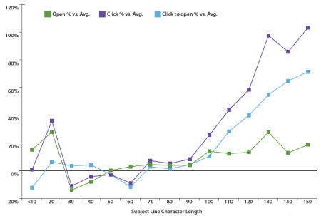
Click to view this as part of a larger (and very useful) article on EmailAudience

Click to view this as part of a larger (and very useful) article on EmailAudience

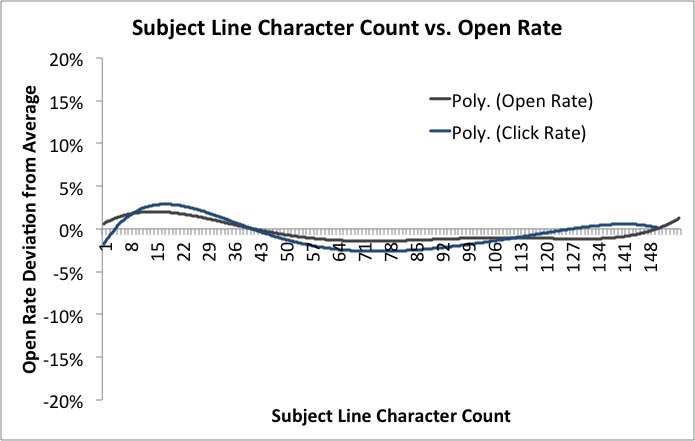
Click to view this as part of a larger (and also quite useful) article on MailChimp

Click to view this as part of a larger (and also quite useful) article on MailChimp

I mentioned in Part 1 that I think the Subject Line is hugely important, and that calling your email 'Newsletter' is a recipe for being completely ignored. You need a decent title, one which gives people a specific reason to open the email; a benefit to them.

As to how long this subject line should be, there is conflicting evidence about this. EmailAudience found that very short worked well, medium length worked REALLY badly, and very long (tweet length subject lines, basically) worked fantastically.

However MailChimp analysed 12 billion emails and concluded 'Subject line length means absolutely nothing'! If you compare the graphs showing the two companies' findings, they do actually follow broadly the same pattern - short and long are good, medium length doesn't do much for anyone. It's just that how much of a difference this makes is clearly reflected as being much smaller by MailChimp. 

They conclude with this very sensible statement which makes a good point about Subject Line length and the kinds of devices and platforms your audience are reading on.

Your audience is chock-full of individuals with different reading habits, interests, and demographics. Maybe my audience is full of Apple fanboys and every one of them reads my newsletter on their iPhone. Well, then the subject line they see might need to be shorter for their small screen. Or maybe my newsletter is geared toward businessfolk who mostly run Outlook. In that case, maybe a longer subject is more acceptable.
— MailChimp

Like so many things, it comes down to understanding your audience. Which takes us neatly on to...

How can I measure and track the impact of my email?

There are elaborate things you can do with Gmail to track open-rates of emails, but I think that's much more important in traditional business than it is in non-profit comms. More important is to measure and track the impact - essentially, do people ACT on the email, and can I influence how often this happens by changing when I send the email, the subject line, the tone, the length and so on?

If your email is a just general update, measuring impact is very hard to do. If, however, it includes a Call to Action, and that action has a website involved - e.g. 'Try our new online resource [link to resource]' or 'Come to our workshop [link to booking form]', it becomes possible to see how effective the email is by measuring the Engagement Rate. This is the number of clicks on the link divided by the number people who received the email - so take a really basic example, if you email 100 people and 30 click the link, the Engagement rate is 30%. 

How do you find out how many people click on the link? You use a unique URL created especially for the email via bit.ly. Bit.ly is a URL shortening service (useful in itself) which provides two fantastic functions for Comms purposes - it allows you to customise the URL, and it counts the number of times that specific customised URL is used.

(So for example, at the end of the 10 Tiny Tips for Trainers slidedeck from a couple of weeks back, I put in a customised bit.ly URL for people who found the presentation on Slideshare, and wanted to read the blogpost which accompanied it on here - a lot more people see my slides than see this blog. The reason I used bit.ly was just to make a short, memorable URL - I chose bit.ly/10TinyTips which is a lot easier to fit on a slide in large letters than http://www.ned-potter.com/blog/2014/8/8/10-tiny-tips-for-trainers! - but it also gives me the stats. So I know that 225 people clicked on the link in the slides, because that link didn't appear anywhere else.)

So going back to the email newsletter - if you're launching a resource or promoting an event, and you want to know how effective your email has been, use a customised bit.ly URL to see how many people clicked your link. If half the people you email click on the link you've included, that's a pretty fantastic rate of return as these things go. Build on whatever formula you used and do it again! If only 5% click, then do things differently next time - perhaps change the subject line, or make the call to action more prominent, or email at a different time of the day or week.

Incidentally, another possibility bit.ly allows is to compare effectiveness of promotional activities. So you have one bit.ly URL for your new resource that you use in emails, one that you use on Facebook, and another you use on Twitter. Then you compare the stats for each, with the overall stats for the resource, and see which communication method is the best way to get people to use your stuff...

Should I care about email preview panes?

If your audience are young (University students, for example) then yes, this matters a little bit. According to ConvinceandConvert, 84% of 18-34 year olds use an email preview pane. I am 34 and I do this! I have a preview pane in both Outlook and Gmail for work, where I can - but not in Yahoo for my personal email, where I've never worked out how. I much prefer a preview.

This means these users will see the first few lines of the email (depending on how big they've set their pane) BEFORE they click to open. Worst-case scenario is they dislike what they see so much they never get as far as opening the email. The best-case scenario is they are enticed or inspired by the preview, and when they open the email they are fully engaged with its contents. So, as with so many media in the web 2.0 age, the important thing here is to hit the ground running. No long intros, no scene setting - just useful, headline information right at the top. It's using the journalism model, rather than the academic paper model - put your conclusions at the start.

Are there any useful email tools I should know about?

I think MailChimp looks great for non-profits. You'd probably need to use the paid-for version, but if email is an important part of your marketing strategy, and you can afford it, then MailChimp is worth it because of the level of control, and of impact measurement, it gives you.

I'm a big fan of Scribd (as a creator rather than a consumer - don't be put off by its homepage which is aimed at the latter!) - it takes PDFs and turns them into web documents. So if your email newsletter is a PDF, I cannot stress enough how people don't click on and open PDFs nearly as much as we'd hope they do, so put in a link to a Scribd version (or embed it in the email if that's possible with the tools you use). Not only does this make the newsletter more easily accessible, it allows it to be discovered on the web, and it gives you built-in usage statistics for how it much it's being read too.

Creating quick and easy videos with Adobe Voice


I saw this tweet earlier in the week, and had a look at the list. It's a good list, and the thing which really caught my eye was Adobe Voice. It allows you to create an animated video which sits somewhere between a normal video or screen-capture, and a slidedeck on autoplay. I decided to sign up and have a go, and it took only about half an hour to create this video with it.

It's a very new product, coming out in May of this year. Hopefully the video above shows you how it works and what it can do - the reason I feel like it could be so useful for libraries is that it allows you to explain fairly dry and complex information in a visual and engaging way. Some types of video, particularly stuff about databases and online things, really don't lend themselves to the 'person talking either to or off camera' school of video-creation - and screen capture can sometimes be a little dull too. I feel like this is a nice hybrid - the 'animation' element keeps things moving, and you can use screengrabs if you like too. You need neither a micrphone nor a video camera to create an effective video. You don't have to master complicated software (and even Camtasia, which I think is ace and very easy to use, feels complex compared to Voice).

Like a lot of new tools coming out these days, it makes things look very smart without the user having to know about anything except providing useful content. There are lots of different templates - here's the same video as above, using a different theme. Notice how it recolours the icons to fit the new theme.

You can also choose different layouts - I chose a side-by-side theme but there are four other options.

So have a look and see if it could be useful to your library. In summary:

(The Cons list looks really big when they're side-by-side but that's only because the cons take more explanation!)

Pros

  1. Solves an existing problem! I love tools which do this
  2. Free
  3. It's an all-in-one solution. When I create slides I have to go to iconfinder for icons, flickr for images and PPT to actually make it - Voice does all these things from one place
  4. Looks great
  5. Extremely quick to create something useful
  6. Conveys information well - it's not just pretty, it's effective in what we need it for

Cons

  1. iOS only
  2. You can't, at the time of writing, have more than one layout (or theme) per video, which would be nice
  3. In fact there's very little flexibility in how you layout each slide, once your theme and layout are selected - but this is also its strength. It's idiot proof. You'd have to go out of your way to make something bad with this tool
  4. At the moment there's no option to upload to YouTube - they have to be hosted on Adobe's own site and embedded elsewhere. That's fine, but having a video which isn't on YouTube always seems like a massive waste of an opportunity...