Tech Guide

Ever wondered why people put a dot at the start of their tweets?


It's for a good reason.

The most common Twitter mistake...

The most common Twitter mistake...

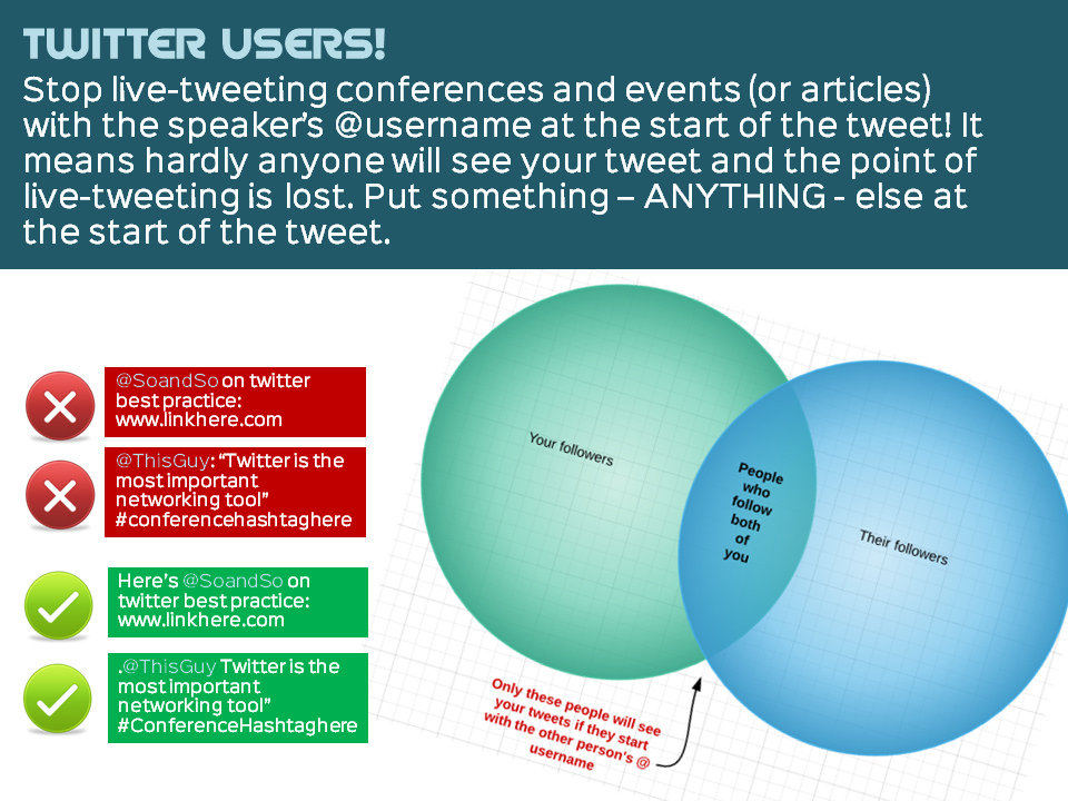
Years ago I wrote a thing on TinyWrite (which sadly doesn't exist anymore) about using a character at the start of a tweet to ensure everyone sees it - when that's appropriate. Later I saw the slide-deck below, on the same subject.

I saw those slides again today, and I feel the same way about the presentation now as I did when it first came out - it is very good (and very popular), but it is also a 44-slide way of making what is quite a simple point! So I made the image above, because it occurred to me that a Venn Diagram could explain it fairly succinctly... I LOVE Venn Diagrams. Any excuse to use one. (Here's my favourite one ever.)

Anyhow here's the deck for a fuller explanation:

You see this problem on Twitter all the time, still. Even experienced Twitter users fluent in everything else on the platform make the error. The reason this matters is that sometimes you want all of your followers to see a tweet with, as I say, sharing content and live-tweeting events being the two main examples. Fairly often people will tweet a link to one of my blog posts with @ned_potter at the start of the tweet - so basically only people following both the tweeter and me will see that tweet, and my followers may already have seen it when I tweeted it anyway...

So it is a basic part of the way Twitter works - Twitter filters conversations so you only see those between people you follow, otherwise it would be completely unusable and overwhelming. (Incidentally, one of the side effects of this system is sometimes you can be tweeting as an organisation, and having a dispute with a user, and it feels like the whole world can see your conversation, which is embarrassing. In actual fact, only people who follow both you and the user will see it, so it's not nearly as problematic as it feels at the time...)

So if you want all your followers to see a tweet, make sure there's a character of some kind before an @username. It's not the end of the world if people get this wrong - but you may as well get it right!


Edit: A brief follow up on over-sharing via the dot

As part of the conversation that followed me tweeting about this post earlier, Matt Shaw pointed this out:

If you click on the date in that tweet you'll see all the tweets which followed in reply - but essentially it comes down to some people overusing the dot to ensure everyone sees their tweets. There are three main reasons people use the dot apart from the live-tweeting and post-sharing described above.

  1. Because someone asks a question to which the answer has value to everyone (this is, in my view, completely acceptable - as long as you're a good judge of what constitutes value to everyone, and I'm not always confident I am a good judge of that...)
  2. Because your tweet is so hilarious / insightful / clever that everyone simply must see it (this is sometimes okay, I am guilty of doing it on occasion, but when people do it all the time it makes me wince)
  3. Because they want everyone to see the praise they're responding to (this one I have the most problem with - you see people responding to thanks for their talk, as in this example from Chuck G in an article raging against the dot. You also see people saying thank you for people nominating them for a #FollowFriday in this fashion. Why do people do this? Or worse still, ReTweet their FollowFriday nominations?! Everyone who sees the tweet already follows them! Desist!)

So, use the dot with caution! Use it to share blog posts and presentations from other Twitter users - or better still, put a word in there to make it a proper sentence. And as Chuck says, if you're tweeting a conference lead with the hashtag (that's a far better solution than my example in the image at the top of this post). But otherwise, think carefully.

ALL THAT SAID, as I've mentioned before, my number 1 piece of advice to tweeters is to ignore advice to tweeters - unless you're tweeting as an organisation, just do it how you want to...


Creating quick and easy videos with Adobe Voice


I saw this tweet earlier in the week, and had a look at the list. It's a good list, and the thing which really caught my eye was Adobe Voice. It allows you to create an animated video which sits somewhere between a normal video or screen-capture, and a slidedeck on autoplay. I decided to sign up and have a go, and it took only about half an hour to create this video with it.

It's a very new product, coming out in May of this year. Hopefully the video above shows you how it works and what it can do - the reason I feel like it could be so useful for libraries is that it allows you to explain fairly dry and complex information in a visual and engaging way. Some types of video, particularly stuff about databases and online things, really don't lend themselves to the 'person talking either to or off camera' school of video-creation - and screen capture can sometimes be a little dull too. I feel like this is a nice hybrid - the 'animation' element keeps things moving, and you can use screengrabs if you like too. You need neither a micrphone nor a video camera to create an effective video. You don't have to master complicated software (and even Camtasia, which I think is ace and very easy to use, feels complex compared to Voice).

Like a lot of new tools coming out these days, it makes things look very smart without the user having to know about anything except providing useful content. There are lots of different templates - here's the same video as above, using a different theme. Notice how it recolours the icons to fit the new theme.

You can also choose different layouts - I chose a side-by-side theme but there are four other options.

So have a look and see if it could be useful to your library. In summary:

(The Cons list looks really big when they're side-by-side but that's only because the cons take more explanation!)

Pros

  1. Solves an existing problem! I love tools which do this
  2. Free
  3. It's an all-in-one solution. When I create slides I have to go to iconfinder for icons, flickr for images and PPT to actually make it - Voice does all these things from one place
  4. Looks great
  5. Extremely quick to create something useful
  6. Conveys information well - it's not just pretty, it's effective in what we need it for

Cons

  1. iOS only
  2. You can't, at the time of writing, have more than one layout (or theme) per video, which would be nice
  3. In fact there's very little flexibility in how you layout each slide, once your theme and layout are selected - but this is also its strength. It's idiot proof. You'd have to go out of your way to make something bad with this tool
  4. At the moment there's no option to upload to YouTube - they have to be hosted on Adobe's own site and embedded elsewhere. That's fine, but having a video which isn't on YouTube always seems like a massive waste of an opportunity...

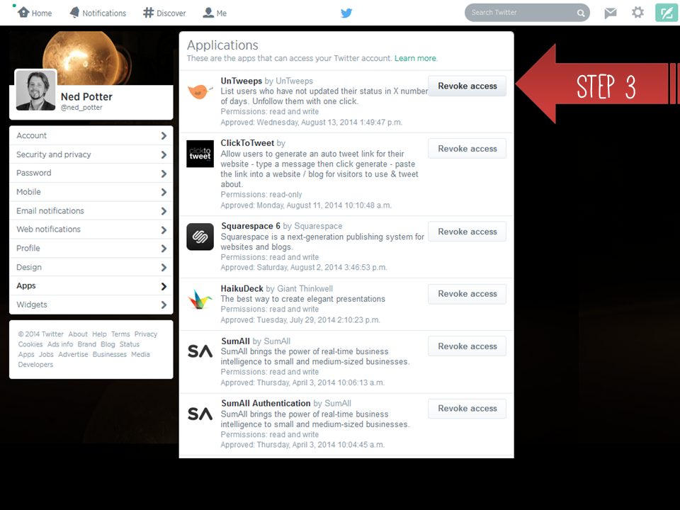
A friendly reminder: revoke access to any Twitter apps you no longer need!


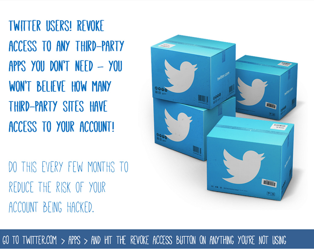
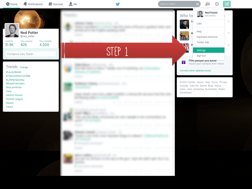
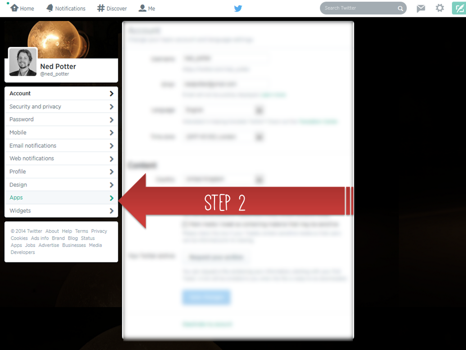
If you tweet, this is just a friendly reminder to periodically go to Twitter.com's Settings, choose Apps (if you're already logged into Twitter, this link'll take you right there), and revoke access to anything you don't still actively need.

I made this - click to view the original on Flickr.

I made this - click to view the original on Flickr.

Often when Twitter accounts are hacked, it's not because a hacker has magically guessed your password, but because a third-party app which has access to your account (and probably thousands of others) has been compromised. Every time you sign into something with Twitter, you're slightly increasing the risk of being hacked.

The sites which only ask for read-only permissions aren't likely to cause any trouble, but any that can read and write tweets - and loads can, even if they don't ever actually write tweets on your behalf under normal circumstances - should only be allowed access to your account if you're using them on an ongoing basis. This particularly important with institutional accounts, obviously, where a hacked account can lead to some reputational harm - but for peace of mind apply it your own personal account too.

I just did this for the first time in a while, and honestly there were apps in there I have no recollection of even existing, let alone being something I've actively taken the decision to link with my Twitter account...

Incidentally, if you ever do find your account has been compromised, here's the Twitter Support page you need.

#BLAle14 Tuning out the white noise in library communication

A lot of the communication between Libraries and academic departments is just white noise, unless we tailor and personalise it. This takes a large amount of time, but the returns you get are absolutely huge - and this is the basis of my #BLAle14 keynote, a version of which is here:.

Tuning out the white noise: marketing your library services from Ned Potter

For context, here's the Twitter back-channel during the presentation - divided into sections so you can read along with the slides if you're especially keen. There's more on the conference itself below the Storify.

=======

The BLA

I became a Business Librarian this year, when I took over looking after the York Management School alongside my other departments in January. I also took over our membership of the Business Librarians Association and have been looking forward to the BLA Annual Conference, which everyone told me was excellent. And it was! I had a great time, it was great to catch up with old friends and make new ones, and I very much appreciate Nathan and the organisers inviting me to speak. As I said in my talk, I've found the BLA to be an extremely useful and helpful organisation to be a part of, so if anyone reading this looks after a Business School but isn't a member, I'd recommend signing up.

I was only able to attend two days of the conference but for me the highlights included:

  • The National Space Centre where we were lucky enough to experience a Key Stage 2 film all about The Stars and that in the Planet-arium
  • Very nice accomodation as part of the conference venue which made everything extremely easy - it's much more relaxing never having to worry about travelling from a hotel etc, so other conference organisers take note
  • A very interesting presentation about The Hive in Worcester - the UK's first joint public and academic library, from Stephanie Allen. I have to admit it never even occured to me that a public-academic library was possible, but although it sounds complicated Stephanie made a pretty convicing case for it being a great idea. It sounds like a great place - generally I have no interest in Libraries as places but I'd quite like to visit The Hive...
  • Joanne Farmer showing us Northampton's very nicely done video on employability (which she scripted)
  • Andy Priestner's very engaging talk about how UX in Libraries is very much a thing now - here's Andy's presentation on Slideshare, take a look .

I was sad to miss Aidan Smith's presentation on Occupye, used at Birbeck to show where there is seating free in the Library - this won the best short paper prize.

I thought the organisers did a great job, and it was the first conference I'd been to since LIASA so it felt great to be at that kind of event again. Thanks for having me!

Blogging: the three main options and platforms for hosting a blog

The issue of where to host a blog is fairly complicated for people new to the medium - particularly the differences between wordpress.org and wordpress.com. I often have to write a condensed version of the advice below in emails to people as follow-ups to blogging workshops, so I thought I'd put it all in one blog post in case others find it useful too.

Why does the platform matter?

Every blogging option comes with its own advantages and drawbacks. On a basic level they run on a sliding scale from quick, logistically easy, and ugly / annoying to use at one end, to more complicated, faffy, and nice to look at / simple to use at the other. Often the more basic solution starts off okay and then becomes problematic later on, but you can migrate blogs to new platforms without too much fuss, so if you set up a wordpress.com blog on a whim and it turned into something significant and valuable, so now you want to upgrade to wordpress.org to get rid the weight-loss ads which have started appearing on your posts, then fear not, you can do exactly that.

All blogging platforms have some things in common. They all have a basic word processor interface for typing in posts, they all give you stats on how many people are reading your posts, they all give you ready-made options to help readers subscribe to, search, and share what you're blogging. All allow you to pay for a URL and so call your site the slightly more credible-looking yourname.com rather than yourname.wordpress.com or similar.

You could show all of them to someone in the year 2000 and their jaw would drop open at the sheer POWER and SIMPLICITY of what you can do in 2014 FOR FREE and with no knowledge of code / building websites. They're ace. They're an opportunity.

I have not included Typepad in this list because it's a paid for service - it's very good but, having tried it out, I don't believe it represents the kind of step up from the free options below which would warrant a monthly cash investment.

Blogger

Blogger.com is a Google product. It is sometimes frustrating and pernickety to use, and is the least aesthetically pleasing option. It looks dated, both to the author and the reader. However, it is free - and at the time of writing, you get no adverts on your blog posts unless you choose to put them there yourself.

Setting up a Blogger account is the most straightforward - if you have a Google account, you effectively have a Blogger account whether you've made use of it or not. Just go to blogger.com, log-in, and click create blog (further instructions here). I use Blogger to power my Library Marketing Toolkit website - I chose it because it is free, doesn't require the logistical hassle of self-hosting, and won't display unwanted ads. It took ages of tinkering to make the site look relatively nice though, and it still looks pretty 90s.

Blogger is quickish, powerful and a relatively straightforward way to build a website - you don't HAVE to use it as a blog, even. 10 years ago this would be the greatest most useful thing ever - it's only because there are easier and more attractive options now that we don't now celebrate its glory.

I recommend Blogger to people who are dipping their toe into blogging but aren't yet sure it'll be a major part of their professional lives, and who need the credibility that comes with not having ads. If you don't mind the potential ads on your posts, then option two, wordpress.com, is a better bet.

Wordpress.com

Wordpress.com is, like Blogger, free and easy to use. Wordpress hosts the blog for you, so there's no need to self-host the website. Compared to Blogger, it is basically easier to use, less frustrating, more flexible, more fresh and modern and nice looking, and great.

The only major downside is that after a certain popularity threshold (I'm afraid I've not been able to pin down exactly where this threshold is) you get ads on your posts, which you can't control or turn off. As I say, if this isn't a problem for you, go for this option, it's great. A second more minor downside compared to Blogger: at the moment you can't use Google analytics with it, and there are occasional issues around embedding dynamic content.

I used wordpress.com to power the Buy India a Library site - it was ridiculously simple to create that, literally in less than an hour, and without needing any knowledge of HTML etc. I also used it for my band's website, below - again, this took a tiny amount of time considering it looks nice and works well.

Wordpress.org

In many ways wordpress.org is the gold standard option - it affords the most flexibility and the most control. You can set your site up any way you like using a greater number of free themes, or by paying for a 'premium' theme, or by designing your own - this thewikiman site is a wordpress.org blog, with a theme I created, writing the HTML.

Two other things there are much more of with wordpress.org than with .com or Blogger are analytics - you can get hugely detailed statistics about who is visiting your site, for how long, when they're from, what makes them leave and so on- and plugins, which is to say the little widgets which appear in the column down the right-hand side. Whether it's Twitter and Facebook sharing buttons, or embedding a Twitter feed or YouTube account, or being able to print these posts to PDF, or displaying the most commented upon posts - all of these are plugins which I didn't create myself, but which already existed and I just applied them to this blog. And you never get ads, or indeed anything, placed on your blog, which you don't put there yourself.

There is only one downside: HASSLE. It is a hassle to use wordpress.org because it is 'self-hosted'. So while Blogger and Wordpress.com blogs sit on the blogger.com and wordpress.com sites without you having to do anything, you need a host server for a wordpress.org blog, onto which you have to install wordpress software. It is possible to find free hosting, but it will put so many limitations on its not worth having - so that means paying for hosting, and paying for the domain name. In my case it's £96 per year for the hosting, and £20 for the domain name. I used to have a cheaper hosting package, but I used up all the bandwidth before the end of each month (due to the amount of people visiting this site) so had to upgrade - although now I hardly blog anymore, I should probably look at going back to a cheaper package.

Wordpress recommends these hosting companies, but personally I recommend Clook very highly indeed. Great service, good prices, wordpress.org can be installed automatically without any technical know-how, and the tech support is completely fabulous. I once tweeted in passing about how my blog was down due to server maintenance, and Clook saw the tweet, looked into it, saw there was a problem with my blog specifically, fixed it, and THEN tweeted me back to say it was sorted! All without asking me any questions or telling me to stand by while they investigated; I hadn't even logged a request with technical support online or actually solicited their assistance. They're ace.

The other hassle is maintenance. Wordpress.com blogs get everything taken care of by Wordpress - the .org version you have to upkeep yourself, installing updates (which is a simple, automatic process) of both the software itself and your plugins.

In my view all of this is worth it for this, my main site - but not for any other projects I'm involved with thus far. If you don't mind the fact that you have to be more proactive in set-up and maintenance, and can afford hosting, it's the best option by far, in my view.

(Bonus option: Tumblr)

Tumblr began as a short-form blogging platform, somewhere between a traditional blog and the instant communication of Twitter. People can use it however they want, but personally I think you need to be on Tumblr for a reason - it's not a direct equivalent to the options listed above, but something a little different. (The BL's mechanical curator is my favourite reason for a tumblr so far...)

Tumblr is a self-contained community in the way the others are not. There is a ready-made group of people for you to join in with, and by far the fastest growing group of users - because it massively popular with a younger demographic, Tumblr continues to grow incredibly rapidly. But you need a Tumblr account to comment on a Tumblr post, so it's not the ideal medium for reaching and interacting with as wide a group of people as possible. By all means set up a Tumblr if you have something offbeat which suits the 'brief and often' nature of the medium, but if you're setting up, for example, an academic blog, I would recommend choosing wordpress or blogger.

So! There you go. I hope someone finds this helpful. Any questions, leave me a comment.

Good luck.