The key to good marketing is to promote one thing at a time

If you've got a great idea, don't dilute it. Simplicity results in better traction for your idea. You need to give people one idea at a time, so they can grab onto it, digest it, and see how it relates to them. Not only that, but the simpler the idea, the more likely it is for people to share and pass it on. Think about the really successful online writers, like Seth Godin. He's made a career out of taking single concepts, focusing on them one at a time, and getting a bajillion hits to his blog as a result. Once people buy into his one-key-thing-at-a-time approach to ideas, they're then more likely to buy into him as a concept, and push his (more complex) books up the best-seller charts.

So, keeping things simple isn't dumbing down. It's providing people with an easy way-in. That's just good marketing. Much of marketing is to simply get people in the door - THEN you can give them a whole variety of reasons to say inside.

Most of the readers of this blog work in the information profession, like I do. This means we have a complex sell. Library services are myriad, but your promotion must be in bite-sized chunks. Libraries are complicated, but your marketing must not be. The secret to good communication is to market one thing at a time.

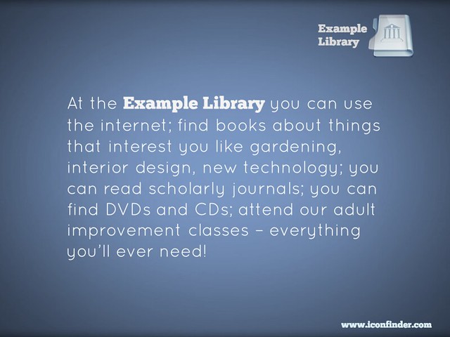
Here's an example of a poster promoting a library. In theory, it ought to be good. It looks okay, uses a nice font. But more importantly, it tells you about all sorts of amazing library services! What's not to like? How you can resist this?

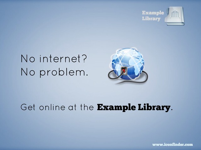
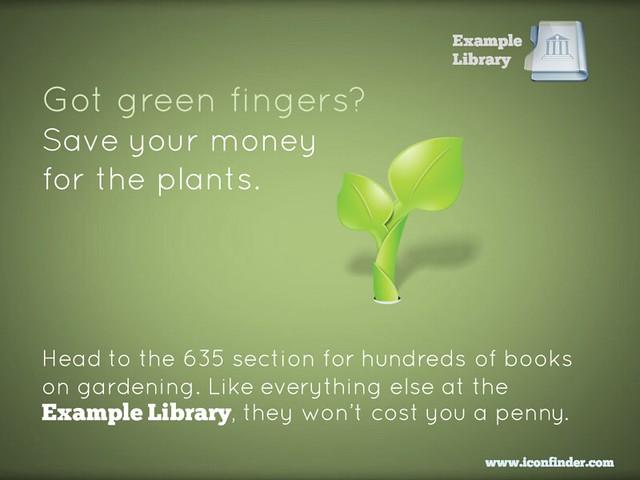
But actually, this poster doesn't work. There's too much going on, it does not provide an easy way in. You're relying on people grabbing on to the part that relates to them, and then taking an action (coming to the Library) because of it - in most cases, that's too big a leap of faith. You're much better off dividing that list up into individual posters, and putting them in the most relevant areas for their specific target groups. So for example this message, even though it's only one useful thing instead of many useful things, is a much more powerful piece of marketing:

Then you make ANOTHER poster to cover another aspect of the original:

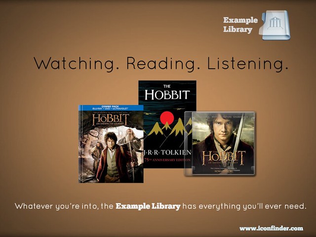
Or you can take multiple concepts but tie them together into one easily-digestible, relate-able, shareable package:

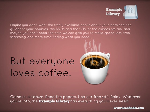
Finally, if you really want to put several library services into the same piece of promotion, you can do this and STILL have the one simple message for people to take away. In the example below, you're saying to people that the library is a welcoming place, that they can come in and use the wifi and enjoy the cafe, without being judged for not using the books and journals. But you're also listing all the other things they MIGHT do if they so desire. As I said above, much of marketing is to simply get people in the door - then you can give them a whole variety of reasons to say inside.

So remember, keep it simple. Market one thing at a time. It WILL yield tangible results.

(All of these posters are available on my Flickr account via an Attribution Creative Commons licence. Note that it's NOT a 'no-derivs' or 'non-commercial' license - in other words if you can find a use for these ideas, but want to change and adapt them to your own purposes, feel free to do so.)



Steal this: Student Guide to Social Media

If you click the image below, you'll be taken to the Student Guide to Social Media. This is an interactive online resource, giving information on various social media platforms, and on tasks you can accomplish using social media - it is aimed primarily at undergraduates but has applications across the board. It is made available under a BY-NC-ND Creative Commons licence: in other words if you think this resource might be of use to YOUR students, feel free to use this, link to this, make it part of your own institution's website, just as long as you credit the creators (the BY part), aren't using it for commercial purposes (the NC part) and use it entirely as it is, in its current state, rather than creating your own version or derivatives (the ND part).

A screenshot of the resource's homepage


Alternatively, book mark libassets.manchester.ac.uk/social-media-guide/ or click the link to open the resource in a new window.

A Northern collaboration

The resource is the result of a joint project between the Libraries of the Universities of Leeds, Manchester and York, developed over the Summer. Michelle Schneider from Leeds' very successful Skills@Library team approached me about working together on a social media resource for undergraduates - I was extremely pleased she did, because it was something on my list to do anyway.

There's a lot of support out there for postgrads, academics, researchers generally in using social media, but I don't think there's as much for undergraduates. It's an area we're looking to expand at my own institution, and as well as face-to-face workshops I really wanted something that worked as an interactive learning object online, probably made using Articulate / Storyline. Imagine how pleased I was, therefore, when Michelle told me the other collaborators would be Manchester, including Jade Kelsall, who is absolutely brilliant with Articulate! I'd worked with Jade before at Leeds; she provided all the technical expertise to create the Digitisation Toolkit (using the Articulate), one of the parts of the LIFE-Share project I actually enjoyed. Also on the team were Carla Harwood at Leeds, and Sam Aston at Manchester.

So we got together, brainstormed on lots of massive pieces of paper, photographed the paper with our ipads, emailed each other a lot, and came up with a resource which we think will be really useful. I feel quite bad because I was off on paternity leave for a month of this and it took me ages to get back up to speed, so I don't feel like I contributed enough compared to Jade and Michelle who worked tirelessly on this (sorry guys!) but I'm really pleased with the result. It's gone down very well on Twitter, and I was excited to see we've found our way onto a curriculum already:


How it works

Increasingly as I do more and more teaching, training, and planning, I'm aware that when introducing people to new tools (or trying to help people use existing tools better) you have to give them two different versions of the same core information. The first and obvious thing is how to use a tool - e.g. here's Twitter, here's how you create an account, here's some tips on using it. But this assumes some prior knowledge - what if you don't know why you'd need Twitter? So you also have to present the information in terms of tasks people want to achieve: "I want to boost my professional reputation" is one such task, and Twitter would be among the tools you might recommend to achieve this. The great thing about using Storyline is we can do exactly that - students can explore this resource by tool, or by task, or both.

We've also included case studies (some video, some not) and I'm indebted to my colleague in the Career's Service at York, Chris Millson, for providing a lot of really useful information about both tools and tasks and sourcing case studies...

The resource is, deliberately, very straightforward. We stripped out everything non-essential to give students easily digestible, bite-sized introductions to the various things they might want to use these tools for (Twitter, Facebook, LinkedIn, Slideshare, Google+, Academia.edu, blogs etc). It's also relatively informal without attempting to be in any way cool or streetwise. I've showed it to some of my students in info skills classes already and it's gone down very positively; I think even students who are very au fait with web 2.0 tools still appreciate some guidance on how to meld the social with the academic and the professional.

So, check out the Students Guide to Social Media, tell us what you think, and if you'd like to steal it, feel free.


Import your floorplans into Prezi to create an interactive map

A couple of years ago I wrote about some interactive maps we'd made of the Library, which we used for induction and teaching - they went down very well. The students are much more engaged by a slick Prezi than a tired PowerPoint, and it's also very practical to have information about the library geographically located in a map, rather than in linear slides. So the maps worked really well as stand-alone web objects to be viewed independently by students and staff, as well as actual materials for live presentations and workshops. You can read the post - Student Induction, Libraries, Prezi, and Interactive Maps - here; it also contains an embedded Prezi map, with which to compare the new version I've created below.

In 2012 we tried to improve the maps a little, including embedded a lot of videos in them - things like the virtual tour, but also information at the point of need, for example '1 minute on... how to photocopy and scan' next to where the printer/scanners are on the map.

This year, we did something I've wanted to do from the start, which is import floor plans to Prezi and create the maps based on those. Previously we simply didn't have good enough floor-plans in a format I could use - hence having an outline of the Library buildings (drawn by someone in the Digital Library team), somewhat awkwardly divided up by me using lines and boxes. Now though, we have a MUCH better interactive map, the basis of which is an imported PDF of our floor plans.

Here is the generic map we display on our Info for New Students page (as always I'd recommend going into Full-Screen mode to view this - press the Start Prezi button then once it loads, click the box icon in the bottom-right corner):

We experimented with various ways of representing the different floors: separate maps for each floor, or one map but with box-outs containing the other floors, for example. In the end we opted for making the ground floor plan of the overall building take up most of each ground floor, but with the other floors contained within the same space. (That doesn't make much sense; you'll see what I mean if you look at the map.)

Unexpected benefits

Once again the response from the students was really good. Quite a lot of our induction talks happen as part of wider introductions to the course, from academics, the Student Union, Careers office etc - just the fact that we aren't using PPT and they all are makes the students sit up and take notice. They've often not seen Prezi before so are impressed by the ability to zoom in on different parts of the Library and talk about them. It really does have more impact, and make people more aware of what you're saying about the Library, than a PowerPoint presentation. (And I say that as someone who still likes and uses PPT a lot, including for a lot of teaching.)

That is the expected benefit of using Prezi, but each year another benefit that occurs is the map instigates conversations with the academics. People from the Departments we're presenting in come up to us and want to talk about the Prezi - they're often impressed by it, and they appreciate the fact that the students took notice of it. I really do think I've found it easier to work with departments after they've seen me using Prezi; it serves as a jumping off point / builds bridges. (Bit of a mix of metaphors there but you get what I mean!)

If you want to try making your own interactive map, here's how

The process we followed at York was this:

  1. Open a new Prezi and edit the template so it reflected our branding
  2. Import the floorplans as a PDF. When you import as a PDF each page of becomes a seperate object on the canvas, to be manipulated: picked up, shrunk, stretched, etc
  3. Stretched the overall top-down view of the Library so it was absolutely massive - after all, everything else has to fit inside it
  4. Placed the individual building plans within the stretched top-down view
  5. Annotated the maps with further information by simply double clicking anywhere on the canvas to type
  6. Put in photographs to give the audience a better idea of where they were in the building
  7. Embedded YouTube vids at all appropriate places (this is very easy with Prezi - you just need the video's URL)
  8. Saved a copy - individual Academic Liaison Librarians then took the generic map and made bespoke versions for each department
  9. Made different versions, by copying the maps, to suit specific needs - so edited the 'path' (the order in which the Prezi moves through all the text and pictures on the canvas) to make e.g. 5 or 6 key points only for a 10 minute presentation, or every single thing on the map for the stand-alone web version ..

An example of a different version of the map (as in point 9) is this iteration I made for my History of Art PG students, with subject-specific information added and non-essential path-points taken out:

We also use Prezi for some teaching but not all. So for my History of Art 1st years, with whom I have an hour on Texts and an hour on images, I use PowerPoint for the Finding Texts session, and Prezi for the Finding Images. The latter was created using a Prezi template - these are really good if you need something nice looking in a hurry. It took me around 2 hours to turn my predecessors PPT into the Prezi you see there.

Non-York examples

Here are other takes on the interactive map:

If you have examples I can add me list, or any comments or questions, let me know below!

Making your message stick - presentation skills for information professionals

On Tuesday the 12th of November I'm running a workshop on presentation skills in London. So many of us have to do presentations now, and it makes a big difference if you feel confident about it, and know some tips and tricks to make presenting easier and more effective. I'm really looking forward to it - it's the first time of doing this outside the British Library, where it's gone down really well. We'll be covering how to make lovely PowerPoints (even if you have to use a dreaded template), how to make your audience remember the things YOU want them to, tips for presenting itself, an introduction to Prezi and a bunch of other stuff too. You can read some of the kinds of things we'll be talking about in this 10 non-standard tips for public speaking post  and this presentation on making presentations...

It's hands-on, at PCs. The details, including a booking form, are here.

UKeIG website picture

One of my favourite ever pieces of feedback came for this course (it was unsolicited, too):

What I enjoyed so much about the presentation workshop:

 1.      Expertise in the subject matter

2.      Relevant and highly useful information: presented and practiced

3.      Clear and engaging presentation style

4.      Professionalism with a great sense of humour, no hidden agenda

5.      Dedication to collaborative professional development, to high standards, to excellence

... so I promise it'll be good! :) Hope to see you there.

Ned

How I work

There's a meme going around at the moment, with people answering some set questions from Lifehacker about their working practice. Ruan Peat has blogged about this and was kind enough to put my name in the 'who would you like to see answer these questions?' bit (a rather clever idea which I'm going to file away for future advice on creating viral marketing campaigns) so just for Ruan - and anyone else who might be interested! - here are my answers. picture of some highlighter pens

Location: York Current gig: Academic Liaison Librarian / Trainer Current mobile device: iPhone Current computer: I don't even know. It's a PC, definitely. One word that best describes how you work: Inquisitively

What apps/software/tools can't you live without? Twitter is the only thing I couldn't live without - there are others like Evernote which I find very useful but whose utility I could probably get from elsewhere if pressed. That said I find myself all at sea when I can't use Outlook for email - it genuinely stresses me out.

What's your workspace like? It's always either very messy, or starting to get messy having just been tidied up. People assume I don't mind mess but actually I'd much rather it was organised. Everything about me is inherently disorganised, and it takes so much effort to triumph over that and be organised in my actual work, that my workspace is always likely to suffer... The one part of the idea of senior management that really appeals to me is having a lovely big office. I'd keep that tidy. Probably.

What's your best time-saving trick? I do almost nothing to the best of my ability. That sounds glib / annoying / unwise to state publicly, but it's true. Good enough is good enough! The search for perfection has cost many an information professional their contentment. I do a LOT of different things so while I try to do all of them well, I couldn't do as much if everything I did was as perfect as I could make it.

What's your favorite to-do list manager? Evernote - it's brilliant. Syncing between devices is the sort of vital functionality that makes me very grateful I wasn't born 10 years earlier; I really need this sort of tech.

Besides your phone and computer, what gadget can't you live without? iPad - I use it all the time, not least because I can't read my own handwriting. I use it to take notes, look things up, as a teaching aide in workshops. It's probably the most useful thing I've ever bought.

What everyday thing are you better at than anyone else? Not accepting perceived wisdom. And by that I don't mean I'm some sort of maverick who never plays by the rules - I'm not that at all, often I test the perceived wisdom and it works just fine so I'll follow it. But sometimes things which have always been done just aren't as good as starting from scratch, so I think I'm good at teasing out meaningful innovation.

What are you currently reading? I've found it very difficult to read actual books since writing one of my own. I've become very unambitious - my ideal scenario would be to forget what happens in 10 or so of my favourite books and then re-read them...

What do you listen to while you work? I like this questions because what I listen to is vital to how I work. Where possible I won't listen to anything, because I want to be open and approachable to my colleagues in an open plan office - but if I'm either A) under real time-pressure or B) really struggling to work something out or C) have several annoying, scrappy, TRICKY things I have to get done, I'll plug my headphones into my phone and start listening. I have several Spotify playlists set-up for just these occasions, depending on my mood - the most often used one is a relaxing jazz-tinged one (lots of Madelaine Peyroux and Gretchen Parlato), followed by a proper jazz one (Avishai Cohen, Brad Mehldau), a Dance one (Photek, JoJo Mayer's Nerve, DJ Semtex) and a classical one (a whole load of Graham Fitkin, amongst other things). With these on I get an ENORMOUS amount done in a short space of time, it's amazing and I love it. A constant sound of music effectively means what I hear is balanced - as opposed to the quiet and loud unpredictability of office happenings, which jolt me out of my concentration - which means I stop hearing anything at all and focus completely on what I'm doing. It's odd because the music needs to be right for this to work, but I don't actually listen to the music as such, I'm only aware of it peridocally. It's a bit like driffting in and out of sleep with music on in the background. (Except, instead of being asleep, you've just OWNED your To-do list...)

Are you more of an introvert or an extrovert? Very much an introvert, but most of the students and academics I interact with probably don't realise that.

What's your sleep routine like? Rubbish. I need lots, get little; I'm not that good at it unless sleeping conditions are perfect. In an ideal world I'd stay up till 1 in the morning and then wake naturally at about half-ten. I do not live in an ideal world.

Fill in the blank: I'd love to see ______ answer these same questions. Hmmm, Andy Priestner perhaps? I can't imagine he'd be a fan of doing so, though...

What's the best advice you've ever received? You see this question a lot, but the whole 'let me give you some advice' scenario seems to happen a lot more in movies than in real life, and I'm not sure I've been given that much. My Dad taught me, more by example and just chatting about it than him specifically trying to impart wisdom, not to worry too much about things I can't control. My guiding principle is that happiness is more important than success, which luckily everyone close to me also subscribes to.

Is there anything else you'd like to add? What I really enjoying, for some reason, is refining things. I like taking existing things (whether originally created by me or other people) and constantly making them better and better each time. It's great.