Library ratio of online versus on site visits and visitors

Interesting tweet from #uxlibucc, above. Can you answer that question? I'd wager most of us can't, but we should be able to. Someone in our orgs should be able to, right? We need to make strategic decisions, about to where to prioritise resources, based on evidence wherever we can.

As it happens, I can check this figure at my own institution, because it's something I've been thinking about a lot. I realised that a) I had no idea which were the most popular online parts of the library presence and b) I had no idea how this compared with actual footfall. So I got access to Google analytics, and I repeatedly ask my colleague Steph for turnstile statistics...

So below is a chart to compare physical and online use of the Library, for Monday of this week (all 24 hours of it). A couple of caveats:

1) This is not presented as a pie chart because we're not dealing in percentages. Many of the users of the building will also be using the catalogue at the same time.

2) I've taken the actual numbers off it in case I shouldn't be giving that info out publicly, but to give you a rough idea the total number of visits to the building is well over 10,000

3) This is just one day. I have not gone into the data to try and find an average day or a representative day, I just chose the first day of this week. (Although we compared it with the previous Monday and none of the data was atypical.)

Chart comparing visits to the library building, subject guide, website and catalogue on one day. The building gets the most visits, the catalogue the most visitors.

Chart comparing visits to the library building, subject guide, website and catalogue on one day. The building gets the most visits, the catalogue the most visitors.

So while building visits outstrip online visits (because each student is coming in almost exactly 3 times on average) it appears more people use the catalogue overall, though that figure could be skewed by people using the catalogue multiple times on different devices. Clearly the catalogue is MUCH more popular than the website, which makes me think: should we work even harder than we already do on the system as it's the way more people interface with us than any other? Should we be trying to get more info on to it as people go there so much more than they go to our other online places, or should we try and strip it down so the usability is as good as possible? 

If you combine the online stats into one figure, the graph looks like this:

Chart showing there are more overall online visitors compared to building visitors, but more uses of the building than the combined online spaces.

Chart showing there are more overall online visitors compared to building visitors, but more uses of the building than the combined online spaces.

Keeping in mind that I'm not including any social media in the online figure - so our YouTube, Facebook, Twitter, Slideshare, Blog(s) and Instagram views aren't represented - you can see the online sphere is a huge factor in people's daily use of the library, as indeed we'd expect.

To go back to the question in the tweet at the start of the post, does our staff allocation reflect this ratio? No it doesn't. The staffing at York is so labyrinthine I can't work the ratio out, but suffice to say we devote much more staff to face-to-face interaction than we do to the website and catalogues.

This is as it should be. I'm not advocating for the staff ratio to exactly reflect the virtual/physical ratio, because the nature of the use is very different. But I do wonder if we were starting from scratch but knew the ratio in the graphs above, would we do things a little differently?


UPDATE: Since I posted this yesterday I had some interesting discussion on Twitter, and a couple of people mentioned if we included the stats for the resources themselves (JSTOR for example) then the online side of things would be even higher.

This is a good point. I didn't include them because I didn't think of doing so (rather than it being a position I'd deliberately taken), but on reflection I think it skews the picture too much to put them in - because a lot of the catalogue views, and probably the majority of the SubjectGuide views, will be people on their way to the licenced e-resources. I'd argue that in the same way one visit to the building results in lots of potential uses of the library, one use of the catalogue may result in several e-resources being consulted.

That said, there will always be lots of people on campus going direct to the resources without following our links, so that would increase the online views somewhat. Ultimately the reason I find this interesting is comparing, for want of a better word, the different interfaces of the library and being able to see explicitly which area engages the most users. So although our databases and journals are hugely important, they aren't 'our' interfaces in quite the same way as the catalogue, website, libguides and building.

For the last time, Google is not our competition in libraries...

There's a very famous Neil Gaiman quote among librarians and lovers of libraries: "Google will bring you back, you know, a hundred thousand answers. A librarian will bring you back the right one."

I found this on Jennie Stolz's Pinterest page. Click the pic to go to there.

I found this on Jennie Stolz's Pinterest page. Click the pic to go to there.

You see it on social media. You hear it used as a soothing balm at library conferences. More than one library has it printed on their floors.

There are various different versions of the quote - often people will attribute Gaiman with having said a million answers from Google, and pretty much no one puts in the 'you know'. In order that I, a librarian, could use the RIGHT quote for this article I...

Well, I Googled it. Obvs.

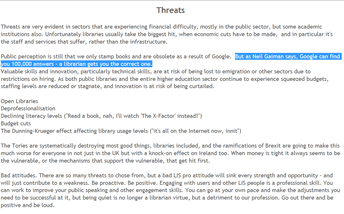
Because how else would I find it? I don't want to put us as libraries and librarians in competition with Google for loads of reasons, but we still do it a lot. I contributed to a SWOT analysis on libraries in LibFocus and someone put the Gaiman quote in there too:

An excerpt from a crowd-sourced LibFocus article - click the image to read the full thing

An excerpt from a crowd-sourced LibFocus article - click the image to read the full thing

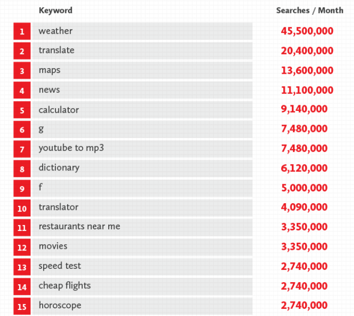
The thing is, most people aren't seeking 'right answers' on Google. They just want basic or general info. Here's what SiegeMedia discovered were the top 15 searches on Google in 2015 in the US, if you exclude brands and porn (the top 5 if you don't exclude them is Gmail, Craiglists, Amazon, Yahoo [why?!] and porn).

Click the pic to read the full article on SeigeMedia

Click the pic to read the full article on SeigeMedia

How many of those have a right answer a librarian could bring back? The weather, obviously - but you'd find that out by Googling it. Perhaps a librarian could find you a more reliable dictionary, that could be a 'right' answer. What's on at the Movies, cheap flights - again we'd at least go online and search, if not specifically Google.

In the UK in 2015 according to Google itself, the top 5 searches were 1) Cilla Black, 2) Lady Colin Campbell, 3) Rugby World Cup, 4) Jeremy Clarkson and 5) Paris. Is there a right answer to 'Cilla Black'? Right answers are not what Google is for. More broadly, people aren't searching Google for things they used to come and find at libraries.

The reason the Gaiman quote includes a 'you know' is this wasn't some grand written statement, it was part of an answer to an interview question he was asked upon becoming honorary chair of National Libaries Week in 2010. The full answer, with the Google part right at the end, can be seen in this video:

What a great quote that whole thing is! Fantastic. He GETS it. This isn't some well-meaning but misguided celeb talking about how much they loved the smell of books as a child in their local library. This is someone who understands how libraries are about social inclusion. I love the full answer. I think Gaiman is brilliant. I just wish we, as a library community, hadn't quite latched onto the Google part of it so much, as the dichotomy isn't helpful.

Also, I don't personally think I can find the 'right' answer in most of the situations I find myself in, even as an academic librarian helping people are who ARE actually after very specific information. Our role is more about helping people find answers for themselves - not in all cases and branches of the profession, but in most - as a couple of people pointed out on Twitter:

Of course this dichotomy isn't somehow Gaiman's fault or exclusive to him, you see it everywhere among librarians. This tweet from Internet Librarian International encapsulates a sentence you hear a lot about libraries and competition:

(It was reflecting something the speaker had said rather than Martin's own opinion.) I find this rhetoric troubling for lots of reasons, many of which I've spoken about before but the idea of Google as competitor just won't go away...

Here are my issues with it:

  1. As discussed above, people don't now use Google for things they previously used libraries for
  2. Google doesn't do what we do. It precisely the human element of libraries that will ensure they endure
  3. If Google IS our competitor then we will lose every battle, forever
  4. Ultimately, to pit libraries against Google is to reduce libraries to their most basic function (provider of information) and indeed the one which IS most easily replaced...
  5. ... and then try and convince people not to replace us with Google by telling them Google is not any good, when in fact - for all the troubling things about Google, and there are many - it IS pretty good at bringing back info of sufficient quality that most people who are non-specialists find it to be excellent for their needs
  6. Related: no one ever won any friends by slagging off something useful (that they themselves use every day)

The fact that Google and the internet more widely has made it so easy for people to access information without needing to physically visit a library is a GOOD thing. So I'd like us all agree to stop trying to make it into us versus them, and focus more on the things we can do to cater for the needs of our users and potential users. They don't need us to find them info on Cilla Black but they DO need us for plenty else. 

Google could find 100,000 things for libraries to do next, but only our communities can find us the right one...

Using Kahoot in Library Induction and Teaching Sessions

A colleague at York, Tony Wilson, brought Kahoot! to our attention recently for possible use in teaching and orientation sessions: it's a really nice quiz tool. There is nothing new about using quizzes in library sessions and there's about a million and one tools out there for making them, but Kahoot differs in its execution of the idea. It's so much slicker and just more FUN than anything like this I've looked at before. And interestingly, it already seems to have currency with students:

One of the most useful aspects of a quiz is that people are asked to actively engage with the information rather than passively receive it. I'm absolutely convinced the students are remembering more this way than if we just presented them with the complete information.

4 reasons Kahoot works so well

It's really, really nice, for these reasons in reverse order of importance:

The music. It has cool retro sort of 8-bit music in the background.
The aesthetics. It has bright colours and looks generally nice. Here's what a question looks like:

An example of a question as it looks on the screen during the quiz

An example of a question as it looks on the screen during the quiz

The leaderboard. Oh yes. It has a LEADERBOARD. This is the key thing, really: people put in their nicknames and after each question the top 5 is displayed (based on, obviously, how acurate their answers are but also how quick). Even completely non-competitive people get excited when they see their name in the top 5... I tweeted about using Kahoot and Diana Caulfied chimed in about the tension the leaderboard brings:

The mobile view from the student perspective

The mobile view from the student perspective

It's VERY easy to use. These things have to be SO simple to justify using them. In the case of Kahoot, you load up the quiz, and the students go to kahoot.it and put in the pin number the quiz gives you on the screen. It works perfectly on phones, tablets, or PCs. There's only one thing on the screen - the box to put the pin number in; and only one thing to do - put the pin number in. This simplicity and intuitive interface means everyone can get on board right away. There's no hunting around. 

You can also use it on an epic scale - one colleague just came back from using it with 95 undergraduates today, who responded really well, another used it with over 100 who were absolutely buzzing after each question. You can actually have up to 4,000 players at once.

Here's what the students are presented with when they go to the (very simple) URL:

An example from York

So here's the quiz I made for Induction, click here if you want to have a go. This particular link is (I think) in ghost mode, where you're competing with a previous group of players. So if you do the quiz now, you'll be up against my History of Art PostGraduates and will only show up in the Top 5 leaderboard if you get better scores than at least 25 of them! But normally in a session I'd use a completely blank slate.

Possible uses

In this example the questions I chose are basically just a way to show off our resources and services: it's all stuff I'd be telling them as part of a regular induction talk anyway:

My Kahoot quiz questions

My Kahoot quiz questions

The students I've used it with so far have really enjoyed it (as far as I can tell!). It's much more interesting than listing things, and, intruigingly, I think that asking people to guess between possible options actually seems the answer more impressive than just telling them the fact outright. So for example in the Google Apps question above, there were gasps when I revealed they get unlimited storage and the majority had chosen one of the lower options (the results screen shows how many people have chosen each option) - I'm fairly sure if I'd just told them they get unlimited storage, not one person would have gasped.

But there are plenty of other possibilities for Kahoot that are a bit more pedagogical in nature. Using it to measure how much of the session has sunk in at the end; using it at the start and end to measure a difference in knowledge; and using it to establish the level of student understanding:

There's also a Discussion mode rather than a Quiz mode. You pose a question and students type their answers in (rather than selecting from multiple choice) and their words come up on the screen. Anything rude or offensive can be deleted with one click. It would be a great way to find out what students felt unsure of or wanted to learn about, or to discuss the merits of a particular approach.

In summary

So I'd recommend taking a look at Kahoot and seeing if you can incorporate it into your teaching. As well as using it throughout Induction I'm planning on using different kinds of quizzes as part of infolit sessions and am excited to see how that works. You can easily incorporate your own library's images and videos and the tool is free, very easy to use, nicely made, and FUN. 

Using PowerPoint as a design tool

If you're a graphic designer you probably use a professional tool like Adobe InDesign or Photoshop to make leaflets, posters, infographics and other digital images. If, like me, you're not, and those tools are beyond both your budget and capacity to learn complicated programmes you're not going to use that often, you need an alternative.

I've written on here before about Canva, which is excellent for more than just presentations, and I like Phoster in the iOS app store for designing digital posters. But an under-rated tool for Design is PowerPoint. The main reasons are it's a lot more flexible than it's often given credit for, and it's incredibly easy to layer content (to put text over images, etc) - something which is maddeningly difficult to do in Word, for example.

So here are the key aspects to using PowerPoint for design.

1) You can make a slide ANY size, and save it as a JPG or PNG file

Go to Design, Slide Size then Custom Slide Size to get to this menu

Go to Design, Slide Size then Custom Slide Size to get to this menu

PowerPoint defaults to a 4:3 or 16:9 slide - but you can edit the slide to be any shape, size and proportions. Open a new presentation and go to Design then Slide Size and choose Custom Slide Size you can bring up this drop-down menu, or just put in the custom dimensions of your choice.

Everything becomes easier with design when your canvas is the perfect dimensions to start off with. Sizes like A3 and A4 are self-explanatory if you're designing flyers or posters, but also think about digital image sizes. For example:

  • A Twitter image (which is to say a perfectly sized image which doesn't require users to click to expand when viewing it's tweeted) is W: 116 mm x H 232mm
  • An Instagram image can be any square, but optimally is 134mm x 134mm
  • A Facebook image is 317mm x 317mm
  • A YouTube custom video thumbnail is H: 190mm x W: 338mm

(You can work out any pixels to mm dimensions using an online converter: I used this one for the above.)

Once you've created blank slides in a variety of useful sizes, save them to use as a template more quickly in the future.

2) You can install fantastic typography

As anyone who has attended my presentation skills training will attest, I'm always banging on about how Typography is a hugely underrated part of design. Fonts matter a lot, and can make the difference between something looking and the same thing looking really professional.

As always, I'd highly reccomend fontsquirrel as a souce of fantastic (and free to use) fonts - and see the previous post for more info on font-pairings.

Click to go to the font-pairing post

Click to go to the font-pairing post

3) It's easy to manipulate images in useful ways

You can find the ideal image from a CC0 site like Pexels, and make it easier to use - to layer text on top of, for example - using PPTs editing tools. They're nowhere near as sophisticated as those in Photoshop, but it's still really useful. Particularly darkening images using the Brightness slider so that white text clearly shows up on it, or blurring images. Both of these techniques are explained in more detail here.

You can also Crop images to specific shapes, circles for example, which can help with really striking design.

4) You can follow the basic principles of good design, and that's more important than the tool

I've found that I really like design without truly understanding it like a proper designer would, but certain rules apply across the board and help me with whatever I'm doing:

  1. Images AS the background most often works better than images against a background (unless you're using icons).
  2. Space is good. Leave space.
  3. No more than three fonts per design. And use fonts that help you communicate your message - or, to use a phrase I'm not altogether comfortable with for some reason, but it seems to apply here: use fonts intentionally.
  4. The most important thing about text is legibility. Make sure text is large, and the contrast is high between the text and the background.
  5. Left-align text unless there's a specific reason to Centre-align it (or very occasionally right-align or justify).
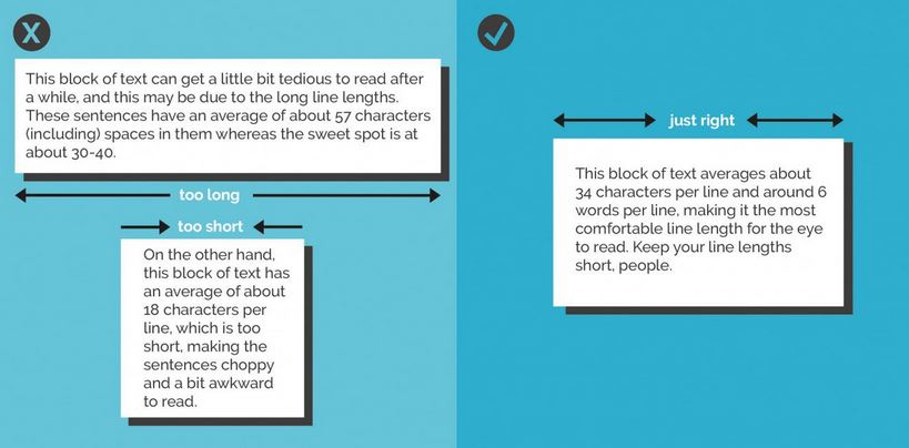
  6. Avoid orphan or widow words. Just stretch your text box a little more, or narrow it, so words aren't left on a line of their own. Canva's helpful design rules also have this to say on line length:

5) Save slides as images

You can save your PowerPoint as a PPTX to come back to the design later, but you can also save a slide as an image, or a whole bunch of slides as seperate images.

When you go to Save As, choose JPEG or PNG from the drop-down menu - it will then give you the choice of saving just the slide you're on at the moment as an image, or to create a folder into which it will save all the slides in the presentation as individual images.

Saving slides as JPEGs

Saving slides as JPEGs

And finally, while we're on the Save As function, here's a brief guide to which format to save regular presentations in depending on your situation...

NLPN's Useful Resources

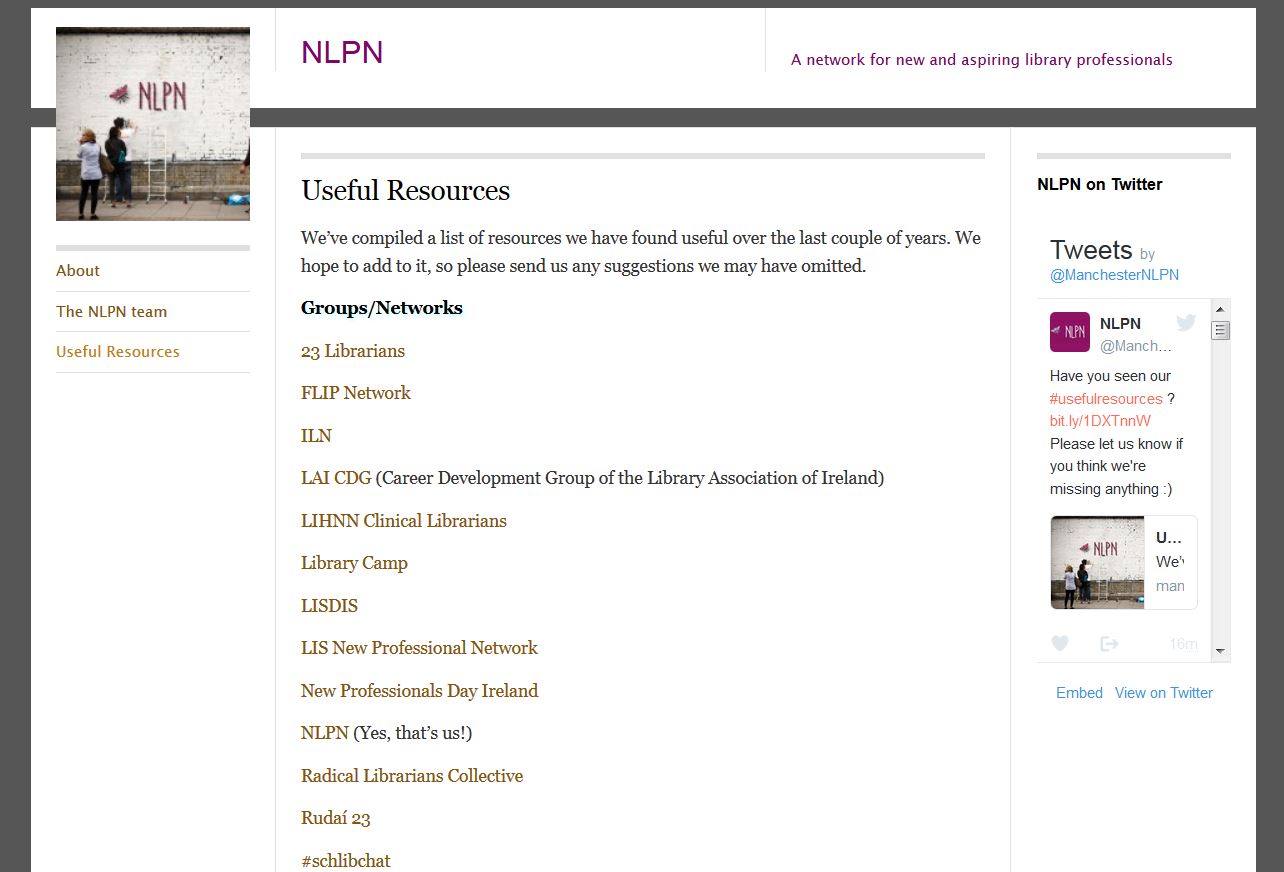
Just a very brief post to say check out the fabulous NLPN's Useful Resources page. They've brought together a list of professional library bodies, groups and networks, blogs, job sites, journals and databases and even institutional repositories. 

It's aimed primarily at New Profs but it's useful for everyone in interested in the wider profession. If I'd had this kind of curated list of useful stuff when I came into the profession I would have found it so much easier to understand the wider context and become part of a bigger conversation. You really could get through years of librarianship before you needed more than what NLPN've put together on this list. Get to it!

Click the pic to go to NLPN's site

Click the pic to go to NLPN's site