I'll never forget #UXLibs, for reasons beyond the excellent content and camaraderie pic.twitter.com/u6KQfo10os
— Emma Thompson (@LibraryEmma) June 26, 2016
At 9am on Day 2 of the UXLibs II conference, 154 information professionals sat in a large room feeling collectively desolate. I don’t want to be glib or melodramatic but the feeling of communal sadness at what had happened in the EU Referendum overnight felt to me akin to grief, like someone close to the conference had actually died the night before.
Was there anyone present who voted Leave? Possibly. But it seemed everyone was devastated. There were tears. UXLibs is, as Library Conferences go, relatively diverse (although it's still something we need to work on), not least because well over a third of the delegates - 60 this time around - are from outside England. Our North American and Singaporean friends felt our pain, our European friends were sad our country had chosen to leave them, and for the Brits it was already clear what an omnishambles the vote had caused.
The committee had met for an early breakfast to process how we should proceed. We agreed on two things: first that however we all felt, organisers and delegates had to deliver the best possible conference experience in the circumstances; and second that this was not time for neutrality. (In fact I was talking to Lawrie Phipps from JISC a little later that morning and we agreed that perhaps if so many libraries and educational institutions generally weren’t so neutral by habit, people might have a better idea of when they were being systematically lied to by politicians.) Conference Chair Andy Priestner was due to open the conference: say what you want to say, don’t hold back, we agreed. There had been a lot of jokes the day before - humour is an important part of the UXLibs conference as it leads to informality, which in turn most often leads to better and deeper communication, proper relationships – but there would be no attempt at making light of this. Don’t gloss over it. Don’t be glib. Don’t be neutral. But do be political.
So he was. You can read Andy’s reflections on his opening address here, and this is what he said:
“Today is not a good day.
I’ve worried for several months about this moment in case unthinkably it might go the way it has gone. I am devastated. Everyone I speak to is devastated. This is a victory for fear, hate and stupidity.
But as Donna said yesterday when describing her experiences in Northern Ireland – ethnographers have to get on with it. WE have to get on with it. Perhaps it’s a good thing that we will all have less time to dwell on what has just happened. Perhaps it’s good that we’ll be busy.
What I do know for a fact is that we have to be kind to each other today however we might feel. Let there be hugs. Let there be understanding.
For me one of the most precious things about UXLibs is the networking and sharing we enjoy from beyond the UK. The collaboration across countries, the realisation that despite the different languages, cultures and traditions that we are all the same and can learn so much from each other.
But it’s too soon to be cheerful. It’s too soon for silver linings.
Today is not a good day.’”
I was proud of him.
And then Day 2 happened, and I was proud of EVERYONE. What an amazing group of people. Shelley Gullikson put it like this:
“Last year I said that UXLibs was the best conference I’d ever been to. UXLibs II feels like it might be the best community I’ve ever belonged to.”
Everyone found a way to help each other, support each other, make each other laugh, and work together – after Lawrie’s keynote the first thing on the agenda was the Team Challenge so no one could spend any time sitting in dejected silence, there was too much to do… Collectively everyone not just got through the day but made it brilliant. It wasn’t a good day overall – a good conference doesn’t transcend political and socio-economic catastrophe. But it was the best day it could possibly be.
I attended the first UXLibs conference in 2015 and I was blown away by it. It felt like the organising committee had started from scratch, as if there were no legacy of how a conference should be, and designed it from the ground up. They kept some elements, the ones that work most, and replaced others with new and more engaging things, especially the Team Challenge. It was the best conference I’ve ever attended.
The follow up, UXLibs II, had something of an advocacy theme – as I put it in the conference, if UXLibs I was ‘how do we do UX?’ then UXLibs II was ‘how do we actually make it happen?’. As communication and marketing is something I do a lot of work around and, as Andy so kindly put it, he wanted to see if we’d actually get on and not hate each other if we worked together, I was invited to join he and Matt Borg as the main organising committee (although we had a huge amount of input from several other people in planning the event). This was in September last year; Andy and Matt had already been planning for a while and by October we had our first provisional programme in place.
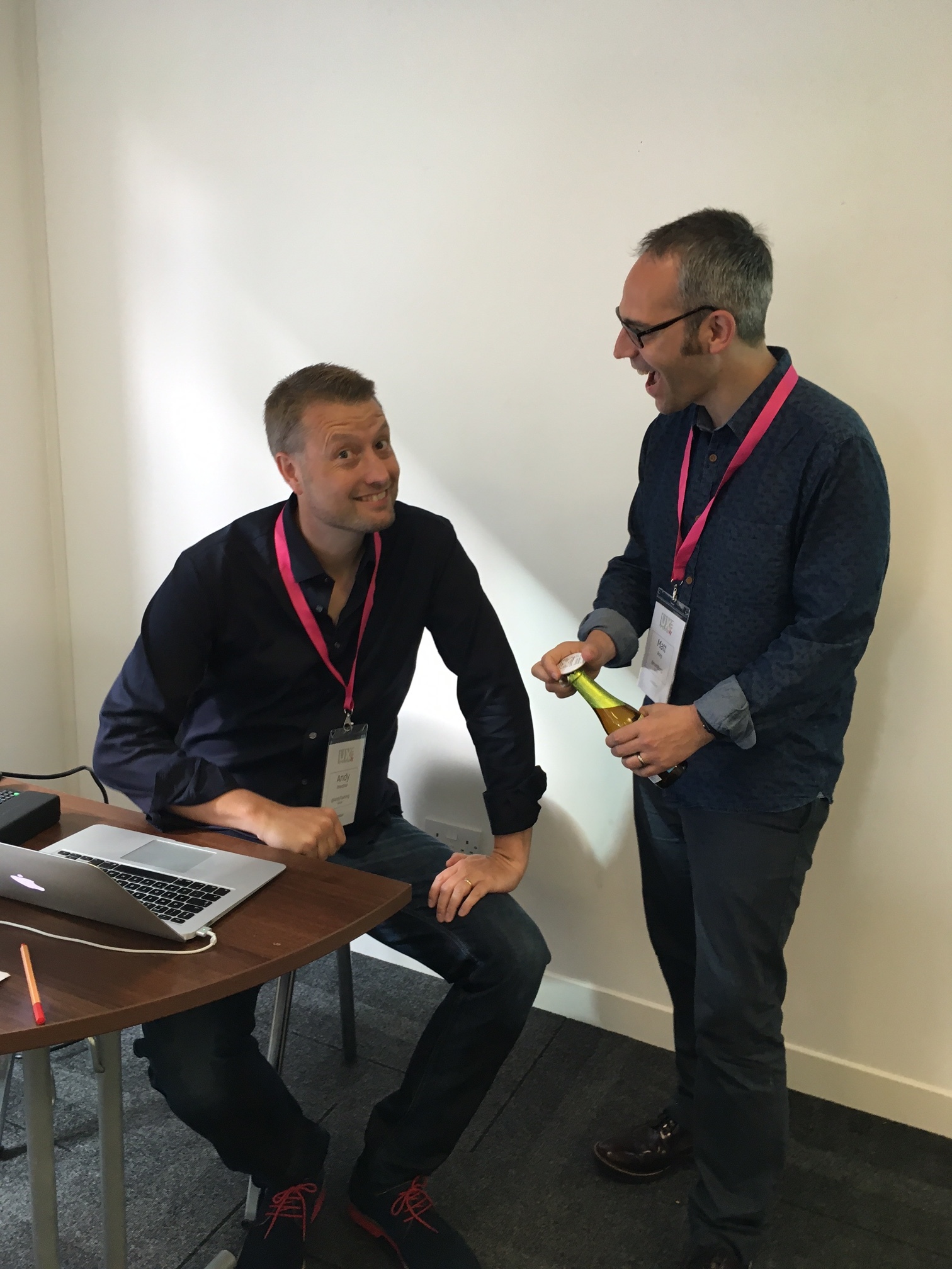
Andy and Matt...
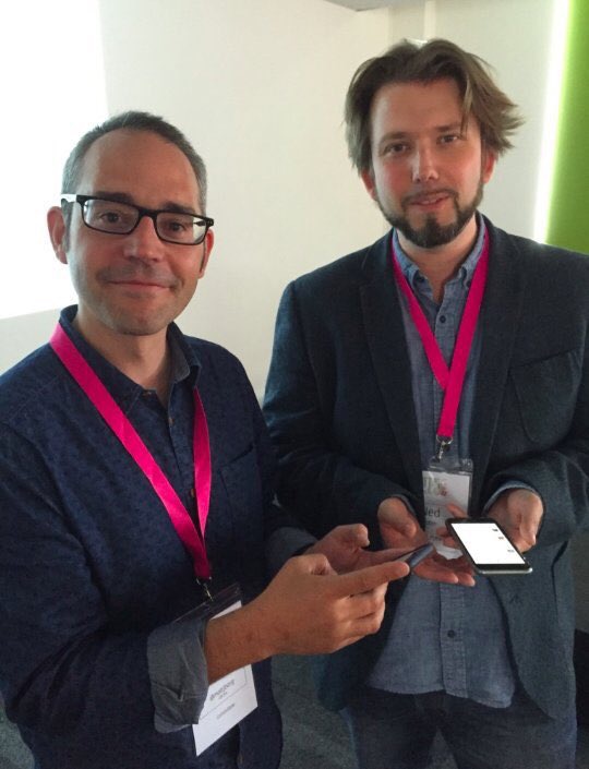
Matt and me...
I find organising events approximately three trillion times more stressful than speaking at them, and hadn’t got fully involved in putting on a conference since 2011 when I swore ‘never again’. But I couldn’t resist the chance to work with Andy and Matt because we are pretty much on the same page about a lot of things, but disagree on a lot of the details, which makes for an interesting and productive working arrangement. So, around 400 emails later, a couple of face-to-face meetings later, many online meetings using Google Hangouts later, we were in thestudio, Manchester for the event itself. At the end of the two days, despite the dark cloud of Brexit hanging over us, everyone seemed exhausted but fulfilled. We’d built the event around the community and what that community said it needed, and I think it worked. It’s a great community and I felt excited to be part of it – challenged, stimulated, and I’d echo the delegate who came up to me at the end and said she’d never laughed so much at a conference: it was FUN.
Several things made this conference different, for me, apart from just the content. There's the fact that all the delegates have to be active participants (they were 'doing doing' as I put it, somewhat to my own surprise and certainly to my own mortification, when introducing the team challenge), there's the mixture of keynotes, workshops, delegate talks and team challenge, there's the informality and fun but with the Code of Conduct to ensure people can work together appropriately, there's the fact we individually emailed 100 delegates from UXLibs I to find out what their challenges were so we could help shape the conference, there's the fact that 150 people got to choose which workshops and papers they attended, there's the blind reviewing process for accepting papers, there's the scoring system for the best paper prize that was far more complicated than 'highest number of votes' because different papers were seen by different sizes of audience... There's the fact there's less fracture and division than in most conferences: I truly feel we're moving forward together as a UX in Libraries community. There's the fact that the venue was not only excellent but had a trainset running around near its ceiling that you could stop and start by tweeting at it!
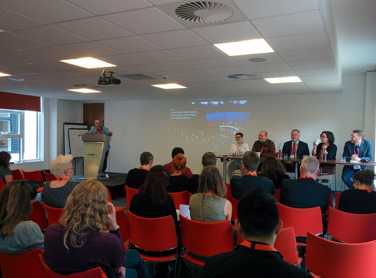
Turns out it's quite easy to avoid All Male Panel. What you do, conference organisers, is you don't put all males on the panel. (Pic by @GeekEmilia)
There's the fact that Matt made completely bespoke badges with individual timetables for all 154 attendees! I can't tell you what mine said (let's say Matt was experiencing some remorse at saying he'd do the badges by the time he got to 'P') but so many people commented on the good-luck messages he put in to all presenters for their slots...
For all who think THE UXLibs Conference is a jolly :) #UXLibs pic.twitter.com/KaThDgLQXQ
— Sonia Wilson (@sonia_wilson1) June 23, 2016
This is very cute :-) #uxlibs pic.twitter.com/CrpH3Zyxcb
— Rachel Claire Walker (@phys_librarian) June 23, 2016
So it was pretty great, overall, despite everything. Thank you everyone invovled.
UXLibs III planning has already begun.