Life, Librarianship and Everything at #NLPNOpen

I gave at talk at the #NLPNOPEN event on Saturday, organised by the wonderful Manchester New Library Professionals Network. I actually invited myself to talk at this event, something I've not done before, because I think NLPN are ace, and because my favourite events have always been New Professionals events, and I miss the enthusiasm and hope, and what to learn from the new ideas. They were kind enough to let me talk at them for an hour at the start, basically about things that I've found to be important and that I'd wish I'd known earlier, about life, librarianship and everything (although mainly, it has to be said, librarianship).

Here are the slides.

Really the key messages are firstly that the tools exist now for you to make things happen if you want to - start a network, start a JOURNAL even, write blog, join a wider dialogue, whatever it may be - and that if you take one action it can lead to all sorts of other actions, that are rewarding in themselves and can benefit your career.

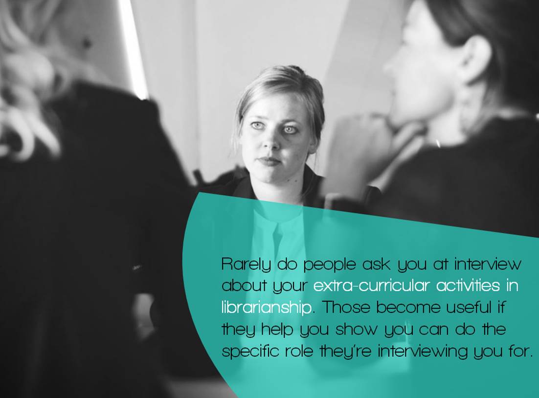
BUT, that said, the second message is no one cares if you're a rockstar, and interview panels don't actually ask about the stuff you do outside your job very often. It may be that you talk about it - it may be that when they say how would you cope with marshalling an annual resources budget, you can reply 'I'm the treasurer for this committee so I have experience' - but no one seems to say 'tell us about what groups you've joined / what conferences you've presented at / what articles you've written'. Not normally. In HE particularly we literally have to ask the same questions to every candidate so there's no room for those kinds of digressions. So this slide is, I think, important to reassure people who feel like they should be Doing All The Things but cannot Do All The Things because life gets in the way:

Everyone present did a brilliant job of tweeting the talk and indeed the whole day, which you can see in the Storify NLPN have pulled together - it's embedded below this next bit.

I saw some really good talks at this event, and I really enjoyed the open nature of the discussion - sometimes at traditional library conferences everything feels quite narrow because so many conversations have been had before, or are on sort of perpetual loop. The standard was very high too, in terms of presentation skills and the slides themselves - hardly any bullet points, lots of images, lots of creativity, lots of good communication.

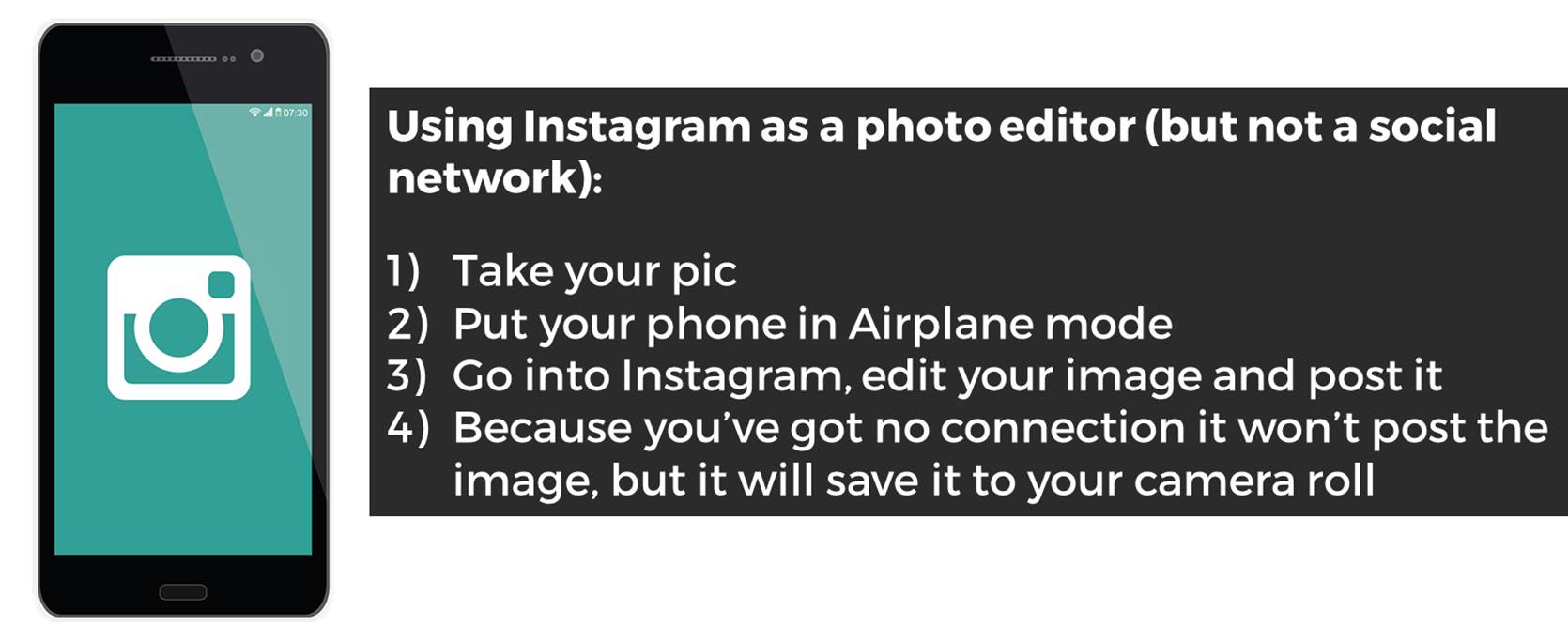
Suzanne Coleman gave a great mini paper about Instagram, which is absolutely the most important platform for academic libraries using social media at the moment. Laura Green and Louise Beddow (who joined Twitter off the back of my talk - please go and make her feel welcome!) then talked about what they did for National Libraries Day at MMU - generally the academic sector engages with NLD in a fairly minimal way but they went all in and it really seemed to work. They had huge success with their comment board, allowing students to write things which other students (and staff) could reply to on the wall - this is an ethnographic technique which seems to work well so much of the time. We have walls at my own institution which you can write on, but they're specifically designed for students to just workshop ideas or get things out of their brains, rather than for feedback. But we're doing the feedback wall thing properly soon and I'm interested to see how it goes.

Carly Rowley talked about music librarianship, which was interesting to me as I've been a Music Liaison Librarian here. The discussion was a lot more Content / Collections based than my experiences - I tended to focus on the services we could offer rather than the stuff we had, but that probably just reflects my biases and interests. It was interesting that a few people in the room could play instruments or read music but didn't consider themselves musicians! I think if you can play or sing, you're a musician. Surely? I love being a musician and in how I define myself it's a lot more important to me than being a librarian is, although outwardly it takes up far less of my life. On that note, there's actually a secret (as in, unlisted in the navigation) part of this website that acts as an outlet - along with my Instagram - for drum-related things. You can find it here, friends of drums and drumming...

The final two presentations were Open Access themed. They complimented each other well actually - Jen Bayjoo representing the librarian and Penny Andrews representing the Researcher. The common theme was really around what it is actually like to be an academic, which is to say a human being with pressures and insecurities and lives to lead, and interact with library systems. A healthy dose of realism ran through Penny's talk - it's so important to be realistic about which parts of what we do work, which parts really matter, which parts may or may not endure... Jen had a nice practical element too, discussing real life problems and issues of working in an OA advocacy / support role. Her slides are online here.

It's also important that we as info pros are Open Access all the way - don't submit your article to a non-open-access journal, folks! I wrote most of my 'proper' publications before I really understood Open Access, but I've retrospectively got as many permissions as possible to make things OA. See my Publications page for the links, including a thing for Bethan Ruddock's New Professionals Tookit book - although my take on a lot of that stuff has evolved since I wrote that, so if NLPNOpen-me disagrees with Bethan's-book-me, go with NLPNOpen-me...

Organising events is hugely stressful - it's THE WORST, worse than dating a Tory, even - so massive thanks so NLPNOpen for doing this, for free, on their weekend (and of course many more days in the run-up to the event, working everything out). I got a lot out of the day. I learned stuff and I felt good afterwards. It was ace.


Here is @ManchesterNLPN's excellent Storify of the day - check out the tweets to get more of a feel for all of the presentations. Thank you SO MUCH to NLPN for having me. Loved it.

3 simple ways to use images more effectively in PowerPoint


Poor old PowerPoint, much maligned despite actually being pretty decent. Admittedly what PowerPoint WANTS you to do is a bad presentation, but if you ignore its promptings it can be a great communicatory tool.

Here are three techniques I use with images to help me make better slides.

Darkening Images

I use this technique a lot in my own slides, and indeed apply to making graphics, posters, thumbnails, and videos too. You take your desired picture (using pictures is good, relevant images help people learn) and then you reduce the brightness in PowerPoint in order to be able to write a relevant sentence or two on top. You retain the value of the picture, your words are clearly legible, and your slide looks extra stylish because it contains no filled (or semi-transparent) text boxes.

So here's a nice image, but it's too busy for text to be easily readable:

Here's the same thing darkened. To do this, right-click on the image and choose Format Picture, then find the Brightness and Contrast menu: this is in different places depending on which version of PowerPoint you're on. Then slide the Brightness slider to the left until you get a happy compromise between the picture being dark enough to write on in white, and light enough to still be easy to see and to work as a supporting image.

Like this:

I use this technique all the time in presentations and training materials, much of the time first showing the image in its orignal state then on the next slide the darkened version. Often I also use the Blur effect on the image to make the text even clearer against the background.

The Rule of Thirds

The Rule of Thirds is not something I'm very good at explaining, but it is something I find very interesting... It's around what makes an image particularly interesting or arresting, and I'll point you towards Ruth Jenkins' excellent blog post about it for a proper explanation.

A really short version is: images are most pleasing when the subjects are arranged on the (invisible) lines of division if you were to divide the space into thirds vertically and physically.

From a purely practical point of view, it relates to slides in that images which conform to the rule of thirds don't have anything in their dead centre. This is great for slides because it leaves a nice 'copy-space' for us to write in - whereas images where the subject is bang in the middle are really hard to use in presentations because there's nowhere convenient for the text to go.

So let's say you're talking about mobile phone use. The image in the darkening example above is a perfectly nice picture of a phone - but the focus of the image, the phone itself, is right in the middle of the frame. So our caption, though nicely readable against the darkened background, obscures the phone somewhat.

Here's another shot of the same person holding the same phone - this time the rule of thirds is applied. I've put in the division lines to make it clearer.

So the subjects are on the division lines - in this case, the lady holding the phone and the phone itself. Our slide is about mobile phone use so the photographer has done some of the work for us by putting the phone in focus and everything else not.

When we add our caption there's a natural space (again, on a vertical division line) to put the text.

So when picking out images for use in slides, you don't HAVE to think about the Rule of Thirds - but it certainly makes life easier if the subject isn't dead-centre in the picture.

Extending Images

Finally there's a technique which is a little bit more complicated but which allows you to manipulate images which you want to use but which aren't quite the right proportions for your slides.

Let's say you have a portrait image to fit into your landscape slide. You don't want to stretch the image because that will ruin it. If it's a busy image with a lot going on then it's best just to back-fill the rest of the slide with a block colour like black, white or grey, and write on that. But if the edge of your image is very simple - a picture of the sky for example - you can paste a second copy of your picture onto your slide, then use the crop tool to crop the second version to a tiny sliver of sky. Then you line up the sliver with the rest of your portrait-aligned picture, and stretch it to fill the slide completely. Your portrait image is now landscape.

In the example below I've used this technique to apply the Rule of Thirds to an image with a centred subject. Here's the original picture:

As you can see, the moon is bang in the middle, making it trickier to write anything big enough for people at the back of a lecture hall to read and still keep the slide looking coherent.

So we paste in the second version, crop, and stretch to extend:

Hopefully you'll agree this is literally seamless - you can't see the point at which the old image ends and the extended, cropped version begins.

I hope you can use one or more of the techniques above in your slides, and good luck!


All of the images used in these examples are Creative Commons Zero - they can be used, remixed, modified and so on without attribution. I sourced them via finda.photo.

So you want to make in infographic? 4 useful options


We're putting together a guide to various infographic software for our students, so I've had cause to play around with a few. I find a lot of tools recomended on the web just don't quite work for educational stuff (or, indeed, library stuff); they're just too much style and not enough substance.

Also, all the articles about infographic tools are entitled things like '61 GREAT INFOGRAPHIC PACKAGES!' which always baffles me somewhat. Maybe it's the information professional in me, but I think if you're going to write something recommending a set of tools, you should at least narrow the number down to a recommended few...

So what are the most effective tools for creating meaningful infographics?

1) Great for stats and figures: Piktochart

I really like Piktochart. It's the tool we use most often at work. My colleagues have used the templates to create infographics, for example this one has been used to explain library processes to users in a way that is engaging and easy to understand:

An example of a Piktochart template

An example of a Piktochart template

It's simple to take something like the template above and change the images (there's a huge built in library of icons, or you can use your own) and the colours etc to suit whatever you wish to express. Piktochart also has seperate templates for Reports, which are nice.

For me, though, the way it integrates very easily with your own data from Excel or Google Sheets, which you can import from a .CSV file, is the best thing about this tool. So it takes what you already have and makes it visually appealing, which helps prevent the all-style-no-substance issue that afflicts a lot of infographics.

You can import your own data

You can import your own data

Although Piktochart does infographics, reports, and some really nice data visualisation with maps, I've mostly used it to create individual charts which I've then exported for use in other things, like Action Plan documents, or presentations. In the example below, all the graphs etc and visualisations are from Piktochart, and I'm by no means an expert user so this is just scratching the surface of what it can do.

Piktochart is free, but also has reasonably priced educational packages, one of which we have at York, that allow you a few more options and some more features. 

2) Good for flexibility: Canva

Canva does a lot more besides infographics. It's really good for creating images perfectly sized for social media, and they put genuinely useful tips on their design school blog.

At York we've used Canva for creating one page guides to things like Google Scholar, or JSTOR, in order to embed them in the VLE, blogs, etc. Canva is simple to use and there are a lot of nice built in fonts and images which can make otherwise not-overly-exciting subjects a bit more engaging for users.

You can use Canva for free, which is what we do. It tries to tempt you in with paid for images and templates, but you can also import your own images so there's no requirement to pay for theirs if you don't want to.

Here's the interface and an example of a free to use template you can build on:

The Canva interface

The Canva interface

I'd recommend playing around with Canva if you've not used it, because it has so many potential applications. The trick, really, is being able to sort through the paid stuff to find the free stuff, and being able to sort through the superficial 'this is probably great if you're the web designer for an artisan baker in Portland' templates to find the 'I can actually see this working in my world' examples...

3) Good for interactivity: Infogram

Infogram is particularly good for creating graphics you want to embed online, because they can be responsive and interactive depending on what you do with them. It's basically about hovering over different bits of the graphics, but it does allow you to focus on certain parts of the data more easily than a static chart allows. See the example below:

Other pluses with Infogram include its ability to import data from a really impressive variety of sources. Downsides include the free version being fairly stripped back of features, and even the cheaper paid for version being out of financial reach for most non-profits.

4) Good for surprising you with its potential for making infographics: PowerPoint!

The much maligned PowerPoint is actually a very good tool which is often deployed spectacularly badly by its users. It's more flexible people than people realise (especially the two most recent iterations, 2013 + 2016), and that makes it surprisingly good for infographics. The main reason it's good is because you can take something - a chart or graph from excel, words written in interesting fonts, icons, images - and put it on a slide, and it just stays where you put it. Then you can layer more and more stuff on, and easily move it around - unlike Word which is a nightmare for that sort of thing, and a bit like Photoshop, but without the need for a 2 year learning curve...

The keys to making an infographic are firstly to edit your slide to the right dimensions: go into the Design tab, choose Page setup and then choose, for example, A3, Portrait. Your single slide is your infographic. Secondly, use images from somewhere like freeimages.com, or icons from iconfinder.com, to make your content interesting (along side graphs and charts you can copy and paste in from Excel). Thirdly, use a non-standard font - download one from fontsquirrel.com - as typography makes a huge difference.

Bonus option: Visual.ly for Google Analytics Infographics

If you have a website which uses Google Analytics to track statistics, but don't want to be logging in to check your stats all the time, visual.ly provide a useful free service. You log in with your Google ID, give them your analytics code, and they send you a weekly infographic which tells you how you've done in all the key areas. When you have a good week it's a nice friendly blue, if you have a not-so-good week it's red for danger...

Sign up for yours at visual.ly, here. Everything else visual.ly does is a paid for service, but the Analytics infographics are free.


Do you have any recommendations I should add to this list? Leave me a comment below.


Upcoming presentation skills workshops and library marketing training

Just a quick post to say here's the current list of open workshops I'm doing this year - if you want to see if I'm doing something at your organisation specifically then the full listing is on the Upcoming Events page, but below are the non-in-house events currently in the diary. Hope to see you at one of them!

You can see a whole load of feedback from previous workshops via the Training page.

How to use Instagram as an easy photo editor but NOT necessarily a social network!


As well as being a massively popular social network, Instagram is a brilliant photo editing tool - it's quick, intuitive and easy to transform images. But you can't save the photos to your phone unless you post them online, and sometimes you might want to edit a photo and not share it with the world on social media.

So how do you do this? The tl;dr version of this post:

How to use Instagram as a photo editor

This is great for family stuff (and professional stuff, more on which below). I've become a little obsessed with manipulating photos so that the most important part of the image is clearly highlighted in some way. For example this weekend I took a picture of my daughter and wanted to use the filters Instagram provides and also the tilt-shift function. I love tilt-shift - it makes part of your image slightly out of focus, drawing the eye to the in-focus part you define. But I didn't want to post a picture of my kids on Instagram because I use that purely for drumming related shenanigans - so I took the picture and went into Instagram, edited it, and posted in Airplane Mode so it didn't actually get as far as the internet, but DID save to my camera roll. I really like the way the bits in the picture frame are in focus, but the resit isn't.

The original picture

The original picture

The tilt-shifted, Instagram filtered one

The tilt-shifted, Instagram filtered one

5 steps to use Instagram professionally for photo editing

For professional projects this is potentially very useful, especially if you can't find a free stock image that suits your requirements. Let's say you're making a slide for a presentation and you need to talk about Google. You don't want to pay for a photo, and you can't find a suitable Google-related pic which has space to write on, without having to pay.

STEP 1: Use your phone to take a picture of the Google app icon on a tablet. (Keep in mind you don't have to take a photo - you could screengrab your phone or tablet if you want to get an image of an app or website. I've gone with a photo in this example to get the angle.)

STEP 1: Use your phone to take a picture of the Google app icon on a tablet

STEP 2: Apply a filter. (I ended up choosing X-PRO II)

STEP 3: Use the Radial Tilt-Shift to effectively blur everything except the Google icon

STEP 4: If you don't post it to Instagram it won't save to your Camara Roll. So go into Airplane Mode then post it - you'll see the 'Failed' message and you can press the X to dismiss it. Instagram will now forget all about the image and not attempt to repost it when you have connectivity - but you'll still have the edited pic saved to your phone.

STEP 4: If you don't post it to Instagram it won't save to your Camara Roll. So go into Airplane Mode then post it - you'll see the 'Failed' message and you can press the X to dismiss it. Instagram will now forget all about the image and not attempt…

STEP 5: Your finished photo! The eye is drawn to the Google icon, and the photo is darkened and blurred so you can potentially add easily readable white text to your image as part of a slide. Email it to yourself and it's ready to use in your slide.

STEP 5: Your finished photo! The eye is drawn to the Google icon, and the photo is darkened and blurred so you can potentially add easily readable white text to your image as part of a slide.

Finally here are the two photos side by side so you can see the difference.

Original photo

Original photo

Edited version

Edited version

You can sign up to Instagram and never publically post a picture if you don't want to! If you make creative use of this technique let me know in a comment.