5 tips to make a great PowToon video


PowToon is an online tool for creating animated videos. I've been a fan of it for a while, both because I saw nice examples of its use (such as this one from the University of Sunderland) and heard from lots of users that it was very to easy to work with. Recently I've started using it for myself (this video from my previous post on here, for example) and have persuaded my place of work to get the Pro licence which removes the PowToon logo from the corner of the video and allows you to upload the video in HD, among other perks. More on the different licenses below.

Here's the first video I created for work, for anyone who wants an example of what you can do with PowToon:

5 top tips

Having now used it a lot in the last month, here are some tips for creating a good PowToon video.

  1. The other rules about making good videos still apply! PowToon makes it easy to create very engaging content, but that doesn't mean the videos can exist in a vacuum separate from the usual good practice.

    Your PowToons still need to a) hit the ground running with no long intros, b) cover the BENEFITS of what your service does rather than list the features, c) be as short as possible without losing the meaning or value - under 2 minutes is best otherwise people will simply switch off before the end, and d) they need to work without sound as well as with sound, so if you have narration try and get some text on the screen to cover the key points too...
     
  2. Choose the style of PowToon that suits the story you're trying to tell. This may sound obvious but it bears repeating - choose the visual style that best expresses the information and the message you're trying to get across. Some of the styles and options in PowToon are really nice but may not suit what you're trying to say. The little animated figures may be appropriate in some contexts and not in others, for example. It's not about how much you like a particular style, it is - as ever - all about your intended audience.
     
  3. Get someone else to check the timings. It's vital that the video zips along, but essential that people can absorb each piece of information before it moves on. When you create a video you become so close to the whole thing that it becomes impossible to judge how long each screen or section should last - I ended up adding several seconds on to some of my screens for the video above, based on feedback after previewing a draft on Twitter. I knew what the text said because I wrote it, so I was reading much faster than a user, and not leaving nearly enough time for each part.
     
  4. If you're recording narration, do that first! It is MUCH easier to animate your PowToon to suit your narration, than to try and pace a voice-over to match an existing video. (Unlike recording a screen-capture video in something like Camtasia, where the opposite can sometimes be true.) So write the script with the software in mind, record it, and then create the visual content to suit it.

    And ideally, as noted in point 1, allow the visual content to work WITHOUT the narration for those who are either hearing impaired or simply watching without sound. The words on screen don't have to match the audio exactly - as long as they convey the message effectively. 
     
  5. Put the videos on YouTube and make the most of the opportunity. You can upload the videos just to PowToon, and it's actually quite flexible - you can link to and embed the video from there. But you'd be wasting a huge opportunity by not uploading it to YouTube as a MASSIVE proportion of your audience will be there already, watching videos anyway. YouTube use is stratospherically high, and it works fine on mobile devices, so get your content on there.

    Below is the video's Info and Settings page. Tags are important as they're how people find the videos, so tag your video well, with the kind of info people might search for rather than just the words you personally would use to describe the content. Note that you can choose the thumbnail which displays as a preview of the video when people are searching. It's vital to choose an engaging screen for this!
The Info and Settings screen for the PowToon video in YouTube

The Info and Settings screen for the PowToon video in YouTube

Pricing and licence types

The most important thing here is you can use PowToon completely free. This is amazing to me - even three years ago you would have had to pay a video-creation company thousands of pounds to make equivalents of what PowToon allows you to do. Should you choose the free option, the downsides are you don't get HD quality video, you can't download the files (so they can sit on PowToon and be uploaded to YouTube, but you can't get the MP4) and you get the PowToon logo in the corner.

If you want a direct comparison, here's a draft version of the video embedded near the top of this post. It was made in my own account and is on my own channel (rather than the work account / work channel) so uses the free licence. You'll see the slightly reduced quality and the logo in the corner which, depending on the size of screen you're watching on, may occasionally obscure some of the content.

At work we nearly went with the Educational Licence, which is crazily good value at $2 a month. This gets you more background music choices, more styles of PowToon, a max length of 15 minutes rather than 5 (which you shouldn't need! See Tip 1 above...) HD quality video, the ability to download, a higher level of tech support, and the EDU watermark in the corner which is much more discreet than the regular one.

In the end we went with the Pro Licence because that gets rid the watermark entirely - we're going to use the software a lot so we though that was worth it. It costs $19.99 a month if you go with the annual plan. You don't need separate licences for separate users within the institution. I think this is pretty great value!


If you've got thoughts on PowToon, tips for using it well, or examples to share, I'd love to see and hear them! Leave me a comment below. Alternatives to PowToon if you want to make camera free videos are Videoscribe, which I mention here, and Adobe Voice, which I wrote about here. Laura Woods made a particularly good Adobe Voice video recently, which is better than the example in my post. 


Library use compared with other things: a snapshot in 2015

UPDATE: June 2016.

I wrote the post below in August 2015 - I was very excited about the stats showing that, despite the overall decline, the sheer number of library visits compared very well with lots of other activities people in the UK take part in. I used a hyperbolic headline ("Visiting libraries is the most popular activity in the UK") which was designed for maximum impact, but was, in the way of headlines, lacking in nuance. It seems naive, looking back at it, and I flinch a little every time someone tweets it now, nearly a year later.

Part of the reason for this is a that the stats are a snapshot of that time - all the sources of figures, listed in towards the bottom of the post, were the most recent available at the time of writing. Most will have changed since then - including the main library use stat, which was for the 2013-14 financial year. CIPFA posted more up to date figures in December 2015.

So the principle of this I still stand by - comparing library use with other activities is a good way to reframe the story of decline in use. But OBVIOUSLY to be used in any kind of serious way in 2016 and going forward, up to date figures would be required. Also, you'll see below I wrote very specifically: "...no need to attribute anything (except the original data sources)."

The Society of Chief Librarians are using the figures below in some posters they brought out at the recent SCL Horizons event. They chosen not to comply with the my wish above that the original data sources be attributed and they've wilfully ignored the most recent CIPFA figures so have knowingly promoted misleading figures on the grounds that 'the stats would stand for next year'. (What? They're stats for a specifc year. They stand for that year only.)

I feel partially responsible for this because I wanted this stuff to be used and I was delighted so many people shared it when it first came out. I made it CC-0 precisely because I wanted people to take it and run with it (and because I don't 'own' the collation of a series of statistics anyhow). But I feel like the SCL were pretty remiss to reproduce this stuff for their big event (apparently there is great demand for the poster) in 2016 without acknowledging that the figures are for a specific period of time. They've said that the banner was a one off and that the poster version will be corrected and updated - I very much hope this is indeed the case.


I'm always struck by just how many people use libraries in the UK. It's a mind-bogglingly huge amount.

When we hear about the figures they're always couched in terms of reductions - CIPFA tells us about the continuing decline, noting that UK visits to public libraries in 2013-14 fell to 282 million, from 288 million the previous year. I'm not surprised it fell - we lost 49 branches and 1,000 full-time-equivalent staff in the same period.

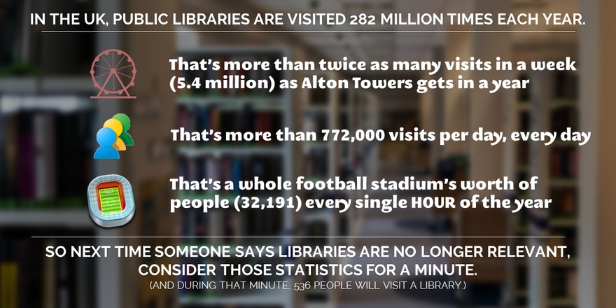
But why do we never take the figures in isolation? 282 million visits! That's MASSIVE. And then I started wondering how that compared with other things we visit in the UK. I came up with a list of as many as I could think of, and guess what? We visit libraries more than we visit ANYTHING else. In fact, we visit libraries twice as often as we visit football matches, theatres, A&E and the Church combined.

I mean come on!

So inspired by some utter drivel from the Telegraph about a new Government initiative about libraries (more on which another time), I've come up with some different ways of expressing the comparisons between how often we visit libraries versus other things we visit.

Everything below has no licence attached to it so please use it however you wish - tweet it, blog it, embed it, remix it, change it, and no need to attribute anything (except the original data sources). I just want this message to go as far and wide as possible.

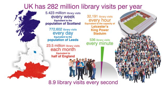
Library usage stats broken down into smaller timeframes

I'd be really keen for people to make their own versions of these - I'm sure we can do better than what I've come up with below. This is the perfect size to tweet as it won't need expanding to be viewed on Twitter.

I really like this version from @bookmarkpeople, too:

Here are all the subdivisions if anyone's feeling creative with comparisons:

  • 282 million library visits per year
  • 23.5 million library visits each month
  • 5.423 million library visits per week
  • 772,602 library visits per day
  • 32,191 library visits per hour
  • 536 library visits per minute
  • 8.9 library visits per second. For every second! Of the entire year! I mean seriously, how the hell can people claim we don't need libraries any more?

Library usage stats on Sway

Here's the first version of the stats. It's done using Sway, a new tool from Microsoft. Direct link to the presentation here.

Clicking the button above will allow you to tweet a link to that Sway presentation. I also did a vertical scrolling Sway in a slightly different style - take your pick! Both Sways allow duplication, so if you want to take them as a starting point to make your own version, feel free - improve and enhance it.

Library usage stats on Slideshare

A slightly different approach for this one - a teaser format where the most popular activity isn't revealed until the very end. Here's a link direct to the slides.

The slides were Featured on Slideshare's homepage and also tweeted by the CEO of the Arts Council, so hopefully we're getting beyond the echo-chamber!

Library usage stats on video

Here's a YouTube video - the same statistics as in the slides, but this time made in PowToon.

Library usage stats: the raw figures

Here are all the raw figures I collected - if you take these and do something interesting with them, let me know in a comment and I'll add whatever it is to this list!

230 million library visits in England (282 million in UK): http://www.cipfa.org/about-cipfa/press-office/archived-press-releases/2014-press-releases/cipfa-library-survey

Cinemas: 165.5 million admissions: http://www.cinemauk.org.uk/facts-and-figures/admissions/uk-cinema-admissions-2013-by-region/

Church of England: 52 million visits: https://www.churchofengland.org/about-us/facts-stats/research-statistics/parish-attendance-affiliation.aspx

The UK itself: 32.8 million visits from overseas in 2013: http://www.ons.gov.uk/ons/rel/ott/travel-trends/2013/rpt-travel-trends--2013.html

Theatre: 22 million attendees in 2013: http://www.telegraph.co.uk/culture/theatre/11001177/Almost-twice-as-many-people-visit-the-theatre-than-attend-Premier-League-games.html

Hospital A&E Departments: 18.5 million visits http://www.hscic.gov.uk/catalogue/PUB16728

Premier League Football: 13.9 million total attendance http://www.espnfc.com/barclays-premier-league/23/statistics/performance?season=2013

There used to be Museums and Galleries figures here, but they turned out to be just for DCMS owned insitutions so I've removed them - thanks to Ian Clark for the heads-up.

Library usage stats: as a Google doc

And finally, if you want to do stuff with the data it may be useful to have it in a spreadsheet: here's a Google doc. It's set to 'anyone can view' - if you want to edit or add to the data etc just make your own copy.


What other people are doing with the stats

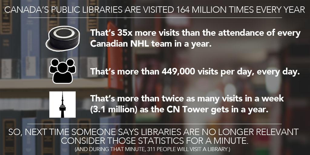
The first remix has arrived! Really pleased that Adlib has redone the graphic at the top of this page but for Canadian libraries.

I hope others will be encouraged to take this basic idea and run with it - either by finding new ways to express the information, or finding new information, or redoing some of these resources for different parts of the world...


Spread these messages however you want, as far as you can. And keep the statistics to hand - every time someone says 'we don't need libraries in the digital age' we can respond 'actually 772,000 people in the UK will need them today alone!' and all the rest of it.

Let's do this!

If you need a conference / event / project website, Strikingly might be the option for you

 
The short version of this post is: if you'd like a clean modern website for your online presence, and aren't looking to do anything too complicated, Strikingly may well be the right choice for you. It's easy to use for both author and viewers of the site, and it's free as long as you don't get TOO much traffic.

Over the past couple of months I've been tinkering around with the website builder Strikingly in spare pockets of time.

I really like the vertical scrolling style websites you can make in Strikingly - I first saw that style when Matt Borg used it for stuff like the UXLibs site. You can use normal navigation to skip to whichever page you like, or you can scroll down and they all appear below the homepage - meaning you never have to load up a new page to explore the website. This long-form one-page style saves time and works well.

Where it doesn't work so well is if you have a lot of complicated information to display on many different subjects - in that setting a traditional website may work better. But if you have just one story to tell Strikingly can do it with an uncluttered, stylish, and very mobile friendly site. For example for a conference, an event, a project, a collaboration, or even a personal website to act as a CV or something for the Googlers to find.

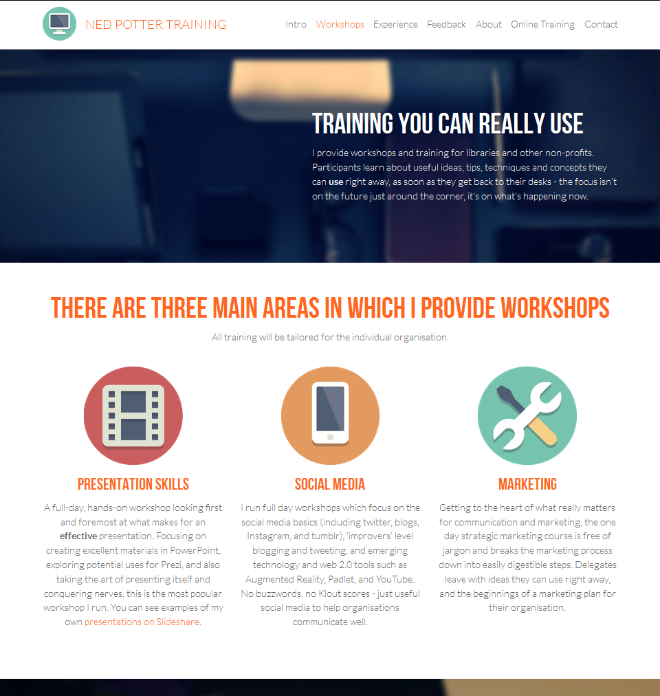
I already have this main website made in Squarespace (which I reviewed here), so in order to have a reason to sign up and play with Strikingly in earnest I built a site for my Training offering. You can find it here if you're interested - the top part looks like this:

Click the pic to open the website in a new window

Click the pic to open the website in a new window

At the moment this feels some way ahead of Blogger and even Wordpress in terms of the interface - it's pleasant to interact with a Strikingly site. You can actually blog using Strikingly, but if you do that and achieve success with it, you're going to exceed the 5GB of bandwidth that comes with the free version of the service. You can upgrade to the 8-or-16 dollar a month packages but I doubt anyone reading this would want to that - so to my eyes, Strikingly is a good option for someone who wants an online presence, perhaps to document some projects you've worked on, an online CV, or to showcase your skills if you're job-hunting, but who doesn't want to commit to blogging. Or, as mentioned, for an event, conference or collaborative project.

The editor looks like this:

As you can see you choose the type of section you want, then edit the content to your own. You edit the actual site - so what you see is truly what you get, rather than there being a seperate Editor interface. This makes it easier to see exactly how the changes you make are going to affect your design.

PROS OF STRIKINGLY

  • It's fairly fool-proof in terms of making things look nice. You are set up to succeed and would have to out of your way to make a duff site, even if you have no experience of web design or blog-building etc
  • It's very easy to create a site. There are nice templates which are relatively customisable
  • It's free, as long as your site is not too popular! (See below)
  • It's Responsive Design, so everything about your site is retained when viewing it on mobiles - it's just re-ordered to best fit the size of screen. Below is a screen-grab of Preview mode where you can see your site in tablet or phone view:

CONS OF STRIKINGLY

  • If you exceed 5GB of bandwidth per month, you'll need to upgrade to a paid-for package. There's more on understand bandwidth requirements here but to 5GB ought to be enough unless you're blogging and building an audience. I don't know what my bandwidth usage is anymore as the Squarespace package I have is unlimited, but in my old wordpress days I used between 10 and 20GB a month - had I not been blogging and thus creating traffic I think 5GB would have been more than enough
  • You need a lot of imagery. As with all modern website designs, it's a lot about pictures - so you'll have to use some. There's plenty of inbuilt options to choose from but in making mine I had to hunt around for things which were relevant, and not just stylish for the sake of it
  • Following on from that, all these new website builders (like Squarespace too) are really aimed primarily at start-ups and freelancers; sometimes it feels like an effort to find the options which aren't all about a: the hard sell or b: vaguely trendy lifestyle stuff that may work in a San Franciso web design office but is hard to imagine having any meaning elsewhere
  • It's not THAT flexible - as mentioned above, a more complicated site is better off with a different website builder. The editor is easy to use but a little constraining so you can't micromanage the finer details of how each section is arranged
  • And the usual disclaimer as with any new site-builder - who knows how long the company will be around? Unlike Wordpress which is open-source and sustained by the non-profit community, Strikingly exists as a business, and businesses go under... There's no reason to expect Strikingly to stop existing, but you never know.

So could Strikingly work for you or an enterprise you're involved with? If you do decide to give it a whirl let me know what you make with it.

A UX in Libraries Reading List

There's a new page in my navigation bar! UX is here.

Earlier in the month I called upon the ever-awesome network of twitter info pros to help me create a reading list to introduce someone to UX in Libraries - the part of User Experience focusing on ethnography and physical spaces rather than primarily on the online experience.

UX is a growing area but lots of people are still unfamiliar with it, so the aim of the list is to take a structured approach to introducing the topic, taking someone from a fairly straightforward definition right through to books, blogposts, presentations and journal articles that go into a lot of detail.

Lots of people came back with great suggestions and I said I'd make the list publicly available upon completion, so here it is. When you're looking for UX literature there's obviously a huge amount on website UX, so it's nice to have a concentrated list that's just about the library context.

UX in Libraries Resource List: A Structured Introduction to UX and Ethnography.

If you're wondering about tweeting a link to this blogpost you can use the sharing button at the bottom of the post, or you can use this one to tweet a link directly to the reading list itself instead if you'd prefer!

I created this primarily for the UX Intern about to start work at York for six weeks, who I'll be managing. I'm very excited about this - it's such a great opportunity to hit the ground running with some ethnography, and turn the ideas from the UXLibs conference into results for our own institution. The intern starts in August - I'll blog about how that all goes at a later date.

If you can think of a way to improve this reading list, please let me know! I've created a copy for our intern which I'll leave alone for the moment, so this public version can be amdended to and added to as much as people feel would be useful. I'm particularly keen on additions that you have specifically read / watched / viewed and found helpful, rather than 'I've heard this is good' type suggestions which might end up making the list too long and unwiedly...

(updated) Training up North! Presentation Skills workshop coming up

UPDATED 1st OCTOBER:

I now have confirmation of the location and details on the October 16th workshop. I've deleted all the stuff about the York workshops in the post below, as those dates are now past.


Oct 16: Presentation skills workshop, Liverpool

This is the full-day Making Your Message Stick workshop, which I've just revamped, for CILIPNW. It'll take place at the Library at the University of Liverpool. All the details, including how to book, are on the CILIP website - in essence we'll be covering how to make a very effective presentation indeed (which, as it happens, will also look really nice!).

There are also two free student places available, with a deadline of October 5th for application - if you're currently enrolled on a LIS course, click here to see how to apply.

Some feedback from the two most recent Presentation Skills workshops I've run, for CILIP NE and the Bodleian:

“Tips and tricks about perfect presentations - it was fantastic! Very informative, very attractive content of the course. I’d recommend it to anyone.”

”The trainer’s knowledge and approach to the presentation were outstanding. We received numerous references for further learning and finding resources, which is greatly appreciated.”

”It was excellent. It is a particularly difficult topic to present on, as the audience is looking to see excellent presentation skills in action. The trainer succeeded in demonstrating presentation skills as well as talking about them.”

”It was just perfect.”

”Ned is very engaging and was able to get across his enthusiasm and expereince of presenting at a high standard.”

”The trainer gave lots of useful tips and could draw on own experience in libraries to illustrate points; there as a good balence between written and spoken input and time to practice new ideas.”

”The course was really fantastic, I came away with lots of practical ideas and feeling enthusiastic about sharing them with my team.”

”The best training I have ever been on.”

“I found the day very useful - a very practical session with time for hands-on practice and a lot of good advice given. I have heard a lot of about Ned’s presentation expertise. He was great!”

”Really useful and informative. Good to have practical sessions as well as demos.”

”Ned was fantastic, and there was a great balance of practical exercises, and presentation of examples and tips.”
— Bodleian Libraries 2015, and CILIP NE 2015

You can see all of the upcoming workshops on my Upcoming Events page. Hope to see you at one of them!