This is the second post in a series about Embedding Ethnography at York. The introductory post is here; the next post will be on the same project as this one, but written by me and focusing on the logistics of organising the whole thing, rather than undertaking the ethnography.
This is Part 2, written by Emma Gray, who was our first UX Intern. At the time of her work with us she was a 2nd year undergraduate at another institution. She did an absolutely brilliant job here, and we learned a lot through her work - about our students but also about ethnography itself. Here's her take on the project. It's a great intro to what we think of at York as the Big Five ethnographic techniques in libraries. There are plenty more, but so far we've focused on these ones, in various combinations, across all our UX work.
UX TECHNIQUES IN A LIBRARY SETTING – INTERNSHIP REFLECTION
In August 2015, I began an intern project looking into how several ethnographic UX techniques can be applied to a library setting and used to investigate possible improvements of the library user’s experience in the University of York library. As the project took place outside of term time, there was a focus on the experience of postgraduate students, who were still using the library over the summer break. The techniques covered over the internship include cognitive mapping, love/break-up letters, interviews, behavioural observation and touchstone tours.
BEHAVIOURAL OBSERVATION
Behavioural mapping is the first technique that I tried out at the beginning of the project. Being unfamiliar with the library before the project began, it was a valuable experience to observe how students behaviour in different spaces in the library. Firstly, I made a grid to record observations over the six week period in different locations within the library, increasingly concentrating on the more busy areas. Using the AEIOU framework, I recorded action (how the students are working in the space), environments (noting atmosphere, for example noise levels), objects (which services are used, e.g. technology and printed resources) and finally users (it is useful to note who is using the space, be it students, staff or external users). Secondly, it was also useful to record pathway maps using coloured diagrams of how individual students move in the space. In the York University library, it was particularly relevant to record pathways in the entrance foyer because the result show which building of the library students head when they enter.
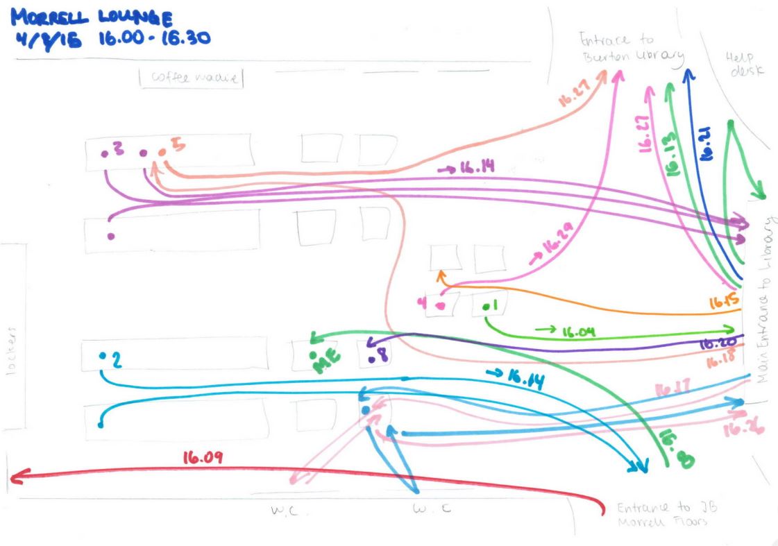
An example of one of Emma's pathway maps
COGNITIVE MAPS
Participants were given six minutes to draw a map of the library, and I asked participants to change the colour of their pen every two minutes so that it could be easily remembered in which order things were drawn. It was a good starting activity because it allowed students to think about how they use the library and its services as whole. This visual representation of the spaces seems to also get the students thinking about how they use the library because I asked them more detailed questions during the interview.
The idea is that students would instinctively begin by drawing areas of the library they area most familiar with. However, I found that most participants started drawing the entrance in detail, maybe because the layout of the library as a whole is quite complex. I therefore encouraged participants to begin by drawing the area of the library they are most familiar with and use the most. This gave stronger results because it showed which objects and areas are most used.
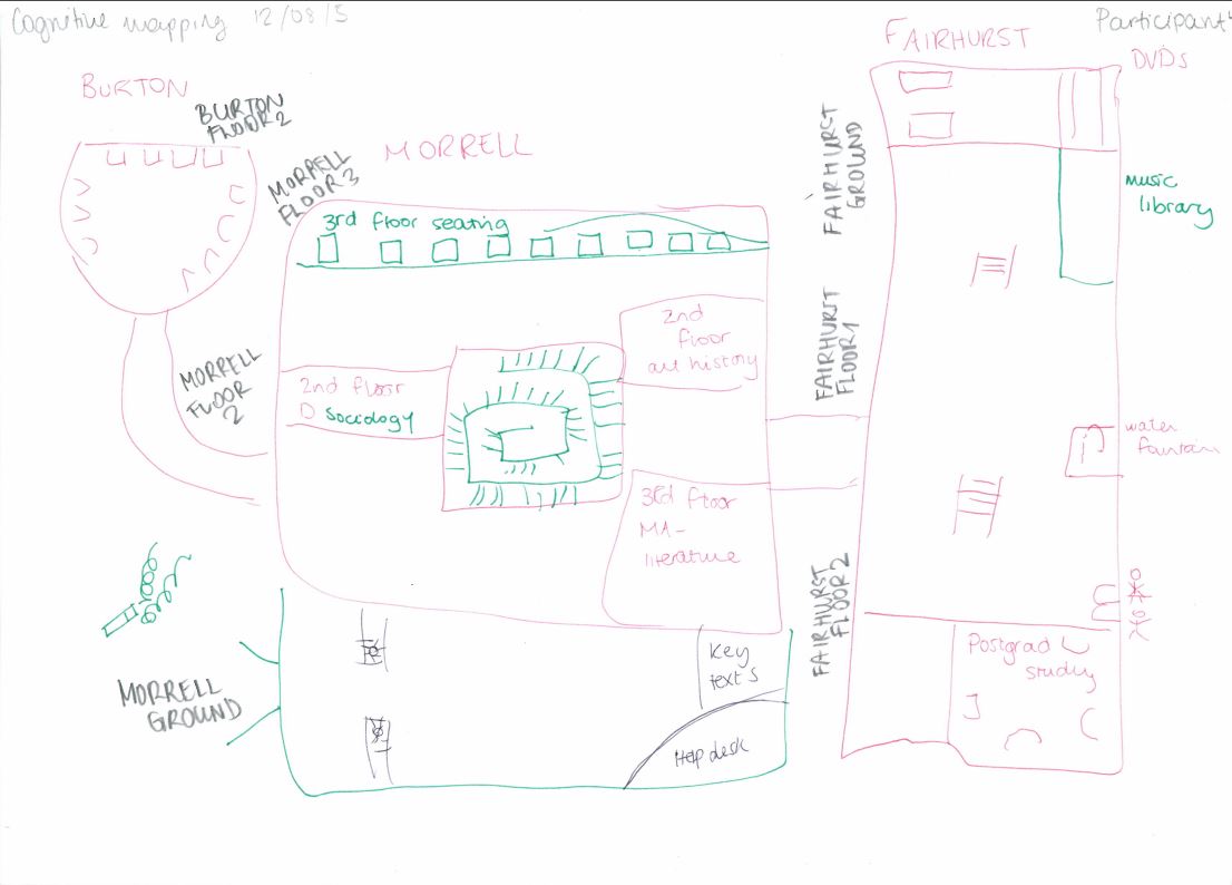
A Cognitive Map drawn by one of the participants of the study.
In order to process the results of these maps, I divided the library into each floor of each building, and for each noted number of occurrences on the maps, its identification index which reflects the percentage of time is occurs (number of occurrences /number of participants), its representative index (number of occurrences / times category is drawn), and its temporal index (3 points for first pen colour, 2 points for the second and 1 point for the third). This process was then repeated for each individual object that is drawn on the maps, which for example included desks, computer areas and other library services. The advantage of this technique is that is gives a visual representation of how the students view the library, and it can also yield quantitative data. However, it is also a very time consuming technique, so the practicality of the data very much depends on the size of the library.
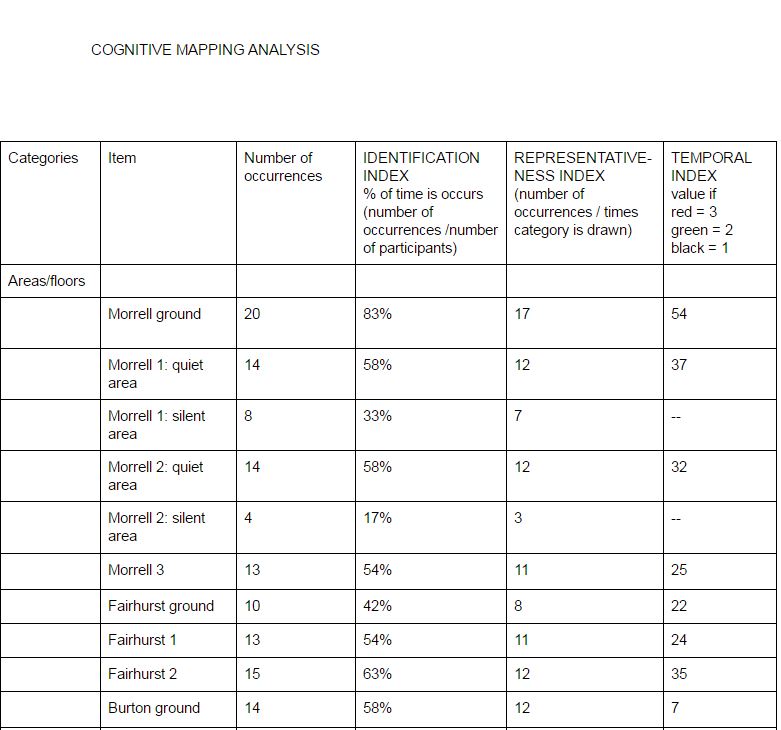
A screengrab of part of Emma's coding of Cognitive Maps
INTERVIEWS
I began the interview by asking the participants to describe and elaborate on their cognitive maps. Many participants elaborated on how they use certain spaces, which provided useful context for the cognitive map. I also asked participants to explain the process of how they use library services when working through an assignment. I asked general questions about the students’ experience with various services that the library provides, and encouraged to give their opinion on how their experience could be improved.
I found that being an intern and a student myself was invaluable to the interview process because the students did not shy away from being honest about their experience and more comfortable being critical than they might have been with a member of staff. Following the advice from Bernard’s ‘Research Methods in Anthropology: Qualitative and Quantitative Approaches’, I occasionally paused after a short answer was given, and often the participant would continue talking in more detail after a few moments, which kept the conversation flowing.
The major advantage of interviews is the breadth of information they yield, especially because things that individuals bring up can be elaborated upon and questions can also be adapted for future participants (e.g. finding out whether students had similar experiences with aspects of the library mentioned by other participants). Having a few standard open-ended questions is key, but participants seem to much more at ease if the interview flows like a conversation, rather than reading off a list of questions.
The only downside is that transcribing long interviews (they usually lasted between ten and fifteen minutes) takes a long time, but is definitely more valuable than making notes at the time because you are free to focus on what the participant is saying.
LOVE / BREAK-UP LETTER
Participants were asked to write either a love or break-up letter to a specific service that the library offers, so that the students can more emotively express how they feel about this service. I encouraged students to write about they feel (either negatively or positively) passionate about.
The participants were given a maximum of ten minutes to complete their letter. I definitely found this technique the most interesting because many participants wrote very imaginative, emotive letters that gave real insight into how library services and staff are perceived, and how this affects their daily university life. I did not find that this technique had any real disadvantages, only that some students preferred to write a wish list on what could be changed in the library. This also gave insightful information, but often did not show the reasoning behind these requests.

An example of a usefully insightful Break-up Letter... Participants write these by hand but Emma wrote them up for ease of searching / reading.
And for balance, here's a Love Letter...
TOUCHSTONE TOURS
For touchstone tours, I asked participants to give me a guide of the library. I voice recorded the tours to be transcribed later, so that every detail of the tour could be recorded.
Before the tour began, I usually encouraged participants to give as much detail as they could about how they use the services and different spaces, and also to point out their favourite space in the library. During the tour, I tried not to interrupt the participants or ask any more questions so that they could speak freely. Occasionally, I asked questions after the tour was over if any clarification was needed, or to enquire why the tour hadn’t included a certain area of the library.
The touchstone tours were interesting because the participants were very free to take me wherever they want, and point out anything they want, meaning that the participants brought some things up which I hadn’t thought to mention in the interview. It is notable that the quality of the tour heavily depended on how comfortable the participants were speaking out loud and narrative as we went along.
CONCLUSION
All of the techniques describe above have their own advantages and disadvantages, but they also each contributed to a more multi-faceted insight into how each participant engages with library services. I found the cognitive mapping the most interesting technique because I think it was the most unfamiliar to the participants and therefore got them thinking about how they use the library in a new way. As was the case in this particular library, it also highlights any areas that are being underused. Conclusively, having an intern collect UX data for a university library is a great idea, because the students are definitely more comfortable making their feelings known than they would be with a staff member.